
Suggested commit message:
git commit -m 'Issue #2582911 by kostyashupenko, snehi, Sagar Ramgade, emma.maria, MRPRAVIN, rokkieweb, rachel_norfolk: Styling of buttons breaks in Blocks UI whilst using Bartik as an administration theme'
Problem/Motivation
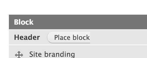
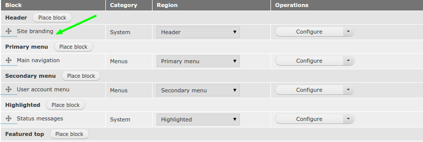
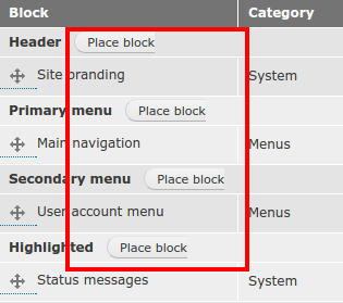
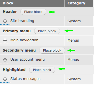
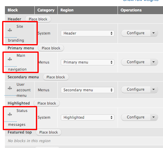
Styling of button breaks while using Bartik as adminstration theme with the Chrome browser. Please have a look at "place block" button in the attached screenshots and note the missing end curve.

Note that this issue is only concerned with the trailing round edge of the buttons, not any other UI issues using the Bartik theme as an administration theme.
Proposed resolution
css update to work better with Chrome.
User interface changes
CSS change to correctly render buttons in Chrome.
after #21

API changes
none.
Data model changes
none - just css.
| Comment | File | Size | Author |
|---|---|---|---|
| #50 | Screen Shot 2016-03-30 at 21.37.27.png | 115.83 KB | emma.maria |
| #49 | interdiff-21-49.txt | 460 bytes | snehi |
| #49 | styling_of_button-2582911-49.patch | 420 bytes | snehi |
| #46 | goodall3.png | 38.35 KB | emma.maria |
| #46 | patchall3.png | 27.06 KB | emma.maria |


Comments
Comment #2
Sagar Ramgade CreditAttribution: Sagar Ramgade as a volunteer commentedAdding display: inline-block fixes the issue, patch attached.
Comment #3
Miranda Jose CreditAttribution: Miranda Jose commentedThanks Sagar.
Patch in #2 fixes the issue with buttons.
Comment #4
Bojhan CreditAttribution: Bojhan as a volunteer commentedComment #5
emma.mariaThanks @Miranda Jose for spotting this bug and thanks @Sagar Ramgade for the patch. I can confirm the patch fixes the visual issue.
Comment #6
emma.mariaComment #8
Miranda Jose CreditAttribution: Miranda Jose commentedThe above issue with patch should have been fixed in https://www.drupal.org/node/2618886.
Comment #9
nmeegama CreditAttribution: nmeegama as a volunteer commentedThe patch in #2 fixes this issue
Comment #10
nmeegama CreditAttribution: nmeegama as a volunteer commentedComment #11
Sagar Ramgade CreditAttribution: Sagar Ramgade as a volunteer commented@Miranda, issue mentioned in #8 seems unrelated. Could you please recheck this?
Comment #12
gnugetYup #8 is unrelated.
I tested this with Firefox, Chrome and Safari, looks good.
Comment #13
Miranda Jose CreditAttribution: Miranda Jose commented#8 was the reason behind failed patch testing.
Seems to be working with #2 now. Thanks for looking into it @Sagar
Comment #14
gnugetohh! good to know, I will run the tests again just to be sure
Thanks!
Comment #15
star-szrI think we're missing something here. With this change the height of the button changes which makes things inconsistent, for example on the node edit form (in 8.1.x) the delete button is too large with this patch applied.
Before

After

Comment #16
emma.mariaComment #17
gnugetI added the tag Novice.
Comment #18
kostyashupenkoFixed sizes of .button class
Results here


Comment #19
ceaucari CreditAttribution: ceaucari as a volunteer commentedHey kostyashupenko, I reviewed and # 18 get's it wright except for 1px, see images attached
If you add to the class .button a margin-top: 1px; it will get completely aligned.
Comment #20
star-szrSo it sounds like this needs more work…
Comment #21
kostyashupenkoSorry, @ceaucari, my bad. Now it looks ok on my side. Check screens below in FF and Chrome
Comment #22
MRPRAVIN CreditAttribution: MRPRAVIN at UniMity Solutions Pvt Limited commentedComment #23
Manjit.Singh@kostyashupenko Buttons are seems ok now ;) but the text is not inline. Please check the screenshot.
After:
Comment #24
MRPRAVIN CreditAttribution: MRPRAVIN at UniMity Solutions Pvt Limited commentedI tested this in Firefox and Chrome. without applying this patch itself for me "place block" looking good in Firefox. In chrome only am facing this problem. After applying this patch issue is not occurred. Looks good.
Comment #25
Manjit.SinghAnybody facing problem the issues that i have mentioned above. This is in Mac - chrome
Comment #26
MRPRAVIN CreditAttribution: MRPRAVIN at UniMity Solutions Pvt Limited commentedAfter applying patch text is in inline for me.. Looks good. @Manjit.Singh which browser are you facing this problem??
Comment #27
MRPRAVIN CreditAttribution: MRPRAVIN at UniMity Solutions Pvt Limited commentedOh in Mac... Let me check..
Thanks
Comment #28
MRPRAVIN CreditAttribution: MRPRAVIN at UniMity Solutions Pvt Limited commentedHi Manjit.Singh,
I tested this in Mac am not facing this issue. for me it works good.
Comment #29
gnugetI tested this as well and I couldn't reproduces the problem either, this works ok for me.
Comment #30
emma.mariaComment #31
emma.mariaThe issue summary does not show the original bug of the issue.
This issue needs "Before" screenshots added to the Issue summary. The "Place block" buttons look broken and we do not have any screenshots - #24 has before screenshots that you can add to the summary.
Then we need manual testing on the patch in #24 with clear screenshots to show the issue is fixed and not caused any more errors.
Then this issue can be marked RTBC.
Comment #32
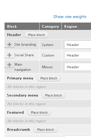
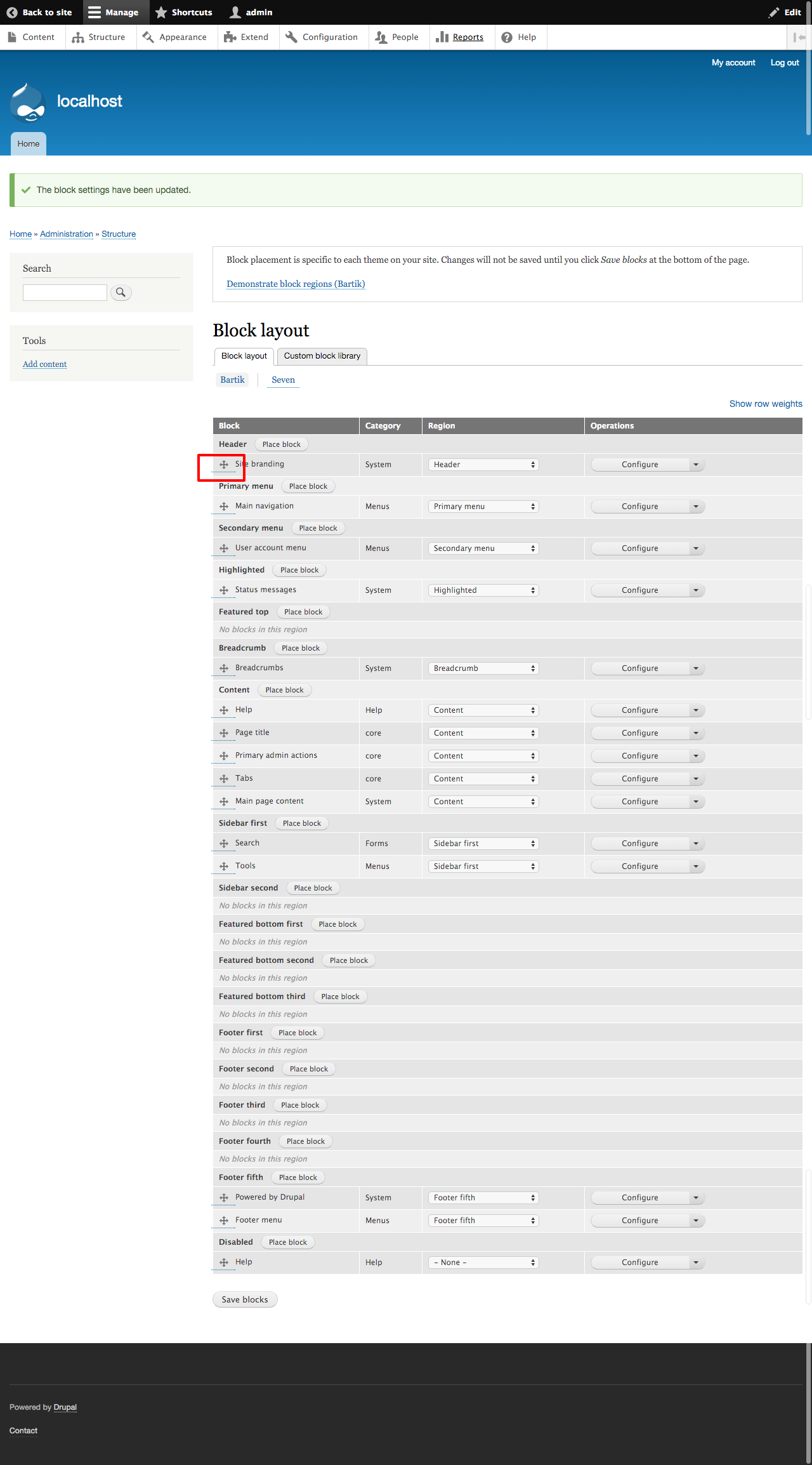
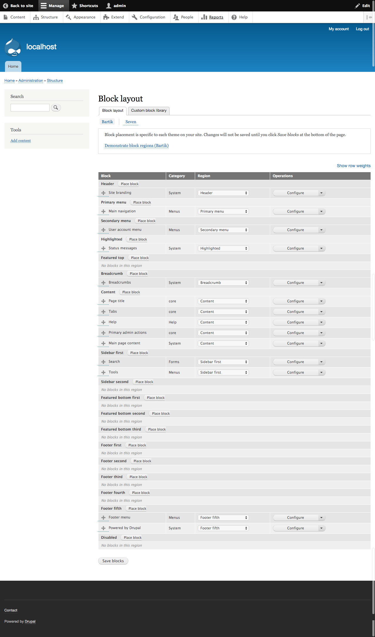
rokkieweb CreditAttribution: rokkieweb commentedFrom the recent git pull, we checked the issue. We recreate the problem and find the problem exist only in Chrome.We took a couple of screenshots before and after the patch both from Chrome and Firefox. After the patch, It seems that the issue is fixed.
before #21


after #21


Comment #33
rokkieweb CreditAttribution: rokkieweb commentedComment #34
rachel_norfolkSlight tidy to issue summary.
Also - hokkieweb should really be mentioned in the commit - done a lot of work today on her first (of many!) ventures into the issue queue.
Comment #35
Manjit.SinghLooks good now for me as well. RTBC ++
screenshots attached.
Before

After

@emma Just one query from after screenshot that dotted line is slightly outside from the container :P
Is that ok ? or Is it already reported somewhere ?
Comment #36
rachel_norfolkLooks to be the same location for the dotted line in both before and after screenshots to me. Maybe a new issue to raise?
Comment #37
gnugetYeah, the dotted line should have its own issue.
Removing some tags.
Comment #38
Sakthivel M CreditAttribution: Sakthivel M at UniMity Solutions Pvt Limited commentedHi,
I have patched for Fixing the issue overflow dotted line in comment #35.
Before Applying patch

After Applying patch

Thanks
Sakthivel
Comment #39
rachel_norfolkAs discussed in #36 and agreed in #37, work on the dotted line should be in a new issue. We should continue this issue from the patch at #21.
Setting this back to RTBC and making the correct patch file appear.
Sakthivel - I have already created a new issue for you to attach your patch to. (If I do it, you might not get recognised!) - see https://www.drupal.org/node/2683433
Comment #40
emma.mariaSorry to be picky but this issue still needs to show the original bug in the issue summary.
Then it should be super clear that we are only fixing the button and nothing else.
I want this to be clear to everyone and especially the core committer who needs to wade through a lot of sidetracking during this issue.
Also the patch to review and potentially commit is #21.
Comment #41
star-szrYup let's keep this focused, please and thanks :)
Comment #42
rachel_norfolkFurther sorting of the Issue Summary
Comment #43
rachel_norfolkComment #44
Manjit.Singh@Rachel_norfolk have you create an issue that i have mention in #35 ? or may i create ?
Comment #45
BQari CreditAttribution: BQari commentedComment #46
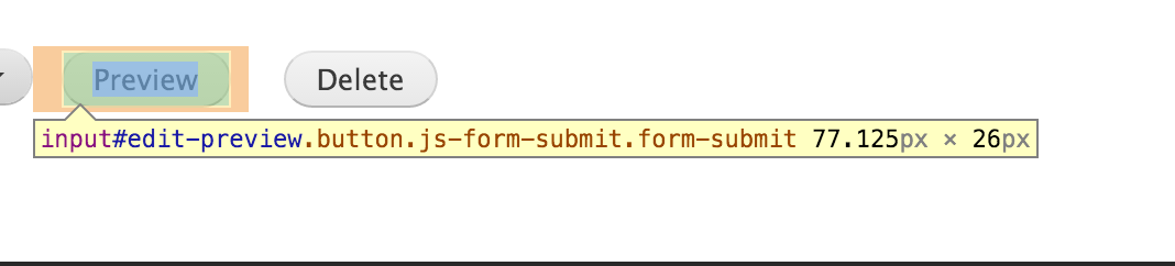
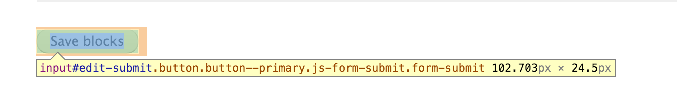
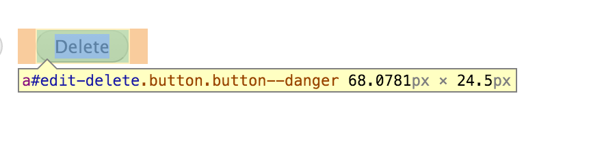
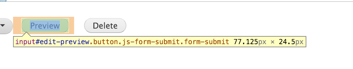
emma.mariaThe aim of this issue was to fix the button's padding collapsing and the styling looking broken as a result.
The bug
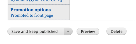
The padding change included in the patch causes a visual regression on the current sizing of buttons in Bartik. The buttons end up bigger and also bigger than the things they sit next to, for eg. look at the Save, Preview and Delete buttons.
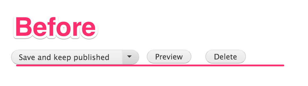
Before at HEAD.
Buttons are all 24.5px tall...
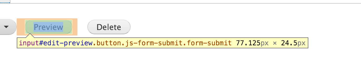
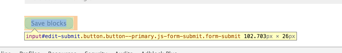
With patch
Buttons are 26px tall...
With patch #21 - the buttons are 26px tall everywhere.
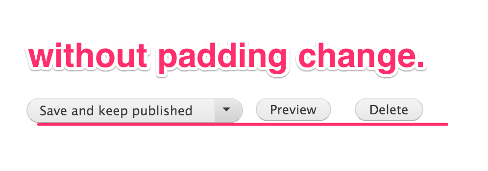
Patch without the padding change
Buttons are again 24px tall...
Next steps
This issue should not introduce any visual regressions to elements indirectly involved in the issue. Therefore the padding change should not be applied to fix this bug.
Please can a follow up patch be created from #21 with the padding style *removed*? And then this issue will finally be RTBC! Thanks!
Comment #47
emma.mariaComment #48
emma.mariaComment #49
snehi CreditAttribution: snehi as a volunteer and at Publicis Sapient for Publicis Sapient commentedDone. Please review.
Comment #50
emma.mariaThanks @snehi for the final patch.

Buttons in the block UI are fixed, no regressions on other buttons. RTBC!
Suggested commit message:
git commit -m 'Issue #2582911 by kostyashupenko, snehi, Sagar Ramgade, emma.maria, MRPRAVIN, rokkieweb, rachel_norfolk: Styling of buttons breaks in Blocks UI whilst using Bartik as an administration theme'Comment #51
star-szrThis looks good, bumping to 8.2.x (UI change that could potentially have other effects, Bartik as admin theme should be rare) and will commit soon :)
Comment #53
star-szrCommitted 3e13553 and pushed to 8.2.x. Thanks!