On this page
Introduction
The Responsive Class Field module provides a field type that allows content editors to define breakpoint dependent styling options (CSS classes) for the entity view display of the entity it is attached to.
When to use responsive class fields
The Responsive Class Field module has been created for allowing content editors to alter the appearance of inlined content entities like Paragraphs when using a responsive theme as Bootstrap for the Drupal site's front-end.
Rather than using general display settings for an entity type/bundle, the styling can be configured individually for each content entity and for all available breakpoints.
For enabling content editors to edit styles on a per-content base, you might be tempted to add a text field to the entity that allows for additional CSS classes. This is the fastest and easiest approach, but not very user friendly. Content editors need to be aware of your theme's CSS classes. Furthermore, they might accidentially break the front-end output of your site by using false classes.
Alternatively, you can provide multiple sets of pre-defined styling options using list fields, or the Classy paragraphs module for Paragraphs. While this dramatically increases ease of use for your content editors, it's somewhat limiting to the anticipated and provided options.
Imagine, you'd like to allow padding options, margin, text alignment, colors, ..., and - of course - all their combinations. You'd end up in long option lists or a multitude of additional fields on every content entity. It becomes even more fields, when you work with responsive themes where all (or some) of these values shall be different for the various screen sizes. You may also need to implement all these fields in your theme's templates or their pre-processing.
This is, where responsive class fields come into play. They allow you to define styling list options that can be different for the breakpoints of your theme, and automatically add the CSS classes to their parent entity.
How it works
Each responsive class field allows you to define a CSS class pattern with two placeholders {breakpoint} and {value}.
You can enable supported breakpoints for every field and define the {breakpoint} replacement value that shall be used for this breakpoint.
You then define a list of allowed values. This list of options will be available for every enabled breakpoint.
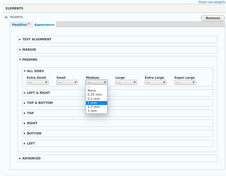
Responsive class field: Field widget example with multiple responsive class fields for Bootstrap 4 utility classes
If an option has been chosen for a breakpoint, a CSS class will be generated using the configured CSS class pattern, the breakpoint replacement value and the value of the chosen's option. If options have been chosen for multiple breakpoints, each choice will result in a separate CSS class.
All generated CSS classes will be added to the parent entity's HTML wrapper attributes.
Help improve this page
You can:
- Log in, click Edit, and edit this page
- Log in, click Discuss, update the Page status value, and suggest an improvement
- Log in and create a Documentation issue with your suggestion
