 Come together with the global Drupal community in Rotterdam, 28 Sept – 1 Oct 2026. Sessions, contribution, connection, and Early Bird savings until 8 June.
Example use: Bootstrap 4 padding utility classes
This example guides you through the steps to create a responsive class field for Bootstrap 4's padding utility class for your content entity.
Preface
The notation of a Bootstrap 4 padding utility class is explained at the Bootstrap 4 documentation as this:
Spacing utilities that apply to all breakpoints, from
xstoxl, have no breakpoint abbreviation in them. This is because those classes are applied frommin-width: 0and up, and thus are not bound by a media query. The remaining breakpoints, however, do include a breakpoint abbreviation.The classes are named using the format
{property}{sides}-{size}forxsand{property}{sides}-{breakpoint}-{size}forsm,md,lg, andxl.Where property is one of:
m- for classes that setmarginp- for classes that setpaddingWhere sides is one of:
t- for classes that setmargin-toporpadding-topb- for classes that setmargin-bottomorpadding-bottoml- for classes that setmargin-leftorpadding-leftr- for classes that setmargin-rightorpadding-rightx- for classes that set both*-leftand*-righty- for classes that set both*-topand*-bottom- blank - for classes that set a
marginorpaddingon all 4 sides of the elementWhere size is one of:
0- for classes that eliminate themarginorpaddingby setting it to01- (by default) for classes that set themarginorpaddingto$spacer * .252- (by default) for classes that set themarginorpaddingto$spacer * .53- (by default) for classes that set themarginorpaddingto$spacer4- (by default) for classes that set themarginorpaddingto$spacer * 1.55- (by default) for classes that set themarginorpaddingto$spacer * 3
We will create a responsive class field for padding at all sides. Our CSS class pattern therefore is like p-{breakpoint}-{size}, whereas the smallest breakpoint value and its leading dash are empty.
How to do it
Step 1: Create a new responsive class field
Navigate to your content entity's Manage fields tab. This is usually located within your administrative back-end's menu at Structure > [Entity type] > [Bundle] > Manage fields, e.g. for a Paragraphs type "Headline" at Structure > Paragraph types > Headline > Manage fields.
Create a new field by clicking the  button and choose Responsive class from the General options of the Add a new field drop-down.
Give your field a descriptive label and click Save and continue.
Step 2: Configure the field storage settings
For our example, settings not mentioned here should be left at their default values. Refer to Field (storage) settings for a list and explanation of all available settings.
Pattern
As previously explained, the CSS class pattern of the Bootstrap 4 padding utility class we want to implement is p-{breakpoint}-{size}, whereas the smallest breakpoint value and its leading dash are empty.
The responsive class field uses the similar placeholder names {breakpoint} and {value}. As Bootstrap's first breakpoint value and its leading dash are empty for the smallest breakpoint, we need to include the dashes into our breakpoint replacement values as well.
The resulting pattern for our CSS classes therefore is p{breakpoint}-{value}.
Breakpoint group
The responsive field class module comes with a pre-defined set of breakpoints that already fits our example's use. If you are using a Bootstrap theme with own breakpoint definitions, you may switch the breakpoint group accordingly.
Then we enable five Breakpoints for the different screen widths supported by Bootstrap. As Bootstrap 4 is responsive first, it's values always apply to the smallest chosen size and all bigger sizes upwards. So we start our field's breakpoint settings with the smallest breakpoint and work our way up to the biggest breakpoint.
If your theme's breakpoints have a different order, don't worry about the screen resolutions and media queries. All information the responsive class field uses is the breakpoint identifier and your configured name/value. So we can safely override the breakpoints by giving them different labels.
The first breakpoint can be labeled Extra small. The value should be left empty to account for Bootstrap's 0 and up classes that aren't bound to a media query.
The following breakpoints may have labels as Small, Medium, Large and Extra Large with the values -sm, -md, -lg and -xl respectively.
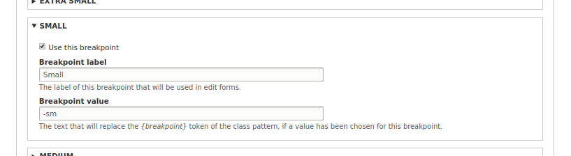
Responsive class field: Per-breakpoint settings
Allowed values list
This list follows the values available for Bootstrap's {sizes}. Given a default Bootstrap, where the spacer is set to a value of 1rem, our list should look like this:
0|None
1|0.25 rem
2|0.5 rem
3|1 rem
4|1.5 rem
5|3 rem
Now, we can save our field settings.
Step 3: Manage form display
Within our entity's Manage form display tab, we need to ensure that the field is enabled and uses the Responsive class form widget.
If our field is disabled here, we drag it up to the enabled fields list.
Step 4: Manage display
Within our entity's Manage display tab, we need to ensure the field is enabled for all displays where the classes should be added, and is using the Responsive class formatter.
The Responsive class formatter won't produce any output on its own, so the label position does not affect your output.
Yet, if the field is disabled, the CSS classes won't be added automatically to our entity's HTML wrapper attributes. This is intended behavior of the responsive class field module to avoid CSS classes to being added to teasers or other displays of our entity.
Summary
We have successfully created and configured a responsive class field for our content entity. The responsive class field is not limited to Bootstrap 4 classes, but does quite well with them.
If you wish, you can add further fields for margins or the various sides, altering the CSS class pattern accordingly.
If you support multiple utility classes/responsive styles with a responsive class field each, your edit form may become quite large and cluttered. Have a look into the Field Group module. It let's you nicely wrap multiple fields of your edit form into tabs and/or collapsible areas.
Help improve this page
You can:
- Log in, click Edit, and edit this page
- Log in, click Discuss, update the Page status value, and suggest an improvement
- Log in and create a Documentation issue with your suggestion
