 Come together with the global Drupal community in Rotterdam, 28 Sept – 1 Oct 2026. Sessions, contribution, connection, and Early Bird savings until 8 June.
Widget settings
The responsive class field comes with a standard widget for all form displays. The widget itself consists of a collapsible details wrapper containing a dropdown for each configured breakpoint.
You can choose between two display variants, stacked and inline. This page will describe the difference and how to fine-tune the appearance.
How to access the widget settings
As with every other field widget, you can access the widget settings in your entity's Manage form display tab by clicking the cog wheel to the very right of your enabled fields.
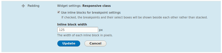
Responsive class field: Widget settings
Available settings
Use inline blocks for breakpoint settings
Check or uncheck this checkbox to toggle between the stacked and inline block display variants. This option is enabled by default.
Form elements in Drupal's standard admin theme Stark will usually be displayed stacked. So all dropdown elements for all breakpoints would be shown in single rows. In order to avoid extensively long forms when the display size is wide enough, the responsive class field features an inline blocks display variant. The inline blocks display shows the breakpoint dropdowns beside each other, as long as there is enough space. Only when the space left isn't enough, the remaining breakpoints will be shown on the next line(s).
Inline block width
This setting is available only for inline block display mode (see above setting). It allows to specify a maximum width for each inline block in pixels. The default value is 125pixels.
Help improve this page
You can:
- Log in, click Edit, and edit this page
- Log in, click Discuss, update the Page status value, and suggest an improvement
- Log in and create a Documentation issue with your suggestion
