
This very simple module adds a responsive class to all tables on your site, and uses the Zurb Responsive tables library to beautifully display all table content on mobiles without needing to hide columns.
From the Zurb Website
When we looked around at the various implementations of responsive tables on the web, we saw lots of interesting ideas but nothing we thought was a really great implementation. Chris Coyier on css-tricks.net did a great round up of responsive data tables and while there's some fascinating ideas in there, nothing seemed to meet the criteria we had for a great implementation:
- Doesn't break responsive layouts
- Doesn't unnecessarily hide data
- Still lets you compare rows
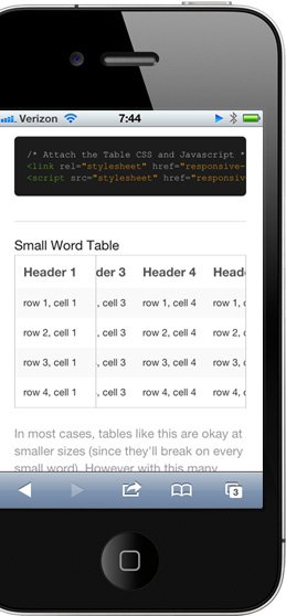
With those existing tricks in mind, we set out to develop this, a CSS/JS combo that takes existing tables and modifies them for small devices so they meet our criteria. It works by taking the first column and "pinning" it to the left of the table, allowing you to scroll the other columns under it. You don't lose the likely key for each row, but you also don't have to break your nice responsive layout.
Similar Modules
Responsive Tables - You can choose a priority for your columns, and as the screen width is reduced, these columns are hidden completely, which isn't great.
Foo Table - A brilliant module, allowing you to keep all column content, but displays it in block content, rather than keeping the original table height.
Compatability
This technique was tested on iOS, Android and Windows Phone 7 (as well as Chrome, Safari and Firefox). One caveat is that because Android 2.3 doesn't support scrollable divs on the page, the scrolling won't work on those devices. Android 3 and up does support this, so it's not an issue on newer Android phones.
Installation
- Place zurb_responsive_tables folder in your module directory.
- Enable module.
- All tables are now responsive.
Project information
- Project categories: Content display
 77 sites report using this module
- Created by Collins405 on , updated
 Stable releases for this project are covered by the security advisory policy.
There are currently no supported stable releases.

