

 The 2026 Drupal Business Survey is open. Your response will help shape the future of the Drupal business ecosystem.
Still to implement:
- Unify redirects when enabling/disabling servers and indexes: redirect to overview only if the action was started there.
- Clean up styling of disabled servers/indexes in overview: no italics, no symbols, maybe gray out the row or something.
| Comment | File | Size | Author |
|---|---|---|---|
| #9 | view-server-20191101.png | 209.68 KB | cedric_a |
| #1 | Screenshot 2014-04-28 16.15.15.jpg | 206.9 KB | lewisnyman |
| #1 | Screenshot 2014-04-28 16.04.12.jpg | 246.18 KB | lewisnyman |
| #1 | Screenshot 2014-04-28 15.59.29.jpg | 140.31 KB | lewisnyman |
| #1 | Screenshot 2014-04-28 15.48.51.jpg | 143.89 KB | lewisnyman |




Comments
Comment #1
lewisnymanView server
Enabling a disabled server
When I enable a server it directs me to the edit form? When I disable a server it redirects me back to the listing page, is this intentional?
Server listing
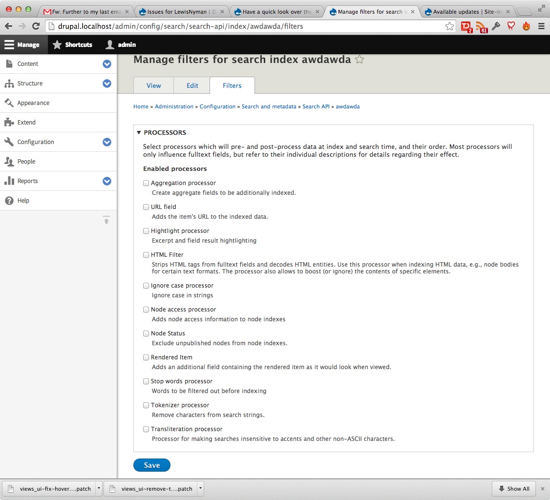
Manage search index filters
Should all the processors be inside of a fieldset? It seems redundant if they are the only items on the form.
That's all the time I have right now. I'll look around some more this week. I can create each of these as separate issue later if you want.
Comment #2
drunken monkeyYes, definitely. Probably the same for the "Reindex" and "Clear" buttons on the index View tab.
It's a very rare action, so I think having it at the top would make it look too important.
Also, usually the table will be small enough to let everything fit on one page, I think.
No, probably just a mess. If doing this from the listing, probably both should redirect back there. And from the edit form, both should redirect to the View tab (but I think that's currently the case anyways).
You are right, that all doesn't make much sense. We should probably completely redesign this at one point.
One thing that would help, which is planned (more or less) for later, is #2134799: Allow backend plugins to provide more specific feedback/information. If we have a dedicated method on the server to check, whether everything is OK for it, then we can use the icons for those. Disabled servers should really be de-emphasized in some way to hide them more. Greying out sounds like a good option, but maybe we also want to re-activate the "Disabled" category on this page.
You're right, of course, that's just a remnant of D7. We should get rid of that, and probably either rename the tab to "Processors" or refer to them always as "Filters".
Comment #3
amateescu commentedUpdated the submit buttons with 'primary' and 'danger' types:
http://drupalcode.org/sandbox/daeron/2091893.git/commitdiff/152788517ab2...
http://drupalcode.org/sandbox/daeron/2091893.git/commitdiff/9460cbf69b50...
Comment #4
draganerorComment #5
draganerorAdded new related issue to description.
Comment #6
draganerorMore related issues...
Comment #7
drunken monkeyComment #8
drunken monkeyComment #9
cedric_aA lot of these initial remarks are no more relevant, here is my analysis (from tests over the git branch
8.x-1.xtoday) :