


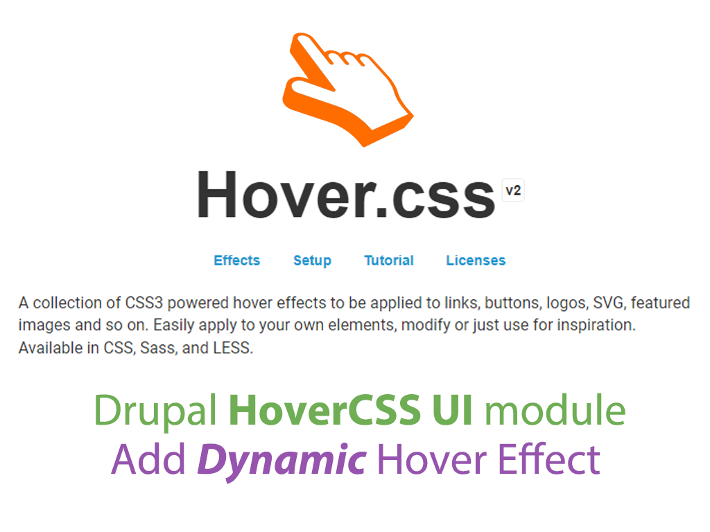
Integrates Hover.css, is a collection of CSS3 powered hover effects to be applied to links, buttons, logos, SVG, featured images and so on.
Features
Easily apply to your own elements, modify or just use for inspiration. Available in CSS, Sass, and LESS.
Installation
Please view the project's README.md for detailed installation instruction.
Requirements
Download Hover.css Library Latest Version from Github.
Recommended modules
- Pattern CSS
Is a CSS only library to fill your empty background with beautiful patterns. - Animate CSS
Allows you to makes cross-browser animations for use in your web projects. Great for emphasis, home pages, sliders, blocks with cool animation effects. - Textimate ( Text + Animate )
Provides text animation, enhancing site interactivity with awesome effects. Effortlessly transform static text into mesmerizing animations. - Splitting.js
Allows you to creates elements and adds CSS Variables for split words & characters! (lines, items, grids, images, more!) to unlock amazing possibilities for style and animating text, grids, and more!. - Vivus
is a module that aims to integrate Vivus.js library with Drupal. Provides SVG animate, Improve site interactivity with awesome animations.
Supporting
Please let me know if a new feature is needed or is there any issue and feedback. You can announce it in the Hover CSS Issues section.
Animations can improve the UX of an interface, but keep in mind that they can also get in the way of your users!
Project information
- Project categories: Developer tools, Media, Site structure
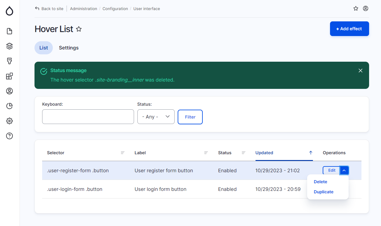
 45 sites report using this module
- Created by mahyarsbt on , updated
 Stable releases for this project are covered by the security advisory policy.
Look for the shield icon below.

