

 Come together with the global Drupal community in Rotterdam, 28 Sept – 1 Oct 2026. Sessions, contribution, connection, and Early Bird savings until 8 June.
Problem/Motivation
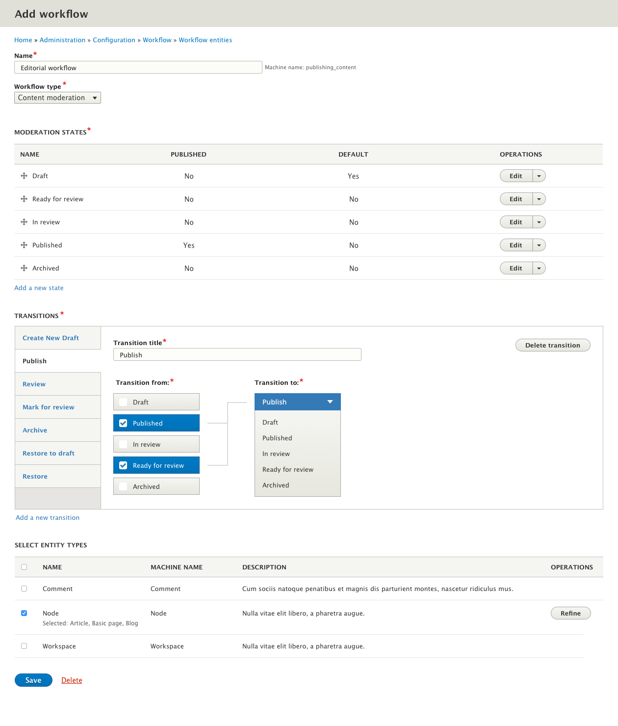
Even with detailed lists of workflow states and transitions it is still quite difficult for users to internalize complex workflows without some visual aid or metaphorical "map"
Proposed resolution
Implement a design which visually shows states and transitions:

Remaining tasks
Produce design comps- Prototype
- Test on users
- Create spec for development
- Discuss any limitations/issues with individual UI elements in sub-issues.
User interface changes
As pictured above.
API changes
TBD
Data model changes
TBD
| Comment | File | Size | Author |
|---|---|---|---|
| #39 | screenshot-views-displays.jpg | 27.85 KB | ifrik |
| #33 | Screenshot 2017-08-08 16.42.56.png | 76.18 KB | Bojhan |
| #30 | create-new-workflow.png | 191.35 KB | jojototh |
| #22 | workflowv2.png | 181.6 KB | jojototh |
| #19 | workflow-mock-3.png | 93.51 KB | tkoleary |




Comments
Comment #2
Crell commentedLink to prior contrib issue...
The non-linear nature of states is the main reason this is difficult to visualize generically. Some degenerate cases are, but not the interesting cases.
Comment #3
tkoleary commented@Crell
I agree that this is difficult to visualize, particularly if we imagine that we can make a visualization that programmatically "builds itself" from the data. If we do that we're going to waste a lot of time and end up with something with limited value.
On the other hand if we approach this from the perspective of the administrator "constructing" this visualization and making deliberate choices about what transitions to display in the diagram and which to leave hidden, to the end of making a visualization that "makes sense" to users and illuminates the pathways that are relevant to them, we might produce something much more useful.
Comment #4
Crell commentedAre you suggesting giving site admins the responsibility to build a manual data visualization? That seems... unlikely to be successful. :-)
Comment #5
tkoleary commented@Crell
No! That would be scary. :)
What I'm saying is that there would be a framework for how the visualization laid itself out which had some inherent logic (there are several quite nice javascript libraries for this). The user would start with a blank slate, then have select boxes to choose the states, transitions or permissions they wanted to show. Obviously if every state and every possible transition were made visible, the result could be a confusing spaghetti of intersecting lines, but judicious choices could result in something like what you see in the diagram in the summary.
Comment #6
Crell commentedOK, that's less scary. :-) Still, that could very very easily result in complex, visually counter-productive images that don't (can't) take into account things like highly variable screen sizes. (I've been playing with Graphviz for a while now, which would be useful for such cases, but I'm still not sure I trust its auto-layout capabilities in this context.)
Comment #9
tkoleary commentedGiven Crell's comment in #6 I spent a lot of time thinking about this and I think the UI that I have prototyped covers the 80% case and merges the visualization into the actual configuration UI. That was the intent of my comment in #3.
The prototype looks like this:
Of course it will also need the Transition name field for each group, but I think we can put that at the bottom.
The working codepen prototype is here: http://codepen.io/tkoleary/pen/LWrYpz?editors=1100
It borrows styles directly from Seven, and some core markup so at least some of the code should be re-usable.
It also re-uses the button-bar component from issue #2863052: Style state select as a button bar but in a slightly different way. In implementation I expect the groups will be loaded via ajax.
I think this can essentially be the main UI for this configuration page. We can still include the lists of states and transitions below for a detailed view, but leave the elements collapsed by default.
Comment #10
tkoleary commentedComment #11
Crell commented#9 actually looks pretty good. It looks like it should scale fairly well. The list of transitions may need to wrap, but otherwise it should work out.
Shouldn't the To state control be a select box? As is, it doesn't look like there's a way to change the to-state after the transition has been created. And of course there still needs to be a way to rename the transition, but that seems doable.
Comment #12
Bojhan commented@tkolearly Looks really good. I dont fully understand the top one, is this like a "view" or can you edit this?
Comment #13
tkoleary commentedIt *could* be a select box but if so it only makes sense for it to be a select when a new transition is being created. Even in the existing UI the radios for other 'to' states are disabled once the transition exists.
Comment #14
tkoleary commented@bojhan
It's like a tab bar. Have a look at it in the code-pen example to see it in action. http://codepen.io/tkoleary/pen/LWrYpz?editors=1100 It's a clickable prototype.
Comment #15
Bojhan commented@tkoleary Ah, thats a bit confusing. I thought these were just buttons, I would make them look more like navigational items.
Comment #16
tkoleary commented@bojhan, @ckrina
In drupal UX meeting Christina made a similar comment to yours above, that it was not clear how the upper buttons were connected to the flow.
The consensus was that we could use vertical tabs for the transitions and put the 'flow' part in each tab.
I'm going to mock that up.
Comment #17
tkoleary commentedI'm a little on-the-fence about the add transition being a tab, but we could also just make it an action button.
Of course the transitions would need to be ajaxed in similar to how it is done in field UI.
Comment #18
tkoleary commentedActually, I think this might be better:
Comment #19
tkoleary commentedGot some feedback on this and it was pointed out that some directionality would help, (the arrowhead).
Also that an indication that a state was both selected and that the selected state's status would be published (green).
Comment #20
Bojhan commentedThis looks quite exciting, I am not too thrilled about the vertical tabs (sadly its almost all we have) but the concept persuaded should work well!
Comment #21
sam152 commentedThe design looks great, nice one @tkoleary. Couple of questions/comments/suggestions:
Comment #22
jojototh commentedI was working on this approach and tried putting it in the context of where Workflow module is. A few notes to consider:
Comment #23
sam152 commentedComment #24
andrewmacpherson commentedSome visual accessibility notes.
The screenshot in #19 fares poorly under WCAG SC 1.4.1 Use of Color:
Additionally, it's not clear that these buttons have checkbox behaviour.
#22 fares better. It doesn't rely on colour to convey selection state, because the checkboxes are visible. (They don't have to look like checkboxes, so long as there's a shape change which conveys the checked state.)
#19 has an arrowhead which helps, even though "from:" and "to:" appear as column labels.
The colour of the connecting lines is a bit pale - let's give it a stronger contrast like we do for text. These lines convey meaningful relationships, so they aren't just decorative. Strictly speaking the contrast guidelines in WCAG 2.0 only apply to text, but the forthcoming WCAG 2.1 introduces SC 1.4.11 Graphics Contrast and SC 1.4.12 User Interface Component Contrast (Minimum).
Comment #25
manuel garcia commentedThanks!
Comment #26
Bojhan commentedThis looks really exciting, from andrews comments we should fix the connecting lines.
If you want to make it less "hard" you can try to go with borders on the states that are more gray.
Comment #28
wim leers#22 looks amazing! Very exciting!
Comment #29
parasolx commented#22 exactly looks promising. however if we can put some description on what is "Moderation state" and "Transitions" for would really help for new user understanding how to use the function well. Because I think some newbie might confusing on how this module works exactly.
Comment #30
jojototh commentedThanks for the feedback! I made some small adjustments:
- Added arrowheads and changed the color of lines
- Added "Moderation state" and "Transition" descriptions
Comment #31
manuel garcia commentedComment #32
Bojhan commentedLets go ahead with this design, I don't see any significant UI problems. The button placement for adding and removing might need some work, but other than that we are good to go for initial patch work!
Comment #33
Bojhan commentedWhat about having those buttons in a separate bar on the top?
*Will need a bit of visual tweaking.
Comment #34
sam152 commentedI think it makes sense to use this as a meta and split out different components into sub-issues. There are parts which I can see are going to be technically trickier than others, so I'd suggest slicing it as:
I like splitting this up because I can see all of these being useful as stand-alone improvements. For example, even if the visual transition from/to element existed on it's own page, I think it'd be a worthwhile improvement. I've also found the mega-overhaul issues are so hard to follow, feedback gets lost.
The changes to the "select entity types" seem kind of loosely defined right now. Not sure what the machine name or descriptions are, but the last issue in the list can go into more detail.
If nobody has a problem with that approach, I'm happy to spin those off and get to work.
Also, unless the latest iteration has been discussed already, it would be awesome if this could be revisited in the UX meeting.
Comment #35
gábor hojtsyJust looking at this on the UX meeting. While demoing the prior experience compared to the suggested improvements, I noticed we can drag-drop order transitions currently, which is then used to list the transitions in the entity form in the priority set up. That is not anymore possible with the vertical tabs design, is it?
Comment #36
ifrikFollowing up on my comments from yesterday's UX meeting:
I think we are trying to squeeze way to much into one form - and then having to create one-off solutions to make it all fit.
There are at least two delete buttons, there will be one or two sections with drag-and-drop options, one set of vertical tabs, one set op drop-down actions... and all of that with one single save button.
The problems I see in detail:
It would be bad UX to place both buttons to create a new transition and deleting this specific one on the right, and both in grey as proposed in #33. On other pages, we very consistently use a blue (primary) button with a plus in it _above_ the section to add a new item, so we should use the same here.
"Delete" is usually a red link, placed underneath.
I don't even think that these two actions belong together because one refers to the whole transition section, while the other one belongs just to a single transition.
I like the very visual way of seeing which states are enabled in a transition, but using the same blue that we use for buttons is confusing - because this now looks like buttons. Also, as far as I know, just using colour for distinguishing between states, is bad accessibility, so the radio button in the "To" section should probably be visible there.
Also: I thought we got rid of such vertical tabs between Drupal 7 and 8? I'm not sure we should introduce them again. In other cases, where we have different version of the same 'thing', we use secondary tabs. See for example, the different view modes for a content type, or the different block layouts per theme.
Maybe it would be easier to use the UI pattern that we have for content types: one tab with the basic information (such as name, work flow type and entity types), one tab for moderation states, and one tab for transitions. Then we could use secondary tabs for the different transitions with the add and delete buttons placed more in the default way - and we would end up with a set of clearly defined tasks per page.
Comment #37
gábor hojtsy@ifrik: well the screens were recently merged to improve usability :) (been looking for the issue but cannot find now).
Comment #38
sam152 commentedComment #39
ifrikI've just realized that besides the tabs and secondary tabs (for example for display modes for a content type) we also already have an existing design that could be reused: the displays in views.
For sitebuilders it would be good to use one of the existing patterns rather then introducing an additional way of navigating between different options.
Comment #40
ifrikAs Roy just pointed out on IRC: there's an issue to bring the Views UI inline with the default UI - so using that UI pattern here isn't really an option...
#2489654: Make displays appear like local tasks in the Views UI instead of custom UI design
Comment #41
yoroy commentedThose tabs are for navigating though, they are not buttons, which is the use case here. The one element that does correspond with the situation here is the dropbutton on the right hand side :)
The (not yet a) pattern we're looking for here seems to be for "Add-button that applies to a section (not the whole) of the current screen".
Comment #42
Bojhan commentedIn terms of taking steps that radically improve our UX, the navigation to me is a small issue. The representation is a major win, and we should get that in regardless of the other elements being "right".
Comment #43
ifrikBojan,
the navigation might be a small issue to you, but to sitebuilders on complex sites, it is a real problem when navigation is time and again different per module.
For core modules we have the responsibility to set out a good standard, because contrib modules can take a lead from there, and if we introduce yet another navigation pattern - especially one that we already describe as "not right" - then we are just making matters worse down the line.
Also, I really think these three different sections don't belong on one page, but on three. Can somebody point me to the issue where they were put together on one page?
Comment #44
gábor hojtsyIt was probably as part of #2779647: Add a workflow component, ui module, and implement it in content moderation it seems. That was reviewed in the UX meetings at least a couple times, @yoroy was involved for example :) BTW with #2830584: Use modals for creating, updating, and deleting workflows, with a new DialogFormTrait it is leaning towards an even more views like experience.
Comment #45
jojototh commentedhttps://www.youtube.com/watch?v=xB-AbupfDxY This video explains why it is better to have it on one page rather than forcing users to go to multiple pages in the Drupal administration which he might not know where to find. 1 place for 1 task sounds better than 4 places for 1 task :)
Comment #46
yoroy commentedWe're now discussing details of an otherwise solid design that improves this particular interaction and we want to move forward on.
Lets update the issue summary to reflect that. There's a better design we can link in the issue summary and in #34 @Sam152 proposes a way to tackle the implementation. Is there anything that keeps us from doing that?
Comment #47
webchickWearing my product manager hat, +1 from me as well for the overall concept. It's a really sizable UX improvement over the status quo.
Comment #48
sam152 commentedLinking #30 from the issue summary. We can swap that for #33 if it included the whole design. I think there have been some good criticisms of the designs so far, the reordering sticks out as the big one for me but those can be discussed and addressed in sub-issues. I don't think there have been any issues with components like Replace the "Transition from" and "Transition to" form controls with a visual interface.
Comment #49
sam152 commentedOne thing mentioned in the issue summary was user testing. How does that fit into the process from here now that we broadly agree the suggested changes are an improvement?
Comment #50
sam152 commentedI have created the following:
#2910708: Add published/default flag from moderation state into workflow states table.
#2910709: Create vertical tabs for all transition forms and bring these into the main workflow form.
#2910710: Replace the "Transition from" and "Transition to" form controls with a visual interface.
#2910711: Add a disabled select list showing the workflow type at the top of the workflow form.
#2910712: Allow the user to select entities for moderation without opening a modal (checkboxes on the workflow form).
If anyone can see dependencies between these, that would be good to know but I think they all stand on their own in terms of usefulness. In terms of addressing the original point of the issue I think #2910710: Replace the "Transition from" and "Transition to" form controls with a visual interface. is the most important.
Comment #51
sam152 commentedCross posting #2830584: Use modals for creating, updating, and deleting workflows, with a new DialogFormTrait, which to my knowledge also looks decoupled from these improvements. But worth having on the radar here, as it'll impact how people use the workflow configuration page.
Comment #52
ifrikRegarding design placing the different transition on one page: According to the UI standards Vertical Tabs should used for settings that the users could ignore such as metadata or settings with good defaults.
https://www.drupal.org/docs/develop/user-interface-standards/vertical-tabs
Comment #53
sam152 commentedCan you summarise that on #2910709: Create vertical tabs for all transition forms and bring these into the main workflow form.? Going to try funnel the conversations about the individual bits into more manageable issues.
Comment #65
smustgrave commentedNot tagging stale-issue-clean up but this came up.