This issue was split off from xxx because it deals with style. However, style in this case impacts usability heavily since the size, and position of the tools impacts how well they display on all devices and how immediately accessible and discoverable they are.
The attached design suggests how we can simplify the bar to consume less space and relate better to it's context (the fields). These changes also affect the way the bar moves in relation to the fields since the position is different.
The position changes include reducing the padding added to the fields and aligning the toolbar to the field content minus the padding.
Some of this would involve overrides to CKE styles.
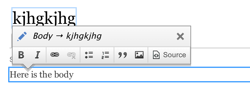
Here's the CSS I used to achieve this in chrome inspector (without prefixes)
.quickedit-toolbar-container > .quickedit-toolbar-content, .quickedit-toolbar-container > .quickedit-toolbar-lining {
  border-radius: 0px;
}

.quickedit-toolbar-container > .quickedit-toolbar-content {
  background-image: linear-gradient(top,#f9f9f9,#e4e4e4);
  box-sizing: border-box;
  color: #333;
  padding: 0px;
  position: relative;
  user-select: none;
  z-index: 2;
}

.quickedit-toolbar-content .cke_toolgroup {
  float: left;
  margin: 0;
  border-bottom: 0px;
  border-left: 0px;
  border-top: 1px solid #ccc;
  border-right: 1px solid #ccc;
  border-radius: 0px;
  background: transparent;
}
Related issues
#2270269: Reduce animation delays
#2090945: Polish entity toolbar's positioning


Comments
Comment #1
tkoleary commentedComment #2
tkoleary commentedComment #3
tkoleary commentedComment #4
tbreese commentedI am looking into this issue at the Forum One Drupal 8 Sprint
Comment #5
tbreese commentedFrom a UX perspective I think this would be helpful.
Comment #6
wim leersComment #7
yoroy commentedAttaching a screenshot of current situation for comparision. I think this is a very welcome simplification. I wonder if there's still a use for the blue pencil icon.
Comment #8
Bojhan commentedI am not sure if we should lose the rounded corners on the whole toolbar. The reason we did this is to align with the style guide. I would definitely love for there to be no double encapsulation of the buttons. That was not in the design we came up with earlier either.
Comment #9
tkoleary commented@bojhan,
As I understand the rounded corners in the style guide are there for the purpose of adding an affordance that denotes "this is a form element" that is not the case here. It's arguable that there are other things in the style guide, such as DSMs that also have rounded corners but IMO this is an anti-pattern that should be removed, because it renders the rounded corners meaningless and ornamental.
Fieldsets, tables vertical tabs etc. do not have rounded corners and, unless we can identify a compelling usabilty rationale for them (ie. they describe form elements) I think we should dispense with them, according the design principle "when in doubt, simplify".
Comment #10
Bojhan commentedI am not sure about taking away the roundness all, this was introduced on purpose in https://www.drupal.org/node/2080217#comment-7834267 which you agreed to. None of this is related to usability, so I am not sure why you bring that up - this element of design is purely about aesthetics and the emotion it brings. I feel like removing it would make for a holistic break with our style guide, which introduced this softness as a core principle to all elements, with various degrees.
Vertical tabs do have rounded corners, and field sets should (as proposed by the style guide). I think if you look closely at all the elements, they are never "hard". There is always a 1 or more pixel diversion. The whole point of a style guide is to ensure that we follow a consistent pattern to all elements and don't allow for multiple interpretations and ad-hoc diversions. I think if thats unclear about the style guide - we should definitely clear on clearing that up.
Time wise, I am a little concerned that we are spending so much time on this and that Wim Leers at some point has to spend time on this. I can only see this issue, as some minor tweaking of little value given that we already did a major round of polish. The much more crucial things in the quickedit module should be resolved. The fact that the experience is often jarring, because of the jumping is crucial to the UX and should be tackled before any polish like this.
I'd like for us all to get in the mindset of releasing Drupal, that means focusing in on the core UX parts that we can still change and need to - to create a great UX. Its crucial for the community, but also for us who are working on UX issues to get in this mindset. Because having things like this wrong or changed, later in the release is much easier than fixing crucial UX problems.
Comment #11
zaporylieComment #12
tkoleary commented@Bojhan
While I agree that we should focus on the most critical usability gaps, I do think that removing the rounded corners in the instances I note is not purely aesthetic but also semantic. Form elements *do* have rounded corners and we can use that fact as an additional visual affordance to users if we square off things that are not form elements. Yes, they also add to the "softness, but, as I noted above, not all elements in seven are rounded now so drawing the distinction at a point that is both aesthetic and semantic strengthens the guide IMO.
Comment #13
tkoleary commented@yoroy
I would be ok removing it.
Comment #14
Bojhan commentedI don't see what is semantic about rounded corners. I think if you read my comment carefully, you will find that the fact that some elements are and some elements aren't is an oversight not a deliberate style decision. As you will notice in the style guide, none of the elements have hard corners.
Comment #15
tkoleary commented@Bojhan
Vertical tabs and table heads have hard corners as do the lower left and right corners of horizontal tabs and the corners of fieldsets. So not *everything* has rounded corners and given that I think we need a rationale for when to use them and when not to.
Could you provide that?
Comment #16
Bojhan commentedActually in our original designs they had a 1px soft corner, but you can't do that in CSS.
I see no good rationale to change the design, different opinions can exist but rather keep one design language. And that shouldn't mean that we add round corners everywhere - we apply it in the many places we feel it makes it look better. I don't see going away from that here, adds any value - I think it looks more in line with the rounded corners.