

Closed (cannot reproduce)
Project:
Drupal core
Version:
8.0.x-dev
Component:
views_ui.module
Priority:
Normal
Category:
Bug report
Assigned:
Unassigned
Issue tags:
Reporter:
Created:
21 Jul 2014 at 23:03 UTC
Updated:
6 Aug 2015 at 19:51 UTC
Jump to comment: Most recent, Most recent file






Comments
Comment #1
charles belovComment #2
charles belovComment #3
nod_Comment #4
charles belovI'm not sure why the Mobile tag was added. This particular issue is from a desktop.
Comment #5
nod_Oh mobile tag because they're the guys you want when something looks bad on a smaller screen.
Comment #6
yvesvanlaer commentedHey all
I added a patch which will make the buttons bar responsive.
Comment #7
lewisnymanI was going to test this but it needs a reroll.
This looks like it's going to affect tabs across the whole site?
Comment #8
lewisnymanComment #9
amitgoyal commentedReroll of #6.
Comment #10
lewisnymanI rerolled this patch and removed the line changed that affects tabs globally and it seems to work:
Comment #11
emma.mariaThe solution in this patch does not work, the list items in the tabs definitely need the float that has been removed. They are all stacking right now no matter what screen width.
See screenshot...
I tested adding the float: left back in within the browser and it looks good...
Small update to the patch needed, tagging the issue with Novice.
Comment #12
Boaah commentedComment #13
Boaah commentedThis patch should fix the Problem.
Comment #14
emma.mariaThis looks much better now, the Page/block buttons now have the behaviour you expect.
I tested IE9, FF - Windows & OS X, Safari OS X and Chrome - Windows & OS X.
I found no differences between browsers and operating systems so here are my Chrome OS X screenshots at various widths where the bottoms drop into new rows...
However the only problem I now see is that at various points the "Edit.." button and the "Add +" button overlap at every instance when the buttons wrap onto another line, see below.
The two buttons overlap as they are both positioned absolute and their margins are taken out of context from everything around them. So if we adjust the Views display buttons this fixes this easily. See below.
Existing styles:
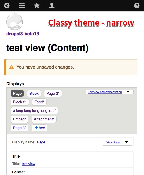
change to
At the same width the buttons now look like this...
This occurs at every instance the buttons wrap (I have a lot more screenshots if needed? But the one fix suggestion above fixes all of them).
After this fix is added I see no more bugs to be fixed from a visual standpoint.
Comment #15
rpayanmPlease review.
Comment #16
charles belovPatch 15 is technically correct. I would have hoped that it wouldn't leave all that blank space.

Comment #17
emma.maria@Charles Belov That is how the code works unfortunately. The +Add and Edit button are taken out of context as they are positioned absolute to other elements and a margin was added to the right of the View items buttons to allow for the spacing of the +Add and Edit buttons, so you end up with this on mobile.
But this section does not look broken at all now and I think this is the least of anyone's worries if you are adding/editing Views on a mobile device :)
However the one thing no one has picked up on yet are the RTL styles! Things look very broken right now when the site is set to RTL. The RTL styles need to be added in the CSS please.
Comment #18
lewisnymanOk wow. I tried to figure out what the problem was but this CSS is a complete puzzle. There's too much CSS overriding other CSS in other files and some that just does nothing at all. Really frustrating.
I rewrote the patch from scratch and started by just deleting stuff. Seems to work well now.
Comment #20
sivaji_ganesh_jojodae commentedRequesting for retest.
Comment #22
andybroomfieldI tried to apply the patch, however it failed to apply.
Going to reroll.
Comment #23
andybroomfieldRerolled Patch
Comment #24
emma.mariaComment #25
lewisnymanLooks like the remains of the reroll are still in here. Also this reroll seems to be missing a lot of the changes from before. I will try and reroll it again
Comment #27
lewisnymanActually the patch in #18 still applies. Weird
Comment #29
emma.maria#18 does not apply anymore.
Patch in #23 applies but needs work to remove leftover reroll git conflict messages as stated in #25.
Comment #30
lewisnymanIt looks like #23 is missing a few changes in #18. Let's reroll 18
Comment #31
emma.mariaPatch in #18 rerolled. I diffed between my new patch and the one in #18 and it found no differences.
Comment #32
idebr commentedThere is still some inconsistent wrapping taking place in Seven as well as Bartik. This might be caused by the red border for displays with unsaved changes that I don't see in previous screenshots in this issue.
Comment #33
lewisnyman@idebr Ah good catch, I guess it's because the border is bigger, which makes every unsaved tab a different size to the first one?
Comment #34
copaingeorge commentedI'm working on it, for the Drupal Dev Days 2015. I am mentored. I'll try to do my best for my first time.
Comment #35
cilefen commentedComment #36
manjit.singhRe-rolling a patch #31
@emma.maria you have changed the
to
Also
to
in
views_ui.admin.theme.cssWhy is it so ? Is it due to
[rtl]?Comment #37
manjit.singhComment #38
lewisnyman@Manjit.Singh It looks like any changes between #18 and #31 would be unintentional.
Comment #39
disasm commentedLets get the screenshots added to the issue summary and clean it up a bit. Lets also list remaining tasks for this issue in the issue summary.
Comment #40
googletorp commentedComment #41
jimsmith commentedI reviewed this issue and then attempted to test the problem. Before applying a patch I could not duplicate the problem of overlapping buttons. There were still some positioning inconsistencies depending on browser width.
I then applied patch #36, but I couldn't find any differences the patch made.
Perhaps other changes were made in a different issue that affected this?
Comment #42
mu5a5hi commentedViewed in Chrome/Mac OS Mavericks, and IE11/Windows 8.1, before and after applying patch #36
Before patch: vertical space between button was inconsistent. seemed to be related to css padding on the 'active' button. Also caused 'INDENT' from the left of your active button was not the first one. Inconsistent. I was not able to duplicate -overlapping- buttons in these two browsers.
After Patch: Both systems/browsers showed a whole line for each button.
https://www.drupal.org/files/issues/Screen%20Shot%202015-05-15%20at%201....
Comment #43
jimsmith commentedThe attached patch cleans up the positioning inconsistencies in the buttons.
Comment #44
lauriiiSetting for needs work since we still need issue summary update.
Comment #45
jimsmith commentedThe patch I submitted needs work too. The Add button does not properly align in Bartik and Classy.
Comment #46
jimsmith commentedThe markup for the buttons is not handled consistently. The Seven theme applies the
tabs__tabclass to all buttons except "add". For that, theaddclass is added. The Classy and Bartik themes do not use thetabs__tabclass.Because different themes may insert their own classes, but we wish for consistent positioning, I have removed CSS references to
tabs__tab.The attached patch makes the display nice and tidy regardless of admin theme. I am marking this "needs review" to trigger the testbot, but will then reset to "needs work" because #44 still applies.
Comment #47
jimsmith commentedResetting to "needs work" until the summary is updated.
Comment #48
jimsmith commentedThe summary has been updated.
Comment #49
manjit.singhI have tested a patch manually in views (bartik theme). seems fine.
Comment #50
RavindraSingh commentedReviewing this issue at SrijanSprintDay
Comment #51
RavindraSingh commentedComment #52
jimsmith commentedThe patch at #46 no longer applies.
Additionally, while testing the Views menu with the latest updates I did not see evidence of the previous problems. They must have been fixed in the course of fixing other issues, as some of the changes contained in #46 were found.
I am marking this postponed. Not being a regular core contributor, I'll leave this issue for someone else to close, but it looks to me as though it can be.
Comment #53
emma.maria@JimSmith We do not set issues to Postponed based on not being able to replicate them.
We usually post screenshots showing that there is no longer a problem and mark the issue as 'Closed (cannot reproduce)'. Also if you can find the issue that fixed this issue in the process (sometimes not possible due to this being fixed indirectly by another issue) that would be great also.
Comment #54
jimsmith commented@emma.maria Thanks for the advice. I recognize that Postponed mis-identifies the status of the issue. As I noted, I was not comfortable setting the issue to Closed (cannot reproduce). I felt it best for now to leave that to someone who is a regular core contributor, just as it is bad etiquette to close a contrib issue when you are not the maintainer of that project. I was merely trying to bring attention to the fact that it can be closed. At any rate, I understand what you are saying and thank you.
I attempted to find the issue that fixed this, but as you noted, it is difficult. I gave up after spending about 30 minutes on that last night and another 15 minutes today. Though I was unable to find a specific issue that fixed it I carefully tested all core themes and did not find the same problems noted when this issue was created.
I have now added screen grabs showing a test views admin page containing several view displays. There are two versions of each of the three core themes set for the administration theme, showing a wide and narrow viewport.
See:
Comment #55
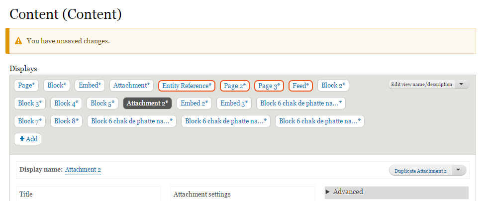
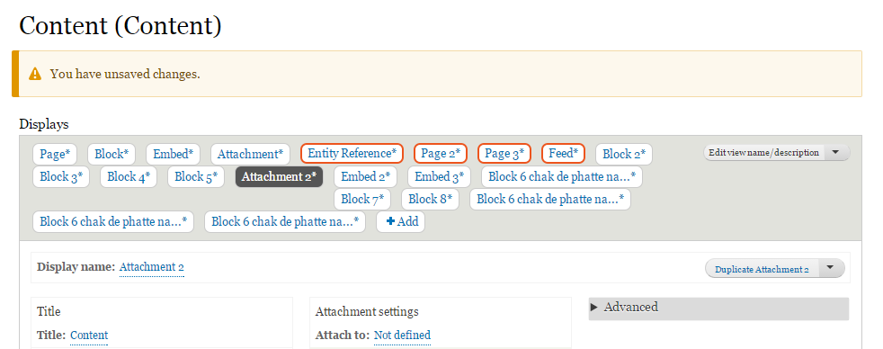
charles belovI can confirm that the issue I originally reported is no longer happening in beta 14. The layout aggressively wraps to the next row when it doesn't need to, but at least does no harm (that is, nothing is obstructed). The obstruction that is happening in the attached image (beta 14 actual) appears to be outside of the scope of the current issue, and I will file a separate issue for that obstruction.
I've also attached a mockup of what I would have expected as a solution to this issue (beta 14 expected) but (1) that might be a separate issue and (2) it is more of a nice to have than the necessity the original issue was when I originally reported it.
For people trying to reproduce this, I am using Google Chrome on Windows 7 with the Windows Display control panel set to 150%. At some point in the past year or so, Chrome started reflecting this setting and displays fonts larger automatically.
Comment #56
emma.mariaAs two individuals have pointed out that they cannot reproduce this issue anymore, I am closing this issue.