
 Come together with the global Drupal community in Rotterdam, 28 Sept – 1 Oct 2026. Sessions, contribution, connection, and Early Bird savings until 8 June.
Table cells need some padding (see screenshot), in the table in the screenshot its very cluttered and hard to read with no padding, links butt against each other and its just needs some theme love (table styles in general).
| Comment | File | Size | Author |
|---|---|---|---|
| #46 | bartik-captions.patch | 522 bytes | bleen |
| #45 | bartik-captions.patch | 645 bytes | bleen |
| #44 | Test Table Captions | d7.jpg | 36.34 KB | bleen |
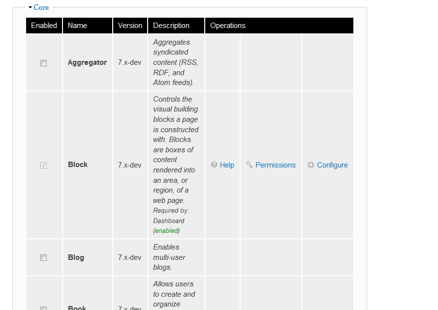
| #41 | Modules - d7alpha4_1274154343542.png | 28.27 KB | Jeff Burnz |
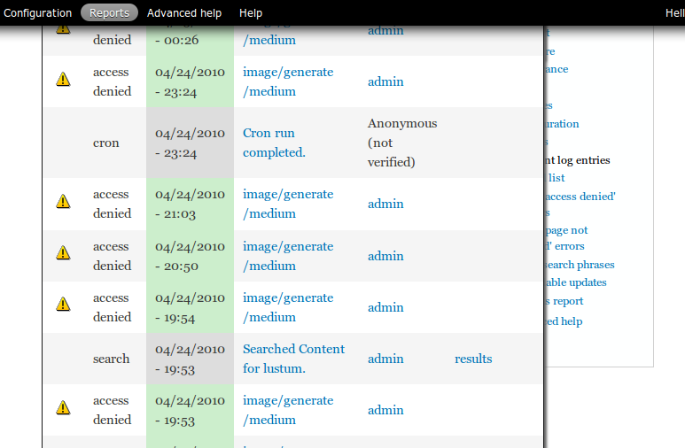
| #41 | Recent log entries - d7alpha4_1274154320235.png | 17.62 KB | Jeff Burnz |

Comments
Comment #1
bradwade commentedAttached png shows how the tables should look with this patch.
Attached patch was tested in Ubuntu Firefox 3.5.9 (bottom table in screen shot) and Ubuntu Chrome 5.0.342.9 beta (top table in screenshot).
Comment #2
aspilicious commentedlooks good
Comment #3
Jeff Burnz commentedWow, this is looking great, just a few minor issues (not really related to the style additions but we could nail them here while we're at it)
Buttons are against the bottom of the table, needs some space:
In some places messages sit hard against the top:
Table background is transparent, and when they're too wide they go under the right sidebar, which could mean some operations are not accessible (you might not be able to click them), what if we z-index them up and add a background color, e.g.
Comment #4
tlattimore commentedGreat point Jeff, I hadn't even caught that z-index bug yet in my testing.
This can partially be fixed by applying this:
The reason I changed the z-index to 599 is because the toolbar-menu has an index of 600 and therefore the table would overlap it with anything greater.
This is a near *fix*, but, to my knowledge there is no way to apply z-index to an element without also applying
position: relative. Unfortunately when a position of relative is applied to the table, it breaks the sticky header?.I attatched a screenshot from Ubuntu Firefox 3.5. Usable links in the operations (far right) column, background makes text readable, but no sticky header : (
Not sure how this can be resolved, but I'll get to work on it and see if I can figure out a solution.
Comment #5
Jeff Burnz commentedhmmm, breaking sticky header is not good, works ok in FF3.6 Win, but obviously needs testing in more browsers etc. Good catch with the z-indexing of the toolbar, as soon as you said that I recall admin menu is 999 also (in d6 anyway, and I used 990 recently).
Comment #6
tlattimore commentedMy initial thought was that applying
position:relative;to the table was breaking the sticky header. Well, thankfully I was wrong. It was just that the sticky header was hidden under the table with the new higher z-index value, hehe, silly me.So, here's my fix. Even though the sticky header won't float over the toolbar-menu, I wanted to keep all z-index's below the toolbar-menu's z-index number just out of principal. So to fix the z-index issues problems stated in comment #3 I applied a z-index of 590 to
tableand a z-index of 595 totable.sticky-header. Not sure if it's the most kosher thing to target the.sticky-headerdirectly, but it was the best solution I could figure out.Here is a patch that fixes of the z-index issues discussed in #3. Also, the screenshot of it working in Ubuntu Firefox 3.5.
Comment #7
bradwade commentedThanks tlattimore for looking into that issue.
Here is an updated patch with tlattimore's additions and (1) the fix for items being too close to the top/bottom of the table and (2) styling for the often-used table "caption".
Comment #8
jacineI'm not seeing the
table.sticky-headercode in Brad's latest patch, but it seems like it should be there, right? Setting to needs work right now, until someone gets back to me on that :)Also, I think Jen should give some feedback on this (if she hasn't already) because of the shadows/gradient. She removed the gradient backgrounds from the blocks recently, so I don't want to step on "designer" toes committing this.
Personally, I think the shadow is a bit too dark (/me ducks).
Comment #9
Jeff Burnz commentedJust updating the title to better reflect the scope of the patch.
Comment #10
jacineAnother issue I just noticed that should probably be addressed here: tbody is getting border-top: 1px solid #ccc from system.css. This should probably be removed.
Comment #11
Jeff Burnz commentedAfter thinking much about tables and fieldsets and playing with color module a fair bit I've come to the conclusion that both tables and fieldsets must be re-colorable.
This is about accessibility and usability - if the user switches to a dark background and very light color text (say white) all the text in fieldsets and tables could appear to "disappear" - this is a potential wtf moment and leaves them having to figure out what just went wrong.
So, I think we need think more about colorable things and place tables high on the list of things to recolor.
Comment #12
jensimmons commentedRe #11: Table are not going to be colorable.
See my comment: http://drupal.org/node/762462#comment-2899786
Comment #13
jensimmons commentedOk, putting on my Designer In Charge Hat.
No shadows on the table. no gradients on the headers. No shadows or gradients on tables at all please.
These should be simple. Clean. Simple. So the focus is on the content. And the website that uses Bartik can be about anything, and feel like one of many different things.
While gradients and shadows are dang fun, they have too strong of a flavor, and sort of shove the site owner into a corner when it comes to how people feel about the site. Too strong.
Comment #14
Nick Lewis commentedHere's the CSS i'm working with, and screenshot's attached. No patch, because i feel like "what's a good table" is still a good question. Attached is a screenshot of forums -- which are the ultimate test of any table style.
Comment #15
jensimmons commentedsame image as attached ^

Comment #16
tlattimore commentedGreat work Nick, I really think you hit the nail on the head with what Jen wants to accomplish by her comments in #13. This design is clean, simple, looks great in the admin area, and is flexible to manually insert a table into a node and have the focus really be on the tabular data, along with a great design.
My only thought is, what do you think about bringing down the
border-width:from5pxdown to somewhere around2px. This I think gives it a less bold and more subtle feel overall. See attached screenshot.Really nice work, keep it up Nick!
Comment #17
aspilicious commentedI think the border is still a little disturbing... I like tables when you don't get smashed in the face with an "oldschool table look". I prefer the striping way (see seven).
I'll try it right now...
Comment #18
aspilicious commentedMy turn for a shot at this.
Comment #19
Jeff Burnz commentedimage from #18
Comment #20
Nick Lewis commentedRe #16 @tlattimore i don't see why not - i just picked 5px borders because most spacing in the design is 10px and 10/2 = 5px :-D that's about as deep as i've thought about it.
Re #19 the goal is to better divide columns not just rows. In general the less design the better.
I think alternating row colors is worth taking a look at.
Also i've been specifically instructed that the tables will have a sans-serif type face.
Comment #21
Jeff Burnz commented+1 for sans-serif in tables, I think its much easier to read.
Comment #22
jensimmons commentedYes, let's do san-serif in tables.
I like strips too. And I like both designs.... so let's keep going. :) Next revision? Combo?
Comment #23
tlattimore commentedAnother vote for sans-serif. That would look much cleaner I think.
Comment #24
aspilicious commentedI also prefer readable fonts.
About dividing of the cols, how do you going to do that with colspan=3 for example...
Comment #25
tlattimore commentedHere is a patch that is my attempt at this. Pretty much just a mod and my take on what others have been doing in the thread. And, of course the sans-serif font family per popular vote.
Screenshot for quick reference - http://drupal.org/files/bartik_tables.png
Comment #26
Jeff Burnz commentedThere are two sans-serif font stacks already in use in Bartik:
So I'm not so sure about introducing a third, and the default basically being Verdana.
The font-family sans-serif should be last in the stack.
Image from #25
Comment #27
tlattimore commentedDrat! I didn't intentionally introduce a third sans-serif font stack into the theme, just wrote it on the fly without thinking about copy and pasting one of the others from the stylesheet.
Here is a modified patch from #25 the fixes all the suggestions made in #26.
Comment #28
bradwade commentedSo here is my best understanding of the sticky-header issue. (Maybe more than you wanted to know!)
Sticky headers (if enabled which they are by default in theme_table) create another table above the actual table. This second table has the class .sticky-header and has the header information only repeated in it. It is hidden on page load and made visible at an absolute fixed position by javascript when the headers scroll above the window.
So, unless we want the sticky-headers to appear different than the regular headers in some way, I don't think we need to target them directly.
There are a couple of issues with sticky headers that you may have run into:
Problem one: This second, sticky-header table doesn't have any of the same specific classes that the original table had. So if you use a table's class in styling of a regular header, it won't translate to the styling of the sticky header. (See issue: tableheader.js should give sticky-header table the same class as original table http://drupal.org/node/590328) This is not an issue for the CSS used here for Bartik because we are targeting "table thead th" directly for all tables in the theme which will be applied to sticky headers too.
Problem two: Sticky headers don't work with the overlay in Drupal 7. In very brief, since the admin page is in an iframe, only the outer page is scrolling, so the headers don't get triggered. (I bring this up because I'm setting Bartik as the admin theme to see all of the tables that the admin section offers, but consequently am not seeing sticky headers.) (See issue: Sticky tableheaders don't work in Overlay http://drupal.org/node/649662).
Am I missing anything? Is there some reason to target table.sticky-header?
Edit: In response to Jacine's #8!
Comment #29
Nick Lewis commentedA quick revision of my design, borrowing from comments above. BTW, I think the modules table is a poor choice of comparison since its already heavily styled. Anyways, I included a screen of report logs table which may be a better choice...
Brief defense of some design decisions.
1. I believe tables with lines separating columns are much easier to read. I'm not hearing compelling counter arguments to this point.
2. I've included shades of gray that are better harmonized with the the blue link color (the only color in bartik). - F5f5f5 and eeeeee are far too yellowish/red in color - maybe i'm a freak but these things bug me.
3. I've reduced font size to 0.8em following the sidebar's font size. Tables often have a lot of info cluttered in them, so I think we should do this regardless.
4. Verdana is far easier to read than Lucida imho. Above all, being easy to read is a top priority for tables - ( imho of course).
5. I prefer table headers bold - i also don't like table headers to use any borders that aren't also used by the cells...
6. Using 4px X 9px padding to account for the 1px borders around cells... (padding is always in units of 5px it seems... maybe this is just me being OCD lol)
Sorry for the ghetto patch - i'll make a proper one once we get closer to agreement.
Comment #30
Nick Lewis commentedHere's a side by side comparison of the two directions on the reports page. My alternative version vs. Latest patch.
Sorry about making a fuss. I'm just so tired of having substandard table styles in core...
Comment #31
tlattimore commentedNick, I really like what you have done with this. Definitely cleaner and more refined looking than my patch (which is picture 17.png I believe?). I think the thing that I like best is your typography overall, it looks really great in the table header especially, really clean. I was kinda of undecided on column borders for awhile, but after some thought I think they just make tables more readable. Like what you have done. My only concern really would be with your font-stack, read comment #26. Though it is not the most terrible thing in the world, it might not be best to introduce another font stack into the theme at this point. Keep stuff as consistent as possible I think.
This is really coming along, I'll keep trying out stuff. Can't wait till will get it done.
Keep up the good work.
Comment #32
Jeff Burnz commentedI have no love affair with Lucida I can tell you! Indeed I much prefer Verdana any day—my comment was more along the lines of Verdana not being the default look 'n' feel of this theme. In all fairness to everyone I should not really have made that comment in the first place (let the designers design, and that ain't me...) so I think Jen has sway here - whatever she says!
And yeah, Nick, rocking table design, looks great. Love to see a patch and see this in bed, I'm kinda waiting to see how tables pan out before getting really serious with the fieldsets.
Comment #33
tlattimore commented@Nick - I second Jeffs motion! Lets see a patch for this. Every time I see a table in the administration section with this theme, I am a little sad because I think of the awesome work that's been done here. It is real improvement over it's current state. I am going to be really psyched when we get this stuff finished and committed.
Comment #34
Nick Lewis commentedWent ahead and tested it against some more tables. The reseting of ul.links in tables is essential for the admin/content/node admin/user/users pages etc... I'll check back for trouble....
Comment #35
Nick Lewis commentedSorry redundant selector against thead th
Comment #36
Nick Lewis commentedRe @tlattimore CC @jensimmons
So I don't think that its a huge concern if tables use a different sans-serif typeface... If a themer wants to override the choice of verdana they can - and tbh i hate verdana just about everywhere besides when scan-ability is #1 priority. Lucida looks good in some circumstances, and i maintain tabular data simply isn't one of them.
No one is going to really notice it besides font freaks anyway. And i swear its a signature of refinement to go with verdana for tables and helvetica for navigation anyway....
Comment #37
Jeff Burnz commentedNeed to reduce specification - i.e. remove thead e.g.
table tr thfor when th is in tbody, such as dblog event details table.Minor but some white space issues - inconsistent use of space between properties and values, and fwiw the current agreement is all colors lowercase. Pretty anal eh :)
Otherwise looking great and very close.
Powered by Dreditor.
Comment #38
Nick Lewis commentedGood catch - the differences in selectors bugged me to last night, but after my second correction, i decided i was going way to woody allen about it already to make a third...
In any case, I very much meant how specific I was -- with the exception of *maybe* table thead *tr* td. What I don't want is to turn th columns black when they are in body. That causes straight mayhem on the status update admin page for example. (consider the discussion thus far.. http://drupal.org/node/783534#comment-2916518 ... !)
I would never get that specific unless i knew firsthand how weird drupal table selectors can be.... I can try testing reduced selectors tomorrow, but pretty sure the selectors are as they are because that's what i had to do make sure a table design didn't go ugly in all the non-ideal conditions that are "drupal css".
Philosophically I'm okay with playing it safe with selectors in themes... after all, the whole problem is that drupal sites have to deal with all sorts of batsh#t weird CSS with no real standards other than 'it looked okay on my instance'.
Themes get the last say, and are allowed to be specific. (well... if you intend on making true subthemes easy... that's a whole nother' issue...)
This was what bugged me last night btw...
I meant this :-D
I'd like to wrap this up soon... not like we have all the time in the world... Maybe we should talk this out on #IRC?
Comment #39
bradwade commentedOkay. As there seems to be consensus building around Nick's pic 16 from comment #30/patch from comment #35,
let me summarize the issues/questions that have been raised so far so that we can be sure to address everything necessary in the final patch.
1) Buttons/Message butting up against tables.
-Buttons now have 10px top padding and messages have margins now as well. But should we still add some top/bottom margins to the table to give it spacing in other contexts?
(I would lean towards doing it to be safe.)
2) Tables, if too wide, go under right sidebar.
-It was suggested to use z-index:599; to make it go on top of sidebar. Should this be done?
(Perhaps not because it seems to be a larger layout issue. Why should we decide that the links/content in the table should be visible over the links/content in the right sidebar?)
3) What font stack should be used?
font-family: "Helvetica Neue", Helvetica, Arial, sans-serif;
font-family: "Lucida Grande", "Lucida Sans Unicode", Verdana, sans-serif;
font-family: Verdana, sans-serif;
(I'd go for consistency even if everyone in this thread happens to prefer Verdana in tables.)
4) 1px border around all cells - or no border?
5) Sticky Table headings - Anything need to be done?
(I think that nothing special needs to be done. See #28)
6) Misc:
-No shadows or gradients at all.
-Be sure to remove/reset tbody which is getting border-top: 1px solid #ccc from system.css
-Don't forget to style the Table Caption!!!
Hopefully Jen can weigh in on these questions, so this can be finished off.
Comment #40
jacine@bradwade Nice list! :D
I think we would all be better served breaking this issue out into smaller issues, instead of having all the "undecided" topics hold the whole thing up. The tables need padding and margin desperately...
Comment #41
Jeff Burnz commentedOK, heres a patch that builds on Niks earlier patch in #35.
I've gone for similar colors that Jen used in the recent Fieldset legend patch (dark text on light gray background) for TH, and used an existing font stack ("Helvetica Neue", Helvetica, Arial, sans-serif;).
Personally I think this looks pretty good and fits the Bartik style.
There is NO RTL for this, so it does need work for RTL.
Couple of screenshots from Firefox:
Modules....

Log...

Comment #42
jensimmons commentedI'm in love with this. Nick, you did an incredible job. And so did everyone who contributed to this discussion and pushed things forward. Yeah!!! And thank you Brad for the summary!
I committed the patch in #35 with two changes. I lighted the table header background so that the headers wouldn't be so dominant to the eye. And I adjusted the color of the table border lines when there's a table in one of the footer regions (#fff was too bright!)
I went with font-family: "Helvetica Neue", Helvetica, Arial, sans-serif; for the font stack.
I love the border. It's staying.
I think we should leave the Z-index alone. And people who use Bartik will just have to *not* have 2 sidebars where there are tables. I can't think of another solution. There's just not enough room in the narrow center column. Put the table on top doesn't fix the broken, it just makes it more possible to get to the stuff in the table.
I added:
table {
margin:10px 0;
}
I didn't do anything about table tbody border, since I don't think it's an issue anymore. If it is, open an issue.
And Table Caption? Got an example? I didn't do this, so someone open another issue for this.
This main issue is set to needs work so that we peel off these remaining issues. Then this can be set to fixed! Cause it's 98% fixed! :D
Comment #43
jensimmons commentedHow about we use bradwade's table caption css from the patch in #7 above:
Will someone test this out?
Everything else from this issue is done.
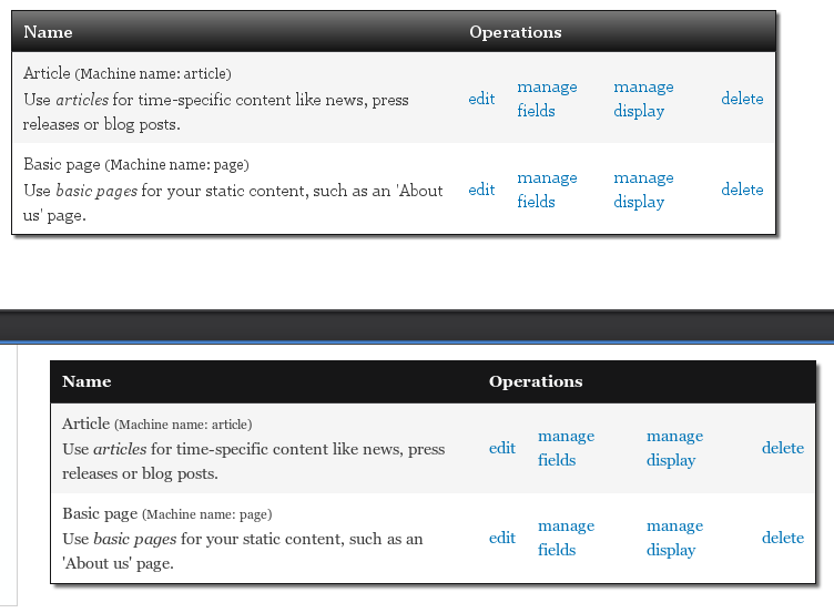
Comment #44
bleen commentedhere is what the captions look like with the css definition @jensimmons mentioned in #43:

Comment #45
bleen commentedignore this patch ... see next comment
Comment #46
bleen commentedhere is the patch with the correct paths
Comment #47
Nick Lewis commentedBy default captions appear at the top of the table and centered. The html spec indicates that they are more of a title for a table then a footnote. I'm not sure, small, right aligned, and below is a proper default...
Comment #48
jensimmons commented.
Comment #49
Jeff Burnz commentedAgree with Nik, they are rather small also (font size), regardless of how much I actually like the idea... way sexy use of captions... but, yes, probably not in keeping with the purpose of a caption.
Comment #50
bleen commentedagree with Jeff Burnz that the font could be a bit bigger ... but I'm a big fan of the lower-right display as seen in #44.
Comment #51
Nick Lewis commentedBut if it was properly used, the caption would read "Test table for captions" or something. Its not like an image caption. See http://www.w3schools.com/tags/tryit.asp?filename=tryhtml_caption_test
Comment #52
Nick Lewis commentedWho uses this element anyways? Anything in drupal that we know of use it?
Comment #53
bleen commented@Nick Lewis:
I have conformed that there is no where in all of core that uses this. The advanced help module does ...
BUt if this will be a core theme we obviously need to accomodate it
Comment #54
dave reidI use them in token.module to provide help for the token tree browser. See http://www.davereid.net/d7/examples/token.
Comment #55
jensimmons commentedSweet, thanks Dave. Grab Token for D7: http://drupal.org/project/token and theme away.
Comment #56
jensimmons commented