

Closed (fixed)
Project:
Project Browser
Version:
2.0.x-dev
Component:
User experience
Priority:
Normal
Category:
Task
Assigned:
Unassigned
Issue tags:
Reporter:
Created:
29 Oct 2024 at 19:52 UTC
Updated:
12 Feb 2025 at 06:24 UTC
Jump to comment: Most recent, Most recent file

 Show commands
 changes



Comments
Comment #2
chrisfromredfinComment #3
rkolleri've raised my concern i had with the current direction of first removing the drop button, moving to an add and install button solution and now moving even one step further and queuing several module to add and install. definitely convenient and streamlined for a big group of people. but that approach has one downside. from my personal perspective i have always a really really hard time figuring out after a module is installed where i am able to find configuration pages for that very module. the more module install at once it multiplies the struggle and cognitive load exponentially for me. that is the reason and rule of thumb, i also add several contrib modules but i never ever install more than one module at once. that is also the reason i am not a fan of a prebuild setup like drupal_cms where you not only have to figure out where all the configuration pages for all the installed modules are but also how they are configured. intimidating. and i suppose there are more people similar like me with similar concerns. but i think i might have an idea to to tackle the problem, without the need of re introducing drop buttons and complicate the entire flow further. i would suggest to have more actions in the bulk action list:
at the moment there is only the "add and install" action i suppose, but i would also an "add" action .with the add action people are able to select a set of modules upfront and then only composer require them . afterwards it is completely up to their preference how to proceed. and that way you would also have the flexibility. for example if you already know a certain set of module and you are familiar with their configuration you could also still choose the default "add and install".
Comment #4
chrisfromredfinComment #5
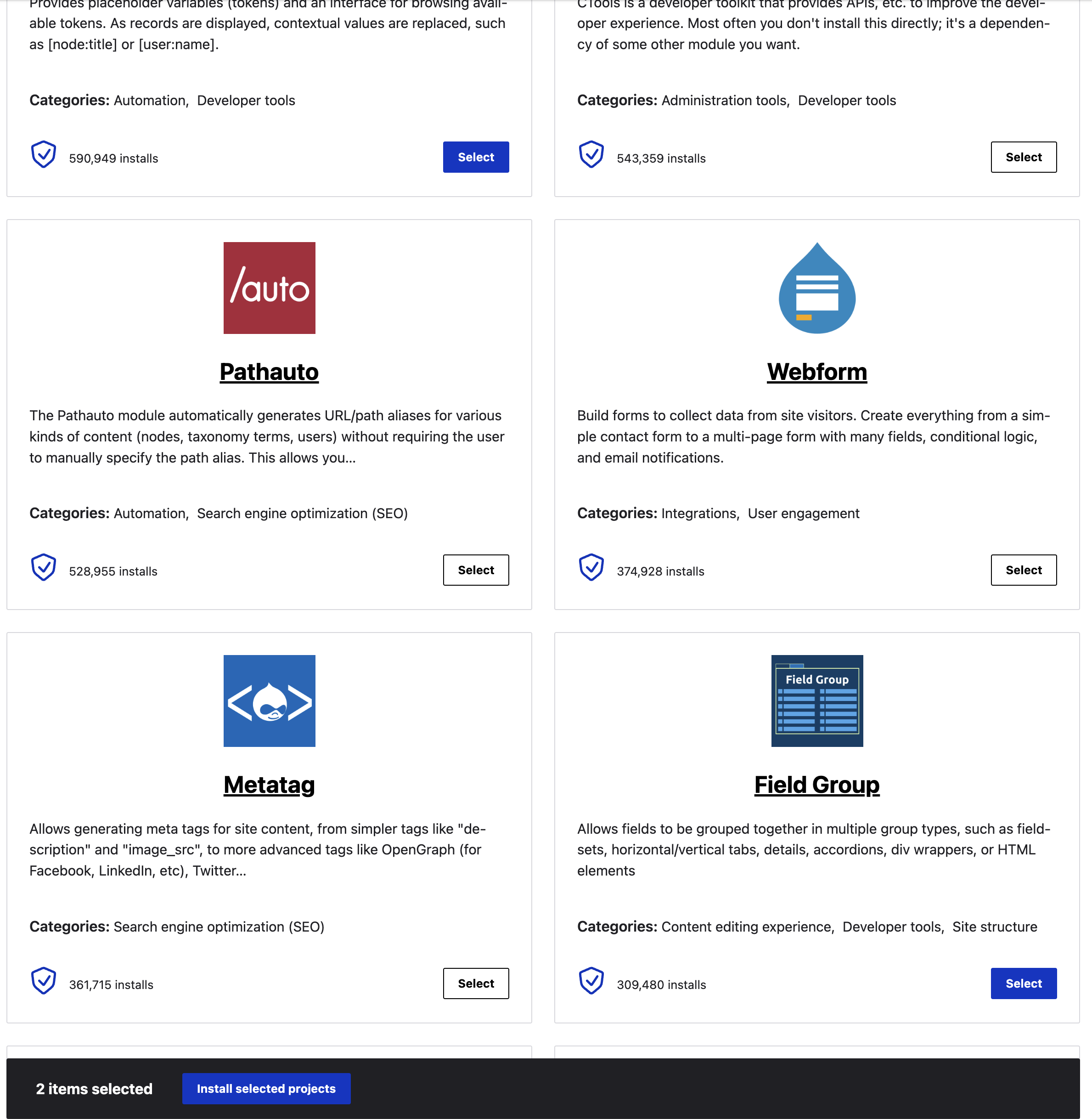
chrisfromredfinPulling in the comment here from https://www.drupal.org/project/project_browser/issues/3476807#comment-15... - we need the "Select" button to actually behave more like a checkbox. So as part of this issue, the buttons should be in a sort of "secondary" button state, and the "select" state should indicate that it's checked. I recommend using the button styles we use for 'installed' right now, where it's white background, and then use the blue state when the button is hovered and/or checkbox is active. This will be better for a11y.
Comment #6
pameeela commentedComment #7
chrisfromredfinQuick mockup provided in the issue summary. This is _very close_ to what I want to see, but not perfect. Please make the bottom bar as close as you can to claro's in markup, and let it inherit as many styles as it can.
Also, we MAY need a second visual indicator for the select button, like an actual checkbox next to it or something.
Comment #8
niharika.s commentedComment #9
niharika.s commentedI checked that section but couldn't find the 'Install' button. Instead, I see a 'Command' button. I've attached a screenshot for reference.
Let me know if you need any adjustments.
Comment #10
niharika.s commentedComment #11
rkolleryou have to go to
admin/config/development/project_browserand check the "allow installing via the UI (experimental)" checkbox. that option requires package_manager being installed, which is either shipping as a submodule of automatic updates (https://www.drupal.org/project/automatic_updates) or if you are on drupal 11.x is available there as an experimental module.Comment #12
narendrarComment #14
utkarsh_33 commentedI'll try to work on this.
Comment #16
utkarsh_33 commentedComment #17
utkarsh_33 commentedComment #18
narendrarTested manually and here are some suggestions:
Install selected projectsbutton should be disabled if no project selectedComment #19
rkollerTwo additional observations to the points @narendrar made in #18:
the dark blue of the "install selected projects" button is too dark and has a too low color contrast (#003ECC/#232429 => 1.9:1).
admin/contentuses--color-blue-400for the "apply to selected items" button, that way you have 3:1 meeting SC1.4.11if you first select a module and then deselect (not sure if the bar was already shown without a selection), the styling of the "install selected projects" button becomes broken. grey background and greyish typography (SC 1.4.3&1.4.11). strictly speaking i wonder if it would make sense to hide the bulk action bar again as soon as no module is selected anymore.
admin/contentis showing the bulk bar all the time, but not sure if this is a desirable pattern since the bulk bar is sort of a visual distraction if someone has not checked a checkbox for any node why then show the bulk action bar on top of the content? the bulk action bar should only be shown if it is needed and in actual use imho. in particular on the project browser page you have already an information overload and having a bulk action bar shown all the time adds to that overload imho.update: or alternatively for the second point about the grey button, now with the sticky behavior added in the last commit, instead of hiding the bulk action bar, it only becomes sticky if something is selected and remains "unsticky" at the end of the result list if nothing selected, it might be an idea to simply hide the grey submit button - which isnt even a button i'Ve noticed just now. on
admin/contentit is a button and if nothing is checked and the button is pressed you run into an error. maybe simply hide that button onadmin/contentsame as the grey button on the browse page without anything selected with no action to take?Comment #20
utkarsh_33 commentedAddressed all the feedbacks and tests are also passing.Ready for review.
Comment #21
kanchan bhogade commentedTrying to apply MR!634 but getting an error
Attaching screenshot for reference
Comment #22
narendrarBelow are some findings:
Comment #23
utkarsh_33 commentedSo i was trying to make this inline with the comment mentioned in #5 by @chrisfromredfin. Not sure if that's not what we want.It would be helpful if someone clearly describes what behaviour we want for the select and deselect buttons.
Or i think we can take that as a follow-up because this issue is majorly fixing the install button behaviour to match the bulk action.
Comment #24
utkarsh_33 commentedComment #25
kanchan bhogade commentedTrying to apply MR! 634 on Drupal 10 but getting an error
also In summary MR shows "Open Failed Pipeline"
Attaching screenshot for reference
Comment #26
rkolleri had already commented over on slack a few days ago, but add my comment for reference here as well now as well. the only two problems i see with the current state is for one that the button style for the queue button moved from a primary button style over to a secondary button style. per se a reasonable and good move since the primary action on this page is the install button on the bulk action bar now. but it feels not correct that the dequeue button is still styled as a primary button. semantically i think it would be the right choice to style the dequeue button as a secondary button as well? that could be done within the scope of this issue. the other styling with the stylized checkboxes we've discussed might be moved to a follow up to provide visual cues aside the plain button label helping the user to distinguish the queue and dequeue buttons more easily.
the color of the hover state has a too low color contrast against the background color of the bulk action bar, but that is an issue that core itself has with claro as well. on the thread i've suggested moving that to a follow up issue , opening an issue for claro and project browser. i'Ve also asked @mgifford about that detail, but havent had a feedback yet.
and another problem that core has on for example
admin/contentas well is the fact if you have not selected anything (an entity onadmin/contentor a a module onadmin/modules/browse) you are able to click/press theapply to selected items/install selected projectbutton anyway and you get ano project selectederror. that error should be avoided in the first place. again that could be moved to a follow up issue.so in summary the only thing i think from my perspecitve that would definitley make sense within the scope of this issue is changing the styling of the dequeue buttons to secondary buttons as well. what do others think?
ps: oh and i just noticed the secondary button is missing the state style changes (hover and active). the blue remains the same here? https://www.figma.com/design/OqWgzAluHtsOd5uwm1lubFeH/%F0%9F%92%A7-Drupa...
Comment #27
utkarsh_33 commentedI have changed the deselect button to secondary button.
Comment #28
utkarsh_33 commented@rkoller can you have a look at this again?I have addressed feedbacks that i think can be addressed as a part of this issue.
Comment #29
rkollerthanks for the changes. over all things look better and more consistent moving the dequeue button to the secondary button style as well.thanks for that. the color for the normal and hover are correct now. the only thing missing is setting the active state when the button is pressed as well. that is still at #003ECC same as the normal state. and on a sidenote wouldnt it be the better choice to use the color variable instead of hardcoding the hex value? normal would be
--color-blue-600, hover--color-blue-650, and active--color-blue-700... and the other points could be moved to follow up issues i agree.Comment #30
chrisfromredfinAdding related issue here - just to note that we _may_ at some point (and it may be a future/follow-on issue) want to change the button action text based on the source plugin. So once you've picked some we may want "Apply selected recipes" for the recipe sources, and "Install selected projects" for the modules, ex.g.
Comment #31
utkarsh_33 commentedAddressed the feedbacks.
Comment #32
rkollerre #31 thank you! left a few comments on gitlab that added variables to the install button states as well plus to the border of the select button states to make things more consistent. but aside that things look good. everything else should be moved to follow ups as utkarsh_33 suggested.
re #30 i still think it is important to be explicit about the terminology used on source type and i wouldnt consider the problem outdated but having an issue just about a single source type might be the wrong approach and there probably needs to be an issue for all source types in general. but there are a few need that need to be discussed how the bulk action bar should behave (out of the scope for this issue) if entities are selected for a source type and the person is switching source types. on admin/content the bulk action bar disappears on the new tab and if you return the previous selection is not restored. with svelte the selection is remembered, if you switch the source type after selecting entities on source type 1, there is no bar and no selection on source type 2 but if you switch back to source type 1 the selection is being restored (i m even able to switch to pages outside of project browser and if i return the filter string, filter settings and my selections are being restored?!). and within the same source type you are also able to add modules across several pages (something not possible on admin/content):
Comment #33
utkarsh_33 commentedAfter reading through the issues that @rkoller listed in #32 i have. my own set of suggestions of how we can handle the issues as a seperate follow-ups for each of them.I'll describe them one by one.
it would be hard Or i would say not a good UI/UX to keep a track of which module was selected from which page as a user might change the number of module that should be listed on page at any point of time.I would suggest to keep a track of all the modules that we are going to install and the show a pop-up or maybe a simple UI that is shown in case of the uninstall modules page in Drupal core where we list the modules that are going to be un-installed.
This might also solve the issue mentioned in
I think the better way to solve this problem of selection persitence is to give a reset button for now which simply deletes all the selections from a particular source type(or maybe all the source types at once) and then further we can provide an option to individually remove modules in case if a user has selected something by mistake.
Comment #34
tim.plunkett#3489054: Make the "add to cart" threshold configurable allows DCMS to sidestep this issue.
Comment #35
rkoller@utkarsh_33 Yes i agree within the scope of this issue, having a button to reset the selection would make sense, everything else noted is rather suitable for followup issues for project browser and or core.
Comment #36
utkarsh_33 commentedI have added a
clear selectionbutton.It's ready for another round of review.Comment #37
chrisfromredfinAt mobile, it seems to be still the single blue button - we need to also match mobile styles like we see on /admin/content, for example.
Comment #38
utkarsh_33 commentedI just checked the issue, I was able to see both the buttons.Am i missing something?
Comment #39
phenaproximaA couple of things that look like possible bugs to me...
Comment #40
utkarsh_33 commentedI have merged the latest changes from head.After reading comments from @phenaproxima regarding the visibility in this i realized that it makes sense to show the clear button only when any project is selected, so i made changes in this commit.If any one has any suggestion regarding this it would be good.
Comment #41
rkollertesting the latest changes on the MR... I completely agree about showing the reset button only if anything is selected, but should the reset be also a primary button? that way you have two primary buttons next to each other? and it looks like the bulk action bar isn't sticky anymore at the bottom of the visible viewport, instead you have to scroll to the bottom of the page? that looks like a regression or is that an intended step (at least con admin /content the bulk bar is sticky at the bottom of the visible viewport). and in the context of drupal cms, the buttons are broken in gin:
Comment #42
rkollerand there is another problem. i've set the max selection to 5 with
ddev drush config:set project_browser.admin_settings max_selections 5. there is no feedback that informs the user about the given limit. without the MR applied i get at least the disabled button mouse cursor that signifies the select button is unavailable, but with the MR applied the mouse cursor is still shown as a pointer and i am able to click the select button as many times as i want but nothing happens. i think two things have to happen:Comment #43
utkarsh_33 commentedI have fixed the following issues according to the discussion in drupal slack:-
views-bulk-actionsclass back as changing the classes according to the discussion in this makes a lot of copy pasting the classes which increase the overhead.Attaching the SS for reference how the buttons look in Gin theme:-
Comment #44
utkarsh_33 commentedMarking it NR as all the feedbacks in the scope of the issue are resolved.I think it would make sense to create a follow-up for what @rkoller mentioned in #42.
Comment #45
rkolleri agree the status changes about how many modules are selected can be moved to a follow up. neither drupal cms nor core using project browser would be directly affected, drupal cms isnt showing the bulk action anyway while for core there is selection limit per default , so most of the people wont run into that problem therefore a good call to move it into a follow up.
in regards of the changes... for claro:
the button label on the regular button has a larger font size than the primary button? and both buttons sort of have a smaller padding on the left and right if you compare it to the primary button on
admin/contentfor gin:
the regular button is missing a background color and the button border same as the button label have with that dark blue against the black background a way too low contrast.
Comment #46
utkarsh_33 commentedI have used the already existing class from drupal's codebase and that already has background color and border color defined.
Comment #47
utkarsh_33 commentedComment #48
rkollerhm i'Ve just checked
admin/contentin gin light and dark mode and learned that the bulk action bar is styled differently there. not as a dark bar but in light mode in as a light bar (which isnt meeting SC1.4.11 probably) and dark mode as a dark bar with a light border.so the styling of the bulk action bar would need to follow the styling on
admin/contentfor light and dark mode. :/ and it has also be noted that the primary button color needs to adjust to the set accent color for gin. at the moment the color remains always the same. checking against two themes every time becomes a rabbit hole :(Comment #49
rkollerand the select and deselect buttons also have to follow the accent colors.
Comment #50
phenaproximaConfirmed in Slack with @rkoller that there are still some bugs with Gin, even with the quick-fix. Pasting and formatting for clarity:
So there's the checklist of stuff we need to fix for this to look good in Gin. IMHO the proper approach is to have a style sheet that is Gin-specific and comes into play if and only if Gin is the active theme (
hook_library_info_alter(), perhaps).This is enough of a bug list that we shouldn't try to land this in alpha7. Let's aim for alpha8, or beta1, whichever comes first.
Comment #51
rkolleri'll add two images to illustrate the points @phenaproxima summarized:
update: and for the installed button i open a separate issue. that is out of the scope for this one.
Comment #52
utkarsh_33 commentedI added a fix that adds the classes to respective elements based on the themes.IMHO it can also be an approach to fix the issues rather that including a separate library via hooks(i might be wrong though).
We can still try to optimise the changes if the approach looks good.Marking it NR to get some feedbacks from @rkoller, @phenaproxima or someone else.
Comment #54
utkarsh_33 commentedJust to avoid confusions:-
change-ui-forbranch has completely working code.3484474-change-ui-forbranch has some issues which i had a hard time to figure out what went wrong while merging so i created a new branch to compare and show the working status.Meanwhile i figure out what have i have messed up in the older branch someone reviewing the code can take the checkout of the new branch as it works as expected.
Thansks!
Comment #56
utkarsh_33 commentedThe main branch is fixed now. Hiding the other branch.
All the problems are fixed in Gin (light and drak mode) as well as Claro. This is up for another round of reviews.
Comment #58
zetagraph commentedAdded a margin to bulk-actions bar when it reaches the bottom of the content so that it's separated from the rest of the cards.
Comment #59
zetagraph commentedTested locally, things look good. RTBC
Comment #60
phenaproximaA few minor points found in review. My main complaint is the heavy use of
!important, which points to a faulty CSS cascade and should probably be fixed.Comment #61
utkarsh_33 commentedI tried removing the !important and i was able to do it for some of the css but not for all as we are using some classes that whose properties needs to be overridden.I don't know whether it makes sense to duplicate the styles in our codebase
ex button classthat is used in clear button as it would also force us to copy all the different states of the css related tobutton class.Setting it NR for thoughts!
Comment #62
phenaproximaThis looks like it's getting there but it seems like we now have unused constants, and I still question the need for
!important. We should try everything else we can to avoid using it, and if we have to use it, every use should have a comment in the CSS explaining why.Comment #63
utkarsh_33 commentedAddressed the feedbacks.
Comment #64
phenaproximaI think the code looks good. It could use a bit of manual testing, I think, but I'm gonna tentatively call this one RTBC and we'll fix any further issues (like a11y bugs) in follow-ups. It's definitely a lot better than the status quo. This will, for the record, need to be tested in Claro and Gin (both light and dark mode of the latter).
Comment #65
chrisfromredfinAfter the rebase it seems we lost the "sticky" feature of the bar once you start adding items into the batch.
Also, while applying the batch, the spinner is missing from the center of the main screen. We need SOME kind of indication that something is happening, or users will definitely be confused. Especially since their ability to interact with things has still disappeared.
Comment #66
chrisfromredfinA note on that - the spinner I believe prior to this issue was in the center of the screen. If we can just restore it that way, that's fine for the scope of this issue (but it does seem to be a regression introduced by this issue).
That said, if it's easy to move the spinner into the bar, that's a better UI - since the indicator is nearer the context of the action that caused it. So if you can do that, all the better. :)
Comment #67
zetagraph commentedThe "sticky" functionality was lost with the removal of "views-bulk-actions" class in here:
https://git.drupalcode.org/project/project_browser/-/merge_requests/634/...
Not sure if that was intentional.
We have two options:
1. Add the class back and inherit the "sticky" style from the "tableselect.css"
2. Add the "sticky" css to "pb.css" by targeting the "pb" specific class: "pb-install_bulk_actions"
IMHO, keeping the "sticky" styles in pb.css might be a bit cleaner.
Let me know which way we should proceed.
Comment #68
utkarsh_33 commentedAs the tests are passing now i will write the details about the changes made recently:-
!importantin the css but i got a better way to remove that by more targated css styling so i don't think it makes sense to duplicate the css as i did earlier.I made the changes bak to what it was before which fixes the problem mention in #2 ofRemaining tasks.!important's in the css thus making it more robust.2.0.xwhich was another point mentioned in #1 ofRemaining tasks, thus covering both the remaining task.I'll update the remaining task's section as both the tasks are done as expected.I also think it makes sense to create a follow-up to decide about the new position of the spinner as per @chrisfromredfin's request.
Marking it NR again.
Comment #69
phenaproximaNo code objections, so tentatively marking RTBC, but will need another round of manual testing.
Comment #70
zetagraph commentedManually tested and verified the "Sticky" functionality and the "Spinner" in both Light and Dark modes.
Things look good on my end.
Comment #71
tim.plunkettSaving credit
Comment #73
tim.plunkettMerged !634 🎉
Comment #74
utkarsh_33 commentedI have opened a follow-up for removing
#project-browserRemove #project-browser from CSS and use more specific selectors..Just adding a comment to keep a track of stuff.