

Closed (fixed)
Project:
Project Browser
Version:
1.0.x-dev
Component:
User experience
Priority:
Normal
Category:
Bug report
Assigned:
Unassigned
Issue tags:
Reporter:
Created:
26 Jul 2022 at 22:48 UTC
Updated:
20 Dec 2022 at 13:09 UTC
Jump to comment: Most recent, Most recent file


 Show commands
 changes





Comments
Comment #2
diegorsI'll work on that.
Comment #3
tim.plunkettComment #5
dmariano commentedChanges was made by me and @diegors.
Comment #6
fjgarlin commentedCan you create an MR for it so the changes can be reviewed and tested. The tests will also run once you do it and they should come up green. Thanks.
Comment #8
diegorsRemove the patch file from the commit and created the MR.
Comment #9
mpauloMR has a package-lock.json file, and has modified the yarn.lock.
Fixing this.
Comment #10
mpauloThis issue is a great addition!
I've changed the arrow to the same SVG used on the Claro theme breadcrumb.
The text was also missing the bold font weight.
I wonder, however, if there was a way to use Drupal's top breadcrumb, instead, and if it would make sense from the UX perspective (of course).
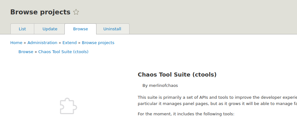
Also, the top last breadcrumb ends in 'Browse projects' and the first PB's breadcrumb is 'Browse'
Comment #11
fjgarlin commentedBare in mind that we are covering both Claro and Seven as admin themes. There is a specific CSS file for each in the repo if needed. Maybe you could save the image so it can be easily re-used and then reference the file rather than loading the full SVG inline?
Also, tests aren't happy (green) yet. You need to make sure that they pass to get the issue moving forward. See the output from the link above in the failed test:
So it seems that you need to run prettier, and then re-compile the files.
Comment #12
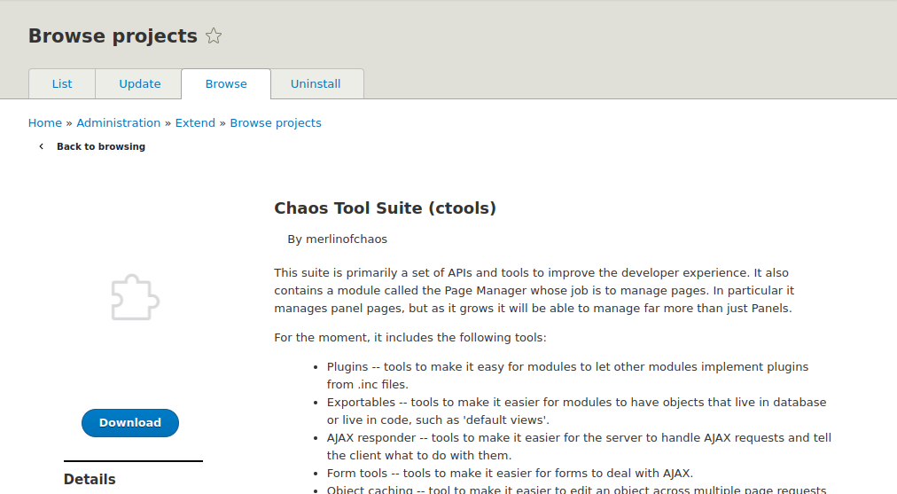
mpauloUsing Seven, it could look like this: (not implemented)

Edit: I see the project has already a way to deal with different styles across these themes. The missing changes can be added there.
Edit 2: It looks like themability is an issue in discussion
Comment #13
rkollercurrently the merge request uses variant a) from the proposed resolution section in the issue summary. there is one problem in regards of consistency. even though the drupal design system uses the current page as the last element, not being a link, in the breadcrumb, but in current version of Drupal that isn't the case anywhere. the last element is the parent page in the breadcrumb. the bread crumb for project browser is for example
Home > Administration > Extend. the issue gets emphasized and illustrated even more with the two bread crumbs right next to each other in drupal 7 (see the screenshot in #12 - thanks for the screenshot!).It was definitely helpful to see one of the solutions and how it turns out in the interface but i would recommend to have a discussion which route to take - which was my initial intention by providing three options in the proposed resolutions section. Personally i lean towards option c). might be easy to implement, clear and not breaking any current patterns.
Comment #14
utkarsh_33 commentedComment #15
utkarsh_33 commentedComment #16
mpauloSeeing two files, named claro.css and seven.css, led me into thinking these were being dynamically loaded, based on the installed admin theme.
Is this not the case?
Comment #17
mpauloHere is it looks on Claro after the last commits.

Currently, I don't see any implementation for conditional theming, based on the current active theme.
Comment #18
mpauloConditional theme styling seems to be something that needs to be addressed.
Comment #19
rkollerComment #20
fjgarlin commented@mpaulo - I think the current implementation works well for both themes. The reason why I mentioned the theme files before was due to the previous iteration, but the current state of the MR has been simplified and works for both themes.
Having said that, the conditional theme styling could be a follow up issue, so feel free to create it.
Comment #21
rkollerthanks for working on it @mpaulo. i've applied MR261 successfully. the only odd part is eventhough
claro-arrow-left.svg is available inproject_browser/imagesbut in the browser i get a 404 no matter if i try it in safari, firefox or edge. not sure what is causing that behavior. :/Comment #22
fjgarlin commentedI added a comment for a small refactoring which should also solve the issue that @rkoller reports.
Comment #23
rkollerhmmm unfortunately the small refactoring hasn't solved the issue. the 404 persists for the svg.
Comment #24
fjgarlin commentedIt was just a comment, not a code change. I'll let @mpaulo do the actual refactoring. Sorry it wasn't very clear.
The issue is in "Needs work", so I wouldn't try to test it again until it's again in "Needs review".
Comment #25
mpauloMaybe this was from using a hard coded module path. Fixed it.
Also, here is how it looks on Seven:

I think if it looks ok, we can move to NR.
Comment #26
fjgarlin commentedCode-wise, it has the thumbs up from me and I'd mark it as RTBC, but I'll let @rkoller do some testing in case there is anything obvious missing (I'm just looking at the code).
Thanks for addressing the feedback @mpaulo
Comment #27
rkollerhm thought about it for a while. i am not convinced if sticking with the breadcrumb styling is the right choice. the link is sort of small and might get unnoticed since people are only used to the original breadcrumb on top of the page. aside the current implementation has several issues on a second closer look. the color is fixed to #222330 so you don't have any color change on hover. in a few cases the left side of the focus outline is missing


it happens in the latest safari on too narrow viewports. in edge it is fine and in firefox i dont get any focus outline at all (firefox is acting out strange on that page in general).
and i think it would be helpful to align the left end of the link (the tip of the arrow) to something. currently
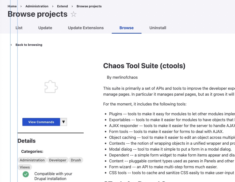
back to browsingis aligned with thelistlabel title but the overall arrow+label block isn't really aligned to anything.i wonder if it wouldn't be the better choice to use the action link styling found in the drupal design systemfor the back button which might also be the better fit semantically? With a medium sized action link the back button would be big enough with a high enough affordance. the spacing between the arrow icon and the action link label is smaller and the icon itself bigger compared to the current breadcrumb styling. and you also would have a background color change aside the text color change on hover which gives the link more of a button-ly feel.
Comment #30
srishtiiee commentedOpened new MR with an action link.
Comment #31
fjgarlin commentedTested via Drupalpod, it looks great! I also checked the code. I only made a tiny suggestion, but it could go as is as well, so marking RTBC.
Comment #32
rkolleri've also applied the new merge request. looks great! only one small detail in the context of screenreaders. i would add an aria-label attribute to the action label. i've created a short video once with the aria-label and then without to illustrate the difference. with the < you have the screenreader pause for a little while and there isn't any need to pause the announcement at the beginning of the label (see pause.mp4). slows down the navigation for the user until scan-able information is announced.
Comment #33
srishtiiee commentedComment #34
rkollerThanks a lot @srishtiiee! The merge request looks good now! The latest commit addressed and fixed my point from #32. I 'll set it back to RTBC.
Comment #35
tim.plunkettLeft small feedback
Comment #36
srishtiiee commentedComment #37
wim leersI think @tim.plunkett's feedback was addressed, but … we're still missing RTL support? Perhaps that's considered out of scope here though?
Comment #38
srishtiiee commentedAll the RTL related issues are being fixed in #3316998: Fix RTL margins and alignment of elements in lists and on project page
Comment #40
bnjmnmChange requested in MR
Comment #41
srishtiiee commentedComment #42
lostcarpark commentedJust want to say the "Back to browsing" link is a much better solution than the faux breadcrumb.
First of all, having two breadcrumbs on the page is confusing. The lower one could mean users won't spot the top one, and then wonder why they they can't go back further than the project browser. The upper one includes the project browser page, so does everything the breadcrumb should do.
Second, the last item in the breadcrumbs should be the page above the level of the current page, so including the project name in the breadcrumb is inconsistent. And if you take that out, all that's left is the Browse level, so renaming it to the "Back to browsing" label makes sense.
I'm sure you all already know all this, but I was considering opening an issue, but found it already resolved.
Comment #43
bnjmnmFound one thing in the MR that needs changing.
Comment #44
srishtiiee commentedComment #47
bnjmnmVery nice to see the discussion result in an accessible solution that works with minimal code changes. Merged!