Problem/Motivation
When testing alpha1 (Drupal 9.4.1 with Claro as the admin theme) I've noticed an odd styling for the focus outline of a radiobutton in the filters section. it isn't a proper circle but the outskirts of the circle are somehow cropped (i've initially tested in the latest firefox):

I've then tested with the latest chrome as well. There the outline is shown as a square:

Aside the focus outline the general look and feel of the radiobuttons differs from the ones in the Drupal Design System/Claro

The styling is different in three browsers i've tested in (dev status as is, maintenance status :hover, security advisory :focus - tested on MacOS Monterey)
Safari
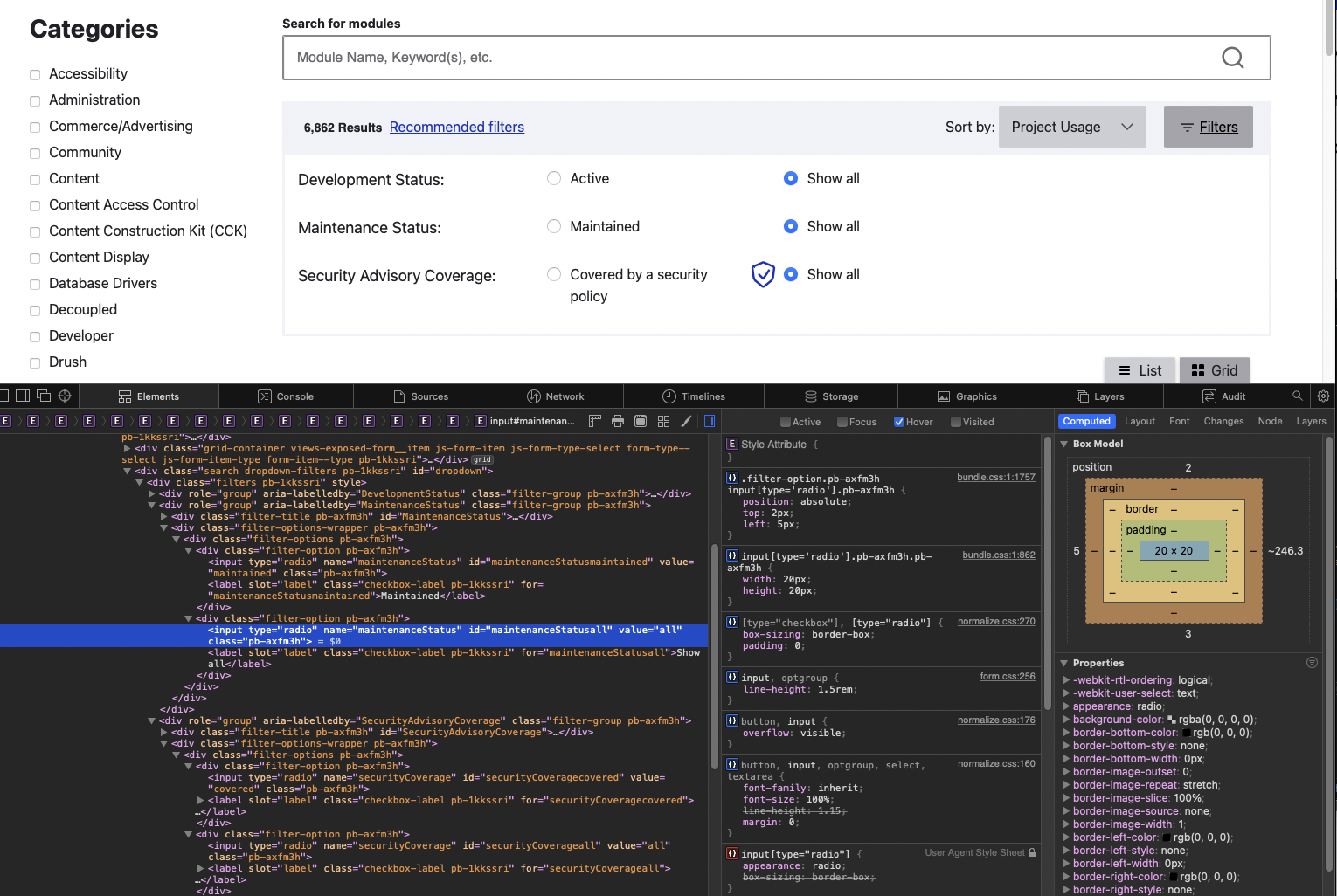
- the radiobuttons are too small
- the blue color doesn't match the drupal design system
- the radiobutton style is completely broken with a white center and a blue outline.
- darker colors on hover for the unselected radiobutton and the selected radio button aren't shown
- no focus outline
Firefox

- the blue colors don't exactly match
- the blue circle in the center is bigger than in the drupal design system
- the color change on hover isn't really visible and only slightly.
- the focus outline seems cropped in firefox (the initial reason of this ticket)
*on a sidenote i have set hover for both maintenance status radiobuttons and focus for both security advisory coverage radiobuttons but in contrast to the other two browsers it is an either or in firefox. you are unable to set both radiobuttons of a group to hover.
Edge

- the radio-buttons are grey and not blue
- the radiobuttons look more sophisticated with thinner outlines in edge but still differ in styling to Claro
- the color change on hover is hard to notice.
- the focus outline is a rectangle instead of a circle
Proposed resolution
I would orient in regards of styling but as well as the way the radiobuttons are built to Claro. There the radiobuttons are way more robust and show consistantely and reliably in all the three browsers I've tested.
On a sidenote like with checkbox components Claro uses a SVG to build the circle in the center. Perhaps something to consider for project browser as well.
Remaining tasks
- ✅ File an issue about this project
- ☐ Manual Testing
- ☐ Code Review
- ☐ Accessibility Review
- ☐ Automated tests needed/written?


 Show commands
 changes





Comments
Comment #2
rkollerComment #3
vighneshh commentedSO which icon Outline should be kept as common Square or circle
Comment #5
bnjmnmWhich theme(s)?
Comment #6
rkollerwoops apologies @bnjmnm forgot to add that to the initial issue summary. I've just tested with an out of the box core-recommended install of Drupal 9.4 with Claro as the admin theme. I'll update the IS alongside.
Comment #7
tim.plunkettThese were adjusted in #3294763: There is no space between the focus outlines of radio button and label in recommended filters., is this still an issue?
Comment #8
tintoI just tested this on a fresh install of Drupal 9.5 with Project Browser 1.0.0-beta1 and can confirm that this is still an issue in Firefox v102.0.1 (see attached screenshot).
Comment #9
tintoIn an attempt to answer #7, I just tested again with version 1.0.0-dev, but this didn't change anything. So I guess it's safe to say that #3294763: There is no space between the focus outlines of radio button and label in recommended filters. did not solve this.
Comment #10
rkollerI've installed a fresh version of Drupal 9.5 with project_browser 1.0.x-dev@dev. There the changes from #3294763: There is no space between the focus outlines of radio button and label in recommended filters. are already committed and in effect I assume. Since I finally got my local dev environment running on my new computer I was also able to also check the latest Safari version. The results:
Safari 15.6: no focus outlines visible at all
Firefox 102.0.1: still the same result like in the firefox_cropped screenshot
Edge 103.0.1264.62: tested with edge instead of chrome but both are blink based and so the result is indentical. the focus outline is a square like in the chrome_square screenshot.
So it is still an issue. Particular with Safari not showing any focus outline (I was unable to test before because with the old version of Safari I had on High Sierra project browser wasn't working at all - an indefinite loading spinner with no project cards loaded)
Comment #11
tintoNot sure if it's a cropped circle or a square with a border-radius applied to it:
Comment #12
rkollerI guess it might be actually a square with a border-radius applied to it. I am not a css dev - but it would have been odd if in blink browsers the outline is displayed as a square while in firefox it would be a circle. Based on your thought I've increased the second pixel value from 5 to 15px:
box-shadow: 0 0 0 2px #fff, 0 0 0 15px #26a769;and there it looks like a confirmation to your suspicion @tinto.
Comment #13
tintoI've studied the theming of these elements a bit closer and it I noticed that instead of the theme, the module CSS is handling the styling of these elements. That seems a bit strange, as the design of the radio buttons differs from the other radio buttons used in Drupal core.
For example, if you examine the radio buttons in
/admin/config/people/accountsand compare them with those in the Project Browser filter, they look much better. Even the color blue used in this module differs from the standard blue used in Claro.I wonder what the reason is to apply a unique Project Browser styling instead of leaving it to Claro (or whatever backend theme is active)? It sounds much more obvious to let the theme handle the styling instead of the module. We wouldn't have this very issue to begin with.
Comment #14
rkollerI've initially noticed the issue about the radiobuttons due to the differing display of focus outlines. But the issue should be about the design of the radio buttons in general. Because the radio buttons have a general styling that differs from the Drupal Design System as well. I am updating the issue title as well as the issue summary accordingly.
Comment #15
rkollerComment #16
tim.plunkettComment #17
chrisfromredfinComment #18
chrisfromredfinComment #19
chrisfromredfinComment #22
mherman-pro commentedAdded the classes that were being used by the Claro theme to the radio button so that it would get the same styles applied.
Comment #23
mherman-pro commentedComment #24
mherman-pro commentedComment #25
MrMason commentedThe content here looks correct. The highlighting of the radio button matches the styling for Claro.
Comment #26
MrMason commentedComment #28
chrisfromredfinRalf - since you had such a nice thorough plan here, if you want to try this out in GitPod that would be fun. :)
I was able to check it out in Safari and Chrome at least and it looks good - but if I had your blessing I'd feel better about this one. :)
Comment #29
rkolleri've applied MR470 locally. If you take a look at the radio button section first on https://www.figma.com/file/OqWgzAluHtsOd5uwm1lubFeH/💧-Drupal-Design-system?type=design&node-id=553-0&mode=design&t=fKFt7DZuX3hQR6Ts-0 and then in gitpod or in your local instance you will notice that there is a divergence. :/
in safari you notice for example that the radio element has only a height of 12x12 , the goal should be 19x19 according to the drupal design system. styling wise it also differs, the center for selected radio buttons are filled in blue then a white ring then another blue one, plus the focus outline is completely missing in safari 17.4.1 on macos 14.4.1.
in edge the element is one pixel "bigger" compared to safari with 13x13. the styling has the same problems like in safari only difference the color is greyish instead of blueish.
and the focus outline is visible in edge, the styling is also not inline with the design system. the outline is a rectangle but it should be a circle according to the figma file:

Comment #30
rkolleruhhh took another look after @chrisfromredfin mentioned the issue on slack. i thought it wouldnt be needed after MRs were successfully applied, but somehow none of the changes were in place still. but running
yarn installandyarn builddid the trick. completely forgot about that :( but all the changes look good now and setting to rtbcComment #31
chrisfromredfinBig victory! This one's been lingering a while. I like it when classes fix the issue. :)