Problem/Motivation
If I tab into a CKeditor 5 body field the focus outline is in a light blue instead of the expected green. The blueish outline fails SC 1.4.11 and SC 2.4.7 (Unable to find the exact hex value for the blueish outline in the devtools but definitely less. with the color picker i got something around #8AAFEC which leads to a contrast of 2.2:1 tops without any padding in between the field and the outline also)
CKEditor 4
CKeditor 5

the really odd part is if i go into the devtools and trigger the focus state for the element i am able to get the expected green outline.

on the other hand i am unable to trigger the blue outline manually. tested on safari 13.1.2 and the latest firefox.
Steps to reproduce
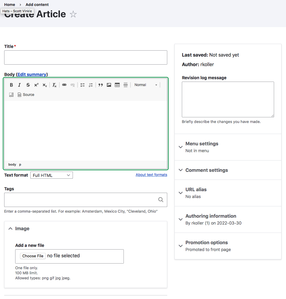
- Go to /node/add/page or /node/add/article
- First select a CKEditor 4 text format
- tab until you reach the body field -> you should see the green outline around toolbar and body field
- Switch to CKEditor 5 text format
- tab until you reach the body field -> you should see a blueish outline around just the body field
- go to the devtools and find the div with the ck-editor__main class and manually trigger the focus state for the ckedtior5 body field -> you should see the green focus outline
I've set the component to Claro but I suppose it MIGHT be directly CKEditor5 related cuz I remember there was an issue moving the scope of the outline from toolbar+body field to body field only. If so please move the issue over to the CKEditor 5 component.
User interface changes
Before

After


Comments
Comment #2
rkollerComment #3
rkollerI've tested now in Seven in the latest
9.4.x-dev- again with Safari13.1.2and latest Firefox. Same results in Seven like the ones I describe for Claro in the IS.When i tab into the body field the focus looks like that:

When I manually trigger the focus in the devtools in Safari the focus looks like that.

As it turns out it isn't an Claro exclusive issue I move the component from Claro to CKEditor5 since the issue doesn't take place in CKEditor4. I leave the parent issue as is since it is still relevant for the Claro focus meta issue.
Comment #4
rkollerquick update. i've noticed today that the toolbar icons have the blueish outline as well instead of the regular green one.
Comment #5
wim leersI bet these are CKEditor 5's styles.
I think you're effectively asking that Claro and Seven provide overrides of CKEditor 5's default styling to use the same focus styling as those admin themes?
Comment #6
bnjmnmI just confirmed that to be the case.
I very much see the appeal in making the focus rings consistent, but overriding CKEditor 5's default styling presents some risks, especially since CKEditor 5 releases new major versions at a Javascripty pace. If they change their focus styling approach, there could be conflicts such as box shadows and outlines clashing with each other, or focus ring inconsistency within the editor. These are kind of difficult to test, so the issue could be introduced without us realizing it. At least now the focus ring appearance change is predictable (inside CK it looks one way, outside it looks another).
The contrast/visibility concerns are worth addressing, but I wonder if this is best done upstream in CKEditor 5 itself. This still means inconsistent focus rings within a theme, but it would be predictably inconsistent, and not jarring. Uniform styling is ideal, but it's also understood that there may be differences with 3rd party widgets.
Comment #9
wim leersPer #6, re-classifying from bug to task.
I asked the CKEditor 5 team for advice. @Reinmar escalated this question to @oleq.
I asked:
@oleq's response:
So … I think that means we could consider overriding this on the Drupal side. I defer to @bnjmnm and @lauriii on this.
Comment #10
wim leersComment #11
wim leersWell, actually, no, this was found by @rkoller at home, not at DDD Ghent. 😅 I just responded while being at DDD. So untagging. Sorry for the noise.
Comment #12
lauriiiI agree that it could be nice to render the focus style consistently in Claro. However, I don't think this is critical because CKEditor 5 has its own design language, and we are not planning to customize all of that to match the Drupal design system.
There are some challenges with the Claro focus styles because in CKEditor 5, the focus is around the preview container, not the whole editor. We probably don't want the outline to render over the toolbar since the toolbar will need to remain usable while the preview container is focused. We also need to decide what to do about selected widgets, should those styles follow Claro too?
Either way, it would be good to play around with this a bit, and see how it would look like to make a final decision on what makes sense.
Comment #13
wim leersThanks for sharing your rationale in such detail! 🙏
Per #6 and #12, this is clearly not a stable blocker then.
Comment #15
wim leershttps://ckeditor.com/docs/ckeditor5/latest/framework/guides/deep-dive/ui... actually seems to make this trivial to implement:
Also see
packages/ckeditor5-theme-lark/theme/ckeditor5-ui/globals/_focus.css, which contains:So this is totally doable. At least for a specific theme. For Claro, we'd want
AFAICT.
And … if Drupal core settles on consistently named CSS variables, that single line should be able to work for any admin theme? 🤓
Comment #16
wim leers@rkoller reported this problem again at #3308911: The CKEditor 5 form-element is missing an outline color change on hover. Marked it as a duplicate.
See the video he posted there: https://www.drupal.org/files/issues/2022-09-09/outline.mp4.
Comment #17
rkolleroh that is the same root cause like the focus issue?! i was unaware of that. i just noticed that there was also no effect on hover but since hover and focus have different styling and different triggers not thought it might be the same root cause.
Comment #18
wim leersYes, same root cause AFAICT, because #3308911: The CKEditor 5 form-element is missing an outline color change on hover is also referring to Claro-only styles. 😅
Comment #20
mgiffordSo CKEditor's styles. Do they meet the color contrast requirements? Is it just that they look different, or can't be easily updated? Consistency is definitely a plus for usability. What WCAG SC would it lie under?
Comment #21
wim leers#20: @bnjmnm is a (provisional) accessibility maintainer of Drupal core (just like you!) and he reviewed CKEditor 5's accessibility in detail, and specifically reviewed it for regressions compared to CKEditor 4. Hence also his detailed comment at #6.
On the roadmap issue (#3238333: Roadmap to CKEditor 5 stable in Drupal 9) there is a long list (23 issues!) of "accessibility" issues to be addressed prior to marking it stable, @bnjmnm identified most of those. See #3239423: Toolbar UI accessibility review: round 2 in particular.
Comment #22
wim leersClarifying that the original report is tightly coupled to Claro, which explains why the parent issue is #3163810: [META] Assess conformance with WCAG SC 2.4.7 "Focus Visible".
Comment #23
mgiffordTagging for WCAG SC
https://www.sarasoueidan.com/blog/focus-indicators/
Comment #25
wim leersI hear the CKEditor 5 team is investigating this too as they encountered this problem while working on https://www.drupal.org/project/ckeditor5_premium_features 😊
Really curious to get their feedback!
Comment #27
wim leersClosed #3327960: CKEditor 5 focus indicator is insufficient and is completely invisible in forced colors as a duplicate. Transferred tags & credit.
Comment #28
mgiffordHow is what we implemented different than what you can see in their demo https://ckeditor.com/ckeditor-5/demo/feature-rich/
The contrast I see for the focus of the boarder is #3879EB / #FFF which is 4.1.2. That's good enough for SC 1.4.11 Non-Text Contrast (Level AA) if the visual presentation only needs a contrast ratio of 3:1 against adjacent color(s).
I didn't see a corresponding problem in their issue queue https://github.com/ckeditor/ckeditor5/issues
but the bigger issue is that i couldn't replicate this in their demo.
Comment #29
wim leersRelated: #3306209: Add outline to buttons with active state. just landed.
Comment #30
pere orgaThis issue is about focus styles, but shouldn't be about styles, in general?
What I first noticed is that the border is brighter in WYSIWYG fields:
(also, it is not resizable, but that would likely be a separate issue)
I agree this is not critical, nor very important. It would be great if consistency could be achieved, though. What I'm not sure is what would be the right solution, considering the toolbar also has a border.
Idea A:
Idea B:
Idea C:
Comment #31
rkollerGood catch @pere-orga! I strongly disagree, it is important since the ckeditor field isn't meeting WCAG 2.2. SC 1.4.11 that way (i've quickly checked) . A color contrast of at least 3:1 is required for the visual representation of user interface components (their states including focus indication and boundaries) and graphical objects. But i would consider the border color out of the scope for this issue and would suggest to open up a follow up issue, since changing the border color of the wysiwyg might be easier and faster done than adjusting the focus color for ckeditor? And I would vote for variant A - the only one where the toolbar buttons as well as the wysiwyg field have a large enough color contrast and therefore are distinguishable.
Comment #32
pere orgaHappy to create a separate issue, but there may be many other CSS inconsistencies, especially if this hasn't been a goal.
Regarding WCAG 2.2, shouldn't we aim to fix this upstream? Not only to avoid adding (and maintaining) more integration code that can break, but also to benefit the CKEditor project, and all the projects that use them.
Related to the focus, I also noticed that when clicking on any blank space inside the toolbar, the green outline appears around the toolbar, partially behind the preview/editor pane:
(not sure if this effect has been reported/identified before)
Comment #33
pere orgaIssue created: https://www.drupal.org/project/drupal/issues/3478281
Hopefully addressed in https://git.drupalcode.org/issue/drupal-3478281/-/compare/11.x...3478281....
Comment #34
pere orgaI took a look and I don't think this is easy, it requires multiple style changes to CKEditor.
This changes the color of the border from blue to green, but it is not much better, because as far as I can see, Claro implements the green outline with box-shadow.
Overriding the following selector gave me a better result:
But still far from perfect: the CKEditor blue focus border is still there (and did not look good if removed, it should probably be converted to be
var(--input-border-color);, but even then, the green outline still would not match Claro's, mostly because the focused element only has 2 rounded corners instead of 4 (which is another non-focus style difference):Also, we would need to replicate the hover effect (
border-color: var(--input--hover-border-color); box-shadow: inset 0 0 0 var(--input-border-size)...).And the issue I described in #32 would still happen.
Comment #36
pere orgaI found something simpler, looking at what Gin theme is doing:
This has the problems mentioned above, and a few pixels of the toolbar buttons are now below (behind) the green shadow, but I can't see how we could improve this if we apply current Claro's shadow:
Comment #37
pere orgaSetting it to Ready for review, as I've created an MR that could be acceptable.
Replicating the hover effect could be a separate issue.
Comment #38
pere orgaGin Admin theme also does this to mitigate #32:
This completely hides the green line around the toolbar. Not doing it in case it can have issues for accessibility. I think it's probably OK though: I'm not sure the toolbar should be focusable at all (the toolbar can still be used by the keyboard when the editor is focused), but in that case, we may consider focusing the editor automatically when the empty space in the toolbar is clicked.
Comment #39
smustgrave commentedScanning issue summary and appears to be missing a few sections.
Proposed solution
User interface change = before/after screenshots probably can be moved.
My recommendation is even if a section doesn't apply to the issue just put N/A vs removing it.
Comment #40
pere orgaUpdating issue description
Comment #41
smustgrave commentedStill appears to be missing proposed solution section.
Comment #42
smustgrave commentedPer #41