

Needs work
Project:
Drupal core
Version:
main
Component:
media system
Priority:
Major
Category:
Task
Assigned:
Unassigned
Issue tags:
Reporter:
Created:
28 Feb 2022 at 16:02 UTC
Updated:
20 Aug 2025 at 14:36 UTC
Jump to comment: Most recent, Most recent file




Comments
Comment #2
mschudders commentedin #3266293: Media items translate items in modal I have proposed a simple UI.
It would indeed be nicer to even have icons but maybe it's overkill?
Comment #3
phenaproxima@Mcshudders, would you be able to post screenshots of your proposed UI in this issue, or -- and this would be going above and beyond -- a demo video? 🙏 Since this issue is meant for designing a UI, it will be helpful to have some kind of visual reference for whatever proposals are put forth. 😇 😎
Comment #4
mschudders commentedSimple UI proposal taken from: https://www.drupal.org/project/drupal/issues/3266293
Comment #6
drdam commentedA UI proposal from media_library_media_modify module
Comment #7
joachim commentedThe design with icon buttons in #6 was nice when it was just 'Edit' which was needed in addition to 'Remove'.
But we also need 'Translate' and 'Override', and those are going to be hard to convey as icons.
A dropdown with words as in #4 is better. (Nitpick though: the position and alignment look wrong.)
Bear in mind a design also needs to show what you get when you click the buttons!
I had assumed we'd have a modal with tabs for each operation (eg 'Edit | Translate | Override'), but thinking more about that, I'm not so sure any more: it would mean we need to:
a. prevent the user from clicking a different tab if they have unsaved work in the current tab
b. have a dual save button, 'save + close' and 'save and don't close' so that users can stay in the modal and switch to making changes in another tab
Comment #8
duaelfrWouldn't it be a solution to bring a Contextual links-like implementation on this part? I did a quick copy/paste on Gimp with my lack of talent ;)
#7 I don't think we have to create a new pattern for a Modal with tabs. Those are independent actions that can live in different modals. If you opened the Edit one by mistake you can still close it to open the Override one. That's not even a hassle for accessibility as Modals bring the focus back to the opener button when they are closed.
Comment #10
chris matthews commented@phenaproxima, would you be able to advise/summarize what is needed to move this issue forward? Does it need a closer look from core committers, accessibility and UX teams before moving forward? If so, in order for that to happen does this issue need funding/dedicated time?
Comment #11
seanbSince allowing an edit button is probably already difficult enough, I suggest we focus this issue on editing media only. Leaving translations out of scope. What we need here is a design for every step of the user flow for editing media from a media library widget.
Step 1: Widget
We need to at least add a button to the media library widget that allows users to edit a media item. I think we already had a design for that.
Step 2: Modal
When a user clicks to edit a media item, we open a modal and need to:
In #3023807-12: Override media fields from the reference field we added some sketches we came up with a long time ago. This needs to be refined to proper designs by someone that knows a lot more about UX than I do.
Step 2 is where we are stuck right now. We at least need some mockups for the design of the modal. Actual designs are probably better. A video that shows the interaction or a clickable mockup would help even more.
Comment #12
joachim commented> Since allowing an edit button is probably already difficult enough, I suggest we focus this issue on editing media only. Leaving translations out of scope
We really need to design a UI that satisfies editing AND translation, otherwise it's not going to do all of what is needed and the UI will need changing again. That's the whole point of this issue -- to do something that covers all the use cases, rather than let 3 different issues come up with clashing and inconsistent solutions.
Comment #13
martijn de witLooking at UI patterns, I would suggest to use the contextual menu pattern here.
I only can't find it in the Claro design system https://www.figma.com/file/NpZUAp8BEkMJvm5gKBCDBB/Claro
There is only a "drop down" component under "Medium priority"
Comment #14
drdam commented#8 & #13 : will be good
Comment #16
flyke commentedHi, So if I am correct, the goal of this ticket is to:
If I am not mistaken, number 1 is OK, we have concensus to use the pencil edit icon.
So in order to get this issue fixed, we need a design with concensus for the edit modal, correct ?
Comment #17
joachim commented> If I am not mistaken, number 1 is OK, we have concensus to use the pencil edit icon.
Not exactly, because there can be more than one edit actions -- so far we have use cases for translate, edit, and override. Any number of these may be present at the same time.
Comment #18
flyke commentedThanks for the feedback. So for number 1, that should just be whatever the design of contextual links is ? So we have that already ?
Comment #19
drdam commentedHi,
What's wrong with #8 proposal ?
I'm agreed with the fact we don't need to have tabs in the modal. Those will be independent operation, so with a correct title on the modal you can check what you are doing
Comment #20
duaelfrUpdated IS to get more feedback about #8's proposal.
Comment #21
joachim commentedAbout #8 - I think some sort of dropdown is the right way to go, as we have an extensible number of options here.
However, I'm not sure about inventing a new icon + dropdown UI pattern, when we already have dropbuttons.
Comment #22
mlncn commentedI agree with the proposals to re-use the contextual links pattern here (pencil icon in a circle plus dropdown). It may be a new pattern on the administrative theme while editing content, but it is not a new pattern for getting to editing from the front-end (edit block, edit teaser) nor for sitebuilding from the administration side (edit view). It is the right pattern to use in the media reference which by default has a preview much like what one would see on the front end.
Note that browsing the media library as Grid also has the preview much like what one would see on the front end and it already uses the pencil icon so extending that to the contextual links style (the pencil icon opens a dropdown) is completely natural there as well, and for Table, the existing button dropdown should continue to be used. That these two visual styles already exist in Drupal core for the media library view are shown in these screenshots below of plain Drupal 11.0.9 (because that's what DrupalForge gave me).
Comment #23
smustgrave commentedIssue summary isn’t super clear what’s being suggested. To better help the Usability team it should be clear so they can quickly pick up
Comment #24
joachim commentedI don't see what I can add to the IS to make it clearer.
Comment #25
w01f commentedThis would be great to improve the default media options via extensible contextual links to:
I'm adding the Download one as a common use case by our users, but an extensible widget would allow a method to add additional options per use case.
Comment #26
rkollerUsability review
We discussed this issue at #3535491: Drupal Usability Meeting 2025-07-18. The recording with a timestamp to the part addressing this issue can be found here: https://www.youtube.com/watch?v=pgAuZ781Vdg&t=2900s. For the record, the attendees at the usability meeting were @benjifisher, @rkoller, and @simohell. This meeting was the second part of our walkthrough of the user tasks entailed in the issues listed in the issue summary as well as the media module in Drupal core in general. The first part of the walkthrough was covered in #3534039: Drupal Usability Meeting 2025-07-11 and the link to the recording is https://youtu.be/FPYyputdZzQ.
The group is in line with the proposed solution to use the contextual link pattern. Users are already familiar with them from the frontend as well as Layout Builder, so being consistent using the same icon and behavior in the context of media items is a good idea.
The only detail that might have room for improvement from our perspective is the icon choice. The pencil icon has a rather specific affordance - people are used to that kind of icon solely in the context of actually editing something. But already the options used in the image in the issue summary (
detach,override, andtranslate) have no close affinity to the concept of “editing” - the suggestion of adownloadoption raised #25 is blurring the line further. So we’ve wondered if it wouldn’t be the better choice to go with a more generic icon, something like the three vertical dots icon used on the navigation top bar or a downward facing caret icon? If the decision to use a different icon for the contextual link button should be taken, the icon should be changed for media items, the frontend and Layout Builder consistently - but that choice could probably be moved to a followup.I'll remove the
needs usability reviewtag and set the status back toneeds work(but was not completely sure what the right pick should be,activeorneeds work)If you want more feedback from the usability team, a good way to reach out is in the #ux channel in Slack.
Comment #27
emma horrell commentedUser testing findings:
I ran a usability test with 2 non-technical content editors which required them to:
Publish 2 news articles
Add the same image to each article
Amend the alt text to reflect the context of the different articles
Findings:
To change the alt text in the context of individual articles, editors expected image editing options in the article to be contextual (not to take them to edit the image in media)
They took 2 routes to update the alt text:
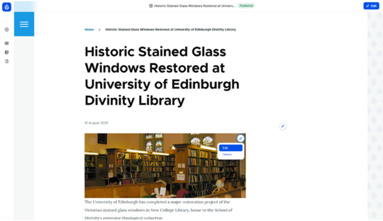
1. Edit option in the preview (https://www.drupal.org/files/issues/2025-08-20/screenshot-1-edit-in-prev...) which took them to editing the image in the media section
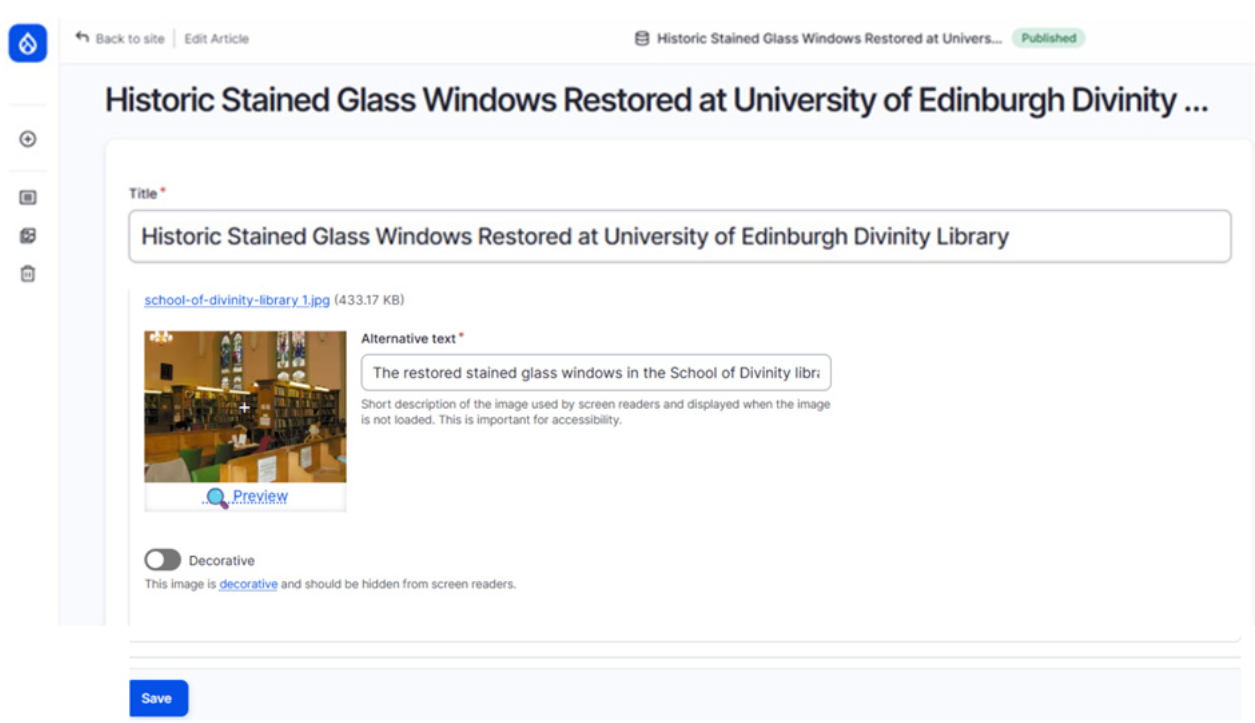
2. Image edit option in the Edit Article form (https://www.drupal.org/files/issues/2025-08-20/screenshot-2-edit-image.png)
Recommendations:
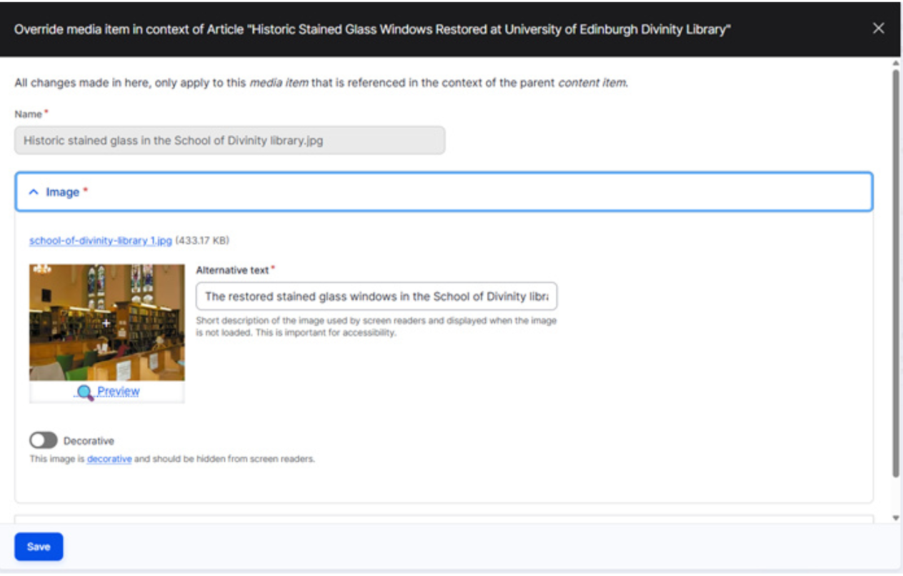
1. Image edit button in preview takes user to contextual image field (https://www.drupal.org/files/issues/2025-08-20/screenshot-3-image-edit-g...)
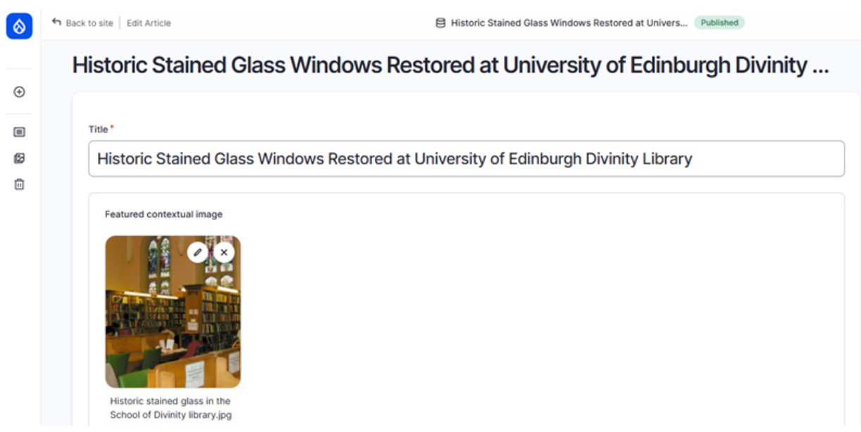
2. Image field in Edit Article displays contextual image field (https://www.drupal.org/files/issues/2025-08-20/screenshot-4-edit-article...)