

Closed (fixed)
Project:
Drupal core
Version:
9.5.x-dev
Component:
Seven theme
Priority:
Normal
Category:
Bug report
Assigned:
Unassigned
Issue tags:
Reporter:
Created:
9 Jul 2021 at 18:47 UTC
Updated:
5 Jan 2023 at 07:12 UTC
Jump to comment: Most recent, Most recent file








Comments
Comment #2
cilefen commentedComment #3
pameeela commentedThanks for reporting @Kumar Ashutosh and for providing the screenshot. I've just updated the title and issue summary a bit for clarity.
Also confirming it does not occur in Claro, only Seven.
Comment #4
tanmaykadam commentedComment #5
tanmaykadam commentedPlease review the patch.
Comment #6
manojithape commentedComment #7
vikashsoni commentedPatch is working fine now the buttons are aligned for reference sharing screenshot ......
Thanks
Comment #8
manojithape commentedVerified and tested patch #5 on drupal 9.3.x dev version and Seven 9.3.0 Dev version.
Patch applied successfully and looks good to me.
Testing Steps:
Expected Results:
The "Place block" buttons should be aligned properly if the Custom block name is very long.
Actual Results:
The "Place block" buttons are aligned properly if the Custom block name is very long.
Looks good to me. Moving this ticket to RTBC.
Comment #9
bnjmnmAlthough this fixes the issue as reported in a controlled test enviroment, it's a solution that introduces other problems.
This is limiting the length of every table cell within the table. Users with larger displays won't be able to take advantage of the additional viewport space. Longer titles/categories will be unnecessarily wrapped.
This is better addressed by targeting either the button itself, or determining why the table does not calculate button width when determining cell width.
Something like this would probably take care of it:
This is because the issue is probably due to it being a single-item dropbutton, and the widest (overflowing) part of the button is absolutely positioned and as a result not factored into the table cell width calculation. Since there's only one item in the button, the absolute positioning isn't necessary and making it static should allow the table to compute widths properly.
Comment #10
katriencI agree with bnjmnm
I've created a patch for this
Comment #11
chetanbharambe commentedVerified and tested patch #10.
Patch applied successfully and looks good to me.
Testing Steps:
# Goto: Appearance -> Apply Seven Theme
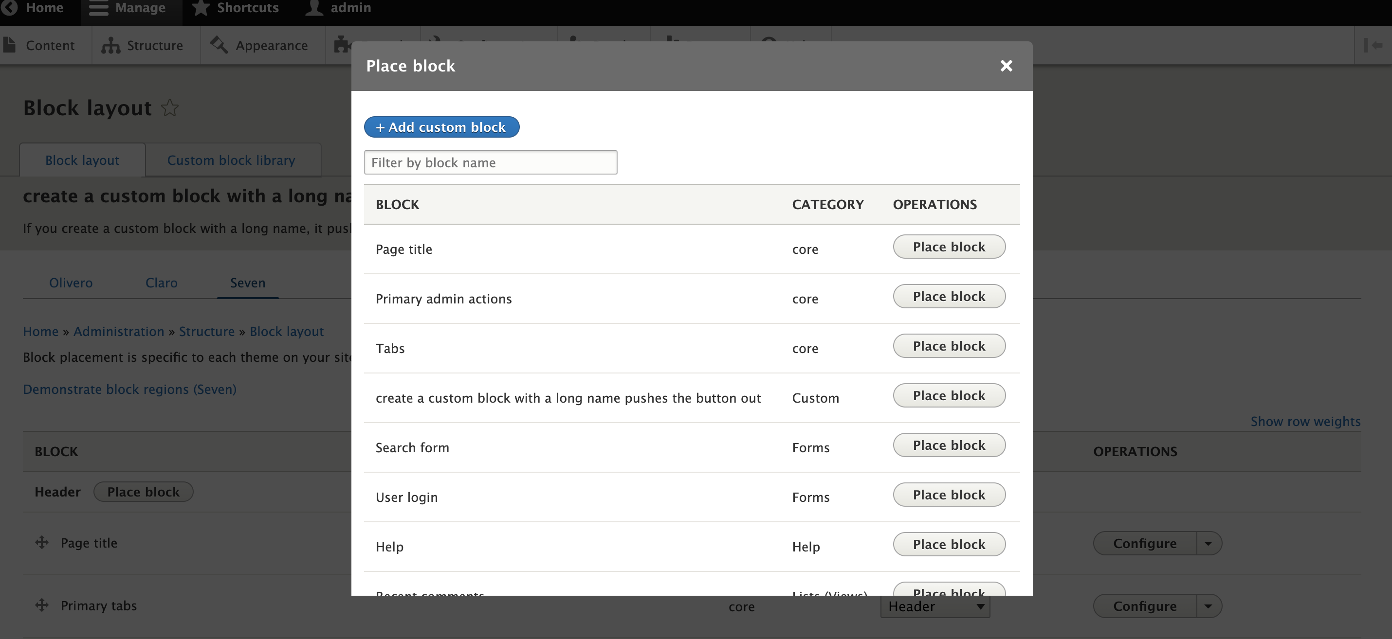
# Create a custom block with a long name
# Go to the block layout page and click on 'Place block'
# Observe the (Place block) buttons are out of alignment
Expected Results:
# The "Place block" buttons should be aligned properly if the Custom block name is very long.
Actual Results:
# Currently "Place block" buttons alignment is broken.
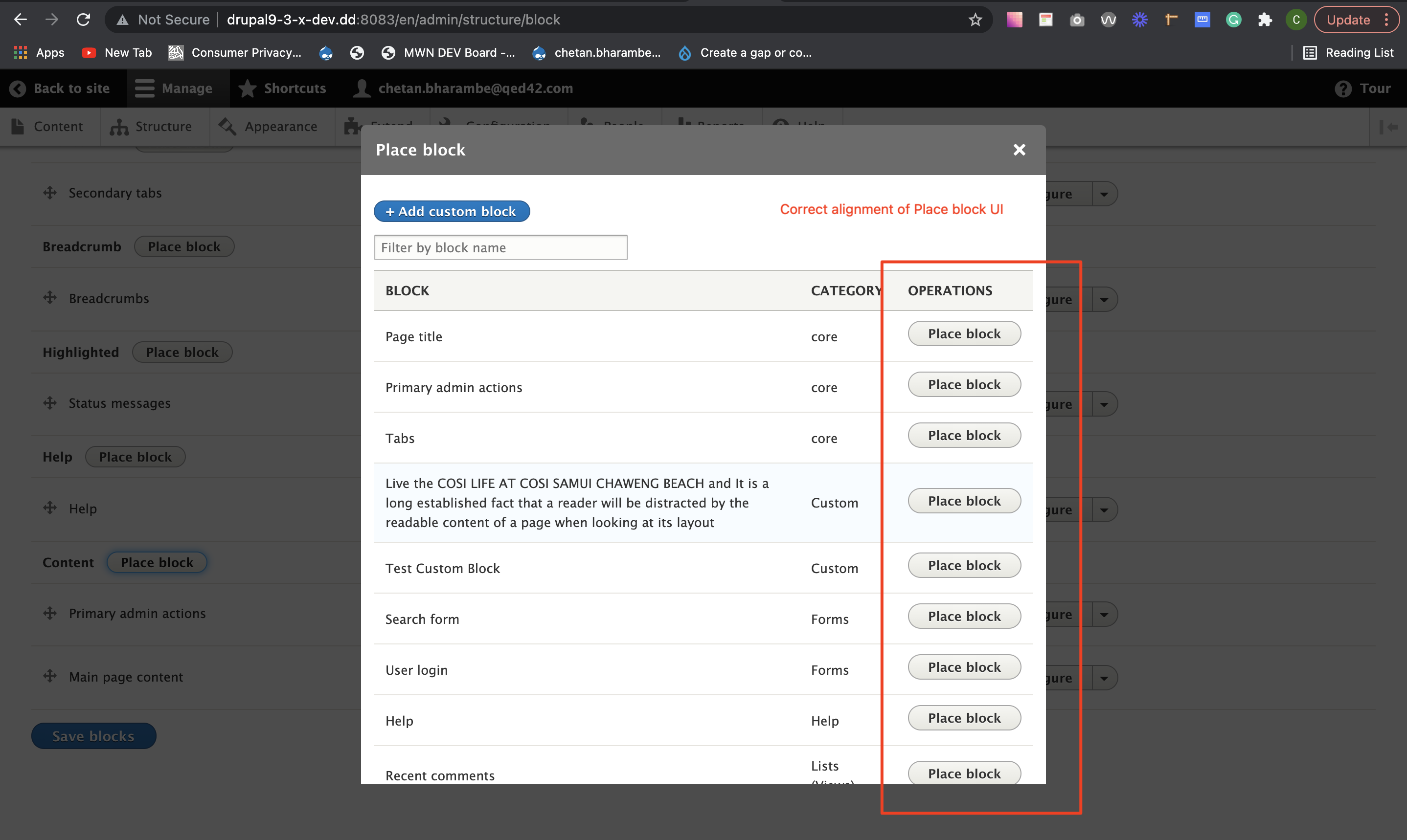
Please refer attached screenshots for the same.
Looks good to me.
Can be a move to RTBC.
Comment #12
bnjmnmThis fix works, but should be applied to dropbutton-related css, not table-related css
The problem is caused by the following style in
core/misc/dropbutton/dropbutton.css(without this rule, it defaults to theposition: static;that fixes the issueWhich suggests it's potentially a problem in every theme, not just Seven where it happened to surface for the OP.
The
position: absoluteis necessary for multiple item dropbuttons, but causes the reported problem on single-item dropbuttons (and doesn't appear to provide any benefits). The ideal solution may be adjusting this rule to target only muti-item dropbuttons, or it may be adding a new style for single item ones.What is there definitely works, but lets put it in the place where it'll work best for us!
Comment #13
sagarchauhan commentedCreated a new patch and tested it as per comments from @bnjmnm. Attached screenshot with the new patch.
Comment #15
devashish jangid commented#13 Patch is working fine and shared the screenshot for the reference.
Comment #17
djsagar commentedJust re-rolled the patch.
Comment #18
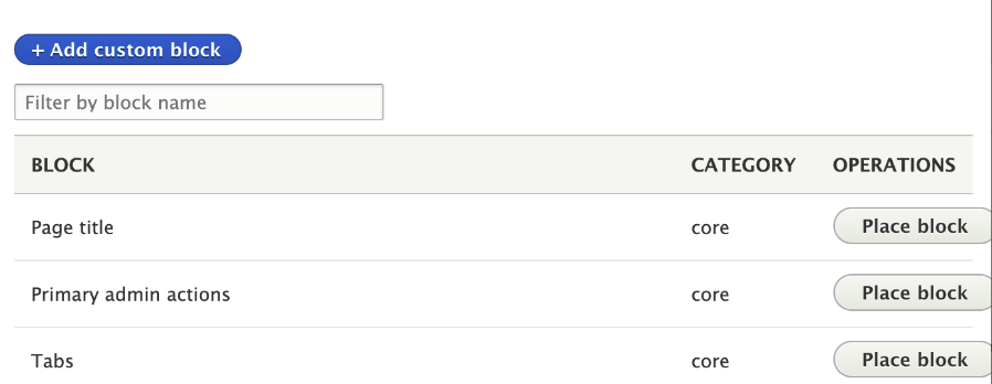
manojkumar_97 commentedBefore Patch:


After Patch:
#17 Patch is working fine and shared the screenshot for the reference.
Comment #20
manojkumar_97 commentedAfter Patch

Comment #21
bnjmnmInherit is risky because it literally inherits from its parent element, so the value can differ depending on what the parent positition is set to.
dropbutton-single, but it may be worth looking into just modifying the style causing the problem to only target.dropbutton-multipleThis causes the issue in single buttons
so perhaps this would take care of it? (this would need manual confirmation)
Comment #23
ameymudras commentedThanks @bnjmnm that seems to be the right approach to me as well. I have added a patch based on your solution direction
Comment #24
ameymudras commentedComment #25
sonam.chaturvedi commentedVerified and tested patch #23 on 9.5.x-dev. Patch applied successfully.
Test Steps:
1. Goto Appearance -> Apply Seven Theme
2. Create a custom block with a long name
3. Go to the block layout page and click on 'Place block'
4. Verify the 'Place block' button is not out of alignment
Test Result: The "Place block" buttons is aligned as expected when the Custom block name is very long.
Attached screenshot for reference. RTBC +1
Comment #26
Harish1688 commentedTested the patch (3223061-23.patch) with version 9.5.x-dev. working fine looks good for RTBC.
screenshot attached for references : place-block-button-before-patch.png , place-block-button-after-patch.png
Comment #27
kristen polThanks, everyone! Marking RTBC based on:
Comment #28
quietone commentedCompliments to @Kristen Pol for clearly stating what was done to support this issue being RTBC.
I am removing credit for duplicate screenshots made on the same patch.
Comment #30
ravi.shankar commentedBack to RTBC as per comment #27.
Comment #34
bnjmnmThe thing happened! Applied to 10.1.x then cherry picked to 10.0.x and 9.5.x.
Also removed credit for rerolls where a reroll was not needed (basically uploading the same patch).
Comment #35
bnjmnmComment #37
maxstarkenburgIn case anybody else out there is now seeing funky looking placement of their paragraphs buttons (as in below screenshot, for example) due to the change from this issue, I've opened #3331203: Core 9.5.0 causing broken-looking styling (Legacy widget, with Seven) in
paragraphs(though I didn't rule out that a more appropriate fix might be a change here, I haven't read through all the above, and assume a change inparagraphsis path-of-far-less-resistance anyway).