Problem/Motivation
The HTML Element <blockquote> (or HTML Block Quotation Element) indicates that the enclosed text is an extended quotation, but it seems to be missed in the Claro theme, please refer to the screenshot attached.
There's nothing about quotes at https://www.drupal.org/docs/8/core/themes/claro-theme/design
Steps to reproduce
- Install Drupal core 9.2.0
- Create a post with this in the body:
<blockquote>
<p>This should be inside a blockquote.</p>
<p>This is the second paragraph inside the blockquote.</p>
</blockquote>
- View the post with the Claro theme.
Proposed resolution
Style blockquotes in Claro.
Remaining tasks
Design a blockquote style for Claro and update the style guide.- Implement it.
- Reviews / refinements.
- RTBC.
- Commit.
User interface changes
Yes. New designs by @saschaeggi:

Figma: https://www.figma.com/file/OqWgzAluHtsOd5uwm1lubFeH/Drupal-Design-system...
Steps to validate/reproduce
Testing Steps:
# Go to Appearance -> Set Claro theme
# Create a blockquote post in the body
# Save it
Expected Results:
# Quotations should have appeared for the HTML blockquote Element in the Claro theme
Actual Results:
# Quotations are missing for the HTML blockquote Element in the Claro theme
API changes
Nope.
Data model changes
N/A.
Release notes snippet
TBD, probably not.




Comments
Comment #2
tushar_sachdeva commentedComment #3
sakthivel m commented#3 Please review the patch
Comment #4
mitthukumawat commentedI have applied the patch #3. The issue is fixed and i can see the
Comment #5
guilhermevp commentedPatch works as intended. Adding evidence as well.
- Created an article in source:
Before patch:

After patch:

Moving to RTBC!
Comment #6
Madhu kumar commentedPatch #3 applied cleanly and working as expected , sharing screenshot for reference.
Comment #7
radheymkumar commentedSuccessfully applied patch
Thanks
Comment #8
dwwThanks for the issue, the patch, and all the reviews!
@radheymkumar and @Madhu kumar -- we've already had multiple folks post before/after screenshots, so we don't need more of those. We also know the patch applies cleanly thanks to the d.o test bot. Instead of duplicating the work other folks have done, it'd be more helpful to either do a careful code review, or find another issue that Needs screenshots and test/review that, instead. Removing issue credit for now, although if you meaningfully contribute here, someone can always restore the credit.
Meanwhile, some concerns on the implementation from #3. I'm only commenting on the .pcss files, since the .css ones are auto-generated from those.
I don't see any discussion of making such a large change to the top/bottom spacing as this. This is doubling the spacing. Not sure that's necessary or advisable.
I'm not sure we want the entire quote to become italicized. This would be especially hard to read for a large quote, and would mask
<em>or<cite>tags within the quote.Seems a little weird to define 6 properties for both the ::after and ::before selectors, then override half of them for the ::before case. I wonder if there's a cleaner/simpler way to express this.
Meanwhile, a lot of
<blockquote>styles in the wild only use the quotes for the ::before case, anyway. So maybe the simplest solution is a design with only the opening quote marks?Seems really weird to introduce a whole new font-family to Claro just for these quote marks. Seems we should fall-back to whatever font-family is already in use.
Doesn't look like this file puts newlines between the rules, so we should probably leave this one out.
This seems out of scope and unrelated. We should remove this from the patch.
More generally, is there not an existing Claro
<blockquote>design we can implement here? I feel weird commenting on design choices, but I don't see any references to Claro's prior art in this space, so I'm doing the bikeshed thing and adding my $0.02 of unsolicited design opinions, instead. ;)Finally, @all: if you want to use html tags in your comments, don't forget to wrap them in
<code>tags, or else d.o will try to render them directly. ;)<blockquote>is just a tag for reference.;)
Thanks,
-Derek
Comment #9
dwwYeah, drat, I see nothing about quotes at https://www.drupal.org/docs/8/core/themes/claro-theme/design
Tagging for "Needs design" so we can get the Claro maintainers to come up with a goal here that can then be implemented.
Also, adding a real issue summary.
Thanks,
-Derek
Comment #10
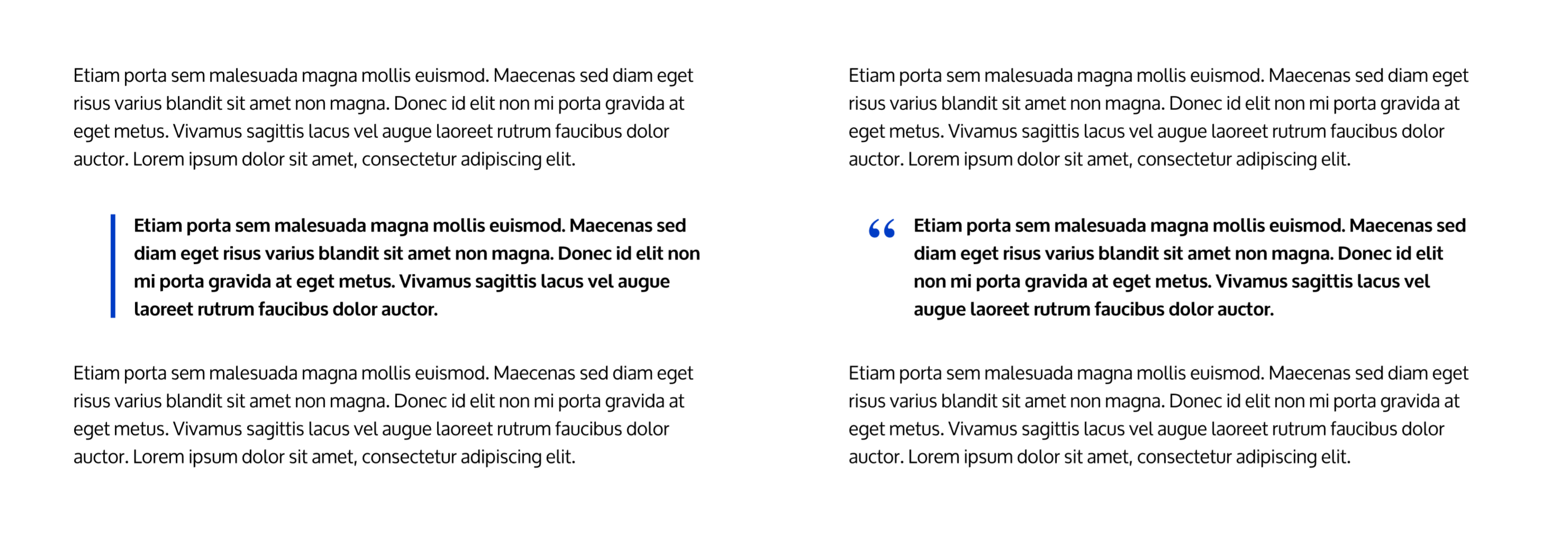
saschaeggiHere are two quick design proposals:
Comment #11
ckrinaI love both of them, thanks @saschaeggi!! If I had to choose though, I'd go for the classical quoted one so we can leave all visual weight & decoration to UI elements that might need vertical lines like groups or tabs.
Comment #12
imalabyaAdded a patch based on the comment from @ckrina. Attached the screenshot below.
It's a new patch so there is no interdiff.
Comment #13
imalabyaNew to patch to add RTL support.
Comment #14
ckrinaThank @imalabya! We discussed @saschaeggi 's design on Slack and agreed on not using bold for the quote itself to visually empathize the quote and use bigger text instead. This way we can still use bold text on a quote.
Here's the design Sascha created:
Comment #15
ckrinaSorry, forgot to change this to Needs work based on the new design.
Comment #16
sakthivel m commented#16 Please review the patch
Comment #17
saschaeggiThe font-size should be 1.25rem
Sorry for not providing any specs yet - I'm currently on vacation 🙈
Comment #18
naveen433 commentedI am working on it
Comment #19
naveen433 commentedFind out the changes in attachment patch files
Comment #20
imalabyaLet's make it round to 3.5
Will need a /* LTR */ to specify that this is overwritten
I saw it in my patch as well, this is not required
This will invert the quote mark in RTL
Comment #21
imalabyaAdded a patch.
Comment #22
chetanbharambe commentedVerified and tested patch #21.
Patch applied successfully and looks good to me as mentioned in comment #20
Testing Steps:
# Go to Appearance -> Set Claro theme
# Create a blockquote post in the body
# Save it
Expected Results:
# Quotations should have appeared for the HTML blockquote Element in the Claro theme
Actual Results:
# Quotations are missing for the HTML blockquote Element in the Claro theme
Please refer attached screenshots.
Can be a move to +1RTBC.
Comment #23
kostyashupenkoSome little clean-up
Comment #24
kostyashupenkoNot sure what to do with font-family for open-quote icon, coz in different browsers this icon can look differently.
For previous comment try to open it in FF browser for example
Also we can't use `initial` value https://caniuse.com/css-initial-value
Ideas ?
Comment #25
volkswagenchickTagging for DrupalCon
Europe2021andnovice. ThanksAdded Steps to validate/reproduce to summary field.
Comment #26
roshanibhangale commentedTesting Steps:
Expected Results:
Actual Results:
Working as expected. Please find the attached screenshot for reference.
Hence this ticket can be moved to RTBC.
Comment #27
roshanibhangale commentedComment #28
lauriiiI think we should remove this. I don't see this font in the designs proposed by @saschaeggi.
Comment #29
yogeshmpawarAddressed #28
Comment #30
yogeshmpawarMoved to Needs Review again for reviewers to review.
Comment #31
dww#29 fixes #28 (which I also pointed out at #8.4).
Overall, the patch now looks good. This seems slightly weird with 4 significant digits:
+ margin-top: 0.6875rem;But I guess that's fine. No real harm, I suppose.
Back to RTBC.
Thanks everyone!
-Derek
Comment #32
dwwHrm, not so fast. Now I'm seeing this:
Comment #33
dwwYeah, if we want to achieve what @saschaeggi posted in #10 and confirmed by @ckrina in #14, we need a
font-familyin here. So maybe the version from #3 is actually better. ;) I don't see the problem that just usingfont-family: serif;gives different results in different browsers (I tried FF, Chrome and Safari), but it's all on my mac, so that's probably not the best test.I think maybe #23 is actually the right patch here now. But maybe @lauriii can re-confirm his thoughts in light of these last few comments...
Comment #34
dwwFor reference, here's what I'm seeing w/ #23 on Chrome, Firefox + Safari:
Chrome
Firefox
Safari
I can't tell the difference. 😉
Comment #35
dwwComment #36
dwwTentatively back to RTBC for #23. Let's see what core committers think now.
Comment #37
alexpott@ckrina @saschaeggi looking at the designs my initial reaction is the with the quote and margin and the font size increase that's a lot of visual emphasis. Are we sure that we should increase the font size as well? I was wondering if the content had multiple quotes and headings whether or not the increase in size would be necessary. I discussed this @lauriii and we agreed to ask this before proceeding with the issue. In isolation it does look nice.
Comment #38
vicheldt commentedI also think the font is too big, also is it really a good idea to leave no <"> at the end of the quotation? I think there should be something to show the end of it, like a slightly different background color or maybe the <"> itself so it's clearer for the users. Thoughts?
Comment #39
vicheldt commentedI added the close quote and it looks like this when i use paragraph


and it looks like this when i use break line
I tried doing the background color differently but it didn't work as i wish it would so i didn't change that, all these changes i did were based on the patch on #23, not the #29, all i need now is the review and test this on other languages and let me know if the font-size should be different.
Comment #40
saschaeggiAlright, I've tweaked the design a bit. Reduced the spacings, also decreased the font-size so that it's only marginally bigger.
Also you'll find all the specifications in Figma now:
https://www.figma.com/file/OqWgzAluHtsOd5uwm1lubFeH/Drupal-Design-system...
Comment #41
vicheldt commentedI still think there should be a close-quote (on a blockquote::after) because it looks incomplete/unfinished, like when you don't put a period at the end of a sentence.
Comment #42
ckrinaThanks @saschaeggi! This will accommodate longer quotes as @alexpott, @lauriii and @vicheldt were suggesting. If a user reaches a limit were it looks weird with so many quotes with this design I'd say it's more a content problem rather than a design one. So +1 to this.
@vicheldt thanks for your suggestion. We chose going just with the first quote as a visual indicator instead of 2 in purpose, and use it together with the extra space to indicate what is a quote without loading it too much with visual information. So it's a classic design patter, we haven't missed it. That's why the blue quote element itself is that big: if we were going to use 2 they should go more on line with the text size and color.
Also, @saschaeggi confirmed on the design specs we should use serif as the font size.
Comment #44
vikashsoni commentedApplied patch #13 in drupal-9.3.x-dev applied successfully
Thanks for the patch ...
For ref sharing screenshot ...
Comment #45
ckrinaNext step here is to implement feedback from #42.
Comment #46
javi-er commentedHi! Here's a new patch addressing #42 and the new design, it was also necessary to define the close quote even if it's not used, otherwise the browser can interpret the second quote as being inside of the first one.
Before:


After:
The font family for the quotation mark is specified as
font-family: "Times New Roman", serif;as it is on the Figma, maybe a--font-family-serifvariable should be added to contain this?Comment #47
saschaeggiVisually it looks good now, thanks.
Now just needs a small code review.
Comment #48
ckrinaNice work @javi-er, thanks!! I totally agree with you about the need to define a variable for
--font-family-serifso it doesn't get defined in other ways in the future (and in other places). I'd say let's add it as--font-family-serif: "Times New Roman", Times, serif;in the variables.pcss.css file.Comment #49
gauravvvv commentedAs per #48,
--font-family-serif: "Times New Roman", Times, serif;font family added to variables.pcss.css file, Attached an interdiff for same. Please review.Comment #50
gauravvvv commentedComment #51
ankithashettyFixed custom command failure errors in #49 by running tests locally, thanks!
Comment #52
dwwThanks for keeping this moving forward, everyone!
Re: patch #51:
Why lowercase
timeshere? Isn't it a proper noun? The other usages in core use "Times". Not sure why this changed here.Everything else looks good to my eyes. If it weren't for this, I'd RTBC.
Thanks again,
-Derek
Comment #53
ankithashettyThe test bot on code-check reported the following error:
Do we need to change it back to uppercase
times?Comment #54
dwwOh okay. Weird. I wonder why bartik's CSS is okay and this isn't. I guess bartik isn't using postcss so we don't notice or care. /shrug
In that case, I think this is RTBC.
Thanks!
-Derek
Comment #55
lauriiiAdjusting credits and uploading Drupal 10 version of the patch in #51.
Comment #58
lauriiiCommitted 11fc6f0 and pushed to 10.0.x. Also committed the patch from #51 to 9.4.x. Thanks!