

Postponed
Project:
Drupal core
Version:
main
Component:
Claro theme
Priority:
Normal
Category:
Task
Assigned:
Unassigned
Reporter:
Created:
5 May 2020 at 00:10 UTC
Updated:
21 Aug 2026 at 10:32 UTC
Jump to comment: Most recent, Most recent file

 Show commands
 changes


Comments
Comment #2
kiran.kadam911Comment #3
kiran.kadam911@dww as per proposed resolution can you please reply on below things for more clarity,
Comment #4
dwwHi @kiran.kadam911. Copying the results of a Slack thread about this.
a) I don't know the details of Claro's design process, so I can't advise on the specific questions you're asking me.
b) Remaining task #2 is "Design what this should look like in Claro." @ckrina said:
c) There's no sense calling this NW or assigned to you, since you're not going to be doing that design yourself. It should probably be "postponed", until there's more progress/agreement on #2625136: Fix label visibility and add wrapper container for exposed numeric/date filters with multiple form elements. That's what I intended with the "[PP-1]" title prefix, but forgot to change the status.
When someone from the core Claro team has a chance to design this and provide some feedback, it could make sense to assign to yourself to implement the design, although it still probably makes more sense to wait for #2625136 to land, since there might be changes there that could invalidate effort here.
Thanks!
-Derek
p.s. Also, since #2625136 isn't going to happen until 9.1.x, this issue should target the same branch.
Comment #5
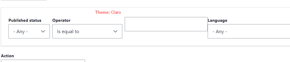
kiran.kadam911Needs design for fields inside fieldset in views exposed filter.
Comment #6
kiran.kadam911Comment #7
dwwComment #8
dpiPP-1 is fixed
Comment #9
bnjmnmFully aware a design does not exist yet -- this patch is intended to help the process, not to impose any design decisions.
Comment #10
dww@bnjmnm - That looks fantastic, thanks!
Code seems fine to me, although I'm not qualified to comment on the Claro-ness of it. ;)
Bumping to NR, at least.
Cheers,
-Derek
Comment #11
slv_ commentedFWIW, I first saw this issue when setting up https://www.drupal.org/project/microcontent. Looks like autocomplete filters with a description below them are worth considering as well for testing this, in case they need specific tweaks
Comment #12
dww@slv_: That's a different problem. This issue is specifically for Claro styles for Views exposed filters that are (as of 9.1.x core) wrapped in fieldsets if they contain multiple elements (e.g. an exposed operator, and/or an operation that requires multiple inputs like 'Is between'). Your screenshot looks like what folks are trying to address at #3116377: Autocomplete input in views exposed filters does not align with select and text inputs
Cheers,
-Derek
Comment #13
slv_ commented@dww ah good, thanks for pointing me to the correct one!
Comment #15
volkswagenchickAdding
NorthAmerica2021andEasy Out of the Boxtags for visibility.DrupalCon NA is April 12-16 with a focus on EOOTB on Wednesday, April 14.
Thanks
Comment #17
sakthivel m commented#9 Patch Failed
Comment #18
sakthivel m commented#18 Please review the patch
Comment #19
sakthivel m commented#19 Fixed Custom command failed issue, Recreated patch
Comment #21
chetanbharambe commentedVerified and tested patch #19.
Patch applied successfully and looks good to me.
Testing Steps:
# Apply claro theme
# Goto: admin/structure/views/view/content
# Scroll down and check the exposed filters
# Save it.
Expected Results:
# User should see input fields properly under exposed filters and should be aligned properly.
Actual Results:
# User is able to see input fields are broken and not aligned as per style.
Looks good to me.
Can be a move to RTBC.
Comment #23
chetanbharambe commentedVerified and tested patch #19.
Patch applied successfully but not working as expected.
Testing Steps:
# Apply claro theme
# Goto: admin/structure/views/view/content
# Scroll down and check the exposed filters
# Save it.
Expected Results:
# User should see input fields properly below the exposed filters and should be aligned properly.
Actual Results:
# User is not able to see "is equal to filter" dropdown field
Not working as expected.
Please check the attached screenshots.
Moving to Needs Work.
Comment #24
bnjmnmThis is now a merge request instead of a patch and here's evidence it works:
Comment #26
abhijith s commentedApplied patch #19 and it fixes the issue with the Claro styling of exposed views filters wrapped in fieldsets.
Before patch:

After patch:

Comment #27
gauravvvv commentedRe-rolled patch #25, fixed cs errors. Please review
Comment #28
volkswagenchickAdding tag for DrupalCon
Europe2021. ThanksComment #29
vikashsoni commentedApplied patch #19 and applied successfully
After patch the exposed views filters in claro theme issue fixed
Thanks for the patch
Comment #31
sokru commentedNot sure if this is scope of this issue, but changing exposed filters from "select" to "radios" will break the layout, so setting "Needs work".

Steps to reproduce:
php core/scripts/drupal quick-start standard/admin/contentand see the label of "Content type" doesn't align with rest of labels.Comment #36
utcwebdev commented#19 patch fails to apply in Drupal 10.1.6 (see new test).
https://www.drupal.org/project/drupal/issues/3133639#comment-14119137
Comment #37
gauravvvv commentedI have attached the patch for 11.x Patch #32, no longer applies so not adding the interdiff
Comment #38
smustgrave commentedIS seems to contain a number of TBD that should be addressed.
Comment #39
shweta__sharma commentedTried to fix failure in #37
Comment #42
prashant.cChanges provided in the patches fixing the issue, removed duplicate code from the https://git.drupalcode.org/project/drupal/-/merge_requests/5811.
Keeping the MR in draft as there is still some work mentioned in #38.
Thanks
Comment #43
prashant.cComment #44
gauravvvv commentedI have updated logical properties in merge request !5811
Comment #45
sokru commentedBased on MR 1134, I added two improvements:
1. Fix alignment of grouped radio filters mentioned on #31
2. Move multi-select operator to top of flex element.
Before:
After:
Comment #46
ckrinaAs commented on Slack, this is more complex that it looks like. We're giving the option to add things to a place that is not designed to have them. If you want to have a field with 5 radio buttons (more than 2 should be vertical), a top bar that is supposed to have horizontal things aligned is not its place. Basically, if we want to convert this search section in a box where anything can be thrown at, that’s not the place. We would need a classic vertical search section or any other modern pattern we can think of. But the top section if designed for quick and simple filters: takes fewer space and it's quick to access.
So my recommendation would be to totally rethink how we give people options, in a way that we can also recommend where to place them and provide that alternative place for complex search. Obviously it's out of scope here, but it's important to point out that this change is breaking the UX.
That said, here are a few design recommendations to make it look less bad in with fields that can be horizontally aligned:
So from this example:

Would become:

Design can't solve much more beyond this. Things like #45 just shouldn't be done in here.
Comment #48
quietone commentedThe Claro theme was approved for removal in #3576460: [policy, no patch] Deprecate and remove Claro.
This is Postponed. The status is set according to two policies. The Remove a core extension and move it to a contributed project and the Extensions approved for removal policies.
The deprecation work is in #3576668: [meta] Tasks to deprecate Claro and the removal work in #3584638: [meta] Tasks to remove the Claro theme.
Comment #49
quietone commented