
 Come together with the global Drupal community in Rotterdam, 28 Sept – 1 Oct 2026. Sessions, contribution, connection, and Early Bird savings until 8 June.
Problem/Motivation
Several places in Claro use the regular size for input fields and take a lot of vertical space.
Proposed resolution
As we have for buttons, we need smaller and more compact input and selects for smaller forms like the content page filter or the people page filter.
The issue was going to implement 3 sizes: normal, small and extra small. But after evolving its implementation we found out we were introducing too much complexity so we decided to use only normal and small variations on the UI, and leave the extrasmall for really specific situations like Views UI.


Input full specs: https://www.figma.com/file/OqWgzAluHtsOd5uwm1lubFeH/Drupal-Design-system...
Select full specs: https://www.figma.com/file/OqWgzAluHtsOd5uwm1lubFeH/Drupal-Design-system...
Remaining tasks
Create designsCreate specsCreate styles for smaller inputs/selects.It should be possible to target a single element by adding a class to that elementIt should also be possible to target all elements within a form by adding a single wrapper class to the form. Although button variants already exist, button CSS will need updating to allow variant-styling based on a parent class such as.form--small- Implement it on views filters, views bulk actions, and block layout. Block layout won't have any visible differences, but refactor so the form itself is styled as extrasmall instead of each element being targeted with the styling.
User interface changes
Some forms will occupy lest space.
Testing instructions
Small size:
Wrapper class:
Filters and bulk operations for the following lists:
- /admin/content (wrapper .claro-form-elements-small) (to test Bulk Operations at least 1 node needs to be added)
- /admin/people (wrapper .claro-form-elements-small)
- /admin/structure/block (wrapper .claro-form-elements-small) > applied to the selects
Direct class in form element:
- Select (.form-element--type-select.form-element--small):
/node/add/page Text format selector under the Body text area.
- Field (.form-element--small)
/node/add/page > manually add the class .form-element--small to the Title field input element (.form-element--type-text).
Extra Small size:
None for now.
| Comment | File | Size | Author |
|---|---|---|---|
| #99 | select-views-modal.png | 47.44 KB | ckrina |
| #99 | file-weight.png | 77.43 KB | ckrina |
| #99 | menu-weight.png | 31.96 KB | ckrina |
| #99 | small-current-implementation.png | 11.38 KB | ckrina |
| #99 | small-input-size.png | 7.28 KB | ckrina |
Issue fork drupal-3083256
 Show commands
Start within a Git clone of the project using the version control instructions.
Or, if you do not have SSH keys set up on git.drupalcode.org:
 changes
Comments
Comment #2
ckrinaHere are the initial designs and specs for this.
Comment #3
ckrinaComment #4
pzajacz commentedUpdated form--select.css and form--text.css with smaller versions of the text field and the select box.
I used the --small and --xsmall flags on form-element class.
It worked for me but needs review/testing, and I think for these two new sizes we need a small and xsmall submit button variations.
Comment #5
pzajacz commentedComment #6
saschaeggiComment #7
ckrinaGreat work @pzajacz! Thanks to your work I've realized we have a small bug on our styles: we have the line height defined for text inputs, but not for selects, which results on taller elements. It's really clear when we see smaller inputs:
I've done a small test and setting a line height for selects solves it.
It'd be also useful to implement the changes on the content/people filter pages so it's easier to test.
Comment #8
ckrinaComment #9
pzajacz commented@ckrina, thank you for your feedback. I'm working on it!
Comment #10
pzajacz commentedComment #11
pzajacz commentedI updated the small and extra small text and select fields.
Comment #12
saschaeggiThe smaller variants should also be used for the actions on the /content page, did you also test that @ckrina?
Comment #13
ckrina@saschaeggi no because the design for that is going to be addressed in #3070558: Implement bulk operation designs and maybe we end up with a different implementation where half of the code is changed. I'd prefer to limit the scope of this one so we get this in and can start opening issues using the variants :)
Comment #14
fhaeberleFixing nits.
Comment #15
saschaeggi@ckrina good thanks :)
Comment #16
pzajacz commented@fhaeberle thanks! :)
@ckrina, please test the patch, and if it's good, it's done.
Comment #17
fhaeberleComment #18
katannshaw commented@pzajacz and fhaeberle: When I tried patch #14, it fixed the extra small fields as seen on the Textarea formatting select screenshot but the content and people filter forms still look like they're using the medium input fields as seen in their screenshots. Please let me know if there's any other testing that I can do to help out.
-Kat
Comment #19
ckrinaThanks @katannshaw! Since this is missing the implementation on the filters I'll change this to Needs work.
Comment #20
huzookaComment #21
pzajacz commentedI added an
ifin theclaro_form_views_exposed_form_alterpreprocess. I don't know that, this is the good solution or not, but it's working now.So, the implemetation of 'small-size' is testable now on these pages:
/admin/content
/admin/people
Comment #22
huzookaThe patch should be re-rolled (we are already in core :)).
Comment #23
martin107 commentedJust a reroll [ it is small enough that I just transferred all the changes between projects ]
This patch is bigger
what is new is that files like
form--text.pcss.css
have a corresponding file in with a name ..
form--text.css
Comment #24
martin107 commentedI am not sure what is going wrong here ... So help would be appreciatedI will also ask on slackWhen I runyarn run build:cssit works only on files inthemes/claro/css/src/components/specifically variables.pss.css does not generate variables.csswhen I try and follow up withyarn run build:css --file themes/claro/css/src/base/variables.pcss.cssis does not function as expected ... hmmplease ignore this as
changes to variables.pcss.css ARE reflected in changes to 'form--text.css'
Comment #25
berdirWhy should this be limited to these two specific pages? Shouldn't all exposed views use this?
Comment #27
ckrinaComment #28
bnjmnmThis builds off the previous patch in #23, but since it was created when Claro's file structure was different, an interdiff wouldn't be particularly useful.
This applies the changes to all views filters and refactors how several values are calculated so there's a consistent method of determining padding, etc for the default and variants.
There's a small change in views-exposed-form.pcss.css that could be argued as out of scope, but is necessary for the submit button to align in views filters. I think this is an acceptable change as views filters are a very good place to do the first implementation of --small variants, and those changes stop this from happening:

There is also a temporary change to in a form_alter() to node forms to make this easier to review. This adds textinput and select inputs of each size to every node form. That should get removed once there's been sufficient manual review.
Comment #29
lauriiiShould we also ensure that autocomplete elements work nicely in the small variation?
Comment #30
bnjmnmAgree with #29.
I also think the selectors should be expanded on a bit so it is possible to make all inputs in a form small/extrasmall by adding one class to the form.
With the current solution, it's only possible to do this on a per-input basis. Also allowing this on a per-form basis will make it easier for contrib developers and prevent the need for many unweildy form_alter() uses.
Comment #31
katherinedThis patch should address 29 and 30. I think I still need to address form buttons though. I matched the autocomplete dropdown to the font-size and padding of the parent field.
Relevant screenshots attached.
Comment #32
katherinedWhoops, I let a composer thing slip through. New patch. :)
Comment #33
bnjmnm.buttoninside.form--extrasmall and .form--smallMay be simpler to just put the class addition in the existing
claro_form_views_exposed_form_alter()There's still a benefit in including the rules that end with classes such as
.form-element--small. This allows the targeting of specific elements OR the entire form. This is useful if there's a need for different sizes in the same form or there are inputs without a parent form (this exists in the wild :) )The additional
.form-elementseems like more specificity than needed, but I haven't tested this manually.It looks like this is changing the default styling to work in a --small form. This should instead get small/extrasmall variants like the other inputs did.
Comment #34
katherinedThanks @bnjmnm!
I think I've addressed 1-4, and 5 was me misinterpreting #29, so I reverted and adjusted the icon in the autocomplete field instead (see screenshot).
I also applied similar small and extrasmall form rules to action links per @bnjmnm's suggestion.
Comment #35
katherinedNew patch with some RTLs I missed.
Comment #36
bnjmnmLooks like some cross-patch contamination
It was decided Claro would stop inlining SVGs in CSS in #3083657: Devise strategy to address several SVG loading+usage issues. Any new SVG background-image styles should reference a file.
For reference, this is being applied to all existing inline SVG usages in this issue: #3085245: Un-inline SVGs in pcss.css files, add build tool to inline them when compiled
Comment #37
bnjmnmAddresses my feedback in #36, and expanded some needed autocomplete RTL rules.
Comment #38
katherinedThese padding-right properties make the autocomplete fields wider and not aligned with text fields in their vicinity.
Maybe adding something in each case like the following would compensate? (I think this does it in this instance):
Current:
With max-width:
Comment #39
bnjmnmGood suggestion in #38
The main patch for this removes the node form override since this is possibly close to completion, but it's still provided in a second manual-review-facilitating patch with the
do-not-testwording so the testbot doesn't bother with it.Comment #40
katherinedThis is looking really good! Though, at smaller breakpoints, the background width adjustment doesn't work, so there will need to be a variation for those. Or, the above changes should only apply to larger breakpoints?
Comment #41
katherinedComment #42
bnjmnmThis addresses #40

In earlier patches, the magnifying glass adjustment also included a fix for a prexisting issue in both Claro and Seven, where an input's content area continues underneath the magnifying glass icon.
What I didn't realize until attempting to address #40 is that this solution does not work consistently at all widths, even after accounting for smaller breakpoints like the scenario discovered in #40
So, the overflow/icon bug will not be addressed here, but I created a followup issue to address it: #3163127: Autocomplete input text can visibly overflow under magnifier icon
This patch also:
form_alter()on node forms to make this easier to review.touchevents. Previously these were only present on.no-touchevents. When using Chrome's device simlulator, the form input sizes would not change. For.touchevents, small and extrasmall both receive the styling for small, as extrasmall would be too small of a target area for touchscreen usersComment #43
bnjmnm@katherined pointed out that small/extrasmall autocomplete inputs do not consistiently match the width of other inputs of the same
size, when at screen widths under 600px. Discovered this was due to the autocomplete wrapper class being set todisplay: inline-block;, which can be removed at narrower widths since the input is supposed to occupy the full width of the form anyway.Comment #44
katherinedI've looked through this in Firefox, Chrome and IE 11, and it looks great in all. I went over the patch, including manually testing a few things I wasn't clear about, and I don't see anything else to comment on.
I've removed the test fields from the patch again, but this patch is otherwise identical to #42. I'm including an interdiff for clarity.
Comment #45
katherinedPer the conversation in #3085245-24: Un-inline SVGs in pcss.css files, add build tool to inline them when compiled, I think we should move the icons to the theme file.
Comment #46
bnjmnmGood catch with #45 - I've kicked back a few tickets for the very same thing and missed it on my own, so thanks for noticing that 🙂.
Comment #47
katherinedI think it's ready!
Comment #48
lauriiiBased on the variable naming pattern documented here https://www.drupal.org/docs/8/modules/claro/claro-css-coding-standards#s..., shouldn't these start with --select-background-image?
Should't these styles be applied regardless of the touchevents to be consistent with the generic form styles?
What is this for? I noticed it has been used before but I couldn't figure out quickly where to test this.
Comment #49
bnjmnm#48.1
Yes, the naming convention needed to be changed.
#48.2
This was building from an existing pattern, but I wasn't aware of what the reasoning was until reviewing #3021094: File field style update. The goal of this was to meet AAA guidelines by having a minimum height of 44px, described in Success Criterion 2.5.5: Target Size. This will need to get accessibliity review, but this patch allows touch devices to get --small styling, but --extrasmall will be styled as --small. The input/select/button height is 32px, which based on informal inquiry seems to be acceptable for applications not aiming for AAA, provided the inputs are sufficently distanced from each other. In addition, for form items with labels above them, the click area turns out to be 44px high at --small. Not allowing some form of smaller form elements on touch devices results in cognitively challening forms due to the limited context available within the viewport, so I'm inclined to adopt an approach that is not-quite-AAA but not so small to be error prone.
#48.3
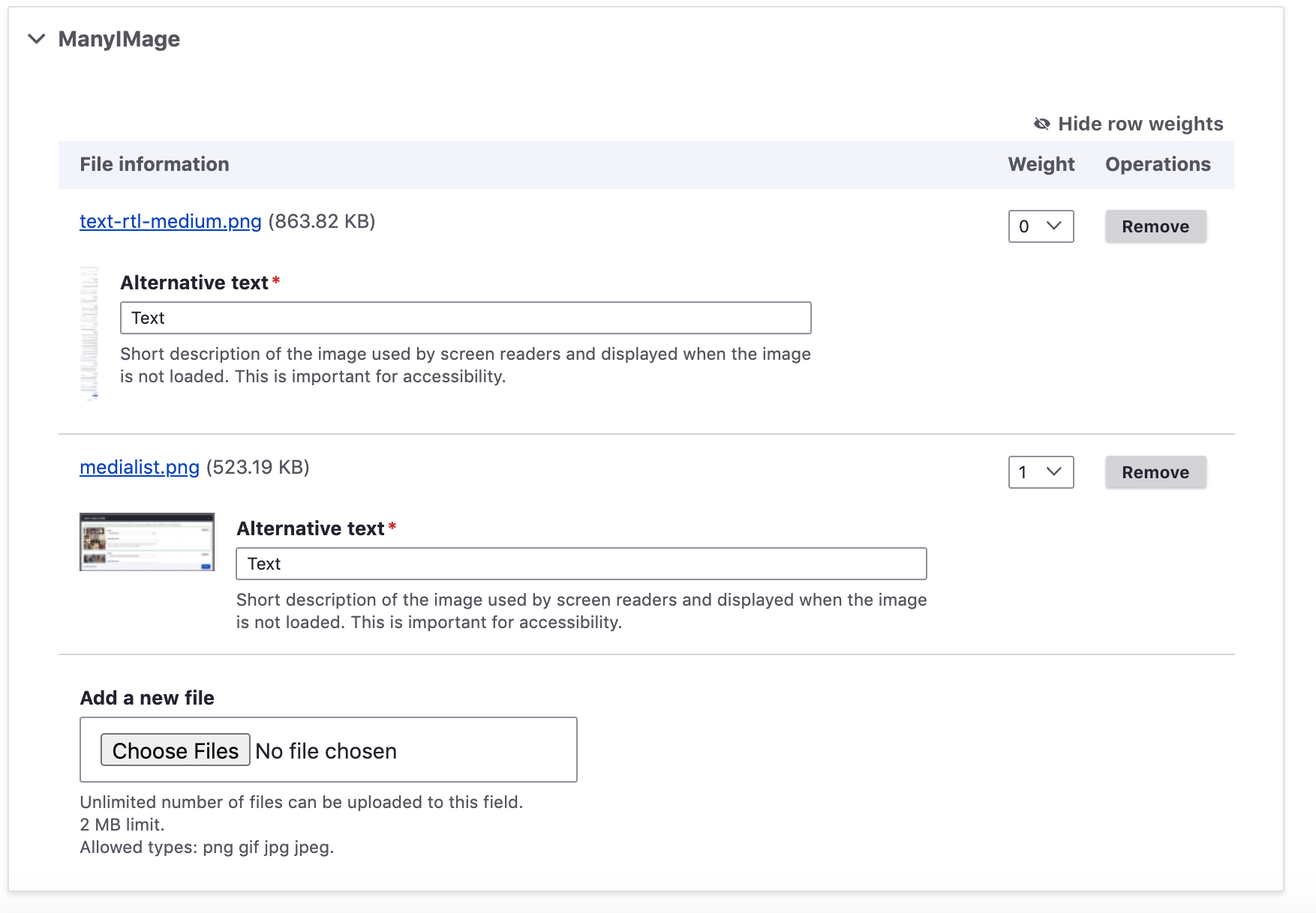
The
.touchevents .form-element[name$="][_weight]"]selector was for targeting the "weights" select field in multivalue file fields. Every element in this widget was targeted individually to make is smaller. This is no longer needed now that this patch provides a.form--extrasmallparent class, which I added to the widget and removed the individual styles.I also added a


.form--extrasmallto the block admin form, which was previously targeting individual items and neglected to include the weights dropdown.Before:
After:
Comment #50
tim.plunkettTagging
Comment #51
bnjmnmReroll since the postcss svg inline build tool has been added.
Comment #52
lauriiiThis won't pass WCAG 2.1.5 (AAA criteria) unless the label can be counted to the target size. The criteria is not explicit on that and I asked @andrewmacpherson on Slack and he wasn't sure either, but he said that it probably should be taken into account when measuring the target size.
However, there is a WCAG 2.2 draft which adds a new criteria 2.1.8 which is an AA requirement. It has slightly relaxed rules compared to 2.1.5 so that space between elements can be taken into account when assessing the target size. I think the current design and implementation passes that criteria.
From my point of view, at least with the current usages of the extra small variation, it seems we have a large enough target size even though we aren't necessarily compliant to a strict interpretation of the WCAG 2.1.5.
Comment #53
bnjmnm#52 Addresses my accessibility concerns, particularly since this included a discussion with an accessibility maintainer. The new criteria 2.1.8 in draft 2.2 puts me at ease regarding future AA compliance. I had also been under the assumption that labels would be included as part of this height. It hadn't occurred to me until now that factoring labels into target height is not formally defined/refuted, but glad to see that the more-credible @andrewmacpherson had a similar suspicion that it would be.
Comment #54
katherined1. It looks like this pattern should be applied to dropdown buttons too?
2. I'm not 100% sure why this is changed, but I can see why it would be a good idea to leave this up to the various forms instead of making these buttons extrasmall everywhere. But then maybe the single file upload needs a template override?
Comment #55
andypostWould be great to be able to apply to big tables
Example in #3167829-3: Remove columns with %
Comment #56
katherinedComment #57
bnjmnm#54.1 Yep, even if it wasn't in the issue summary, dropbuttons need to be included as they'll be sharing forms and table rows with small/extrasmall variants. Not matching them makes the UI feel broken. On touch devices, the toggle button has an increased width of 44px on small/extrasmall so it's a sufficient target size. Screenshots of every possible variation I can think of attached. To test the variants manually, I provided a dropbutton-markup-for-testing.txt which can be pasted into any page that loads the dropbutton library. This has all size variants, both the specific classes and the form--small, form--extrasmall wrapper classes. Obviously the JS won't work for this pasted-in markup, but it displays everything that was restyled in the patch.
#54.2

The change was made because the weight dropdown (only present in multiple item widgets) was already set to extrasmall, so the wrapper was changed so the adjacent form elements match. When multiple items are present it also seems beneficial to save space overall so the list of items doesn't overwhelm the surrounding context.
I opted to not do this for single item widgets because there is no weight dropdown that needs to be matched with, and there's less need to conserve space when only a single item is present.

Comment #58
katherinedI just found a few small things testing in Chrome, Firefox and IE 11.
1.
Looks like the dropdown/adjacent menu items also need this margin. Something like
.form--extrasmall .dropbutton__item:first-of-type ~ .dropbutton__item > inputIn IE 11, the default and small variants also have a similar, additional issue.
2.
Missing .touchevents small variants. The dropdown menu items will still get the default styles on touch devices.
3. The extrasmall variant jumps a bit/widens when the menu item is wider than the button:
Comment #59
bnjmnm#58.1 fixed
#58.2 Addressed a bit differently. That made me realize that the list items did not have sufficient height for touch device accessibility, so .touchevents dropbutton items now get the same style regardless of variant. The button itself can afford to be a bit smaller as surrounding space can (probably, no official spec exists yet) can be factored into the target region. The list items are adjacent, though, so they should be at least 44px high.
#58.3 This is one of the quirks dropbutton is most famous for, and among the reasons it's getting replaced with splitbutton 🙂 It happens more often on smaller variants since less word is needed to exceed the padding + toggle. #1890266: dropbutton text fails to retain .dropbutton-widget width
Comment #60
bnjmnmComment #61
katherinedThis is a small thing:
duplicate line
And I'm still seeing seeing something like this in IE, on all sizes (and I'm not even sure it's a deal-breaker):

Otherwise, it looks good! I love the approach for #58.2.
Comment #62
bnjmnmThis patch removes the duplicated line
The IE11 issue happens in HEAD as well, so out of scope in this patch. I filed an issue for it.
#3169141: IE11: background is visible in space between secondary dropbutton items
Comment #63
katherinedThank you! You've fully addressed everything I have seen, so marking as RTBC.
Comment #64
lauriiiWe should expand this to other tables. I would be fine if that was done in a follow-up.
The 2.75rem width makes the toggle look misshapen. I think we should implement this according to the designs here. We could try to make the dropbutton/splitbutton AAA compliant in a follow-up.
Is this still needed now that buttons are rendered using small variant on touch devices? I'm not saying that it wouldn't make sense to have this rule but that the reasoning might not make sense anymore.
Comment #65
bnjmnm#64.1 Created followup #3169690: [PP-1] Add form--extrasmall class to forms with operations dropbutton
#64.2 Wide toggle removed, followup created: #3169699: [PP-2] Investigate touch-friendly target size for dropbutton/splitbutton toggle
#64.3 Good call, that is no longer needed and it is now removed.
Comment #66
bnjmnmIt was pointed out in #3029675: Add support for the inline variation of form elements that a wrapper class used for styling all form elements was applying a modifier a nonexistent base class. That concern also applies to the
.form--smalland.form--extrasmallwrapper classes applied here, so those have been changed to classnames without a modifier.Comment #67
lauriiiNow after these changes I'm wondering how strictly we should follow the BEM guidelines. It feels like the form level size and inline variations would go against the principles of BEM.
http://getbem.com/introduction/
It's certainly a nice to have feature, but it does add some complexity to the CSS. I'm certainly not sure which way is better so I'd love to hear what others think.
Comment #68
katherinedThe patch in #66 looks good to me, and I'd say it's ready to RTBC again, pending any additional thoughts on the BEM approach.
If we're not strictly following the spirit of BEM, then I don't have a strong preference either way, but I do have a slight preference for the most recent change now that I see it.
form-elements-smallseems a little more precise, and it's consistent with the latest patch in #3029675: Add support for the inline variation of form elements, so I'd probably leave it as-is.Comment #69
bnjmnmSee #3029675: Add support for the inline variation of form elements for an explanation regarding why I see the benefit of slightly deviating from BEM by providing wrapper classes for that would style all elements inside a form.
Comment #70
katherinedThe very thorough explanation in #3029675: Add support for the inline variation of form elements is enough to convince me, and in particular, the current approach prevents the need for excessive form alters on things like the media library specifically, or any other form displayed in a dialog.
I also especially appreciate addressing the benefit to contrib maintainers:
Comment #71
tanubansal commentedTested #66 and looks good on 9.1
This can be moved to RTBC
Comment #72
katherinedPer @lauriii in #3029675-48: Add support for the inline variation of form elements, we should proceed here with this issue, but also follow up here: #3170928: Add form variants to the Form API and #3170933: Use Form API to implement form variants
Comment #73
bnjmnmThis takes care of the final suggestion from [#13822587-13822587]
Comment #74
bnjmnmFixed typos from previous patch.
Comment #75
katherinedEverything I've seen has been fully addressed. Marking as RTBC. :)
Comment #76
lauriiiThe patch adds few usages of the small variations of form elements and it feels like some of the pages become inconsistent because different forms / sections of forms use different size variation. For example, multiple file upload is now using the small form elements which could be placed in node form where rest of the form elements are using the normal variation. Also, the views filters are using the small variation, but bulk operations are using the normal variation. Should we at least provide more guidance on how different variations should be used?
I’m also wondering if we should prefix these utility classes with
claro-for now to make it explicit that they are specific to Claro.Comment #77
bnjmnmThe issue summary has been updated so it documents all things that are changed. The multiple file element widget is no longer being changed in this patch, nor are the styles that target
[name$="][_weight]"]selector as those must be present to keep the extrasmall styles on the multiple file widget if the wrapper class isn't used.This expands the small form element styling to the views bulk operations form as suggested in #76
This also adds the claro- prefix to the wrapper classes.
Comment #78
lauriiiDiscussed this with @ckrina and @katherined at length yesterday. The concern with 3 variations is that it requires very strong rules around where each of the variations should be used because when the variations are used incorrectly, it can make elements look unproportionate. For example, the button looks extremely large compared to the select:
Another example of this can be seen with #74 applied. In this example you can see all different size variations on a single page:
I was curious to know how other design systems define how their size variations should be used. I looked at Carbon, Material UI and Bootstrap and I didn't find any examples of size variations from them.
This made me wonder why do we need three variations of form elements if the competing design systems only define one. I didn't come to conclusion on that, but I started wondering if some of it was due to the normal variation of the form elements being too large for most use cases outside of the entity edit form, and if the solution should be to make changes to the default variation so that it could be used variety of use cases.
Comment #79
bnjmnmComment #80
bnjmnmPerhaps someone who was present for the discussion in #78 can clarify what next steps should be (or at the very least, what next steps have been ruled out)?
The two types of approaches that come to mind fall into two broad categories:
Was one approach or the other determined to be the preferred one? If there was no clear preference, I suppose that will need to be figured out to unlock the multiple stable blockers currently depending on either this or an equivalent solution.
I'm partial to the second approach since Claro is not currently Stable nor does it have a BC promise and the postponed issues wouldn't need to wait on potentially lengthy design discussions. This opinion may also be influenced by the amount of time I put into the issue so far, so my objectivity is debatable.
Comment #81
lauriiiAs far as I know, @ckrina is working on new design spec that would reduce the size variations to two. We are planning to discuss this again tomorrow on the Claro weekly meeting. I'm hoping that after the meeting we have clarity on how we should proceed on this issue.
Comment #82
bnjmnmHere's a version with two variants instead of three, as discussed. From a brief manual review, it seems like extrasmall may not be needed. It's possible something like Views could require it, but Views already needs a decent amount of custom styling. A nice advantage of this approach is every variant is tall enough for touchscreen, provided there is whitespace above/below.
I still get the feeling that the default form input sizes could still be a little smaller, but that possibility has more to do with my personal preferences.
Comment #83
katherinedThis looks pretty good! I just found a few things.
1.
Missing RTL
This should be restored.
2. Remove "extrasmall" in a few places:
3.
This can be removed
Comment #84
bnjmnmThe changes here are based on #83. I made these changes in hopes of advancing the issue, but it should be noted that the requirements of the issue haven't "officially" changed and this should be viewed more as a proof of concept to help confirm the new approach is a good one.
This should get an issue summary update with the new agreed-upon specs before any additional reviews happen, so those reviews can be checked against the current requirements.
Comment #86
fhaeberleComment #87
volkswagenchickAdding
NorthAmerica2021andEasy Out of the Boxtags for visibility.DrupalCon NA is April 12-16 with a focus on EOOTB on Wednesday, April 14.
Thanks
Comment #88
ckrinaUnassigning since the designs already have the 2 main variants done, and keep the extrasmall for specific situations like the select below the text area.
Comment #91
bnjmnmComment #92
sakthivel m commented#84 Patch Failed
Comment #93
sakthivel m commented#93 Please review the patch
Comment #94
gauravvvv commentedAttached patch. Added interdiff for same.
Comment #95
gauravvvv commentedComment #96
gauravvvv commentedComment #97
volkswagenchickTagging for Design4Drupal 2021. Contributions are Friday, July 22
https://design4drupal.org/
Comment #98
volkswagenchickCorrecting tag Design4Drupal2021
Comment #99
ckrinaAfter trying the patch I have a few things that might need some CSS changes:
1. Looking at the form elements next to the button the height is different and the form elements height should be decreased. Maybe changing
line-height?. See an screenshot from the /admin/content, but it can also be seen in /admin/structure/block:The specs on Figma define the height as 32px:
But it ends up being bigger:
Also I have a few questions, not necessarily something that needs to block this issue:
2. The Weight column on table drag uses the Small variation in some places, but not on all of them, like /admin/structure/menu/manage/admin?destination=/admin/structure/menu.
2b: Also. it is implemented on the multiple Files/Image draggable table but the buttons in there don't. I guess they'll be addressed in a follow-up? After reading all comments, I'm not sure what happened after #57.
3. Not sure if this one should be fixed on this issue, but the filters inside the views preview (
.views-exposed-form--preview.views-exposed-form--preview) are still the normal size ones (/admin/structure/views/view/comment).4. Also on views, the Select on the top of the modal doesn't has the background well placed (/admin/structure/views/view/comment):
5. The color used for the magnifier isn't any of the ones defined on the gray scale. Maybe this can be a follow-up to update all the icons color &folder naming?
6. One final question: I think on the designs we defined the
extrasmallsize for the Text format field below the Body (text area) after the discussion from #78. I'm OK moving into a follow-up, specially taking into account that it shouldn't be used anywhere else unless there's a very exceptional need, or even changing the designs if we agree on it to ease the implementation.Comment #100
volkswagenchickAdding tag for DrupalCon Europe 2021. Thanks
Comment #101
volkswagenchickAdding tag for DrupalCon Europe 2021. Thanks
Comment #103
kristen polTagging for Global Contribution Weekend since this only needs minor CSS work to get this over the finish line.
Comment #105
stefdewa commentedI assumed the changes had to be rebased onto 9.4.x because that is the current active development branch. I did that, force pushed and thus added 1000 commits... That broke the MR and I can't change the MR destination branch (from 9.3.x to 9.4.x) so I rebased the changes on 9.3.x, force pushed and the MR is mergeable again. Sorry for the issue noice -_- .
Comment #107
gauravvvv commentedComment #110
miro_dietikerWhen polishing the Paragraphs UI from Claro, we realized that the Core extrasmall button component has inconsistent height padding that makes these buttons inacceptably tiny (both top and bottom vertical padding 3px instead of 5px or 6px.).
The proposal here fixes this problem. I would love to see extra small buttons cleanly implemented by Core.
Comment #111
mgiffordI think this is a WCAG 2.5.1 issue as per https://knowbility.org/blog/2018/WCAG21-251PointerGestures/
WCAG 2.1.5 and not 2.1.8
https://www.w3.org/WAI/WCAG21/quickref/?currentsidebar=%23col_overview
https://www.w3.org/WAI/standards-guidelines/wcag/new-in-22/
Comment #113
finnsky commentedGonna work on it.
Comment #115
charles belovExtra-small creates usability/accessibility issues for me. I created #3412439: Give users option to override Claro --font-size-xs and --font-size-xxs with --font-size-s, which I believe would also apply to the current issue.