Originally submitted on Github
Problem/Motivation
Recent interviews and research exposed pain points around Drupal's admin experience of looking and feeling dated, especially compared to our competitors, and universally cited that choosing a more modern-looking admin theme instantly led to Drupal being better-perceived by said users.
There was an amazing community effort to Create a Style Guide For Seven that vastly improved its look + feel compared to the original, but Design best practices and Drupal functionality have moved on since then.
Proposed resolution
Implement new field cardinality styles to create a favorable first impression of Drupal for evaluators and a better user experience for site authors. No functional differences.
Specification
Quick overview
This image is just a quick overview of the Field Cardinality specs. Please use this Figma link to the full specification as the main resource for specs.
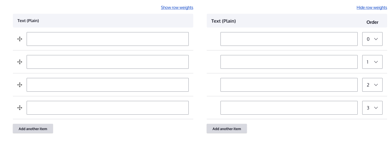
Full specification
FIGMA: https://www.figma.com/file/OqWgzAluHtsOd5uwm1lubFeH/Drupal-Design-system...
This link is anchored to the board with the full specification. As an anonymous user you can see the design, but to actually be able to pick colours and sizes please login to Figma.
Remaining tasks
- Accessibility review
- RTL review (Right to left)
User interface changes
All field cardinality styles will be changed, no functional differences.
Test Pages
/admin/structure/types/manage/article/fields/node.article.field_tags/storage (?)







Comments
Comment #2
saschaeggiComment #3
ckrinaComment #4
evankay commentedComment #5
evankay commentedComment #6
evankay commentedComment #7
bnjmnmComment #8
huzookaThis issue still depends on #3032365: Table drag style update and table styles.
And I think that when those are ready, this wont need any further action.
Comment #9
bnjmnmMost of my efforts for this issue this were in the scope of #3032365: Table drag style update, which I didn't spot as I was filtering by the Code component. I added a patch to that issue, which has a few changes that are specific to the scope of this issue. I can pry those apart as needed.
Comment #10
bnjmnmComment #11
lauriiiTable drag has been committed. This is now unblocked.
Comment #12
finnsky commentedComment #13
finnsky commentedNot sure if tables headings should be managed in this issue. So keeped it as is.
Comment #14
katriencLooks great.
I tested it and it now looks like this:
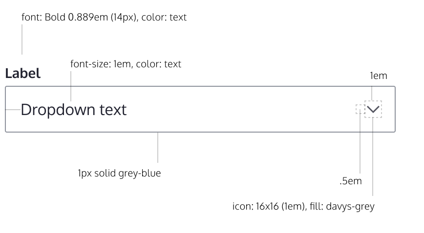
1. Shouldn't it been better that there would be more space between the text and the arrow down ? (between -10 and the arrow at the screenshot) On screens lower than 600px you don't have this problem. It also appears on the other selectboxes as well like this :
and
2. when you use the handler to sort the records the background color will be yellow so you can easily see that the record have changed.
You do not have that feature when you change the option from the select box, buts thats maybe out of the scope of this issue.
Comment #15
fhaeberle@lot007 I think the negative values causing less space in the select box isn't covered by the design yet and needs a review/little rework in case of design. I tried to get the spacings out of Figma but it isn't that clear how the values should be positioned.
Comment #16
lauriiiI think #14.1 has to do more with the pre-existing select implementation and designs. Maybe it should be discussed in another issue?
#14.2 also seems out of scope.
I'm wondering if we could make the rows that have been changed look a bit nicer. Currently, the asterisk is pushed on a new line which doesn't look too great:

Comment #17
lauriiiMoving to needs work for #16.
Comment #18
ckrinaThe spacing for the select was defined but probably not highlighted enough, but just on the select component itself. There should be a distance of 8px/0.5em between the arrow and the text content.
Comment #19
ckrinaAnd +1 to what @lauriii says on #16 about the asterisk. Everything should be center-aligned and nothing apart from text should jump into a second line.
Comment #20
lauriiiI tried to make some progress on this but I think we have to make some adjustments to the designs.
Here's how this looks at the moment:

abbr[title]elements that leads into double border (border + underline). I added override to Claro to remove text underline so that only border exists. This border has been then overridden in our table drag styles since the border doesn't look too useful in this particular use case.I found one more issue with the design which is that on entity reference fields, the loading animation doesn't have enough space to properly render the loading text above the input element. This becomes even worse after #3054689: Implement green focus ring on text field has been committed. We should update the designs to take this into account.
Comment #21
huzookaIn review.
Comment #22
huzookaInstead of making the
formcomponent too big, please create a standalone asset for theming multiple field markup.This will look really odd if we have some description for the field (btw design does not have an example for the description...)
Comment #23
huzookaUpdate for the description: https://monosnap.com/direct/QA3pZe1O6y46B776RitGV9kV73C21T
Comment #24
huzookaTest module with multiple text fields added to CD Tools: https://github.com/zolhorvath/cd_tools/releases/tag/1.10.0
Comment #25
fhaeberle@huzooka Did somebody already taken #20.4 into account (missing space)? We have a fix for it here, but don't know if that's the right issue for that fix.
Comment #26
huzookaComment #27
huzookaPatch of the current state attached.
Comment #28
huzookaComment #29
huzookaWhat happened since #20:
cd_tools:fieldcardinalitywithout a Toolbar, the small button variant wasn't in action because the lib was added only if there was a<button>element on the page.vertical-tabs.jsreplacement: on IE11, the '_slicedToArray' shim (added by the JS build process) for handling destructured arrays broke IE11. I disabled that rule ant went back to the inherited variable assignment style.Since our tabledrag functionality has changes, I've tested this new patch on multiple pages:
/contact/field_cardinality_test, provided bycd_tools:fieldcardinality./admin/structure/taxonomy/manage/tags/overview.l/admin/structure/types/manage/article/form-display(orl/admin/structure/types/manage/article/display).Comment #30
lauriiiLet's reference to https://github.com/babel/babel/pull/8947 here.
We should probably remove the hover effect from the disabled table drag.
The table drag handle column doesn't look great when viewed on a wide screen.
Comment #31
huzookaComment #32
huzookaAddressing #30.
Comment #33
lauriiiI'm not sure if we actually want to make this a heading since this affects accessibility.This is already a heading 😲 Let's not do anything for this now but we should figure out if this actually should be a heading.
Should we check if the attributes object exists?
What use case is this solving?
It seems that the RTL styles are missing
[dir="rtl"]from the selector and that the properties are a bit inconsistent.🧐 Nit: let's use the @see syntax here.
There's a regression on other table drags. Before the patch, the vocabulary name is displayed on one line, but after this patch, it's on two lines.
Comment #34
huzookaComment #35
huzookaComment #36
lauriiiJust did some very quick testing with the latest patch. It seems to work more as I expected, but when the table drag has been moved, the asterisk is rendered very close to the field:

Comment #37
huzookaRe #36:
What is the expected spacing?
Since we have some issues because of our font sizes are big enough (it's a good and useful thing imho), I think that it is always a good idea to save some space wherever it is possible.
(BTW my recent patch addresses everything except this, but I will add my reactions for #33 a bit later, from home - I'm on a tram right now.)
Comment #38
lauriii@huzooka Maybe something similar to what I proposed in #20?
Comment #39
huzookaRe #38: What about something like this?

Visual diff on mobile:
Re #33:
template_preprocess_table():Comment #40
lauriiiThere's a regression on the focus styles.
Before:

After:

Comment #41
huzookaComment #42
huzookaI just checked this in IE11 and it lets the inline
<svg>to be focused with keyboard.I move this drag handle to a background-based solution.
Comment #43
huzookaComment #44
lauriiiIf we use the background-image it results into no icon at all on the IE 11 high contrast which makes tabledrags unusable. 😕Can we think of any other approach?
Comment #45
fhaeberleTalking about the background image is striped out in IE11 HC-Mode: Maybe we can learn from this thread?
https://github.com/twbs/bootstrap/issues/21269
They discuss about replacing the svg with 'text' content (could also be a symbol?) in css.Doesn't work because isn't translatable.Another possibility would be to deliver the svg (inline?) with
content: url()Comment #46
huzookaComment #47
lauriiiWe can't really replace it with text in CSS since that needs to be translatable.
Comment #48
huzookaRe #44:

The previous drag handle was also the same on HC (screenshot with #20):
Comment #49
lauriiiLet's open a follow-up to address this
Comment #50
huzooka+ I've to document my new additions to Claro's tabledrag.js replacement (and open the related FR to core).
Comment #51
huzookaComment #52
huzookaAdded the needed docs about the tabledrag-improvements added since #20.
Follow-ups:
Comment #53
huzookaFound some smaller bugs while I was generating the screenshots.
Comment #54
huzookaComment #56
lauriiiThis looks good! Thank you for generating the screenshots and thanks to everyone who has helped on this.
Comment #57
saschaeggiComment #59
saschaeggi