Originally submitted on Github
Problem/Motivation
Recent interviews and research exposed pain points around Drupal's admin experience of looking and feeling dated.
Proposed resolution
Implement new table styles to create a favorable first impression of Drupal for evaluators and a better user experience for site authors. No functional differences.
Specification
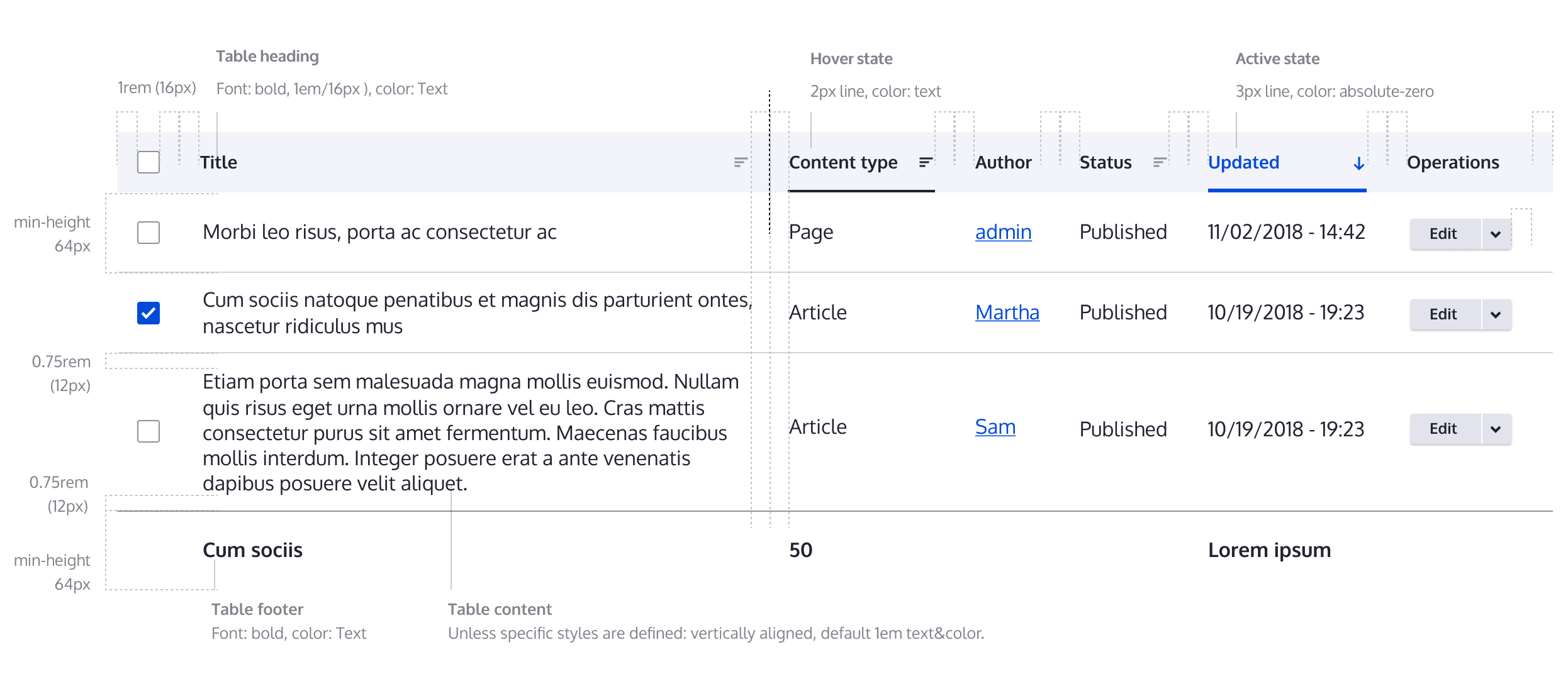
Quick overview
This image is just a quick overview for Table list specs. Please use the Figma link to full specification as the main resource for specks.

Color palette
Quick overview
FIGMA: https://www.figma.com/file/OqWgzAluHtsOd5uwm1lubFeH/Design-system?node-i...
This link is anchored to the board with the full specification. As an anonymous user you can see the design, but to actually be able to pick colors and sizes please login on Figma.
Remaining tasks
Create new design- Update patch with new styles
- Accessibility review
- RTL and LTR review
User interface changes
All Table styles will be changed, no functional differences.
Test Pages
- /admin/content
- /admin/content/files
- /admin/content/comment
- /admin/people
- /admin/reports/dblog
- /admin/structure/block/block-content/manage/basic/form-display


Comments
Comment #2
ckrinaComment #4
ckrinaCrediting @antonellasevero as she initially created the issue on Github.
Comment #5
ckrinaComment #6
antonellasevero commentedComment #7
ckrinaComment #8
huzookaComment #9
saschaeggiComment #10
huzookaAttaching Seven screenshots as a reference.
Comment #11
huzookaMissing:
* Tabledrag (example: Field UI form)
* Available translation updates table (
/admin/reports/translations)* Extend / Uninstall table (
/admin/modules,/admin/modules/uninstall)*
warninganderrorstates of table rows (/admin/reports/updates)Comment #13
huzookaComment #14
huzookaComment #15
huzookaComment #16
huzookaComment #17
huzookaComment #19
huzookaComment #20
modulist commentedhttps://www.drupal.org/files/issues/2018-12-03/table.png
Increased row height
An increased row height will display fewer items per screen and require more scrolling, creating a greater cognitive load for some users.
Recommendation:
Provide an affordance to choose alternative settings for table cell padding to vary the row height, like Gmail's Comfortable/Cozy/Compact settings.
Comment #21
modulist commentedComment #22
ckrinaThanks again @modulist! I think it's a really nice feature to have, but to not block this basic table theming issue I've created a new one to address it and improve the implementation: https://www.drupal.org/project/claro/issues/3026547. Feel free to post further comments there :)
Comment #23
ckrinaComment #24
Kami Amiga commentedShouldn't these values be converted in rem ?
Cannot the differences of values between the width and the viewport be a problem ? (alignments for instance)
Comment #25
huzookaComment #26
huzooka#24.1: Done.
#24.2:
Comment #28
huzookaComment #29
lauriiiWhere has the hover effect come from? It is not described in the design system. We should either update the design system or change the implementation.
Comment #30
lauriiiHere's a screenshot of the hover effect for anyone wondering:
Comment #31
lauriiiComment #32
huzookaFrom https://www.figma.com/file/OqWgzAluHtsOd5uwm1lubFeH/Design-system?node-i...
Comment #33
lauriiiThank you for pointing that out. I must have missed it somehow 😇
There was some discussion on Slack and as a result, @saschaeggi and @ckrina changed the styles for hover and active states of the sortable table headers. We should implement that change before committing this.
Comment #34
saschaeggi@lauriii about the hover state, see the specification below:

Cheers
Comment #35
huzooka#33 #34 This is already implemented.
Comment #36
huzookaComment #37
huzookaComment #38
huzookaComment #39
huzookaComment #40
lauriiiGood job on testing this with both versions. We should add a @todo to remove this after 8.6.x is out of support.
If we provide
th--sortableclass, we should havethclass as well. Maybe it could be changed to something likesortableorsortable-headinginstead?Did you consider adding class to the link itself? It seems like it could be done in the template.
For the hover state, this should 2px.
Comment #41
huzookaComment #42
huzooka#40.1 Done. I also switched comment styles.
#40.2 It's
sortable-headingfrom now.#40.3 It's theoretically possible.
The problem is that we should completely refactor Views table implementation (eg remove
column.urland generatecolumn.contentas a link renderable) and since it's impossible to generate a query-only url what views provides there, I'm afraid of having issues in that case.#40.4 I don't think so.

Comment #43
lauriiiIt seems like it wasn't updated everywhere. If you look at the component spec, it has a clearer explanation of the design:

Comment #44
huzookaomg... I always miss something :/
Comment #45
huzookaComment #47
huzookaComment #49
saschaeggi@huzooka there is another thing we should add. The Highlight color (hover) for the table row. See https://www.figma.com/file/OqWgzAluHtsOd5uwm1lubFeH/Design-system?node-i...

Sorry for that!
Comment #50
huzookaSeven provides a bg color for a selected table row, don't we want to do something equivalent?
Comment #51
saschaeggiYes we want to do something similar. I've added the active state.

See https://www.figma.com/file/OqWgzAluHtsOd5uwm1lubFeH/Design-system?node-i...
Comment #52
huzookaComment #53
huzookaHover + active state updated.
New 'after' screenshots attached.
Comment #55
huzookaComment #56
lauriiiThe active column is missing background on active rows:
Comment #57
huzookaComment #58
huzookaComment #60
huzookaComment #61
huzookaComment #62
huzookaComment #64
huzookaComment #65
huzookaComment #66
huzookaComment #68
huzookaComment #69
huzookaThe recently applied autocomplete patch contains the improvements of this issue.
Comment #70
andrewmacpherson commentedRemoving the needs accessibility review tag, I think @modulist's proposal in #20 is great, and it has a follow-up issue filed.
Comment #71
huzookaComment #73
huzookaComment #74
andrewmacpherson commentedA couple more feature requests to make the table styles more future-proof. The patch here is already quite big so I made them follow-ups to this.
Comment #75
huzookaWhy needs work?
Comment #76
andrewmacpherson commentedNo idea, wasn't intended. I might have had the form open at #72
Comment #77
lauriiiOne more problem I could find is that the tabledrag handle is not aligned with text in a table row:

Comment #78
huzookaI don't really see the advantages of re-arranging the tabledrag handle until we miss Table drag styles (especially only the dragging and the last-dragged colors are missing if we can assume that the handle icon is final here).
Comment #79
huzookaAnother follow-up for table drag: #3032365: Table drag style update
Comment #81
lauriiiThis looks good now! Thank you!
Comment #83
idebr commentedThis changes causes some admin modals to display over the full viewport width. I have filed #3021388: Table style update to fix this.