
Closed (fixed)
Project:
Claro
Version:
8.x-2.x-dev
Component:
Code
Priority:
Normal
Category:
Task
Assigned:
Unassigned
Reporter:
Created:
1 Jan 2019 at 19:07 UTC
Updated:
21 Oct 2019 at 08:24 UTC
Jump to comment: Most recent, Most recent file


Comments
Comment #2
saschaeggiPostponed due to missing final specs.
Comment #3
ckrinaComment #4
ckrinaReady to start working on a patch here. Thanks @archita-arora for all your work on the design!
Comment #5
ckrinaCrediting Antonella too :)
Comment #6
ckrinaComment #8
ckrinaComment #9
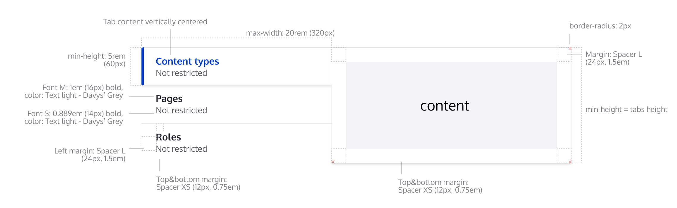
andrewmacpherson commentedThere's a line separating the 2nd and 3rd tabs (Pages and Roles).
What colour is that? The image doesn't say.
The separator between tabs needs to have 3:1 contrast to satisfy WCAG 1.4.11 Non-text contrast.
Comment #10
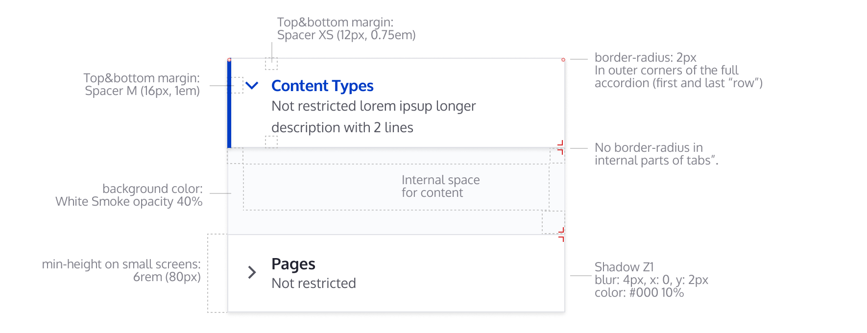
andrewmacpherson commentedIn the second picture, what is "background-color: white smoke" for? Does it signify any information or state?
Comment #11
quironThis is still in WIP, but you can check the progress status with this patch.
@ckrina, can you provide some indications about the :hover and/or :focus please?
Comment #12
quironComment #13
fhaeberle@quiron Your progress is great, thanks! Suggesting to use pseudo element(s) for either the blue border or the gray ones to not get in conflict with the overall border styling see picture #1. Also, we have to care about accessibility, see #2.
#1

#2

Comment #14
fhaeberleComment #15
fhaeberlePushed this forward! I focused on fixing the overall styling and behavior of the vertical tabs and getting the basics right.
We still have to check the details provided by Figma (colors, paddings, font-size etc.), I applied some of them already on the way.
Comment #16
lauriiiI asked for designs for focus and hover of the tabs from the design team. Tagging this issue accordingly.
Comment #17
rosinegrean commentedComment #18
ckrinaI've updated the designs for the hover and focus styles on the Figma file, both for mobile and desktop variations. Is this doable with the existing markup? Here's an screenshot, but please use the Figma file as the reference since this can become outdated after some iterations.
Comment #19
ckrinaComment #20
fhaeberleComment #21
fhaeberleI added the missing hover style, focus is already enabled like it's designed above. I put the vertical tabs "title" in blue color (on hover) because of consistency with the detail boxes which also have a blue title on hover. Let me know if that's wrong.
Comment #22
fhaeberleComment #23
fhaeberleFixing stylelint error.
Comment #24
fhaeberleNote: We don't have the accordion behavior on small devices (or any width based change) yet so setting it back to needs work.
The accordion designed for the vertical tabs on small screens isn't possible with the current markup I think.
We have to render the content with the details element to achieve this. Any other ideas?
Comment #25
andrewmacpherson commentedHas #9 been addressed yet?
Comment #26
huzookavertical_tabstest module added to Clarodist Tools!Comment #27
huzookaI'll continue this.
Comment #28
huzookaComment #29
bnjmnmComment #30
bnjmnmComment #31
bnjmnmThis patch adds the mobile designs. This required quite a bit of work for a number of reasons:
Setting to needs review, because it definitely should be looked at by someone else, but there are still some outstanding items:
The comments in the code should hopefully make it clear where these changes were applied.
Comment #32
ckrinaSorry because the wrong color was used to define the divider.
I've just changed the color Light Grey to use a color with a ratio that complies with WCAG non-text contrast (1.4.3 Contrast (minimum)). Now the divider should be using #D4D4D8, which has a ratio of 1.478.
The panel border should keep using the current one.
Comment #33
huzookaComment #34
huzookaAdding a patch that shows my progress.
Styles are worse than in #31, but the JS is closer to the end imho.
Missing/known problems with the JS:
I feel that the design definition of the medium-sized vertical tabs should be reevaluated, see the attached video.
Comment #35
andrewmacpherson commented#31 has added a Claro-specific override for the vertical tabs JS. That wasn't present in patches prior to #31, but it isn't explained in that comment.
My understanding was that Claro was intended as a visual refresh, which wouldn't involve changing any functionality.
Comment #36
fhaeberle@huzooka As you mentioned in slack channel, there is a problem about the medium width design in Figma. The video you recorded strictly follows the rule but as @ckrina mentioned interrupts the flow/editing experience with jumping layout and is therefore not possible. I would suggest setting the width to 40% / 60% of the two containers in medium width (768px -> 1200px) and let the content flow. With this solution, we kinda follow the rule and have a reliable layout. And you are still assigned, is that correct?
Comment #37
huzooka@fhaeberle, yes, I'm still working on this.
Comment #38
huzookaThis is now functionally complete.
Todo:
Edit: this patch addresses #32.
Comment #39
huzookaComment #40
huzookaThis patch fixes the CS of #38.
Comment #41
huzookaComment #42
huzookaComment #43
huzookaAddressing #38.1
Comment #44
huzookaComment #45
huzookaThis patch addresses #38.2, and:
Tomorrow I'll generate and check our usual screenshots. Hopefully that's the only remaining task here.
Comment #46
huzookaComment #47
huzookaComment #48
huzookaMinor improvement of the menu hover styles.
This is the last patch that uses flexbox, I have to replace that approach. Sadly, it is impossible to solve some situations with flexbox, like this one:
Comment #49
huzookaComment #50
huzookaI think that this is ready for review!
#48 fixed, screenshots attached.
Comment #51
fhaeberle@huzooka Thanks for your work on this. You did an amazing job and this is a big push forward. I did a brief review of this and didn't found code improvements, but things we might want to consider.
The focus styles are a little off. On the left side (talking about LTR but same for RTL) of the menu item there is a gap / space indicating the menu item which is focused is also active but isn't in every case shown by the screenshot but the focus border has this little extra gap. Also, on the right side of the menu item, the focus style is covered/hidden by the pane. Also, the focus border overlays the active menu item on the picture (not that bad in my opinion). Is this intentional or should we fix that?
On mobile I found out that the active tab isn't collapsable. On the real details element however, this is possible (they are all collapsed by default). We might to change the behavior here to also collapse all items or let the users decide to collapse the item and set the first one active by default. Explicitly on mobile collapsing content in the height direction is very important and it's also about consistency that elements which looks the same, kinda works the same. I'm interested in your thoughts.
Comment #52
finnsky commentedComment #53
finnsky commentedChanged z index for focus and active item, so now:
1) default
2) focus
3) active
Looks better imo

Comment #54
finnsky commentedComment #55
huzookaRe #51 (and #53 / #54):
Originally, with Seven or even with Stable theme, if the page was loaded with lower browser canvas width, vertical tabs remained simple details, even after the user swithed to higher browser width (withouth refreshing the current page). And vice versa, if the vertical tabs was rendered with a big-enough browser width, the component remained vertical tabs even after changing to a lower width.
We agreed with @lauriii that we will change this dynamically, without forcing users to refresh the page.
Because of this improvement, we always need an active (and only one active) vertical tab (that's content is expanded). Otherwise we won't know which tab content (details content) should be shown as active when the page is wide enough to show the vertical tab design instead of the accordion design.
Comment #56
junaidmasoodi commentedComment #57
lauriiiHow about we use similar focus effect as we use for tabs? This would mean that the focus border renders on top of other borders. This makes the design look much less busy and would remove some of the complexity of having to manage different layers
Comment #58
ckrinaGood idea, I think your proposal will look much better. And if it also simplifies the implementation huge +1 to it. Let's find someone to work on the design for this.
Comment #59
ckrinaOk, here's the design updated for the focus for the Vertical Tabs. I've integrated your suggestion so we only change the border. Just take into account the blue border for the active one stays there to make more evident which is the active one. Let me know if there is any problem on the implementation.
Comment #60
finnsky commentedComment #61
finnsky commentedComment #62
junaidmasoodi commentedComment #63
lauriiiUnassigning for now since I heard that @junaidmasoodi isn't working this at the moment.
Comment #64
huzookaComment #65
huzookaImproved patch #50.
Screenshots have to be re-generated.
Comment #66
lauriiiComment #67
huzookaComment #68
huzookaRe-rolled #65.
Comment #69
huzookaComment #70
huzookaI'll remove the CSS class settings from
claro.vertical-tabslibrary and hard-code our new CSS classes instead.Comment #71
huzookaComment #72
lauriiiShould we add
hyphens: autoas well?Why are we adding [1] here?
Should we apply this rule more globally?
These seem like unrelated changes. Should we open separate issue to discuss these?
This doesn't support settings tray which works in similar way as the toolbar tray. I'm wondering if it would be better UX to just use details until we can show vertical tabs even when toolbar tray and settings tray are open. This should be also easier to implement.
It might be a good idea to target this with
.vertical-tabs__menu-item.is-selectedsince .is-selected isn't specific to this component.I'm not sure I understand how this is related to the clearfix 🤔
Let's explain here why we are not using the core vertical tabs. We should also open follow-ups to move these changes to core and add them as @todo comments here.
Comment #73
huzookaComment #74
huzookaI still have to report the issues that lead my to replace the whole
vertical-tabs.js.Re #72
.claro-details__content--vertical-tabs-item .form-element.I hope you thought so.
detailselements.I agree that the checkmark and the radio mark changes are not related. But they're causing XML parsing errors in IE11 (maybe in Edge as well?.. can't really remember), and - as I remember - we don't really open new issue for these kind of issues (neither for bigger ones).
If you insist, I will open a new issue for every situation similar to this, but in that case, I'll ask everyone to do the same from now.
clear: both|left|rightproperty. (In general, if I say clearfiy, I mean a (pseudo)element that hasclear: left,clear: rightorclear: both.)Because of this, the content of the
.vertical-tabs__item--processedwill be one pixel higher than the vertical menu next to it.And that's why we need that negative pixel.
The related
clearfixpseudoelement follows the rule you highlighted here.Visual explanation:

Needs review: only for testing the new patch.
Comment #75
huzookaBack to needs work because of #72.8.
Comment #76
lauriii#74.3 I was wondering if we could apply it to
.form-elementbut the currently used selector is already better.#74.4 I think it's fine to fix them as part of this issue. It was mainly that I wasn't sure if we were fixing something, or if it was an accidental change because I didn't find any mentions of them in the issue.
#74.5 I'm still not sure if we should actually switch between mobile / desktop views when settings tray and toolbar tray are being opened since this might lead into confusing UX. It makes sense that the layout changes when users browser width changes, however, opening setting tray or toolbar tray doesn't actually lead into browser width change, therefore users probably wouldn't expect the layout of the page to change.
Comment #77
huzookaUpdate: the new breakpoint will be
85(r)em.Comment #78
huzookaEvery bug and feature request are reported to core. Follow-up issue: #3081521: Refactor vertical tabs, remove vertical-tabs.js replacement when core issues are resolved.
Patch fixes everything from #72 (so it addresses #76).
Re #76:
For #74.3: It was there :). Removed.
For #74.5:
85remis used for the breakpoint.Comment #79
ckrina+1 For 85rem breakpoint.
Comment #80
andrewmacpherson commentedWhy is Claro fixing these in it's own JS file? These should be addressed in the core/misc library - have bug reports been filed? If not, please do so.
If Claro (in core) has theme-specific fixes like this, it means other themes won't benefit, and gives Claro a privileged status. Contrib admin themes would be at a disadvantage to Claro, or would have to re-implement the same fixes.
Comment #81
lauriii@andrewmacpherson We have already filed follow-ups to core issue queue (see link in #78 for more information). Since we are already overriding this JavaScript for other reasons, it seemed fine to implement these fixes here. I agree that we have to fix these in core as well, but it's much faster to make this type of fixes in Claro since we don't have to worry about BC implications.
Comment #82
lauriiiI made some minor improvements to the documentation 😇
Comment #83
huzookaRe #82: +1
@lauriii, thanks for these!
Comment #84
bnjmnmIn the process of reviewing, but manual testing indicated a reroll was needed so here's that.
Comment #85
bnjmnmThe progress since I last looked at this issue is great.
<label for="edit-additional-settings" class="form-item__label visually-hidden">Vertical Tabs</label>. This is not detected as theforattribute is looking for an ID that is not present on the page. The value it is looking fordoes appear in a div's data-drupal-selector attribute, an element that can't receive focus.Either the id should be added and the labeled element should be focusable. Or, if the label is unnecessary (which it could be if item #3 is addressed) the label can be removed.
At the very least a core issue should be created (or this should be added to one of the already-created followups). It would be great to include this in Claro with a @todo to remove once it is supported in core, but @lauriii and/or an accessibility maintainer should probably determine if that is in scope for this issue. This would significantly improve the screenreader experience.
Comment #86
lauriiiThank you for the review @bnjmnm!
#85.1: Did you try vertical tabs both settings tray and settings tray open simultaneously? If we want to support that, I'm not sure we can support the desktop version of vertical tabs on narrower screens than 85em. 😕
Comment #87
bnjmnm#86
I see now there's a mention of this in #76 that I overlooked. I can reproduce this if I make Claro the default theme and add a front-end page with vertical tabs, but I'm curious if there a scenario on the admin end where the system tray (or any other right-side dialog on a page with vertical tabs) is available? It sounds like we're probably stuck with the 85em but I'd like to at least experience it on admin to see if an idea for a solution emerges.
Comment #88
huzookaRe #85:
#85.2: This isn't specific to Claro. Do we have an issue for this?.. (Let me check!)
#85.3: I think this would be a really big feature to solve here. Based on @andrewmacpherson's comment on #3081500-3: Accessibility bugs with vertical tabs, this might be solved by #2893640: Modernize ARIA usage, in line with ARIA 1.1 and the ARIA Authoring Practices guide. sometime in the (distant?..) future.
Comment #89
huzookaPatch #84 cannot be applied anymore.
Comment #90
huzookaRe-rolled #8 (which was a re-roll of #82).
Comment #91
huzookaRE #85.2:
I added this bug into the list of #3081500: Accessibility bugs with vertical tabs.
I'm afraid we cannot fix this (in a nice way) in Claro. I tried to remove the for attribute from the label, but I cannot do that without adding ugly hacks in the codebase.
Since VerticalTabs only have
$element['#id'], this is the value that is added to the label as afor. But this is not a focusable element, and for example on the Node type edit for (where you noticed this), this id isn't added to the vertical tabs attributes array. Setting#label_forto NULL for vertical tabs isn't an option since it is added to theform_element_labelrenderable only if it is not empty. But theform_element's id will be always passed to the label theme function. And there, this happens.So, the summary is:
#85.1: explained/answered in #86
#85.2: Global (core-scope) issue, and we cannot fix it nicely.
#85.3: Global (core-scope) feature, we won't fix this only for Claro.
Back to NR.
Comment #92
lauriii#90 provides a reroll. Accessibility review was done on #85.
Comment #93
lauriiiShould we document why we have to run this first?
According to Drupal coding standards, control structure conditions shouldn't be wrapped to multiple lines.
Nit: Maybe null would be a more accurate representation of no type?
Why are we changing this?👍 This was explained in #32.Is there a technical reason why this needs to be added by JavaScript? If there is, we should explain that here.
I know I asked about this before, but I don't really understand how this is related to the clearfix? AFAIK our clearfix shouldn't cause this behavior.
According to the design system, this is the maximum width, not a static width. If this seems difficult to change, we can move this to a follow-up.
Can we document the design requirements this is matching so that it's easy to confirm how we expect this to work?
Should we add
.vertical-tabs__menu-itemin the beginning of this selector as well?Any thoughts on trying to explicitly pass the content as a variable to the theme function rather than use .wrap and .append?
Nit: s/upporting/supporting
Could we link to the follow-up where this is supposed to be fixed? I also think the commented code can be removed.
Let's add mention that this is for the vertical tabs variation.
Comment #94
huzookaComment #95
huzookaComment #96
huzookaRe #93:
No, we shouldn't, because it isn't needed at all. 😁 (Refactored, we just add our prerender without tricks.)
Done.
Done.
I've no idea. That's an inheritance from the original
.js. I don't really think that the current scope allows me writing a brand-new code. (A similar – rhetorical – question: why is the vertical tabs menu assembled and inserted by the.js? My answer is the same.)See #74.
Short version: This is fine as it is right now.
TLDR – Longer story: Well, let me be honest: We don't really follow the this part of the design system. Especially, even the originally used breakpoints where defined by @fhaeberle in #36 and since nobody made an objection, we followed those values initially.
Since we (I mean you and me) agreed on that we won't change anything dynamically (based on the available width), it would be hard to detect where we should width the percentage-based menu with to the specific width. We cannot use max-width, because for the vertical tabs content element (that wraps the details and inserted by javascript) I'm unable to use max-margin.
Initially, two months ago, I tried to solve this issue with a flex-based layout, but with that way we had usability issues (see #65) and ran into unresolvable cases like the one described in #48.
So I returned to the float-based solution, and whit that, I just simply calculated that breakpoint width (cases: with vertical toolbar and without) where I was able to smoothly switch from the proportional menu width to the fixed one (Smoothly means without a 'jump' caused by a menu width change).
Since you asked me (in #72.5) to remove the media queries that were used for implicitly checking the available container with (and I guess we don't want to bring those back), I don't see how I should (could) implement the rest of the original design. If we still need that, I'm happy to get the mid-sized layout back, but in that case I need an another breakpoint value where the VerticalTabs will switch from the mid-sized to the wide layout.
(BTW on my laptop I only see the mobile design because of the
85remthat the team specified...)Done.
I guess we should.
I want to remove the hard-coded markup.
Besides that,
Drupal.verticalTabsstill needs to know which element is its own main tabs wrapper (for fixing #3081500: Accessibility bugs with vertical tabs.2 and maintaining the first and last modifier classes of the VerticalTabs menu items – example can be found on the text editor/ filter format settings form).The
verticalTabListWrapper()is needed because the menu items are constructed and added in an each loop (see point 5 above).(F)ixed 😉
Well, we don't need follow-up, it works. Comment reworded and clarified.
Added.
Comment #97
lauriii#96.5 I guess the follow-up question is then, why do you think it's important to document that the class is added by JavaScript? Does it matter from the CSS point of view?
#96.6 👍
#96.7 Let's open a follow-up to discuss the max-width and the breakpoint. Maybe we could improve the designs which would allow us to use a narrower breakpoint.
#96.10 👍
Would it be possible to see a screenshot highlighting what is this supposed to fix? I was trying to fiddle this on my browser but I couldn't figure out what is this supposed to solve. Also, why are these added in two separate selectors?
This is still unclear. How is collapse.js not ready and where is the manual opening happening?
Comment #98
huzookaI guess this needs work.
Comment #99
huzookaRe #97:
#97.#96.5:
Why I think that it is important? Because when I started the implementation, it took me a while to find where the original
.vertical-tabs__panesCSS class was coming from. I strongly believe that this comment will help others (contributors) as well: we won't forget that its only added if we have JavaScript interpretation. And I strongly believe that since we will have the related issues be fixed for core in the near future, these kind of comments are really useful (DX). Like to the ones you asked for in #93.8 imho.#97.#96.7: Done: #3085787: Discuss the layouts and the layout breakpoints of VerticalTabs element .
#97.1: Yeah, it isn't easy to spot.
Why separate: I want to keep the first single-selector targeting to the merged one as close as possible. The second selector themes a state of the element.
#97.2:
While I was trying to explain this more deeply I noticed that this comment does not make sense anymore. (Especially after #38, where I refactored the way how the tabs are shown and hidden. Removed.
Comment #100
wim leersWanted to review this, but this is above my CSS paygrade 😅😆
😵
🕵️♂️👏👏🤯 That’s eye for detail, wow! Beautifully demonstrated too.
Comment #101
fhaeberleComment #102
fhaeberleComment #103
lauriiiComment #104
fhaeberleComment #105
ckrinaLGMT! Thanks all for the great work!
Comment #106
saschaeggiAwesome work guys 🤟
Comment #107
andrewmacpherson commentedRe. #85 and #88:
#85.2: The vertical tabs label is a bit annoying from a markup purist's view, but is actually completely harmless for accessibility. Inputs without accessible names are bad, but a label without an input isn't. It may as well be a span. I'd leave it in place. It's not Claro's problem to deal with.
#85.3: I would like to see our vertical tabs re-worked to follow the ARIA pattern. This isn't for Claro though; we should do it in core so all themes can benefit. Vertical tabs are mostly used in admin pages, but there could be times when it is used with the front-end theme. In particular, sites can be configured to use the default theme for node forms. In such a case, it would be quite strange if an admin user was exposed to two different versions of the vertical tabs interface.
Comment #110
lauriiiThis looks great! Committed and pushed! 🚀 See you on the follow-ups! 👋