
 Support for Drupal 7 is ending on 5 January 2025—it’s time to migrate to Drupal 10! Learn about the many benefits of Drupal 10 and find migration tools in our resource center.
Problem/Motivation
The current Media administration experience is not very visual, and does not look like what most people expect from a CMS.
Proposed resolution
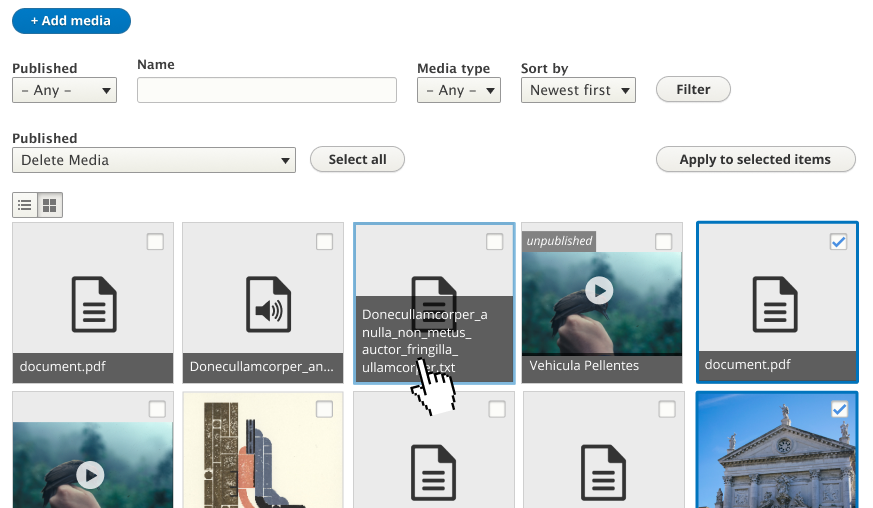
We should update the view at /admin/content/media to look more modern - displaying a grid of media cards that show a preview of the media and metadata (attributes/fields) that make sense for each media item.
To give more flexibility to site builders and themers, each media item in the library is rendered in a new view mode called "Media Library", which is customizable like any other view mode.
This updated view will also be the basis for a new Field Widget, to allow visual selection of Media while editing/creating content. This widget will be added in another issue, but part of why this is being added in a new experimental module is to have a place for us to iterate on the widget and other code related to the Media Library experience.
Review the current patch. Discuss UX feedback.
Note for committers - on commit, please ensure that "jan.stoeckler, webflo, seanB, chr.fritsch, DyanneNova, yoroy, dennis-cohn, rfmarcelino, andrewmacpherson, benjifisher" is added to the issue credits. This is ported over from #2834729: [META] Roadmap to stabilize Media Library.
User interface changes
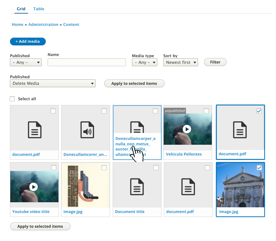
The view at /admin/content/media looks different, but is functionally the same.
API changes
None.
Data model changes
None.
| Comment | File | Size | Author |
|---|---|---|---|
| #136 | 2962110-136.patch | 23.84 KB | Mingsong |
| #124 | 2962110-124-media.png | 130.11 KB | phenaproxima |
| #124 | 2962110-124-media-library.png | 119.93 KB | phenaproxima |
| #115 | interdiff-2962110-100-115-0.txt | 5.74 KB | samuel.mortenson |
| #115 | 2962110-115-0.patch | 54.04 KB | samuel.mortenson |


Comments
Comment #2
samuel.mortensonHere's the patch moved from #2834729-72: [META] Roadmap to stabilize Media Library. Here's the unaddressed review:
Do we need additional variants of this icon for other color schemes? (That's probably a question for the UX team.)
Let's change this class to something more generic, so that we can (ideally) bring this click-to-select functionality into Views. Any ideas for what to call it? Maybe 'click-to-select'?
Again, to groom this functionality for inclusion into Views, let's rename the plugin now (click_to_select or something like that, or maybe just 'selection').
Same here.
Should this also be made "generic"? If so, something like 'selectable-content' might make more sense.
I will be demoing the library to the UX team today and will ask them about the filters. Specifically, whether we have enough, or should have different ones out of the box.
Why is this dependency here? It's not used in the view display; it's really just a dependency of the media type, no? Can we remove it, or was it automatically calculated?
Same here.
Same here.
And here.
It's SO nice to be able to use flexbox. However, I wonder if we shouldn't make these into generic classes so as to eventually merge this CSS into Views.
I'm not entirely certain we're supposed to size type in pixels. This file needs review from a CSS expert who knows the standard practices for core CSS.
I'm not sure this will have the intended effect (to prevent links in the rendered content from being clicked). If it indeed does, we should prove that with a functional JavaScript test.
Can we use .closest() here, for clarity?
Can't we just check
$input.prop('checked')?I don't think we need this comment. Anything in a JavaScript file will only be taking place if JavaScript is available :)
I think we can prefer .closest().
I think we could use .closest() here too.
Not a big deal, but why do we have the explicit dependency on User?
I believe jquery.once already depends on jquery, so we can remove the explicit jquery dependency.
The test should assert that this link actually appears.
If we're going to move this into core as a Twig function, let's also mark it @internal.
Would it helpful to use data attributes, and/or Attributes objects, for these purposes? Like <div data-media-library-component="preview"> and <div data-media-library-component="attributes"> or something? It might separate the concerns a little more cleanly.
Nit: need a hyphen between "Library", and "specific", e.g. "Media Library-specific".
Let's call assertSession() once at the top of the method and keep re-using the result of that.
Also, can we definitively assert that thumbnails are being displayed and names are not? Additionally, let's assert that bulk actions are present and functioning as expected.
Comment #3
samuel.mortensonAnd from the UX meeting feedback:
Comment #5
ckrinaI think the most important things would be:

- Empty text
- Bulk operations visible from the beginning and solve it in another issue.
- Agree on that the right chevron is not the appropriate pattern. Bottom/top chevron to follow admin toolbar pattern would be the ideal so we reuse patterns, but also html detail default visualization or +/- symbols.
- Accessibility: navigation&selection with keyboard. Is there any standard pattern?
-
Editing & deleting media imho is really important. What about showing the "edit" and "delete" icons only when you're over an item? Like this Wordpress example. If we add the "check" on the right and the "edit"+"delete" icons on the left (or the opposite) I think it might be enough.Update: Just realized that we have bulk operations and the checkbox, so the actions can actually be done anyway.- Expandable details upwards can be dangerous because it is really easy to have long names exceeding the height.
- I really liked the idea of having the selection pattern reusable!
So the needed designs might be:
- Bottom/top chevron
- Edit&delete buttons
- Checkbox (empty circle to indicate it's clickable)
- How to handle large amount of metadata: modal or new page?
Comment #6
phenaproximaTagging for design changes per #5.
Comment #7
phenaproximaFrom #3:
Let's open a follow-up issue for this request.
Comment #8
phenaproximaResponding to #6:
Don't forget the ability to distinguish between published and unpublished media items. :)
Would a tooltip be appropriate or useful for this?
Comment #9
samuel.mortensonResponding to review from #2, no UX feedback addressed yet.
We don't enforce that anywhere - since the view mode is configurable site builders are welcome to change what the preview looks like based on their use case.
We already have this test coverage, from what I can tell.
Comment #11
samuel.mortensonMy debug code strikes again!
Comment #12
samuel.mortensonView config changes didn't get into the last patch.
Comment #13
samuel.mortensonWe're blocked on design for the items in #5, but this patch introduces keyboard accessibility for the Media Library that appears to work pretty well. When you first tab into an item it has the same outline as a normal mouse hover, and pressing space (like you would press for a normal checkbox) selects it. If you tab again it focuses on the link to the Media item, which can be navigated to by pressing enter. This makes visiting an item and selecting it distinct, which I think it important and maybe more clear than having space/enter do different things on the same focused element.
Comment #14
phenaproximaNice work! I think we will want accessibility review for that.
Comment #15
phenaproximaWe're making excellent progress. Great teamwork from everybody! I'm really looking forward to landing this.
I agree that we're mostly blocked on design, but true to form I was still able to raise questions and find some things we can spruce up. :)
Let's expand this a bit. How about "Allows users to browse and administer media assets."?
Let's extract this into its own separate library and JavaScript file, so we can easily merge it into Views later (or at least let developers reuse it for things that aren't the media library). To keep things consistent, let's rename the behavior to something like viewsClickToSelect.
Is it possible/easy to put the click-to-select-checkbox class directly on the checkbox, rather than having Yet Another Wrapper Element?
Let's use $(context).find() here. I wonder if a <button> element would be more semantically correct here. Also, should the metadata toggling element have a title attribute, or some sort of text (suppressed with CSS) to indicate to screen readers etc. that it reveals metadata?
Let's use $(context).find() here too. Also, for readability, can we put the chained .once() and .on() calls onto their own lines?
The path should be /admin/content/media. :)
It's possible that a site builder will have deleted the media_page_list display. We should probably check for that.
Should be /admin/content/media.
Let's also sanity check for the presence of the media_page_list view here.
We probably don't need to do this in order to land an experimental module, but we should open a follow-up for this and link to it here.
Should be "...overrides the /admin/content/media view..."
Doesn't this mean that all the items will, by default, have tabindex="0"? Could that produce unexpected behavior? I'm not sure there's any way for us to test that, but if there is, we should. (Maybe we could take advantage of the shiny new Nightwatch testing system for this, if you're up for it.)
Can we make that threshold configurable? Maybe just introduce a hidden config setting for it.
Rather than hard-code the date format, let's ship a DateFormat entity and use that (see https://api.drupal.org/api/drupal/core%21lib%21Drupal%21Core%21Datetime%...).
It feels a little clumsy to keep repeating the 'media-library-item' prefix. Could we just add the media-library-item class to the <article> tag, then use classes like 'created' and 'type' for the created time and media type? And could we use a semantic <time> element for the created time? I'm not sure if these ideas constitute best front-end practice, though, so maybe a front-end dev should sign off on these first. Not a big deal either way. (Just 'cause we *could* doesn't necessarily mean we *should*, after all!)
I assume this is testing that bulk actions work, by deleting one of the created media items. Just to be clear about that, let's explicitly select the delete action before clicking "Apply to selected items".
Comment #16
starshapedLooking at item 15 in comment #15, I'd keep the media-library-item prefix on all the items. If we're following BEM or a BEM-ish convention, we'd want to name the classes more like media-library-item__name, media-library-item__created, and so forth. Even if Drupal 8 doesn't follow BEM conventions for naming CSS classes, it looks cleaner to target a single class rather than start making longer selectors which increase specificity.
Comment #17
samuel.mortensonAddressing #15 -
Comment #18
phenaproximaThis code is clean. I can't find anything else to nitpick. So, in order, here's what we still need to do in order to land the patch:
We need to open a follow-up to move the "pretty time" functionality into Twig.Done: #2964790: Move formatting code in TimestampAgoFormatter into DateFormatterComment #20
samuel.mortensonFixed tests and created follow up issues. Also updated the IS with issue credits from the original MVP issue.
Comment #21
samuel.mortensonComment #22
ckrinaHere's a proposal for the design trying to adapt it to Seven styles, based on proposals from @yoroy, @dennis-cohn and @rfmarcelino in the #ux Slack channel:
- Example with audio, docs, images and video.
- Example with non-squared images.
- Example of hover&selected.
- Example of unpublished items.
Some accessibility concerns mentioned in the #ux slack channel by @andrewmacpherson and @benjifisher addressed here:
- Checkbox always visible.
- No caps.
- No important actions reserved for only hover.
Since we can use flexbox to have the same the height on items in the same line, having multiple lines per title makes sense. Anyway, I would try to limit the title's height/length to 4 lines or so with CSS so the grid keeps being readable.
Comment #23
samuel.mortensonThanks @ckrina (et. all)!
I have some notes/questions about the design:
1.
If I make the "Checkbox always visible" per the design, should I style it with CSS to match the design as well? Checkboxes in Seven are basically unstyled right now, but the mockup looks nice.Actually increasing the default checkbox width seems to accomplish this nicely. I can remove the tabindex as well since accessible users can check the real checkbox themselves now.2. The design doesn't contain the collapsible section for attributes. Is there a reason for this? Edit: Since the only attribute displayed in the collapsable area now is the created time, I'm going to remove the attributes completely. The area wasn't configurable in the user interface anyway so it would be hard for people to add more stuff here.
3. In the bottom middle item, the title is being hovered but the entire media item has an outline. When the title is clicked, the user will visit the media item, not select the checkbox, as it's an outgoing link (an A tag). I think that the outline should only be present if clicking will select the media item, which is how the behavior currently works.
Comment #24
samuel.mortensonHere's an update that addresses the mockup and feedback from #22 (the UX team).
I ended up removing the collapsible attributes area as it wasn't easily configurable, and after implementing the mockup only contained one piece of additional information. If users want more attributes displayed, they can simply add fields to the View.
I also added more options for the sort exposed filter - only one option was previously available which didn't make sense to expose.
Comment #25
dawehnerI applied the patch locally and really enjoyed seeing it!
Here is some quick review.
I just compared this with our existing 'short' date format:
'm/d/Y - H:i'Is there a good reason to switch to AM/PM in the media library?Note: There is quite a bit of code in Drupal which switched from classes to data attributes to do this kind of feature flagging. This way there are less problems when changing the markup.
Comment #26
samuel.mortenson@dawehner Ah I should have removed
core.date_format.media_library.yml, in #24 I removed the relative created date as it wasn't in the mockups from #22.The main negative of switching to data attributes for this is that right now you can enable click to select with only the Views UI, which is how the library adds the right classes to make it work. If we moved to data attributes, you would always need to write template or preprocess code to add the attributes in the right place, and adding them to specific Views fields would not be pretty.EDIT: Actually the
.click-to-select-triggerclass is added in a preprocess hook, so we aren't exclusively using the Views UI. I'll see how hard moving to data attributes would be.Comment #27
samuel.mortensonUpdating issue credits to include UX team.
Comment #28
samuel.mortensonMade a few tweaks to match the design better - notably always underlining the title and fixing some spacing/border issues.
I looked into using data attributes per #25.2, but I think the functionality is more useful if we use classes, as classes are easily added in Views which is what site builders would use to add this to other administrative interfaces. If we moved to data attributes you would need multiple preprocess hooks for every area you want to use this.
Comment #29
phenaproxima@samuel.mortenson just demoed this patch in the UX meeting. @andrewmcpherson was there as well, and was able to offer accessibility input. Therefore, I'm removing the tag.
Summary of the feedback from that call:
Comment #30
webchickYep to all of that. Here's the video for anyone who wants to see this patch in action and learn some cool things about accessibility! :) https://www.youtube.com/watch?v=L1Zh6YiQPIU
The only correction is I would say sorting by "Newest first" is the default expectation... you certainly would not want to see the same image of your dog you uploaded back in 2008 every single time you loaded this screen, and most likely the things added most recently are those you'd want to reuse. So we might need to keep that selection there so you can revert back to it after playing with the sort filter to be something else and then being all "nah."
I think the main point raised during the call was "should we also include a 'time ago' on the media element somehow so people can see how recent their picture is" and while we could, a) it's hard to cram much more data into that small "descriptive" area without it overtaking the thumbnail, and b) I noticed that Facebook, WordPress, and SquareSpace also have no exposed time ago field despite sorting recent first. (In fact they have no descriptive section at all—purely the visuals, so we're an outlier there...)
Comment #31
andrewmacpherson CreditAttribution: andrewmacpherson as a volunteer commentedSomething I just noticed - there's no bulk-operations checkbox for selecting ALL media items. On the table displays there's a select-all checkbox in the table header, but we don't have that on this new display. Is that by-design, or a regression we overlooked?
Comment #32
phenaproximaOnly nitpicks, and very few at that. Code is RTBC from me otherwise, although I'd still like CSS review.
Nit: These can be chained, I think.
$input.prop('checked', !$input.prop('checked')).trigger('change')Nit: We don't need the $preview variable if we chain the calls like
.once(...).on('mouseover focus')...on('mouseout blur')Comment #33
samuel.mortenson@andrewmacpherson That's a regression - although I'm not sure why it's tied to tables specifically. May have to be something we fix in Views.
Comment #34
phenaproximaKicking back until we have answers on #31 and #33.
Comment #35
GrandmaGlassesRopeManThis iife should get adjusted,
Two things, use single quotes, and we also don't need
use-strictanymore.Use the object-shorthand style for this function.
While just a warning, this is an unnamed function. You can use an arrow (preferred), or name it.
Additionally, it would be a bit nicer to namespace these `once` events a bit more.
While just a warning, this is an unnamed function. You can use an arrow (preferred), or name it.
Missing trailing comma.
This iife should get adjusted,
Two things, use single quotes, and we also don't need
use-strictanymore.Use the object-shorthand style for this function.
While just a warning, this is an unnamed function. You can use an arrow (preferred), or name it.
While just a warning, this is an unnamed function. You can use an arrow (preferred), or name it.
Missing a trailing comma here.
Comment #36
GrandmaGlassesRopeMan- fixes all my own JS feedback from #35
Comment #37
samuel.mortensonThis patch addresses the following accessibility/UX concerns:
Both notes from #32 have also been addressed.
Comment #38
andrewmacpherson CreditAttribution: andrewmacpherson as a volunteer commentedReview of patch #37
+ $form['media_bulk_form'][$key]['#title'] = t('Update media "@label"', [Remove the quote marks from the text here, because some screen readers might pronounce them. Narrator and NVDA were fine, but ChromeVox said "Update media quote red parrot quote", which is pretty ugly. If we think some kind of punctuation is necessary here, I'd go for a colon, so reads like "Update media colon Red parrot". Personally though, I don't think any punctuation is necessary here at all (in English).
We could wrap the entity label in emphasis tags, like we do with on the permissions page for the various content type permissions, but screen readers don't generally treat this as any different from normal text, and this is an invisible label so the typography doesn't matter.
+ $form['media_bulk_form'][$key]['#title'] = t('Update media "@label"', [We can probably loose the word "media" too (to reduce verbosity) because media is the whole purpose of this page, and every item in the view is a media entity.
This has an interesting severe side effect - it breaks when a Windows' high-contrast theme is being used. Beware of toggling colour to/from transparent to indicate state. In Windows' high-contrast mode, border width and style are respected, but border colour is overridden. CSS "transparent" is treated as a colour in this regard, so it results in ALL of the title links getting a visible border, whether they have focus or not.

I'd say this approach of toggling a border between transparent and blue fails WCAG 2.0 Use of color. The solution is to toggle the presence of the border, rather than the colour (i.e. toggle between 0px and 2px width). If this messes with the box model, you can use the CSS outline-* properties instead. An outline-offset: 0.15em is nice for readability.
(Aside: core themes have lots of other problems in Windows high-contrast mode. I want to fix them in other issues. But we can avoid introducing new problems here.)
The blue is too pale. It has a contrast of 2.44 against the white background. There's a new WCAG 2.1 success criterion, 1.4.11 Non-text Contrast, which means we want a focus outline with 3:1 contrast. The easy solution would be to make the focus outline the same colour as the link text.
Leaving at needs review, I haven't looked at anything else in the patch.
Comment #39
andrewmacpherson CreditAttribution: andrewmacpherson as a volunteer commentedSomething I mentioned in the UX meeting, but it hasn't been written down here yet...
The entity operations (dropbutton) links are have the same problem as the bulk operations checkbox - users need to know which media item they apply to. Just like bulk-ops checkbox, the dropbuttons currently get context from the HTML table row structure. But in the new grid, the dropbutton is outside of the rendered entity's
<article>wrapper.There's already an issue to address this in EntityListBuilder, but the dropbuttons in the new media library actually come from the EntityOperations views field plugin.
Between the bulk-ops checkbox, dropbutton links, and the visible title link, repeating the entity label stacks up to a lot of verbosity for screen readers. I'll have a think about this, and look around for other patterns, but for now I think we'll have to include the entity label in the operations links.
Comment #40
samuel.mortensonThis patch addresses #38:
1. Layout problem was fixed by setting a non-inline display for the select all media checkbox.
2/3/4. I updated the label to be "Select %label", which I think addresses all your points.
5. I took your advice I added the border on focus, instead of changing the color.
6. I've removed the border color which means it will default to the text of the font ("color").
7. I changed the name's display to block per your suggestion.
8. From my testing the changes in 6/7 fixed the overflow issue.
After researching #39, it appears to not be possible to alter the output of the entity operations field. So I think we have three options:
Comment #41
starshapedI took a quick look at the CSS and it looks great to me!
Two minor comments:
Does this have any effect on the grid of media items? space-between should add an equal amount of spacing between all the items in the grid, and I don't see that being applied. If this isn't needed, this can be removed.
I've noticed a mix of em and px for margin and padding values. I'd probably stick with one or the other, though there isn't any particular convention I can find for what units to use within Drupal. So, this is more of a 'keep things consistent' suggestion :)
Comment #42
samuel.mortensonThanks @starshaped - you're right that "align-content" was there in error, so I removed it. I also converted all "em" values to pixel values for consistency.
Comment #43
samuel.mortensonAdding the "Needs frontend framework manager review" tag as we haven't had one yet.
Comment #44
samuel.mortensonI had talked to @lauriii in a PM and he had noted that the CSS isn't split up into functional/theme styles, so I did that in advance of the review.
Comment #45
andrewmacpherson CreditAttribution: andrewmacpherson as a volunteer commentedAccessibility review of patch #44, what's improved since #38
Comment #46
andrewmacpherson CreditAttribution: andrewmacpherson as a volunteer commentedContinuing accessibility review of patch #44, stuff not fixed since #38...
The Entity Operations drop button has repeated buttons and links which aren't contextually tied to the individual media items. When we had a table view, these dripbuttons were inside the same row TR wrapper, so context could be inferred by exploring the row.
With three media items, we see three indistinguishable "Edit" links. Here's a screenshot of NVDA's list-links tool.

Similarly, there are 3 indistinguishable "list additional actions" buttons, in NVDAs list-buttons tool.

I think we are best of fixing this in EntityOperations itself, providing some flexible display options for the output.
Comment #47
phenaproximaOpened #2973124: Provide better context in accessible names of EntityOperation views plugin drop-button operations to address #39 and #46. And with that, all requested follow-ups have been opened and I believe accessibility review is complete.
Comment #48
phenaproximaDemoed this in the UX call using simplytest.me. There were (only!) three excellent pieces of feedback:
Comment #49
samuel.mortensonAddressing #48:
1. The "Media library" view mode's preview area (just the thumbnail, by default) is output by core's entity/field API. If thumbnails have this problem here, they have this problem everywhere media thumbnails are displayed. Long story short - the Media library doesn't set this and can't change the default behavior. This alt text is set in
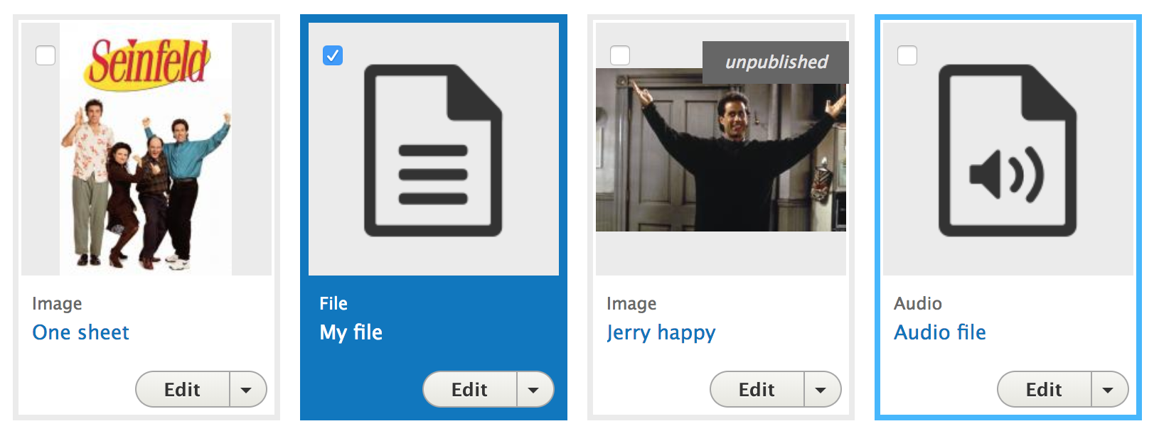
\Drupal\media\Entity\Media::updateThumbnail, where it also looks like the default title text is set to the entity label. Looking at test coverage for Media it looks like this is expected behavior, and is unrelated to what the library is doing.2. The original size of the icons is 180x180px, so we would have to conditionally restrict the size of thumbnails if a media icon was being displayed, which is not possible with the current Media API. We're outputting the thumbnail in a view mode, and trust the source plugin to give us something that represents the media and looks presentable.
3. I'll work on making this a button.
EDIT: #2 may be possible by using another image style for audio/video/file and changing some CSS. Will look into it.
Comment #50
andrewmacpherson CreditAttribution: andrewmacpherson as a volunteer commentedRe #48.1, I found #2956368: MediaThumbnailFormatter produces unhelpful text alternative and title attributes for media thumbnails which claims
alt="Thumbnail"is by design for MediaThumbnailFormatter. I've reclassed it as a major bug. I guess it could be a stability blocker for Media Library, but the formatter is already in use by the table version of the media listing.Comment #51
samuel.mortensonThis patch fixes #48.2 by changing the image style to "thumbnail" for non-Image types by default, and ensuring that the CSS doesn't upsize small images which it was previously doing.
I started converting the select all checkbox to a button but it didn't feel right - with the checkbox the on/off (toggle) state is clear, but with a button we would need to change the button text every click. It also seemed like a button should go into the bulk form, not floating around on the screen. It would be good to have designs on this if the checkbox isn't desirable, before we move over to a different HTML element.
Comment #52
andrewmacpherson CreditAttribution: andrewmacpherson as a volunteer commentedFor accessibility, things are going well so far, and we have some follow-ups which are fairly well understood. No concerns from me for committing this as an experimental module.
Comment #53
ckrinaYesterday in the ux call we discussed whether to use a button for the “Select all” instead of a select. The main reason is that it’s not a single item to be picked, it's an action. Actually, it’ll override the other selects in the grid, so unless we come up with a better visual way to explain the hierarchy (like happens in the table) a button is a much simpler way to imply it.
But there’s yet another problem to solve once you have all items selected (as @samuel.mortenson said):
- The select all button looses it’s purpose and it’d be confusing to keep it when all items are selected.
- What if you want to “unselect all”?
So I would add a button that toggles between "select all" and "unselect all"(not a copy specialist here :P) as it is clicked/has done its job. The ideal design would be implementing designs from #2721807: Design for filters and bulk operations.
But since it is out of scope from this issue I'd go for something like this:
Comment #54
ckrinaSorry, uploaded the wrong file.
Comment #55
samuel.mortensonThanks @ckrina - the button looks a lot more natural inline with the rest of the form.
Comment #56
dddbbb CreditAttribution: dddbbb as a volunteer commentedAlso not a copy specialist but "Unselect all" should probably be "Deselect all".
Comment #57
John Pitcairn CreditAttribution: John Pitcairn commentedOr perhaps "Select none"?
Comment #58
samuel.mortensonThis patch moves the "Select all" checkbox to a button per the mockups in #53. I went with "Deselect all" but the other text, and added an "aria-pressed" attribute to assist with accessibility.
I didn't move the "Apply to selected items" button to the right as it feels wrong on larger screen sizes. I think it's OK to wait for all Views to do this in #2721807: Design for filters and bulk operations. It may seem odd to users to have one view where this is out of its normal place.
Comment #59
andrewmacpherson CreditAttribution: andrewmacpherson as a volunteer commented+ const $button = $('<a class="button media-library-select-all" aria-pressed="false"></a>')This isn't keyboard operable. Use a
<button>What's the aria-pressed for? Only use that for a button which behaves like a toggle. Also, it doesn't make sense on a HTML
<a>element - links don't toggle.Comment #60
andrewmacpherson CreditAttribution: andrewmacpherson as a volunteer commented"Select all" vs "Deselect all" isn't actually a toggle behaviour. They are two separate actions, to override the selections made in the grid of individual items, which could be in a mixed state.
Let's imagine there are 20 items shown. 7 are selected, 13 not selected. In this state, both actions would make sense. So it isn't appropriate to treat the button as a boolean toggle (aria-pressed=true|false).
This is actually more like a tri-state switch, where you cycle though mixed/all/none. Desktop applications use them, but they're not very common on the web. Now
aria-pressedandaria-checkedboth support tri-state widgets - in the ARIA rec, at least. I haven't looked at how well supported that is in real tech. Come to think of it, the select-all checkbox on the table display would benefit from this too. ARIA wasn't around in Drupal 3 or whenever the bulk operations appeared ;-)"Invert selection" would be a toggle behaviour. Some Linux file managers have that.
MacOS Finder only has "select all", it doesn't have "deselect-all", or "invert selection".
Comment #61
andrewmacpherson CreditAttribution: andrewmacpherson as a volunteer commentedTagging, I'm a bit concerned about this button.
Comment #62
samuel.mortenson@andrewmacpherson I tried using aria-pressed after reading through https://inclusive-components.design/toggle-button/, but agree that it should probably be a button element as it is in that article.
What path forward would you suggest for the "Select all" functionality? Is moving to a button adequate, or should we go back to the checkbox? I don't want to re-roll the patch until we have UX and accessibility team agreement on what should be implemented.
Comment #63
andrewmacpherson CreditAttribution: andrewmacpherson as a volunteer commentedI've been thinking more about the select-all checkbox, to avoid complicating things...
aria-pressed=true|falsein a boolean way. Unless we fully implement the tri-state behaviour, it could be misleading.Edit: by coincidence, I found some relevant advice just a few hours later...
Source: Patrick Lauke, WAI-ARIA - An introduction to Accessible Rich Internet Applications (slide 104).
With this in mind, that means I prefer a
<button>to a checkbox.Comment #64
GrandmaGlassesRopeManPersonal preference, but this line feels a bit too long. Maybe two or more chained methods we wrap them?
We have destructured
eventelsewhere. I think it makes sense to do it here.Missing a semicolon here.
Are we sure we want to adjust the permissions on these files?
Comment #65
samuel.mortensonThanks for the review!
This patch addresses #63 and #64, and also removes some selector nesting for BEM-style classes we have.
Two pieces of UX feedback from chat and the meeting on Tuesday have also been addressed:
1. Clicking the Media item name now takes you to the edit form, if you have permission. From our discussions it seems like the most common action from the library is to edit media, not view it in its full view mode.
2. The Entity Operations dropdown has been removed from each Media item in the grid. The only operations for Media were "Edit" and "Delete", both of which are possible by either clicking the Media item name or using the bulk operations. This was done with the caveat that the table view will also be available for users who want more metadata and operations displayed. @andrewmacpherson and others have already brought this up a few times as well. :-)
For (2), I have not been able to implement a good-looking switcher between the table and grid views yet, but am still working on it.
Comment #66
ckrinaAs discussed in the #ux channel, here's the last proposal for the design:
1. Adds new table/grid switch buttons so the content can be adapted to each one needs.
2. Proposes to remove the media type label as @samuel.mortenson mentioned in the previous comment.
3. Proposes to show one line of media name by default, then show the rest on hover. There wasn't an agreement on the last UX, so this decision still needs accessibility review at least.
4. Changes styling of the attribute area.
5. Moves the checkbox to the top right, and the unpublished status to the left.
Comment #67
samuel.mortensonThis patch addresses some of the UX feedback from #66:
1. Instead of table/grid switch buttons, local tasks are added as sub-tabs to switch between the new and old Media view. We discussed this in chat and agreed that buttons may be confusing as they are just links to other View pages, and the current selection and exposed filter values will not carry over to the next page. Users know what to expect when clicking local tasks.
2. The media type label has been removed.
3/4. The attribute styling and hover behavior has not been changed yet. It's not a lot of CSS but I wanted to wait until the next UX meeting to decide on the hover behavior, then I'll do the attribute styling.
5. The checkbox/unpublished label have been swapped.
Here's a new screenshot from this patch for reference:
Comment #68
andrewmacpherson CreditAttribution: andrewmacpherson as a volunteer commentedPatch #67:
Focus and blur events will never fire on
.media-library-item__previewbecause it isn't a focusable element - it's just a wrapper DIV. If we want to provide the blue border is-hover style for keyboard users, we'd want something like:or
Comment #69
andrewmacpherson CreditAttribution: andrewmacpherson as a volunteer commentedMore review of patch #67:
I tested the Drupal.announce() messages from the select-all button. They're good.
Re: #66.3
It would be good to show the full title to keyboard users as they are tabbing though items. A complication is that the hover area contains TWO focusable items for a keyboard user - the checkbox and the title. When a mouse user sees the whole title on hover, it helps them to decide which checkboxes to select. For a keyboard user to have a comparable experience, they would need to see the full title when the checkbox has focus, not just when the title has focus. This is a bit like a tooltip behaviour.
So we'd want something like:
I mentioned this in Slack, just saying it again here.
Comment #70
andrewmacpherson CreditAttribution: andrewmacpherson as a volunteer commentedWe should remove the image title attributes - they're no use. Only mouse users can perceive them, and it just duplicates visible text nearby:
I think this might be an issue with the media thumbnail formatter in general, so maybe not in scope here.
Aside: Drupal core makes way too much use of title attributes in all sorts of places where they are useless, so it might be better to address this in a "stop using unncessary title attributes" plan for the whole of core.
Comment #71
andrewmacpherson CreditAttribution: andrewmacpherson as a volunteer commentedThe blue is-hover border appears when you hover over a preview image, but it dssappears when you hover over the checkbox itself.
Comment #72
andrewmacpherson CreditAttribution: andrewmacpherson as a volunteer commentedWe're just using the user-agent focus styles for the checkboxes. Nothing wrong with that, but we've provided our own focus style for the title link, so it feels a bit half-done to still use the user-agent style for the checkboxes. More consistency would make it easier to follow focus visually.
Comment #73
samuel.mortenson@andrewmacpherson For #68, I thought that the checkbox would be what keyboard users interact with, which is why it's tabbable and the entire Media item is not.
Comment #74
andrewmacpherson CreditAttribution: andrewmacpherson as a volunteer commented@samuel.mortenson My point in #68 is that
on(mouseover focus) creates a JS focus event listener which will never fire, so it shouldn"t be there.
The tabbing order itself is correct - checkbox and link are both focusable - and I wasn't proposing to change that.
Rather, I mean that whatever styling is supposed to be activated by on(mouseover focus) will actually only work for mouseover. I think the border around the whole media item could help keyboard users too, but it would need to track focus-within, because the wrapper isn't focussable.
The focus indicators for the checkboxes and title links must remain tough.
Does this make sense? I could make a little demo.
Comment #75
samuel.mortensonThanks @andrewmacpherson, that makes sense. The "focus" listener is left over from when the item itself was tab-focusable. I'll address that in the next patch.
Edit: Looked into the image title attribute - that's not set by the Media library so it's not something we can change here. Will address feedback about revealing the entire title when the checkbox or title is focused once we get UX feedback.
Comment #76
yoroy CreditAttribution: yoroy at Roy Scholten commentedI'm not a big fan of on hover solutions. I think we designed this explicitly to create as much room for longer titles as possible. Then again, grid layouts like this will eventually break if we don't take ultra-super-long titles and/or long words like Eisenbahnenschienenhinundhersteller into account. So maybe we need some kind of mechanism to handle overflow anyway.
Still, I'd like to proceed with what I see in #67
The "Select all" button seems to be in a weird place. Was a "Select all" checkbox on top of the grid itself considered?
Comment #77
samuel.mortenson@yoroy We limit the height of Media titles, which was requested in earlier mockups. The mockup you uploaded is very close to how the checkbox looked before we moved to a button - it appeared right above the grid.
Comment #78
andrewmacpherson CreditAttribution: andrewmacpherson as a volunteer commentedFor expanding the full title, we can make that work for hover, and focus too.
What about touch screen users? I don't see how they will expand the truncated title.
Comment #79
ckrinaDuring Frontend United @yoroy and I discussed and agreed in the following design:
- Change from dark background to white for the item title to play better with Seven general styles.
- Revert the "Select all" to a select again.
- Don't move the "Apply to selected items".
- Title is a link, cropped by default and expanded when hovering it.
Comment #80
samuel.mortenson@andrewmacpherson Could we have your feedback on #79? You mentioned in #63 that you prefer a button to a checkbox, if we go back to a checkbox (similar to what you previously reviewed) would that break accessibility?
Comment #81
samuel.mortensonThis patch implements the mockup from #79, and addressed:
#68 - The unused (unusable?) blur and focus event listeners have been removed.
#69 - I added a is-focus class to the ".media-library-item" element if the checkbox is focused. If the media item is focused, the full title is displayed.
#71 - Using the is-focus class, the blue border is visible when the checkbox is being focused and hovered.
#72 - The above change should address the inconsistency with checkbox interactions (keyboard and mouse).
#78 - The full title is shown on focus, but I have not implemented anything for touch users yet.
I'd like UX feedback on how we should show full titles to touch users, @andrewmacpherson mentioned in chat that he would like to see this addressed.
Comment #82
yoroy CreditAttribution: yoroy at Roy Scholten commentedMaybe the touch interaction can both select the item and show the full title? My assumption here is that in those cases that the selected item is not what you were looking for *based on reviewing the full title* it will be quicker to just unselect that item.
Comment #83
samuel.mortenson@yoroy So when you touch the media item to select it (by touching the thumbnail or checkbox), that shows the full title. If you just touch the truncated title it visits the link normally. Is that right? Would you expect the full title to be displayed for selected items on desktop as well?
Comment #84
ckrinaAbout keeping same behaviour on desktop... I'm not sure there's a reliable way to differentiate from touch screens so I'd keep it consistent and I'd try to keep the same interaction for now. So it means having the full title displayed for selected items in desktops too.
Comment #85
webchickSoooo... just to remind folks that we're trying to put this feature into core as an Experimental module, at least initially. So while all the attention to these details/edge cases, balancing UX vs. accessibility concerns, etc. is greatly appreciated, I'm concerned that we might be endangering the feasibility of this making it into 8.6 at all if we don't get something committed sooner than later.
Are we close here, or should we start spinning off sub-issues for some of these gnarlier bits?
Comment #86
webchickAlso, escalating this to "Major" since it is both one of the main roadmap items for this initiative, and also blocks other aspects of it, e.g. inserting media during content creation.
Comment #87
samuel.mortensonThanks for the clarification @ckrina - I think this can be accomplished by showing the media name when the item is checked, which is the change I made here. This is ready for review.
Comment #88
phenaproximaOnly minor nits. None should block commit.
We can combine this with the
.media-library-view .view-content formselector.Let's combine this with the
.media-library-view .view-content form > [id*="edit-actions"]selector.Nit: We should add a space after the comma separating the selectors. Also, can the .once() call be moved to its own line?
Nit: Can .once() be on its own line?
I echo @webchick's sentiment from #85. The bikeshed has been open for a long time on this issue, which is a very important 8.6 target. We need to land this thing. It has undergone a lot of UX and accessibility review, and at this point we don't seem to have any commit-blocking problems on either front, although we've generated several follow-ups (many of which address deficiencies we are inheriting from other parts of core). Everyone seems pretty happy with the patterns we're implementing here. The code looks good to me, and I would certainly consider its new APIs (which is really just the "click to select" stuff) to be beta-quality, although this module is mostly configuration and therefore should not need an update path if we change it later, seeing as how it is an experimental module.
We have beaten around the bush long enough. It's time to go to RTBC.
Comment #89
lauriiiI reviewed the front-end parts of the latest patch. Mostly it looks good, but there's few things we should still fix. Only the first of the issues should be commit blocking, so if you prefer to open follow-ups for rest of the feedback, feel free to do so.
These styles are quite opinionated so we should move them to Seven before we mark this module Stable. Let's add a @todo comment so that we don't forget that.
We also have to make sure that the UI works without these styles.
We should prefix the classes used in JavaScript with
js-. While moving tojs-prefixed classes, it would be good idea to revisit the selectors to make sure that we use good specificity, for example.media-library-item .media-library-item__previewselector doesn't need.media-library-itembecause BEM already guarantees that.media-library-item__previewis inside.media-library-item.Could we add a class instead of using the id for theming?
Would it be possible to add class to the form element to simplify this selector?
Comment #90
samuel.mortensonThanks for the review @lauriii! I think I addressed all your feedback from #89:
1. Added a @todo. Also commented out the theme CSS temporarily and the library was mostly functional, I just added one new style to ensure that the checkbox is positioned relative to the media item.
2. I prefixed the selectors with
js-, and audited the JS/CSS to see where I could remove parent selectors. I think this should look better now.3. We luckily already had a form alter that I could use to add classes for this, so this is done now.
4. A new class is used here as well.
Comment #91
chr.fritschIs there a reason why the media_library view mode of image is using the medium image style and all the other media types are using the thumbnail image style?
Comment #92
chr.fritschAh, I think I can answer my question by myself :)
Image is the only media type that supports "real" thumbnails. The others are using the default icon, and for that one, the thumbnail image style is enough.
Comment #93
phenaproximaNow that @lauriii has reviewed this, we can remove the front-end framework manager review beacon.
The changes look good to me. I'm moving it back to RTBC, and hopefully we can get a chance to run this past committers soon.
Comment #94
lauriiiSorry, bumping back to NW. We actually want to move this to Seven because we don't want to include this in Stable. If we don't move this to Seven, we cannot make any changes to these styles after marking the module Stable. Since these styles are quite opinionated, the UX team might want to make improvements to these in future.
Comment #95
phenaproximaLet's also open a follow-up for that, and link to it in the comment, so we don't forget.
Comment #96
samuel.mortensonSorry, misread the comment about moving the styles. I've fixed the @todo and opened #2980769: Move Media Library styles into the Seven theme now.
Comment #97
phenaproximaLooks good. Thanks, Sam.
Comment #98
GrandmaGlassesRopeManA number of places we've used $(context).find().
These .once() keys should probably be prefixed with media library or something similar. Click-to-select feels vague.
This should be .es6.js
I think we can use the ability to pass multiple events and use .toggleClass() to simplify this.
Looks like all of these lines have some incorrect indentation.
Additionally,
I think we can use the ability to pass multiple events and use .toggleClass() to simplify this.
Bit curious why these strings are stored in an object when they are only used once.
Comment #99
phenaproximaDiscussed #98.2 with @drpal and to clarify -- we don't need to change the CSS class names; just the key we pass to .once().
Comment #100
samuel.mortensonAddressing #98:
1. This was brought up in #15.4 and addressed in #17.4 - the current syntax internally calls .find() so the result should be identical, with less verbosity.
2-6. Fixed, thanks!
Comment #101
phenaproximaThe changes look good and @drpal's feedback has been addressed. Thanks!
Comment #102
webchickJust reviewed this with @GáborHojtsy and @phenaproxima. This looks frigging AWESOME!!
Played around with various things, and here's a list of what was found:
The biggest thing is that when the module is enabled, you don't actually see the Media tab on the admin/content page until you click on one of the other tabs, or manually clear the cache. This is some sort of views caching issue, because the code in hook_install() is loading the view, replacing some properties, and then re-saving which you would think would be enough to clear the local cache, but sadly no. So we either need a follow-up or to identify the existing issue about this, if applicable. Because this is an upstream problem, however, not a commit blocker for this.
Minor, but the media tab lacks an empty table text the same as the other things under Content. We should add that for consistency.
The URL Alias + Revision/Author info fieldsets still appear which clutters up the form spectacularly. :( However, this is a "pre-existing" condition. There's also a magically shifting around published checkbox that's sometimes above and sometimes below the fieldsets, depending on the media type. Also, "pre-existing condition," though.
"Save" media (under the bulk actions) is a bit goofy; I can't think of any reason you'd want to do that from here. However, that's something that just came over from the existing page in core.
I'm also a little confused... Grid vs. table? Why do we still have both? Seems like a stable blocker to unify this, but not a blocker for beta.
The empty text thing would be great to fix before commit if possible, but not a commit-blocker.
Product manager sign-off: complete!
Because this is a new module for core, adding framework manager review, and because we're hoping it to be beta quality, adding release manager review as well.
Comment #103
phenaproximaComment #104
amateescu CreditAttribution: amateescu for Pfizer, Inc. commentedl.d.o's parser does not know to look up variables like this, we need to pass the actual string to
Drupal.t()otherwise it won't be translatable.We should probably call
trustData()on the view before saving.Can't we put this in the media--media-library twig template?
I thought we were trying to get rid of preprocess hooks.
Minor nit: I think
@todos are meant to be placed after@params.Comment #105
GrandmaGlassesRopeManTo fix #104.1
Comment #113
xjmMarking NW for #104. :) Also adding issue credit for those listed in the summary and for other reviewers on the issue.
Comment #114
amateescu CreditAttribution: amateescu for Pfizer, Inc. commentedRe #105: I think the
Drupal.t(`All ${$checkboxes.length} items selected`);part from your proposed code should beDrupal.t(`All @count items selected`, { '@count': $checkboxes.length });instead.Comment #115
samuel.mortensonAddressed #104 except for #3 - a preprocess hook is required because we need to add additional cache contexts and conditionally swap out a URL based on permissions, which is not possible in Twig. The attribute objects could be moved to Twig, but because the Javascript is reliant on those classes we didn't want templates to think they could not include them in an override.
I also ran into a bug with the new combined event handlers which I fixed by only adding classes when it's the right event.
For #102:
This table is provided by core media and is not altered by this patch. If we want to add empty table text we'd need to open a new issue and add an update hook since the View is already used on all sites using core media.
From accessibility/UX review we found that the table is always going to be preferred for users using screen readers that can better parse table markup, and for more technical users that want to show more metadata than the Grid is able to nicely handle. We could make this configurable and only show the Grid by default on new installs in a follow up, if showing both isn't desirable.
Comment #116
phenaproximaThat's worth looking into. Let's open a follow-up for it.
Also a worthwhile discussion to have, but out of scope for this issue, so a follow-up is called for there.
The changes look good; all feedback since #102 has been addressed. Back to RTBC once it's green.
Comment #117
phenaproximaOpened #2981042: Add empty text to Media view and #2981044: Unify the grid/table views of the media library.
Comment #118
webchickWe had a conversation today between a few folks, including @xjm, @samuel.mortenson, and @phenaproxima.
Due to the multiple upstream dependencies, as well as the lack of concrete design spec, #2938116: Allow media to be uploaded with the Media Library field widget looks unlikely to land in 8.6. The idea we discussed was shipping Media Library as beta in 8.6 if it includes both this issue and #2962525: Create a field widget for the Media library module. This might need more thinkering, but at a glance, this would give us the ability to ship something of significant value in D8.6 (select from existing media functionality), while giving us the ability to make the "upload new media" experience really slick.
Comment #119
plachOverall this looks good to me, nothing blocking stood out. I also performed some manual testing and things looked good, nice work!
I have only once concern, but given this is experimental code I think it would be fine to address it in a follow-up:
This logic seems a bit fragile: it's assuming the original media library view was never customized, but that's not safe. I moved the view to another location, installed
media_libray, uninstalled it, and my customization was reverted. We should probably add some checks to verify that the path and menu settings are the default ones before altering them.Comment #120
phenaproximaOpened #2981105: Media Library should not modify the media view in response to the above. Thanks, @plach!
Comment #121
catchThis looks pretty good to me, I don't see a problem with it going in as an experimental module, except unless I'm missing something there's no access control on the view at the moment (see first point):
Isn't this missing access?
Are we ever going to replace this fully, or is this always going to be necessary? I'm wondering why we couldn't just hide the existing tab, add a new tab, and use a different path. Why do we need to use an identical path here? Could be changed in a follow-up but it feels odd.
Comment #122
phenaproximaI'll leave @samuel.mortenson to respond to #121.1. As far as the second point goes, though -- realism aside, I think the ultimate long-term dream is to replace the table we currently have with the grid, since it's more "visual" and therefore more amenable to displaying a library of media assets. There are a lot of UX questions to sort out there, however, and a follow-up is already open at #2981105: Media Library should not modify the media view (I have copied @catch's feedback into that issue).
Comment #123
catchFor example views.view.media.yml has this:
Marking CNW because I'm sure this is missing.
Comment #124
phenaproximaTested locally with the patch in #115 and confirmed that the Media Library has the "access media overview" permission. Screenshot:
And, for good measure, I confirmed that the modified Media view has the permission as well:
Everything looks to be in order, so I'm restoring RTBC.
Comment #125
catchOK that's me sorry, it's right up the top of the view, I was looking for it in the page display :(
#2981105: Media Library should not modify the media view as a follow-up seems fine.
Given this has had product sign-off, both me and plach have reviewed it too, this seems fine to go in as experimental and it's good to see incremental steps towards reusable media widgets.
Fixed these DrupalCS issues before commit:
Committed d4350e2 and pushed to 8.6.x. Thanks!
Comment #127
andrewmacpherson CreditAttribution: andrewmacpherson as a volunteer commentedRe: #115 (emphasis mine):
It's already configurable: site builders can disable the media table view.
I'm dead set against having the table view disabled on new installs. Of all the accessibility aspects looked at in this issue, keeping the table view is by far the biggest win. It's not just for screen reader users: it provides useful metadata for everyone, and offering multiple ways to manage things is a principle of inclusive design. If the table view was off by default, my hunch is that few site builders would ever think to turn it on for their users. If it's enabled by default, my hope is that few site builders will ever turn it off :-)
Edit: Other benefits of keeping the table view...
The choice of grid / list is quite common. A quick look at my phone apps show that Google Drive, Dropbox, the Android file manager, and my RSS reader all have a button to swap between a list and a card/grid view.
Comment #128
webchickCool, that data point is helpful. My review was less "let's get rid of that" and more "Hm. Why?" since it creates maintenance overhead to keep the two views in sync. But #127 is a pretty good wrap-up of why, so cool. :)
Comment #130
xjmDiscussed with @catch. This is something we want to highlight in the frontpage post about the release. :) We don't think there's any specific update instructions we need to add for it though.
Comment #131
kiwad CreditAttribution: kiwad commentedSince its marked as an highlight, why removing it from 8.6-dev ?
https://github.com/drupal/drupal/commit/bd6756510075429ef539c5727461323e...
Comment #132
Christopher Riley CreditAttribution: Christopher Riley commentedI would really hate to see this not be included in 8.6 as it will really be a step backward in getting media in a real usable form.
Comment #133
samuel.mortenson@kiwad @christopher-riley This is a quirk of the Drupal 8 release cycle - because the Media Library's field widget (#2962525: Create a field widget for the Media library module) did not make it into 8.6 before the alpha 1 deadline, the module was removed form 8.6.x but remained in 8.7.x. Once the field widget is committed to 8.7.x, core maintainers can (and likely will) decide to backport it to 8.6.x before the beta deadline (which is next week).
This is the first new experimental module I've worked on so I also had to learn about release-cycle stuff. :-)
Comment #134
MingsongI am working on an installation profile in which the Media Library module is a required module via the info.yml.
For some reason, the media_library_install() wasn't called after installing the profile.
Is there anyone have seen an issue like this?
Comment #135
MingsongFor anyone is facing the issue raised in #134,
The install hook function won't be called during a profile is being installed. If you create your custom installation profile in which the Media Library is enabled, you need to copy the 'views.view.media.yml' from '/core/modules/media/config/optional/' to your profile config/install folder and then make following changes:
Comment #136
MingsongHere is the patch to fix the issue with installation profile raised on #134
Comment #137
annerl CreditAttribution: annerl commentedThank you guys for the great work on Media Library!
So far, I'm missing just two features:
1. As a author, I'm in the backend on a node form with a media field. I see the media library preview of the inserted images. Now I want to change something about the inserted images (e.g. its crop settings). I propose a simple button next to the media item preview which links me to the media edit form.
2. Help test in Media Library insert dialogue for image field:
As a admin, I tried to put some help text for my clients under the image field in the insert dialogue. I changed the help text in the settings under
/admin/structure/media/manage/image/fields/media.image.field_media_image
But the entered text doesn't appear in the insert dialogue.
Comment #138
apaderno@annerl This issue has been closed 2 years ago. If you have any feature request, it would be better to create a new issue.