Problem/Motivation
The proposed approach in #2905922: Implementation issue for Layout Builder leverages local tasks to expose layout functionality. This issue is intentionally started from a problem statement, rather than solution.
This is like to create usability issues as:
- This is an overarching task, users might not expect or note it near the node edit links.
- It is not homogeneous to the other buttons, which switch the user into an edit page to edit content.
- It requires nesting of "save" and "cancel" links to be close to the overall action.
Resulting in the following design:

We should explore design alternatives that expose it on the page in such a way that its easy to find, distinct from the other "edit actions" and scalable to include the save and cancel functionality.
Proposed resolution
There are several proposed solutions, include them in the comments.
Remaining tasks
- Explore design directions
- UX and accessibility sign-off on the final direction
- Development
User interface changes
We expect to change the design of the change layout, save layout and cancel layout navigation.
API changes
-



Comments
Comment #2
tim.plunkettComment #3
tim.plunkettComment #5
tim.plunkettWhen switching away from Local Tasks, the "Revert to Defaults" link should be conditionally displayed.
Comment #6
tim.plunkettComment #7
bkosborneHmm, I disagree that the main "Layout" link should be placed somewhere else. I think it's more confusing to not have it near the other page tasks, despite the fact that clicking the link doesn't bring users to a different page.
I think the real UX issue is the supplementary links for saving changes and canceling changes.
Comment #8
mark_fullmerFor what it's worth, our team had a similar UX discussion for our precursor to Layout Builder; a first iteration had placed the "Layout" button in the admin toolbar, much like how the experimental block_place module approached it.
Ultimately, our UX person led us to agree that the local tasks was the most intuitive placement, despite its divergent behavior from "Edit" or "Revisions":
Comment #9
tim.plunkettComment #10
bkosborneComment #11
andrewmacpherson commentedWe shouldn't be abusing the local task links for these actions (save, cancel, and revert to default). The primary and secondary tabs are a navigation landmark region, and these actions don't amount to navigation:
The visual arrangement shown in #8 is fine, but semantically it isn't navigation. Instead, a custom landmark region like
<div role="region" aria-label="Layout builder tools">will suffice. The ARIAregionrole is for "a perceivable section containing content that is relevant to a specific, author-specified purpose and sufficiently important that users will likely want to be able to navigate to the section easily and to have it listed in a summary of the page" (emphasis mine, again).Comment #12
andrewmacpherson commentedExpanding on #11...
To be clear, I think we MUST correct the semantic misuse of the navigation landmark role (by moving the actions out of the secondary tabs) for accessibility. The fact that the tabs are identified as a navigation landmark region creates an expectation for what kind of content will be found there. A screen reader user may well overlook navigation landmark regions when they are trying to find the "save" button (i.e. they can be "easily missed" as the issue title says).
Comment #13
andrewmacpherson commentedComment #14
andrewmacpherson commentedComment #15
xjmBased on the accessibility review above, I think this probably qualifies as a major bug.
Comment #16
andrewmacpherson commentedI want to expand on why I'm proposing a custom region called "layout builder tools" in #11. It's because this can go beyond "where to the save and cancel buttons live?" to include some other tools like these:
Collectively the save/cancel buttons, together with toggles like these, amount to an application toolbar for the layout builder. A custom landmark
role="region"is appropriate for this.Comment #17
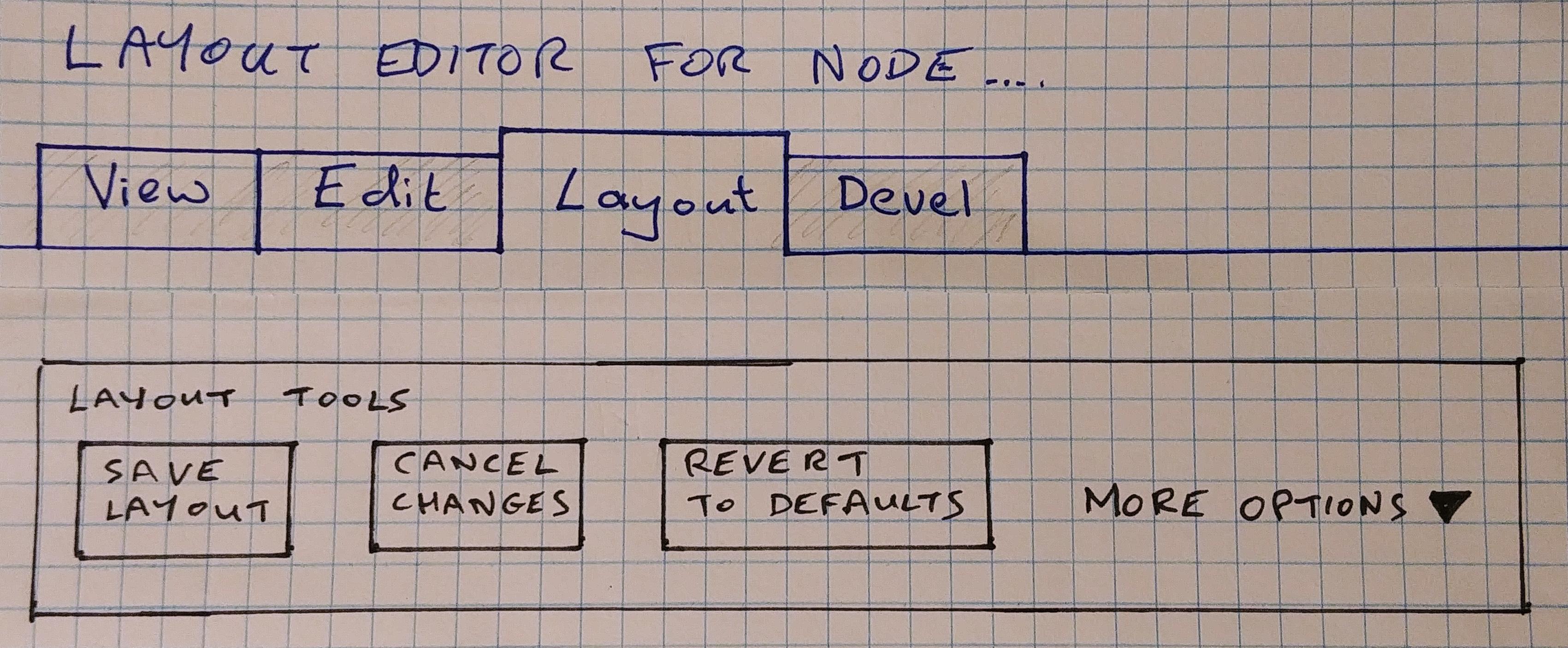
andrewmacpherson commentedI made some pen-and-paper mockups of the custom landmark region I described in #11. (Sorry about the messy handwriting.)
The first version has the existing 3 buttons, and also some checkboxes to represent some of the options from #16, to customize the information being displayed.
The second version hides the checkboxes inside a "more options" collapsible region, because we don't know quite how many we are dealing with yet.
This allows more space to arrange the display customization options. Here I've shown radio and checkbox controls to toggle the block content, and admin labels for blocks and regions.

I have some mockups of the rest of the UI to show the effect of these options. I'll add those to the related issues.
Comment #18
bkosborneNot much to add, but chiming in to say those mockups look great to me and is how I envisioned this would look as well.
Comment #19
tim.plunkettTo clarify, these actions are currently links. But due to purely architectural issues, they will likely be changing to buttons.
This doesn't seem to conflict with #17, but just wanted to call that out.
Comment #20
k-dyckes commentedTask Bar Option A1-A2
Task Bar Option B1-B2
Task Bar Option C1-C2
Comment #21
aaronmchaleFollowing on from #19, I wonder if it's worth postponing this for now until #3004536: Move the Layout Builder UI into an entity form for better integration with other content authoring modules and core features is fully implement or at least RTBC, so that we know what form the UI will take going forward, as that linked issue could directly impact this one.
Comment #22
tim.plunkettAgreed
Comment #23
tim.plunkettThese actions have stopped being links and are now buttons
Comment #24
andrewmacpherson commented#19: Yes, these would be better as buttons.
#23:
"Save layout" is now a button, but "discard changes" and "revert changes" are still links. Filed #3037113: Replace layout builder discard-changes + revert-to-default links with buttons to address that.
Comment #25
tim.plunkettFixing tag.
Also, this needs an issue summary update. Is there still a change needed here?
Comment #26
andrewmacpherson commentedyes, todo:
role=regioncustom landmark is still desirable. The must-fix misuse of the secondary tabs landmark has been addressed (#11-12) but the landmark region is still desirable to find these buttons. Now that the save button is the first submit in a<form>, it would be normally be a candidate for implicit form submission. However, there aren't actually any of the elements that would normally trigger that; the "form" is really just a collection of actions, without any checkboxes, text fields, etc. So assistive tech users may still have trouble finding this region, and making it a landmarkrole=regionwould help.Comment #27
andrewmacpherson commented#5
This is something we can do now.
Comment #29
xjmAlright, I chatted with @andrewmacpherson about this issue, and there are two remaining parts to solve:
We'll still want to update the issue summary here to reflect the current state of things, since the original issue was filed while these were still the highly confusing local tasks.
Thanks!
Comment #35
askibinski commentedI'm working with layout builder for the first time on a project and was wondering if there has been any usability findings from "simple editors" which are using Layout builder?
Because my main issue (and I found this issue to be the one touching this) is that there are now 2 tabs: Edit and Layout which basically *both* cover content editing. As a dev or site builder, I understand why this distinction exists, but as somebody who just want to edit content this must be confusing having 2 different screens for basically the same content.
So just wondering if this issue is the best place for that or if this discussion already took place (probably) somewhere else.
edit: found #3121372: Use layout builder for content add/edit form
Comment #39
mgiffordTagging for https://www.w3.org/WAI/WCAG21/Understanding/name-role-value
Comment #40
bkosborneThe issues this was originally postponed on have long been resolved