Problem/Motivation
There's some side discussion going on in #2724819: Create experimental module for place block on any page feature to make the interaction pattern a lot more well-designed and user-friendly; for example, by re-using the Quick Edit paradigm, or to use transparent backgrounds on the regions so they assault the eyeballs less and only show the "Place block" button on hover.
The current look and feel is the following:

This issue is to explore various aesthetic options and arrive at a validated design we can then create a patch around.
Place Block module in Drupal 8.2 needs an improved design; ideally one that brings together the rest of the nascent "Outside-in" issues in a way that is minimal but not unusable.
Proposed resolution
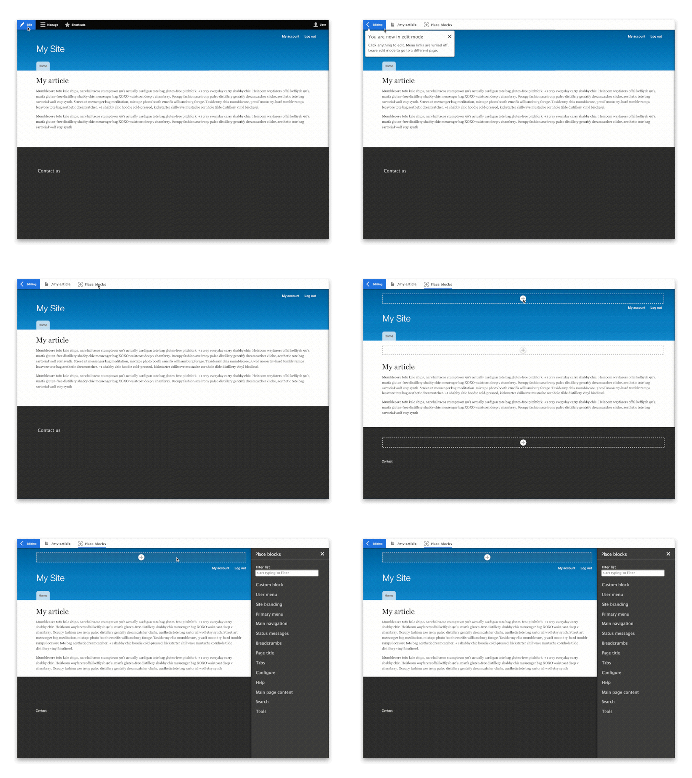 Image links to attached video
Integrate block place module with view-edit toggle and off-canvas tray.

- Change "Place Blocks" menu item to only show up on secondary Toolbar [required]
- Change icon + label to "Content regions" [must have]
- Remove horrid yellow backgrounds and replace with transparent background [must have]
- Change "Place block" button with "+" icon [should have]
- Change "active" styling [could have]

- Clicking anywhere in the outlined region triggers sidebar, rather than modal [required]
- Show simplified "place blocks" form + search filter in sidebar [required]
- Icon changes from "+" to "x", which if clicked closes the sidebar and returns back to region outline view [could have]
- Change "hover" styling [could have]

- When clicking block name, block appears in place to provide instant preview [required]
- Block add form is replaced with simplified configuration form for block [required]
- "Cancel" takes back to region overview [required]
- Second click on “content regions” hides content regions [required]
- Options changed (e.g. "Hide title") takes instant effect in preview. [must have]
- On hover, block name has a “block” background [could have]
- When block name is clicked, block “moves” into place with animation [could have]
Remaining tasks
User interface changes





Comments
Comment #2
tkoleary commentedComment #3
tkoleary commentedComment #4
webchickUpdating the issue summary with a breakdown of what implementing the proposed prototype would look like.
Some of these things (e.g. switching the words/icon, the removal of the BRIGHT YELLOW backgrounds in favour of the standard in-place editing region outlines) we could already start on in sub-issues. Others are blocked on the Outside In patch(es).
Comment #5
webchickComment #6
elliotc commentedHi! I'm going to do a little bit of this at the DrupalCorn Sprint:
I have a few questions/concerns about my very basic changes.
Comment #7
elliotc commentedComment #8
elliotc commentedNot done, but I am in the middle of the CSS/button.
Comment #10
xjm#2784495: Normalize block place and outside-in experiences might be a duplicate?
Comment #11
webchickComment #12
webchickThat got committed, so I think we can work on this again. :)
Comment #13
webchickAdding a screenshot of the current look/feel for contrast.
Comment #14
dyannenovaI've updated the css to use the outside-in dashed outlines, moved "Place block" into visually-hidden, and added two plus images, #bebebe to match the mockups, and black for the hover effect.
Here's a gif of the resulting interaction:

Comment #15
dyannenovaComment #16
pwolanin commentedI think the hover effect should have some kind of boarder around the whole region as we have in HEAD now, but looking for feedback from @tkoleary
Comment #18
skaughtInteresting. Moving from the Modal/overlay to the tray will be making Place Black dependent on Outside In
Comment #19
tkoleary commented@DyanneNova
Looks good. My only comment would be to match the size, color and hover effects of contextual links so there's a consistent experience when both are visible, which will happen in outside-in edit mode.
I'm even leaning towards positioning them to the right so the user can more easily scan down that edge of the page, but I'd like to hear more opinions on that before we do it.
Comment #20
tkoleary commented@skaught
If I understand correctly outside-in will look for place block and then alter it to use the tray ajax instead of modal. So neither would depend on the other.
Comment #21
tkoleary commented@pwolanin
That's correct (sort of) .region should have a border when place block is toggled on, .place-block-region should have the same background effect on hover that .outside-in-editable has in outsidein module.
Comment #22
skaught@tkoleary #20
more to my thought: the tray should become a core element sooner rather than later; so that it's just another tool OF core for modules to use.
also then, we can focus on ux(breakpoint) and a11y issues of the tray itself.
logic based on 'if this other experimental module is active' is layering complexity when the whole UX tool that the tray adds...is awesome. (:
Comment #23
pwolanin commentedChanging the modal dialog is out of scope for what we are trying to do in the patch here. That needs to be a follow-up
Comment #24
skaught..scope. (:
Comment #25
akalata commentedUpdating tests.
Comment #26
tkoleary commented@skaught
Absolutely.
@pwolanin
Yes. It's already another follow-up issue related to outside-in.
Comment #27
dyannenovaI've standardized the plus button size and changed the plus hover color from black to #787878 to match the pencil hover. There was some confusion here about where to implement the border and hover background color, so I tried a few variations and tested them with @lizzjoy to get a better idea of a content editor's expectations.
Here is an interaction with the region area surrounded by a dashed border, and highlighting the place block area with a background color on hover. In testing, the plus button was difficult to find and then understand. The border seemed to indicate that it related to the current content.

Here is an interaction with the place block area surrounded by a dashed border, and highlighting the region with a background color on hover. In testing, the region background on hover was confusing. Before the region background appeared the plus seemed like the right option, but that changed when the background appeared on the region. That seemed to indicate that the current content would be changed.

Here is an interaction that highlights the plus button, with no region highlight. This was the easiest to understand.

This patch is for the last interaction.
Comment #28
yesct commentedI had a similar concern.
Placing a block may become so easy, ... that people try to use it for content.
The dashed boarders (visual indication), with the plus sign getting louder (growing/changing to higher contrast colors) on hover seems like it is the clearest. With that also, it may be most flexible for different colored backgrounds people have in their theme... if the plus sign has an edge color (A) and a fill color (B) (and the plus sign color same as edge?) so that A and B have high contrast with each other.
Would a block icon with a plus sign in it remind people they are adding blocks?
When did you want accessibility feedback? I have a few thoughts already, but dont want to give them before you are ready.
Comment #29
miwayha commented@DyanneNova user tested these options with me, and I agree with @YesCT that the plus side getting more prominent feels like the most usable thing. Providing a background color on hover suggests to me that the entire area is clickable, whereas having the add button getting larger is nice.
The yellow background option doesn't offend me; it felt familiar to the D7 display regions interface.
Comment #30
pwolanin commentedIn order to support user expectations that the place block wold place the block at the top of the region.
Adding this task for block module to make the needed changes to core to support this: #2787641: Add non-UI mechanism for setting block weight through block forms
Comment #31
tkoleary commented@dyannenova
That makes sense. The border around the whole region when you toggle 'place block' on indicates 'here are regions where you can place blocks' the hover background effect on only .place-block-region div at the top tells the user 'the block will go here'. Putting the background effect on the entire region would be confusing.
Comment #32
skaughtre: #28
color's are a great issue. As these mocks are only in bartik, isn't not going to highlight just home much of an issue outlining regions, dimming backgrounds and the icon swell is only just effecting as a visual* aid. that was the strength of the old yellow color (which simple came from the block demo page) -- no one uses yellow.
* of course, some general true a11y issues pre-stand
hopefully as a constructive suggestion: i often use http://www.html-color-names.com/khaki.php to help clarify things for content editors and site admins in my projects..and i've had positive feed bad from those clients for it. regardless of their actual theme design and palette.
Certainly with outside_in's display of contextual links and it's outline and bg shading, it's getting visually muddly about "which thing i'm doing now" -- placing blocks or quick editing block config..
needs work:
Comment #33
pwolanin commentedWhat's the throbber placement you mention?
If it's existing modal code, that's out of scope. All this patch changes is CSS, essentially.
Comment #34
skaughtthrobber is falling to the bottom of the plus sign. Forces the icon to shift to the right -- lost of visual jumping.
Throbber itself is cut off on the right side (width too narrow).
Comment #35
tkoleary commented@miwayha
Actually, assuming we want to make this consistent with outside-in, the entire area *should* be clickable.
We should be testing the block place feature and outside-in with both toggled on to make sure all of the interactions are consistent.
Comment #36
tkoleary commented@pwolanin
The throbber is positioned with CSS, so I don't see how that's out of scope.
@skaught
I agree. I have been messing around with a way to fix that by absolutely positioning the throbber on top of the button, like this:
With this CSS:
Of course this also assumes we position the plus button to the right, which when you look at it with edit mode toggled on seems to make more sense.
The only drawback is that if the positioning shifts you might see the button peek out from under the throbber, but perhaps we could hide the button with js when the throbber is active.
Comment #37
tkoleary commented@DyanneNova, @miwayha
Nice work. It's great that you usability tested it, but i'd suggest we need a little more validation on the expanding icon interaction since we don't use that anywhere else in core. For this issue I think we should keep the hover effect consistent with contextual module by just removing these attributes:
Then we can open a meta issue for more discoverable hover afforadances for things that are editable on the front end. That would apply to place-block, quick-edit, and outside-in as well as any other contrib module that does "front-end" things and wants to leverage it eg. Panels IPE, Scald, etc.
Comment #38
lizzjoyFrom the usability testing, as a content editor, I found that the region highlighting was confusing but the increasing size of the plus sign when I hovered on it was more clear and an improvement. I like the differentiation on placement of the plus sign (centered) and the icon for editing (right) because of the clear difference in functionality of placing a block and editing the block itself.
Comment #39
tkoleary commented@lizzjoy
I'm not discounting your experience but, did you test it with both block-place and outside-in enabled and toggled on at the same time or while quick-editing a node? Those will be experiences that we need to cover.
What I'm saying is that we can't look at this module in isolation. It needs a holistic approach.
Also, while your experience is a valuable data point, we also need to test on users who are a "blank slate" ie. have never used Drupal, to cancel out the curse of knowledge effect.
Comment #40
skaught#36.
+1 -- i do think i like all being set to the right. should make it easier to flip for RTL with throbber too.
again, i think killing the css grow effect for a negitive would be a good cue and now, bypass re-positioning with throbber overtop.
Comment #41
pwolanin commentedGiven that webchick felt the current design could not ship and we are nearly at the point of releasing 8.2.0, I suggest the improvements by @DyanneNova should be committed and a new issue replace this for additional refinement and user testing.
Comment #42
tkoleary commented@pwolanin
I'm ok with RTBC as long as there's a new patch that removes the "expanding icon" attributes pointed out in #37 and seconded in #40.
I'm ok with pushing the ajax throbber stuff to a follow up.
Comment #43
tkoleary commentedComment #44
webchickI'm not 100% sure I'm reading #27 right, but what it sounds like is the expectation from @lizzjoy was that the entire highlighted region was clickable, and the confusion arose when that was not the case, and instead only the button was clickable. What about fixing this the other way, and making the entire region a link, including the button?
Comment #45
tkoleary commented+1
Comment #46
Bojhan commentedWe can definitively do this, but I am not quite sure for a small improvement we should also change the entire interaction pattern (expanding the button and region). Lets make it a followup and explore it, its quite an interesting idea.
Comment #47
yoroy commentedDiscussed this at UX meeting:
Lets create a patch that removes the scaling/expanding bit and commit this otherwise excellent design update.
Expanding the box the + button is in is an interesting idea that we can consider but would be good to do that in a separate issue. Lets get this design update committed without introducing this a new pattern.
Can somebody remove that bit from the patch?
Making the whole region clickable is a good idea, lets do a follow up for that as well. There might be technical implications for why this is not the case.
Comment #48
pwolanin commentedThe "button" is simply a link. If we wanted to make the whole inserted block clickable it would need to be changed to an A tag displayed as block, and then the "button" would just be some decoration in the middle. This seems like it might be rather theme specific to work right, so I'm a bit reluctant.
Comment #49
lizzjoy@webchick yes, that is correct about #27. The highlighting made it appear that it would be possible to edit content within the existing blocks.
Comment #50
tkoleary commented@pwolanin
As @yoroy summarized from UX meeting, making the entire area a button can be a follow-up issue.
The only thing blocking commit right now is removing the attributes mentioned in #37. Could you roll a new patch with that change and then we can put this back to RTBC?
Comment #51
dyannenovaHere's a patch to remove the expansion of the button.
Just to clarify, we were doing testing with Outside In enabled. We did have one user, @faalbane, who is just now learning what Drupal is and didn't know what a content type was while testing. I have more notes written up on that, but will need to find the relevant issues, since they are out of scope for this.
Comment #52
profiweb commentedThe best Inline editing interface for Drupal was (now it is not on sale) in D7 SIMPLR Builer module:
https://www.youtube.com/watch?v=yitq5iIq-xM
This module was predecessor of MD AweContent - Page Builder for Drupal
http://demo.awecontent.com/drupal7/user (login: demo / pass: demo)
The best of these 2 modules plus Inline editing UX of Sitefinity CMS (look the video on homepage) for my opinion is the best examples for "Outside-in" features in D8.
Will be in D8 flexible, inline placeble and editable Grid, which is need BEFORE placing blocks?
It is very important!
Comment #53
tkoleary commented@DyanneNova
Awesome! I'd love to have a look at the full report since I'm already working on next gen prototypes to place 'between any two blocks' as well as drag position.
Comment #54
tkoleary commented@profiweb
Interesting, but layout is not in the scope of this issue. That has it's own initiative (blocks and layouts). This is simply about getting a minimally viable solution to place blocks in core.
Comment #55
pwolanin commentedApplied the last patch - it works as requested, though I still think there should be more of a visual hover effect since the scaling was removed which was very eye catching.
Let's consider options as a follow-up though.
Working on #2787641: Add non-UI mechanism for setting block weight through block forms to enable placing the block where expected.
Comment #56
tkoleary commented@pwolanin
Great, but can you pause on implementing that? I have designs to review.
Comment #57
pwolanin commented@tokleary - the change I'm proposing has no impact on the UI of the modals, only passes data along in the query string. Check out the patch.
Comment #58
webchick(Tested on simplytest.me and Chrome)
Here are a few screenshots in contrast to the original in the issue summary:
Default state:

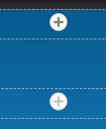
On hover, the plus sign gets a touch darker (compare top/bottom):

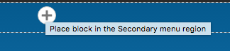
If you hover long enough for the title attribute to show up, it tells you the region name:

On click, the plus icon gets offset by kind of a gnarly looking AJAX spinner (sorry, this is tricky to take a screenshot of):

So while this version is immeasurably less assaulting visually, it indeed feels like we have a bit more design/touch-up work to do on this yet. The hover interaction is super subtle (and possibly not conforming to contrast standards?) and we need to somehow lose that white jagged outline on the spinner, and probably also not have the button displace; that was kinda weird.
That said, this looks like a really great start, so happy to commit this so we can build from it.
Committed and pushed to 8.2.x and 8.3.x. WOOHOO! Thanks so much for all the work on this!!
As far as where to go from here, I'm a bit unsure. We're already at ~60 comments, yet we haven't yet really achieved the issue's aim to "Create a validated design for Block Place module." The real user feedback we did get pointed at a new interaction pattern (embiggen) that we don't yet have in core, and the UX team was (understandably) uncomfortable adding a one-off pattern here versus discussing the general idea for the interface as a whole.
So I think I'm going to re-title this to be around reducing the visual clutter of the previous UI, and spin off sub-issues for those specific things mentioned up above. Doing that shortly.
Comment #61
webchickComment #62
webchickOops, one more screenshot.
Comment #63
webchickOK, here we go. Let me know if I missed anything!
- #2793199: Ensure Place Block's hover styling meets accessibility guidelines
- #2793207: Fix off-set and goofy white jagged background of AJAX throbber when clicking Place Block
- #2793197: Explore UI pattern: not just colour-changing on hover, but "embiggening" as well
Also updated the meta plan at #2739075: [plan] Make Place Blocks module functionality part of the Block module (etc.).
Comment #65
gábor hojtsy