

Closed (fixed)
Project:
Drupal core
Version:
8.0.x-dev
Component:
user system
Priority:
Normal
Category:
Task
Assigned:
Unassigned
Issue tags:
Reporter:
Created:
6 Sep 2015 at 12:28 UTC
Updated:
3 Oct 2015 at 18:54 UTC
Jump to comment: Most recent, Most recent file






Comments
Comment #2
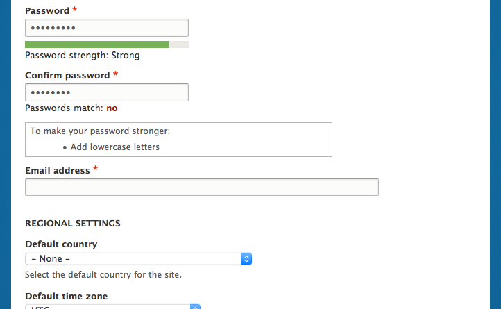
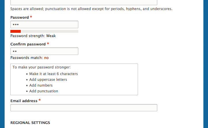
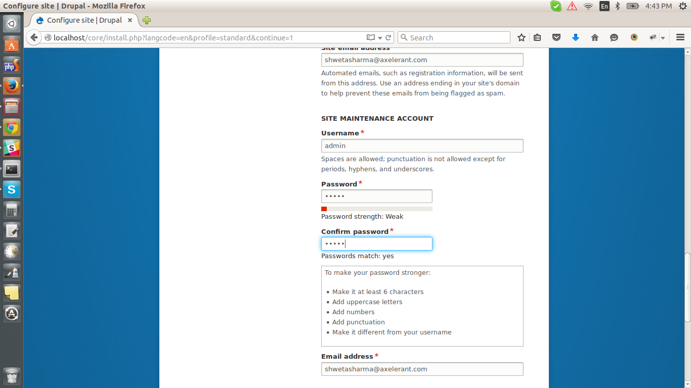
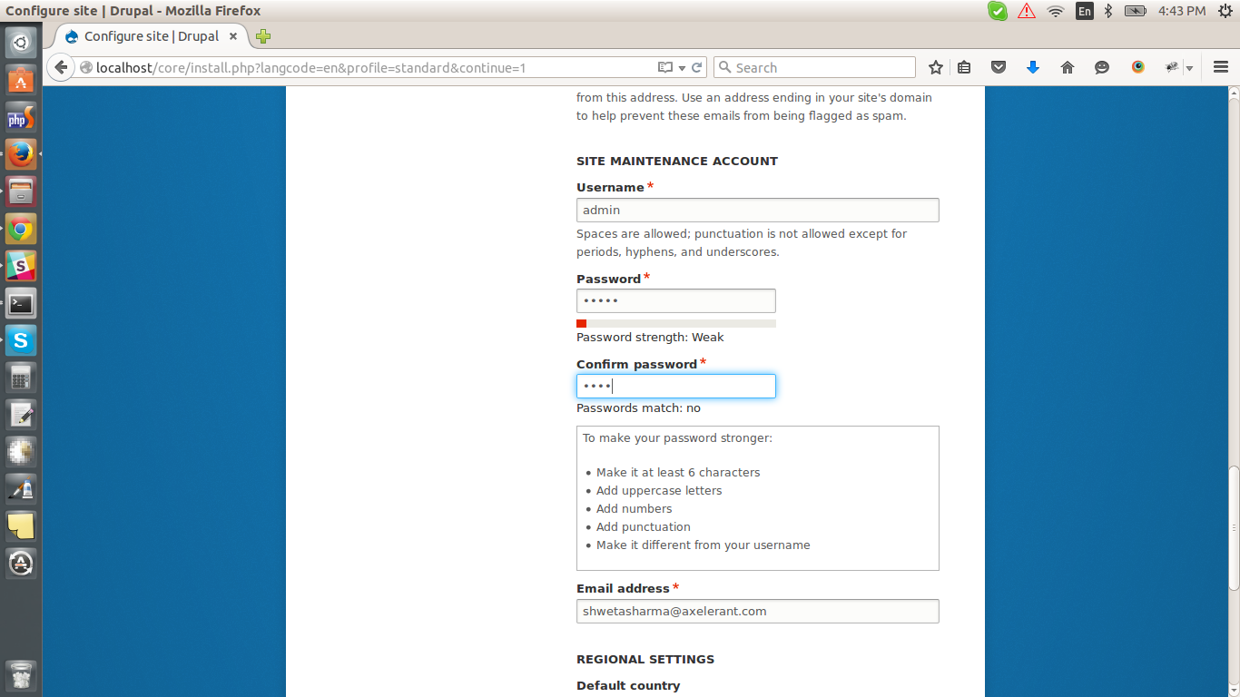
sushantpasteScreenshot attached after applying the patch , which will give more idea.
Comment #3
sushantpasteComment #4
sushantpasteComment #5
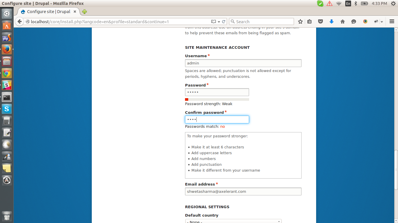
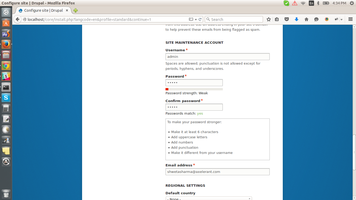
shwetaneelsharma commentedTested confirm_password-2563955-2.patch. It works fine. Colour for both password match and mismatch appears in green and red respectively. Attaching screenshots.
Comment #6
cilefen commentedComment #7
cilefen commentedComment #8
xjmThanks @sushantpaste for the patch!
That "yes" color looks pretty low contrast against the white, especially in that font -- can we run an accessibility check on that?
Also, I'd like a check from the subsystem maintainer that this is consistent with the style guidelines. I guess the installer theme is consistent with Seven? So assigning to Lewis.
Finally, it's be useful to check for when these colors were removed in D8 since that issue might document why (or indicate if it was unintentional).
Comment #9
lewisnymanThanks for raising this issue with me. I have some suggestions:
Can we not use the 'span' element before the class? We try and avoid this where possible
This green should match the text color in the system messages:
#325e1cThis red should match the text color in the system messages:
#a51b00Both of the colors reference above are already confirmed accessible, so I'm removing the tag.
Also, can we place a comment above these to say what they are? The classes are quite vague but I don't think we have much time to improve them.
Comment #10
bruvers commentedThis patch uses just the class selector and implements Lewis's suggested colors from #9. Notice that the green color is hard to distinguish from the text base color.
Comment #11
anavarreMay I suggest (didn't dare suggesting bold text):
text-transform: uppercase;'yes' in green is barely distinguishable on a white background and surrounded with black text.
Comment #12
lewisnymanI am worried about using uppercase in this situations because I'm worried it might look like we are shouting at the user. Maybe we should give bold text a go and see how it looks?
I think 'Passswords' should be lower case. Also we need a full stop at the end of comments.
Comment #13
bruvers commentedFixed CSS comment and made the passwords match test status indicator text bold. This makes the green color stand out a lot more and it is now recognizable as green.
In the screenshots you can see that the text of the password strength indicator is not bold. I think this is ok because the strength test uses a colored bar as the test result indicator whereas the password match test uses text to indicate the test outcome.
Comment #14
bruvers commentedUploaded screenshots of a WCAG level AA contrast check.The inputs are barely visible. Should that be fixed?
Comment #15
lewisnymanGreat, these colors seem good. I think the input fields are ok.
Comment #16
ianthomas_ukLooks like the error case was originally broken by #2336141: Create reusable color classes which renamed .error to .color-error. I can't see what happened to .ok.
Should we use the color-error and color-success classes for this? That's nicer for reusing colours, but not as nice for writing semantic class names.
Comment #17
sushantpasteThanks all for reviewing the patch. I think all good now. I am not sure about #2336141: Create reusable color classes
Comment #18
lewisnymancolor-*classes also add a background color. Maybe we needtext-color-*classes?Comment #21
anavarreTestbot acting up.
Comment #22
alexpottCommitted 108e038 and pushed to 8.0.x. Thanks!