

Closed (fixed)
Project:
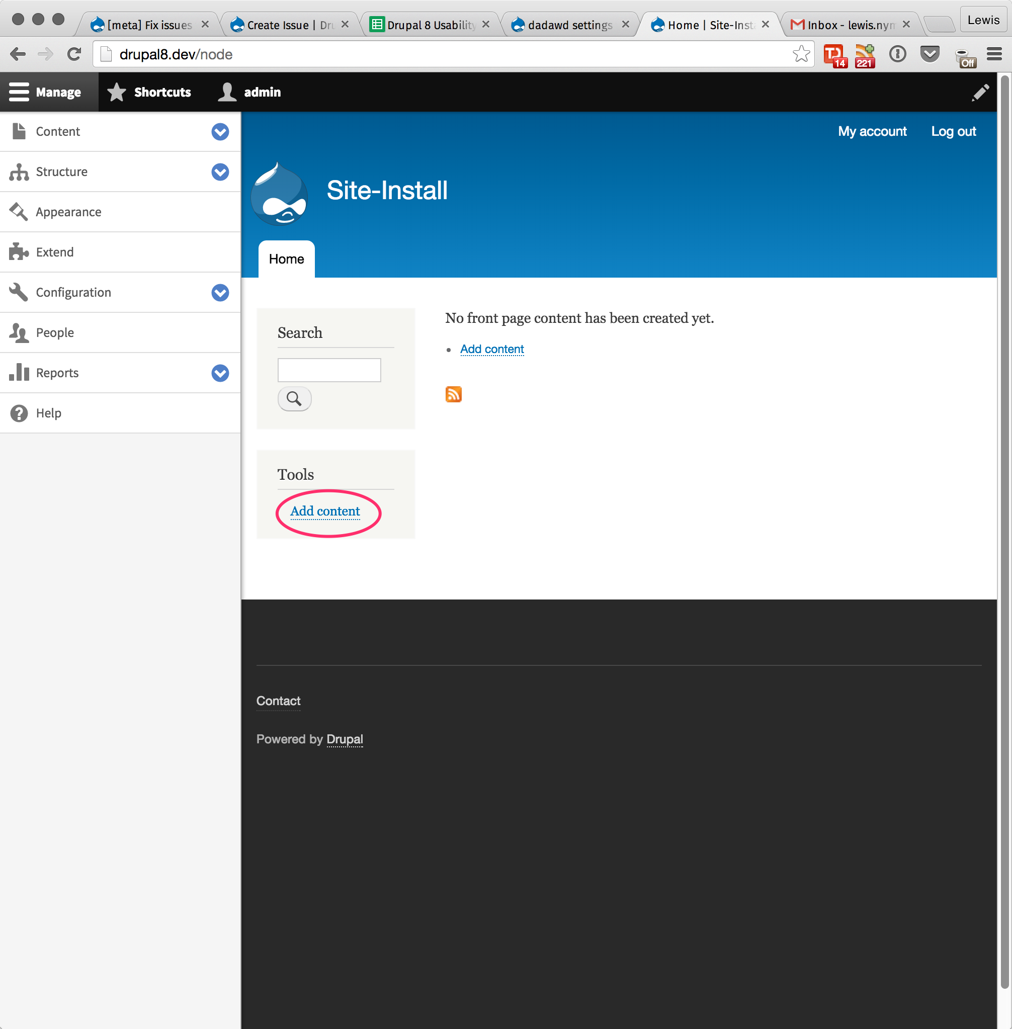
Bartik
Version:
1.1.x-dev
Component:
Look and Feel
Priority:
Normal
Category:
Task
Assigned:
Unassigned
Reporter:
Created:
3 Jul 2015 at 14:35 UTC
Updated:
11 Dec 2025 at 13:09 UTC
Jump to comment: Most recent, Most recent file
 Show commands
 changes









Comments
Comment #1
merilainen commentedNot sure if this is the correct approach, but since there is no general menu component css file in Bartik, I made a tools-menu.css and made the font-size bigger. The breakpoint is the same as for the main menu. Probably needs work.
Comment #2
lewisnymanThanks for the screenshots. From a design perspective I think that increasing the font size kind of breaks the heirachy of the element, because the title “Tools” is now smaller than the content.
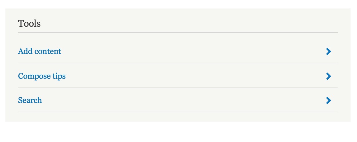
Another way we've done this in the past is to increase the padding on the link, so the target increases without the font size changing. See the conversation in #1137800: Increase minimum size of targets for touch screens for more discussion.
I think there is also work to do from the code size, using @file comments and not using ID's. We can do the design changes first though and then pull in Emma to review the code.
Comment #3
lewisnymanComment #4
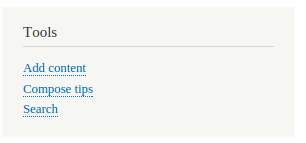
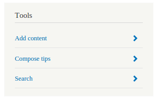
emma.mariaI think this should be added to any menu placed in the sidebar. Modules seem to add items to the Tools menu, plus we should keep styles consistent.
In the screenshot I added padding top and bottom to any menu-item in the sidebar so they became a height of 44px.
See screenshots.
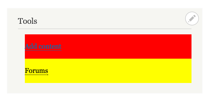
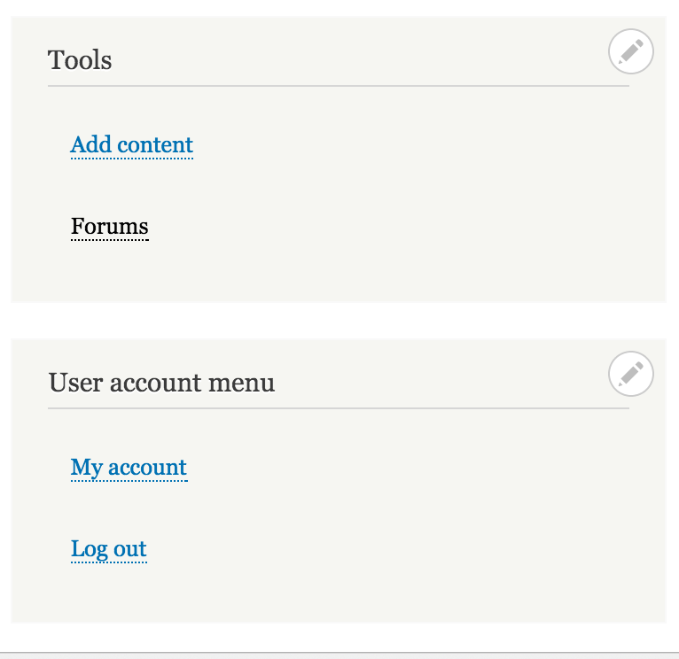
Also note the space on the left of menu items is a bug and being dealt with in another issue.
Comment #5
emma.mariaAs no one has answered I would like to move forward and implement a new patch with the direction in #4.
Any sidebar menu at a touch device screen widths gets the styles outlined in #4.
Comment #6
chandeepkhosa commentedAssigning to myself
Comment #7
chandeepkhosa commentedI created a patch that does this successfully, with changes to bartik/css/components/sidebar.css
I targeted the 'a' link tag which works well, the only issue with this is that the underline appears lower. Any ideas on how I can improve my patch?
Screenshot of this is attached.
Comment #8
legolasboGood start, thanks for your efforts. You'll find my review below.
This adds 44px of padding to the top AND bottom making the element at least 44px high. Also, since there is no media query. it also gets applied on regular screen sizes, not just mobile devices.
As per the coding standards, there should be a newline at the end of a file.
Comment #9
chandeepkhosa commented@legolasbo, thanks for the feedback. That's what you get when writing a patch in a hurry before lunch :)
1) Have changed this so it adds 22px to the top, and 22px to the bottom. I have targeted this to viewports less than 768px wide.
2) Done
Comment #10
legolasboI assume you didn't test this, because your media query is missing a
{Also, why did you choose the 768px breakpoint? The sidebar has a breakpoint at 851px (min-width) and the menu uses 900px. The general consensus seems to be to use 851px, which means you would have to break at max-width 850.
Comment #11
chandeepkhosa commentedThanks again. Here is the fresh re-roll
Comment #12
legolasboI reviewed the results of the patch, it doesn't produce the desired result. Please see attached screenshot taken at about 800px screen width.
Comment #13
lewisnymanEmma asked me to come up with a better design for this
Comment #14
szeidlerWhat is lacking in patch #11 is a
display: inline-block. Otherwise the padding-top and padding-bottom will be ignored completely.The downside of using inline-block or other displays, is that the border-bottom will be pushed down and away from the actual text, which looks weird.
See attached patch and screenshot.
The only solutions, that come to my mind, would be a usage of :before or:after for in some way. But feels too much for such a task.
Comment #15
szeidlerComment #16
lewisnymanHere's the patch. I changed a lot of the original patch so an interdiff didn't seem worthwhile.
Comment #17
emma.mariaComment #18
legolasbo@LewisNyman,
Even though i like the chevrons, they are out of scope for this issue. The patch should only fix the issue at hand. Adding chevrons should be done in a separate issue. Besides that your changes look good from a code perspective.
Comment #19
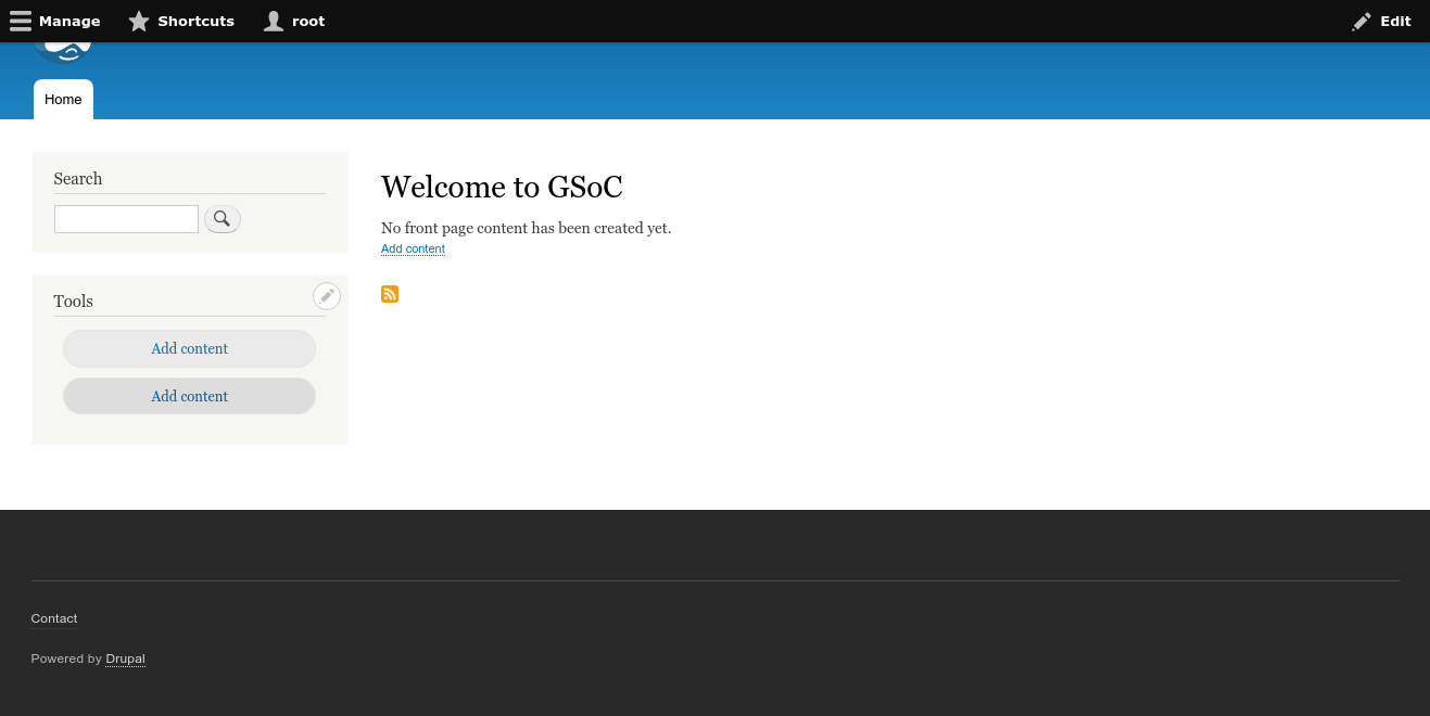
lewisnyman@legolasbo I agree the scope has expanded a little, it's tricky to just fix the problem at hand if it looks bad. It requires a little bit of design on top of the technical solution. I'll ask Emma to comment on the scope.
Comment #20
emma.mariaI agree that a solution for touch here will probably need a change in design. I will however admit that the blue arrows initially surprised me as nothing like this exists in Bartik right now.
I'm adding the mighty "Needs usability review" tag to get more eyes on this.
Comment #21
yoroy commentedThe underline moving down is because it's a border style, not an actual link underline, right?
So, why is it a border in the first place?
Comment #22
emma.mariaThe default link style has a dotted underline, which can only work with a bottom border :-(
Comment #23
lewisnymanThis decision was made in #890362: Links should not be indicated by color only and it has come back to bite us ever since
Comment #24
yoroy commentedRight. I wouldn't want to revert to underline instead of border-bottom just for this issue alone, but if that decision is hurting us in more places we should probably reconsider.
Comment #25
Bojhan commentedI think the design approach by Lewis here makes a lot of sense, you shouldn't have more than a couple links in here anyway
Comment #26
yoroy commentedSo the chevrons would only be applied to the 'Tools' menu, right?
Comment #27
emma.mariaI thought for consistency it should be any menu added to the sidebar as they will all print like the Tools menu. Bad idea?
Comment #28
legolasboAdded to any menu in sidebar +1
Comment #29
hubbs commentedI do like the updated menu as Lewis has it in comment #16, but I question the chevrons. It's common to have an chevron/arrow as part of a single link or button design (i.e. Read More buttons). However, chevrons/arrows in a menu often mean there is some sort of slideout or dropdown that will activate. If we don't include the chevron/arrow we leave open the possibility for adding one in later, if multiple menu levels are required. Just a thought :)
Comment #30
emma.maria@yoroy would you be able to take a look at this issue again with fresh eyes and provide any input?
Comment #31
yoroy commentedOk! I retract my #26 :)
Lets see a patch that does this. We need to see it in action to make a call on this. Lets explore this direction where any menu in the sidebar would get the same treatment with the chevrons ">".
Comment #32
yoroy commentedTested the patch in #16 but see nothing happening.
Comment #33
yoroy commentedComment #34
pguillard commentedI just compared adding a touch class to the container, and this is what I got :
Comment #35
pguillard commentedSo I guess this is what we want!
Comment #36
yoroy commentedLooks like it yes! :) Is the patch in #16 still ok then?
Comment #37
pguillard commentedIt is still OK. I would say RTBC for that one !
Comment #38
yoroy commentedComment #39
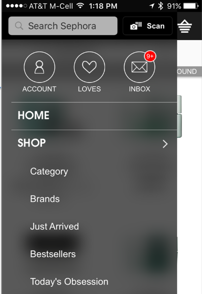
webchickHubbs raised a good point in #29 that I don't think was addressed, and was my first thought when seeing this, too. Basically, it seems like > in a mobile pattern normally means an "expando-thingy" to take you down a sub-nav. Here are some examples I found while searching for mobile navigation patterns:
Core's toolbar uses the same pattern:
So I'm a little worried that mixing the two might be confusing, because on Tools and other associated menus, clicking the link just takes you straight to a page. Any data we out there that illustrates when chevrons are appropriate?
Comment #40
markconroy commentedThere's an interesting study here about using icons in menus: https://www.viget.com/articles/testing-accordion-menu-designs-iconography
An interesting takeaway:
"Finally, participants were asked via multiple choice question what they thought would happen after they clicked. The majority of participants believed the menu would change (Figure 4), while a small number believed they would be taken to a new page..."
What we are doing with this patch is "taking people to a new page" - the expected behavior of only a "small number".
Also in the study (albeit there was only a small sample of people used), having the chevron on the right resulted in slower response times.
The results of this would suggest not using the arrow unless it is to expose more menu options. Presently as a stylistic device it may look nice, but as a UX tool it should serve a different function.
Comment #41
yoroy commentedThanks for that. So we want something without the chevron.
Comment #42
szeidlerThanks @markconroy for the linked study. It approves the feeling, that the chevron could be ambiguous ux-wise. Then we should focus on solving the main purpose of the issue, making the links finger friendly, without introducing new and potentially confusing patterns.
I removed the chevrons from Lewis' approach, but keeping the borders, which makes the link area identifiable and follows the button separation pattern from core's toolbar.
Comment #43
markconroy commentedWhy are we changing this for touch screens only? I don't think we lose any benefit by having it for all screen types.
Actually, I think click screens would also benefit, especially for people who are not too steady with a mouse.
Comment #44
mikeoharaI am going to take a screenshot of the result of #42 as part of this issue at Drupal Con 2016
Comment #45
mikeoharaI attempted to test #42 on both Simpletest.me and on my local environment and did not see the expected result.
I am at the mentored sprint at Drupal Con 2016
Comment #46
mikeoharaI am changing this ticket to "Needs Work" because of the results obtained from my test of the most recent patch.
Comment #47
afem commentedThis is a new approach than the last patch that was submitted so I have not included an interdiff.
Comment #48
mikeoharaI tested the patch above and do see that it does perform as intended. I do think it is an improvement.
Comment #50
yoroy commentedComment #51
tassilogroeper commentedComment #52
tassilogroeper commentedHi,
nice work so far. Since this issue had not moved on, I took the liberty to review it and update the styles.
- As pointed out by @markconroy #43 there is no need to actually media query the links only to mobile. Thus, I removed it.
- Plus, I also added the active state with a solid white background. see screens attached.
Side note:
Bare in mind, touch targets are not only limited to mobile device widths. Even large displays may have the ability to engage via touch.
One Important thing can come up, too: you may have to add additional margin between the elements to make them touch friendly. In my experience, Google Page Insight sometimes complains about links being too close to each other.
FYI: working on it at the Milan DevDays.
Comment #53
tassilogroeper commentedComment #55
yoroy commented@emma.maria, what do you think?
Comment #56
tkoleary commentedComment #57
brahmjeet789 commented@tassilogroeper i have reviewed your patch and it is working fine for me but the menu hover color is different that's why i used the same background color on hover that is used in search icon's hover ,please review it.
Comment #59
Bojhan commentedComment #61
tikaszvince commentedThe #57 patch works for me
Comment #62
tikaszvince commentedComment #63
gábor hojtsyJust expanding on @tikaszvince's comment, I've seen him testing on an Android phone and on desktop for touch friendliness in person at the sprint weekend :)
Comment #64
xjmThe screenshot images in the summary seem to be broken; can someone embed the latest screenshots up there for clarity?
Also it looks like a theme maintainer hasn't had a chance to review this in the past year, so tagging for subsystem maintainer review. Leaving RTBC though because that review could also be our frontent framework manager's on commit. :)
Comment #65
xjmAlso, this is actually an important hyphen.
Comment #66
star-szrThanks everyone, and sorry that this got stuck in the queue.
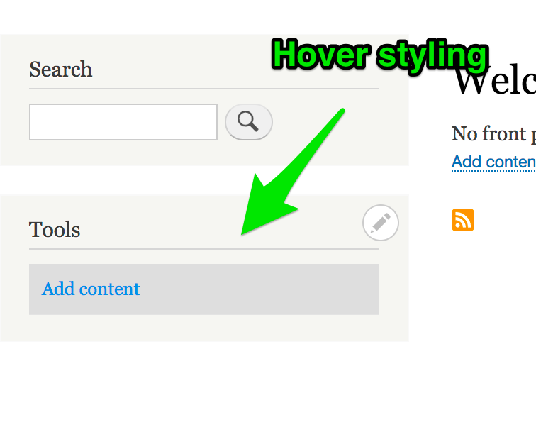
Reviewed this with some of the other committers and we found some design and usability issues with it. The hover looks a bit weird (especially on desktop) and the contrast ratio there is questionable.
@xjm will upload a screenshot or two later on.
Comment #67
star-szrPerhaps a more accurate title.
Comment #68
xjmSo yeah, the design on the hover needs review I think:

We also should confirm (for any such fix) that the colors meet contrast guidelines per the accessibility gate.
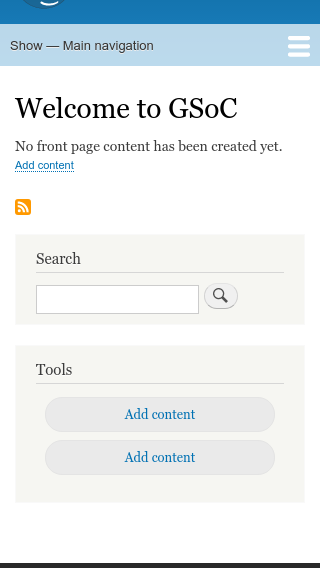
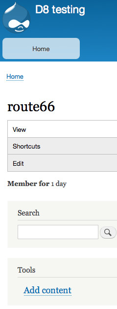
While the hover makes it clear what the clickable area is on desktop, so that the user would not be surprised by the link opening when they click there, that's not really helpful on mobile because there is no hover. There is no visual indication for mobile that the entire area is clickable, so it introduces the inverse of the original usability problem: a mobile user has no indication that the empty gray area is a link, and so if they click on it unintentionally, they will unexpectedly be taken away from their current page to somewhere strange they did not intend. Screenshot on mobile with the current patch:
Is there any reason the sidebar menu shouldn't just be responsive?
Comment #69
abbym commentedTo be clear - per comment #68 above (xjm), is the suggestion that we retain the latest's patch's vertical padding, but make it no wider than the word itself? Also, what specifically is meant by "Is there any reason the sidebar menu shouldn't just be responsive?" Thanks!
Comment #70
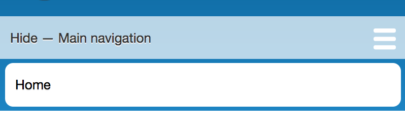
sudhanshug commentedI suggest to make the anchors in the side-menu look like buttons but behave like anchors anyways. I propose the following solution:
Desktop(notice that the colors are changed for perfect contrast ratio as suggested in #68):
Mobile(notice that the anchors look like CTAs and hence are intuitive to user's click behavior):
Comment #71
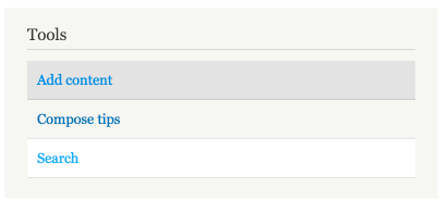
star-szrI like the general direction of #70 but I think they should look less button-y and more like how the tabs/main menu look in Bartik (screenshot below). I think buttons should be used for performing actions, not navigating.
Comment #72
Bojhan commentedAgree with Cottser here, and most of that is in the roundness applied. Also on "submission forms" like create content this will be confusing otherwise.
Comment #73
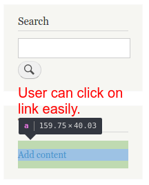
joginderpc@cottser i had re-implemented the theming for add content link as per you comment. Now user can click on link on mobile device i had increased its height with padding so the link can be clickable on mobile. The recommendation was 44px x 44px now the height is 40px
Please look into this once.
Comment #76
brahmjeet789 commentedAny update on this task.
Comment #86
smustgrave commentedThis appears to be bartik specific and since bartik has been removed from core in D10 moving to the contrib project.
Comment #87
markconroy commentedSorry Bartik, we tried but after 7 years we still couldn't come to an agreement on how to add a little bit of space between items in the sidebar menu. :-)
Comment #88
gaurav-mathur commentedComment #89
gaurav-mathur commentedSuccessfully Applied patch #16 for Drupal 10.1.x version. It is working as expected. Adding screenshots to refer after and before patch.
Comment #90
gaurav-mathur commentedComment #91
roberttabigue commentedHi @joginderpc
Confirmed it resolves when I applied patch #73 to the Bartik contrib theme against 1.0.2 version and with the Drupal core version 9.5.6.
Moving now to RTBC and
Please see the attached screenshots for your reference.
Comment #92
liam morlandPlease put the patch into an issue fork and merge request.
Comment #94
merilainen commentedMR created, there were some non-related core changes in the patch in #73, now the patch is css only and for Bartik only. Hence "Needs review" again.
And patch provided too.
Comment #95
roberttabigue commentedHi @merilainen,
Confirmed it resolves when I applied MR!16 to the Bartik contrib theme against 1.0.x-dev.
Please see the attached screenshots for your reference.
I'm moving this now to "RTBC".
Thank you!
Comment #96
liam morlandDoes your RTBC apply to 1.1.x?
Comment #98
liam morland