
Closed (outdated)
Project:
Drupal core
Version:
10.1.x-dev
Component:
CSS
Priority:
Normal
Category:
Task
Assigned:
Unassigned
Issue tags:
Reporter:
Created:
28 Feb 2014 at 07:47 UTC
Updated:
6 Jan 2023 at 18:40 UTC
Jump to comment: Most recent, Most recent file


Comments
Comment #1
lewisnymanComment #2
lewisnymanComment #3
lewisnymanThat was easier than I thought.
Comment #4
lewisnymanOnce #1921044: Align the styling of tool tips to be more consistent with Seven is committed, we should definitely try and bring the two closer together.
Comment #5
philipz commentedThis looks good but the tooltip is always to the right of the parent element isn't it? Maybe there could be also a modifier class when it should be to the left like it needs to be in #2170947: Visual cleanup of Edit shortcuts link - comment #13.
Or we could add that when/if it really will be needed later :)
Comment #6
lewisnymanYeah I was thinking the same thing. We should probably add a little arrow similar to the tooltips in #1921044: Align the styling of tool tips to be more consistent with Seven
Comment #7
philipz commentedAbsolutely! :) I was thinking the tool tips in joyride are looking nice with the arrow, little less opaque and with smaller radius (it looks smaller).
Comment #8
lewisnymanYeah, I think they should be able to share the same classes as long as we can wrangle the joyride templates enough. We will need a variant to change the radius but I can't decide if we should have a tooltip--small or tooltip--large variant.
Comment #9
lewisnymanThe more I think about this, the more I think we should be using the title attribute and Javascript to create and style these tooltips. It would be good to get an opinion from a Javascript maintainer.
I know jQuery UI provides this functionality, bootstrap also provides a really nice attribute only API for this http://getbootstrap.com/javascript/#tooltips
Comment #10
lewisnymanThere are loads of ways of adding this tooltip functionality with just CSS. Should we do that instead? What are the browser requirements?
Comment #11
lewisnymanI am 100% convinced we should do this is pure CSS. If we're going to use a library to do this (why not?) then we might as well add this to every theme. I'm going to work on a patch to add hint.css
Comment #12
lewisnymanThis needs theming to match Seven's tooltips but so cool :)
Comment #14
lewisnymanAdded Seven CSS and attempted to fix failing tests
Comment #16
lewisnymanI've opened an issue with hint.css to separate out the styling so it's not so overbearing https://github.com/chinchang/hint.css/issues/80
Comment #17
sqndr commentedSeems like we'll be able to use hint.css? :)
From the GitHub discussion:
Comment #18
lewisnymanYep :) let's try and push forward on this
Comment #19
sqndr commentedI'll give this a go.
Update 1:
- I've applied the patch from Lewis. The tooltips look good, but the
<em>tags are displayed as code. I'm looking for a solution for this at the moment.- Screenshot of the issue be found here.
@LewisNyman: It's a bit off topic, but is there a style guide for these elements? Should I add some documentation on how developers/themers can use this new design element? Where can this documentation be found? ;-)
Update 2:
Small coding remarks:
-
array ()should bearray()- so with no space.- there should be a
,at the end of the line.Comment #20
sqndr commentedHere's a new patch with the small remarks from comment #19. Still needs work, since the
<em>'s are an issue. I've updated the issue summary.Comment #21
sqndr commentedComment #22
sqndr commentedOK. I've solved the issue with the
<em>. I've changed the%shortcut_setinto@shortcut_set.Comment #23
sqndr commentedComment #25
sqndr commentedChange the Issue summary. Since we've made some changes to the html, the tests for the shortcut module are failing. These tests need some work.
Comment #26
lewisnymanWe do not have a good process for documenting the style guide yet, see #2102191: Discuss the availiable solutions to document the Seven style guide
I'm happy to start pushing along with that.
Comment #27
lewisnymanOk, looks like we have to keep some text inside the link. That makes sense for screen readers anyway.
Comment #28
sqndr commentedI don't think there should be a space?
{ } -> {}
The rest of the patch looks good.
Comment #29
sqndr commentedTo-do: Remove the space from the last patch. Added the novice tag.
Comment #30
pushpinderchauhan commentedRemoved extra space as mentioned by @sqndr in #28 and #29. Please review the rerolled patch.
Comment #31
sqndr commented@er.pushpinderrana - Thanks for change. Marking this as RTBC!
Comment #32
lewisnymanI am happy for this to be committed now, as long as we have a follow up to implement hint.base.css when it lands in the master branch: https://github.com/chinchang/hint.css/blob/add-a-base-build/hint.base.css
We haven't really changed the mark up that much, and the new attributes don't affect accessibility, so I don't think this requires a hard accessibility review.
We need a change record because this is an API addition? Let's also give this a quick sanity check in Stark and Bartik.
Comment #33
mgiffordI just saw this.
There are still accessibility issues with hint.css https://github.com/chinchang/hint.css/issues/81
I'm happy to report that it works well with keyboard users.
The problems with screen readers may be that there's still no best practice that's well supported for tooltips.
I created this issue with hint.css:
https://github.com/chinchang/hint.css/issues/81
Also filed issues with NVDA & ChromeVox.
Comment #34
mgiffordWas there any consideration of http://jqueryui.com/tooltip/
This too has known accessibility issues:
https://www.ssbbartgroup.com/blog/2013/07/03/jquery-ui-accessibility-ana...
But I'm not clear what version it was tested against.
@falcon03 suggested that actually a year ago https://www.drupal.org/node/1919940#comment-7234280
Notes too from Twitter with @scott_gonzalez:
https://twitter.com/scott_gonzalez/status/484402080677777408
https://github.com/jquery/jquery-ui/commit/b9e438d07c370ac2d4b198048feb6...
This is probably the better way to proceed.
Comment #35
mgiffordWell, the jQuery Tooltips are certainly available:
core/assets/vendor/jquery.ui/ui/jquery.ui.tooltip.js
Seems pretty powerful http://www.tutorialspoint.com/jqueryui/jqueryui_tooltip.htm
I'm just not sure how to use it.
Comment #36
nod_I'll be less categorical than sun is in #1919940-6: Build API to Replace Links using Title Attributes with Proper Accessible, Themable Tooltips, by saying that any solution that requires jQuery is a no-go. It'd mean we're back to jQuery (and some jQueryUI) being loaded on all pages.
I agree with him that it's not the place of Drupal to take care of this but if we can do something for a11y, why not.
That said, rerolled patch to use libraries properly.
Comment #37
lewisnymanAs a frontend dev, I would much rather use lightweight CSS plugin than a jquery plugin, jquery UI has always had terrible mark up and really annoying CSS to override. It looks like the author of hint.css recommends aria-label which looks like an accessible solution. If we add that to the implementation here, with a recommendation in documentation, is that enough?
Comment #38
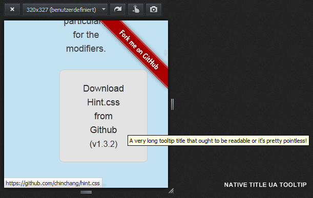
sunFanciness may be an argument, but Accessibility is not a good argument to bring up for Hint.css, because its tooltips may appear outside of the visible viewport and are thus not accessible.
Hint.css:
Native UA tooltips:
For the UA demo, a
title=""attribute was added to the download button on http://kushagragour.in/lab/hint/UA tooltips can be displayed outside of the browser window, and they are automatically repositioned in case the tooltip does not fit on the screen.
Since purely CSS-positioned (ahead of rendering time), Hint.css tooltips are hard cut-off on the visible browser window viewport. The tooltip text does not soft-wrap even in situations in which the whole tooltip could fit on screen.
This applies to all possible tooltip directions, whereas the bottom and top directions are most problematic, since those may simply be rendered off-screen. In the right and bottom directions, a tooltip causes browser scrollbars to appear on hover on smaller screens.
Lastly, unless I'm missing something, the
data-hintattribute is unknown to screen-readers, so any contained help text won't be announced. I assume the source attribute would have to be changed to consume one of the ARIA description attributes instead.Bottom line: Hint.css looks like a great effort and library. I like the idea. But without some minimal JavaScript for positioning & text-wrapping (& scaling), I don't see how it can reliably work for tooltips in today's world of vastly different screen sizes. In its current form, it clearly introduces accessibility problems (even for users not having a visual disability).
Comment #39
lewisnyman@sun Can we not just position them on the other side for these situations? eg.
hint--left?Comment #40
sunThe attempt to control layout/positioning in HTML (via classes) is conceptually flawed. Normally, layout/positioning exclusively belongs into CSS. However, CSS still lacks conditional screen/box selector constraints at the element level that would allow to prevent tooltips from appearing cut-off/incomplete or off-screen/invisible. At this point, the necessary level of positioning control can only be achieved through JS in a reliable way.
Due to that, we should move forward with a CSS + JS based solution.
I'm not sure why a potential dependency on jQuery presents any kind of problem? Tooltips normally appear on more complex user interfaces only (e.g., forms) and those pages have a very high probability of requiring jQuery either way already.
(That's not to be meant as an endorsement for the jQuery Tooltip library [there are popular alternatives], but only meant to say that I can't get behind the resistance to a JS based library.)
Comment #41
nod_jQuery based library is my issue. But I guess one could just do away with the library and use the default browser tooltips.
Comment #42
lewisnymanWe could add this implementation just to Seven? Then it wouldn't affect frontend pages, most admin pages load jQuery anyway I assume.
There is a use case to add tooltips to some of the toolbar icons though, but the toolbar loads jQuery anyway so that isn't a problem.
Comment #43
lewisnymanComment #44
lewisnymanOk, it's a shame we can't do this is in pure CSS but I think using a jQuery plugin isn't going to upset anyone if this is going to be used on pages that load jQuery anyway, right @nod_?
I've updated the remaining tasks with this in mind.
Comment #45
nod_I'm ok with implementing that with jQuery if it's Seven only.
Comment #46
droplet commentedSites owner always expected more than just showing the hints, Pure CSS libs never able to fulfill their needs.
anyway, #1890266: dropbutton text fails to retain .dropbutton-widget width has same issue mentioned in Comment #38. (sometimes a hint could be a dropdown menu, just see how do you styling it.)
Comment #47
lewisnymanOk, here's a go at implementing jquery.ui.tooltip with the Seven styling.
It kinds of shows how much we use the title attribute all over the UI that aren't always obvious. We should probably have a data attribute to opt in to this styling. I kind of wish we were using a plugin with a more modern API.
Comment #49
lewisnymanI forgot to add the new files
Comment #51
nod_Less code than expected, nice.
From what I tested, jquery handles the offscreen situation nicely but there are a few styling issues.
Background should be opaque, not transparent. It's not legible when there is text under the tooltip (which is very often). Position of the tooltip isn't helping much, either top or bottom is more helpful.
with
$(document).tooltip();and a black background the tooltips looks good enough.Comment #52
lewisnymanI would really like for it to be easy to change the position of the tooltip on a case per case basis, what works for some does not work great for others.
Also, the idea of using the tooltip for any element that has a 'title' attribute feels really flawed, we use the title attribute in lots of situations to provide context to screen reader users only, and the sometimes unnecessary information can be distracting for visual users. eg. The toolbar menu items. I'm guessing this is one of the reasons the tooltip for title attributes has effectively been removed from modern browsers.
Ideally we could do this without JS, similar to how hint.css uses variant classes. I'm tempted to explore another JS solution which has a more modern API :\
Comment #53
Anonymous (not verified) commentedMay be we can use something like this http://cssdeck.com/labs/hint-css-tooltip
We should take tooltip text from some data attribute, for exmple data-tooltip.
Comment #54
lewisnyman@bobrov1989 If you read through the initial comments that idea what shot down because it's impossible to adjust the position based on viewport width/height. I would still prefer that over nothing...
Comment #55
mgiffordWould love to have it, but....
Comment #56
joelpittetOpen for business
Comment #58
emma.mariaAdded tags + updated to 8.2.x.
Note: Discussion for a solution is very much needed before any patches appear for this issue.
Comment #59
yoroy commentedDesign solutions should probably also take the design of the Tour module call-outs into account.
Comment #61
mgiffordeBay has come out with this pattern https://ebay.gitbooks.io/mindpatterns/content/disclosure/tooltip.html
Comment #63
mgiffordAlso curious about Web Components tooltip:
https://www.webcomponents.org/element/PolymerElements/paper-tooltip
Comment #65
mgiffordRan into these accessibility tooltip patterns too:
https://van11y.net/accessible-simple-tooltip/
https://van11y.net/accessible-modal-tooltip/
Comment #67
mgiffordWe need to keep in mind WCAG 2.1 when building this.
Success Criterion 1.4.13 Content on Hover or Focus
"Where receiving and removing pointer hover or keyboard focus triggers additional content to become visible and hidden, respectively, the following are true:
Dismissable
- A mechanism is available to dismiss the additional content without moving pointer hover or keyboard focus, unless the additional content communicates an input error or does not obscure or replace other content;
Hoverable
- If pointer hover can trigger the additional content, then the pointer can be moved over the additional content without the additional content disappearing;
Persistent
- The additional content remains visible until the hover or focus trigger is removed, the user dismisses it, or its information is no longer valid.
Exception: The visual presentation of the additional content is controlled by the user agent and is not modified by the author."
Comment #68
andrewmacpherson commentedThanks for linking the WCAG 2.1 criterion. More information is available in the draft of Understanding Content on Hover or Focus, with diagrams.
The WAI-ARIA Authoring Practices includes a pattern for accessible behaviours of a tooltip widget. If we follow this, we'll need some ARIA attributes to establish the tooltip role and relationship with the trigger element.
A few things about the WCAG 2.1 Success Criterion 1.4.13 Content on Hover or Focus...
The WAI-ARIA Authoring Practices assumes the escape key will provide the means of dismissing the tooltip. This would rule out a pure-CSS approach.
This is important for screen magnifiers. A tooltip may be too large to fit inside the magnifier's viewport, so moving the pointer over the tooltip itself may be necessary in order to read it all. If the tooltip is offset from the trigger in any way (e.g. speech bubble style, with a connecting triangle) then we'd need to account for moving the pointer across a short empty area, e.g. use a slight delay before it disappears.
Basically, this means the HTML title attribute is exempt from this WCAG criterion. But that's a cop-out really - the point of this issue is that we want accessible tooltips, and the HTML title attribute won't suffice. The Understanding Content on Hover or Focus draft explains: "This criterion does not attempt to solve such issues when the appearance of the additional content is completely controlled by the user agent. A prominent example is the common behavior of browsers to display the title attribute in HTML as a small tooltip.".
The "add to shortcuts" tooltip in Seven passes this success criterion. For dismissable, it passes because it doesn't obscure any content. That's not because of the component itself though, it's because nothing is placed after it in that region.
Comment #69
andrewmacpherson commentedForgot to say, I'd like to follow the ARIA Authoring Practices on this one.
Comment #70
volkerk commentedReworked #49 for 8.6.x
Comment #72
mgiffordThanks for the patch @volkerk - I'm just moving this to Needs Review as that way the bot will check it. Core's probably moved since then, so....
Sorry it took me 6 months to notice your patch!!!
Do you have any screenshots of it?
Also wanted to post Scott Vinkle's Tooltip solution so we'd have that in the mix:
https://inclusive-components.design/tooltips-toggletips/
Comment #74
kostyashupenkoComment #75
kostyashupenkoComment #77
kostyashupenkoDuring reroll i got only 1 conflict here
/core/modules/shortcut/shortcut.module -L 359
so i changed in on
'#title' => new FormattableMarkup('<span class="shortcut-action__icon"></span><span class="shortcut-action__message">@text</span>', ['@text' => $link_text]),Comment #78
andypostI see no reason to use formattable markup here - it looks more like inline template
Comment #80
mgiffordHere's an approach to using tooltips with WCAG 2.1 - https://sarahmhigley.com/writing/tooltips-in-wcag-21/
Comment #81
bojanz commentedNote that core is about to adopt Popper.js in #3074267: Replace jQuery UI position() with PopperJS.
Popper.js has an optional Tooltip,js addon which might be useful here: https://popper.js.org/tooltip-examples.html
Comment #89
mherchelClosing this as outdated since PopperJS now exists (see comment #81)
Comment #90
mgiffordUpdated link to the one provided by @bojanz in #81 above. Should be https://popper.js.org/docs/v2/modifiers/offset/ or something like that.