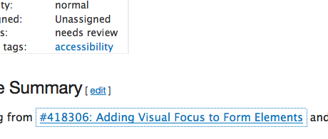
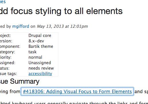
Moving from #418306: Adding Visual Focus to Form Elements and sparked by this recent webaim post on easy accessibility tips.
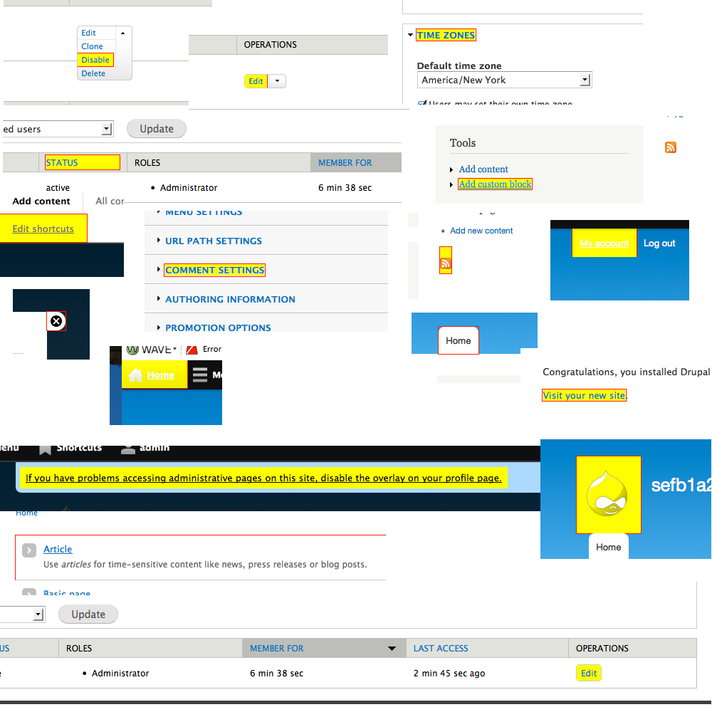
"Sighted keyboard users generally navigate through the links and form fields on a web page using the Tab and Shift+Tab keys on the keyboard. To help ensure they can visually identify which link or form field they have navigated to, you can add the following to your CSS file:
a:focus {
outline:1px solid red;
background:yellow;
}
The colors may need to be customized to fit your site design, but they should be fairly distinctive.
To take this tip one step further, you can search your CSS files for a:hover and in each instance change it to a:hover, a:focus. This will ensure that keyboard users get the same visual highlighting when they navigate to items as mouse users get when they hover over an item."
After a little discussion it was discussed that although this should be brought up with the browsers, having a theme specific focus for elements on focus elements could be a very nice touch:
https://twitter.com/opdavies/status/333590693731782656
In Drupal 7 this was seen as a browser responsibility, particularly with the form elements. However, the link focus as suggested by webaim provides one that will benefit a broader group of elements.





Comments
Comment #1
Bojhan commentedThe twitter argumentation is a little weird, just because someone saying "yes" on twitter :P?
I am not against this, but keep in mind that focus also shows upon clicking of fields. For which we have "focus" styles, we should not overwrite those. I also don't think he suggestion of a red outline, would fit very well with most designs - this includes Bartik. Browser default focus styles, tend to be quite nice - we should replicate some of that.
Comment #2
mgiffordMy local install is messed at the moment, but wanted to put up their initial example as a patch to start with.
Totally about the twitter "yes" I should have downplayed that. Oliver's been contributing to the Skype chat, over the years which is the more relevant thing.
It would be nice to be able to incorporate some of the elements from the Color module if people are using that. Not sure how to leverage other design choices.
I'm totally open to finding more appropriate (and more subtle) focus. It should look nice, not mess with user contrast (for both dark/light link text color) and not mess up other "focus" styles.
Was thinking too about how more folks like David Pogue are encouraging people to learn how to use their keyboard for time savings online (this is only vaguely related):
https://www.ted.com/talks/david_pogue_10_top_time_saving_tech_tips.html
Comment #3
mgiffordYes.. Definitely requires much more thought:

Comment #4
Bojhan commented@mgifford Hehe, oke - yes this looks afwul :P
So could you explain a little why this is not a browser concern? Because that's why we didn't pursue this before, we did take into account "focus" status on buttons but not all elements in the style guide because its largely already done by the browser. Often we can get away with the hover state, in many cases we can't.
Comment #5
kat3_drx commentedThe issue of outline:0 in CSS resets was addressed in Drupal 7, and allows browsers to add back in the default link outlines. One issue I can see with continuing to rely on the browser is that the browser's default outlines (often the "dotted lines") have not changed over the years to better accommodate accessibility, and do not accommodate the look and feel of all themes. A theme with a dark background color would potentially render the theme useless to low-vision users because it doesn't provide an adequate color contrast ratio.
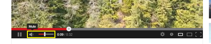
Maybe a solution would be to provide a thicker, more contrasting outline to links instead of a link outline and color fill? A 3 - 5 pixel outline with a bright(ish) shade of yellow seems to be the industry standard for accessibility-minded folks. See the Section 508 site and the Youtube video player for examples. Naturally, whatever the solution, the CSS could be easily overridden within the theme to change the color if the default color still doesn't provide the right contrast.
Comment #6
mgiffordThanks Kate!
I was trying to put forward some examples, and found the Youtube videos useful in this screenshot:
But I couldn't find it in the video player sadly. Not sure why, but maybe it is a Mac or FireFox thing.
There are certainly other options to consider that are an popular use. The dotted lines are not that good.
EDIT, I should add About (active), Share (focus), Add to (hover) - the active & hover look the same here.
Comment #7
kat3_drx commentedHi Mike,
Thanks for looking into this more! The Youtube player has been a little weird in Firefox lately, but I managed to get a screenshot of the border I was talking about:
The yellow border like this seems to be a standard default. It probably won't be pretty in every theme, and may not even match color contrast in all themes, but if it was made easily-override-able in the theme, having a default like this could help, and serve as a helpful reminder to themers to include this.
Comment #8
mgiffordOne argument against letting the browser handle it is that they don't do it in the same way.
Chrome/Safari do it basically the same way, but Firefox doesn't (least on the Mac). I have filed a bug with them.
Here are some screenshots (from this page) with default link, hover link & focused link:
But I'm still looking for examples of how setting in Drupal can clearly improve the UI & also a11y.
Comment #9
kat3_drx commentedI concur, Mike. As I mentioned in yesterday's comment, this default is weirdly unsatisfactory when it comes to accessibility, specifically for low-vision users or anyone who has a problem with color contrast or very small details.
Furthermore, it really would not be that hard for us to add a default to the Bartik core stylesheet, no? If people don't like the look of it, they can override it, but as was mentioned on Twitter, adding it by default makes it one less thing that can be forgotten for accessibility in constructing a theme (not to put a negative spin on this).
Comment #10
mgiffordI decided to look at ideas from the Drupal disability community on this - http://groups.drupal.org/node/268908
I think one of the best examples I've seen is not surprisingly from http://www.paciellogroup.com
Comment #11
Bojhan commentedI do think this needs some realignment with visual designers, I think we are working under very different standars as what looks acceptable - none of the designs proposed to me look acceptable. Ideally we choose a toned down browser default style, and apply it elsewhere (e.g. the chrome one).
I'd like to point to the idea that "ohh they can just change it" is not an argument for anything. Bartik is the default we present Drupal with, it is what people out of the box evaluate and if it has elements that would make Drupal not good looking - it will reflect badly upon Drupal, you know Garland did this.
I'd personally prefer to style individual elements with the correct focus styling, the chrome styling gets us really far and its not as obtrusive as is being suggested in this thread. It will not work for all elements (e.g. VT's) and we will need to style those separately, keep in mind we have loads of hover styles that are perfectly transferable to focus.
However I am still not sure we should overwrite default browser styling, aren't people used to that styling? Wouldn't Drupal breaking that styling interfere with a established standard - that people might even have tweaked for contrast? Also the few browsers that don't provide a default focus styling, should get their act together its not Drupal's job to fix these kinds of bugs in firefox.
Comment #12
mgiffordThanks Bojhan!
If we're going to bring this into D8 it does need to fit closely with Bartik & Seven's themes & also work well with the Color module.
I wasn't suggesting that we'd found the right solution, simply posting a few of the options I could find as examples. Only at a brain storming stage.
On the Mozilla front, this issue hasn't been actively discussed since 2008.
https://bugzilla.mozilla.org/show_bug.cgi?id=53927
Steve Faulkner said on this issue: "@mgifford as a matter of course we advise clients to apply CSS outline styles as the default styles across elements and controls are [crappy]"
I do like how the http://paciellogroup.com (bottom right image) inverts the foreground/background color on hover. Their CSS is:
Comment #13
opdaviesInverting colours in what we tended to do whilst I was at Nomensa - e.g. http://www.nomensa.com/blog.
Comment #14
opdaviesAt the very least, the state for :focus should be the same as :hover.
Comment #15
mgiffordMy screenshot in #10 above had one link in focus and one link hovered. So many of them were different. Agreed that its not a good practice though.
Comment #16
shanly commentedHas the discussion for this problem moved to another issue? My reading of this thread suggests that this patch doesn't correctly fix the problem. Should this issue be in "needs work?"
Comment #17
mgiffordYes, agreed that this patch needs work. We don't have an identified solution yet.
Comment #18
mgiffordThis came up https://groups.drupal.org/node/303268#comment-934858 and @suntog brought up how this would be useful for tablets too. Decided to try out http://www.paciellogroup.com to see how it looked on an iPhone. It does really add some nice usability.
Comment #19
mgiffordWe're trying the following on an AdaptiveTheme base:
Comment #20
mgiffordKnowability has a good example of how they apply this on their site:
Comment #21
mgiffordLooking at the comments on #890362-114: Links should not be indicated by color only I'm thinking this might be a more subtle way to do this.
Maybe other folks could review/fork this CSS concept:
http://jsfiddle.net/mgifford/h4fD7/5/
Comment #22
mgiffordI'm quite impressed at the keyboard focus for http://webaim.org right now.
I like the transition from:
to this:
Visually when you're tabbing through I like how it zooms. It might get tiring after a while, but it's gives direction as to where to look for the next link which is quite useful.
Comment #23
emma.maria@mgifford This issue has unfortunately sat here for some time. Is there any chance you can update on what needs to still be completed or the direction to head in? I believe this issue is important :)
Comment #24
mgiffordHi @emma.maria - ultimately it's about getting support for the design concept. Then we can hammer out what actually gets implemented.
I think if we added some of the visual elements that http://webaim.org has built into their site for both mouse & keyboard only users that it would be a great example for other sites to follow. I think it just adds a nice usability layer even if you don't have a disability.
For sighted keyboard only users I think it is important though to style the link on focus so that it is easier for the user to know where they are on the page.
If for D8.0 we could just agree on how we want that styled it would be great. D7 already brought ahead the skip-link behaviour. We'd just need need to agree on a simple design for keyboard only users which would complement Bartik.
Any suggestions?
Comment #25
mgiffordInteresting to see Keyboard, Mouse & Touch highlighted in http://ten1seven.github.io/what-input/
I do think that this is a good pattern to look at to see that the links & forms are easy to see. More info:
https://github.com/ten1seven/what-input
Comment #26
mgiffordJust tagging.
Comment #27
emma.mariaComment #29
mgiffordNice to see a good solution practiced by the UK's GDS in their blog.
Just using:
Comment #31
helenasue commentedWould it help solve the design argument if these focus states were constrained to only when focus is generated via the keyboard and not briefly on click?
I worked with a client who did NOT want focus states when mouse users interacted with elements, so we coded up a small solution that made focus state indicators only appear when accessed via the keyboard. This might be less disruptive to designs while still being useful to the people that this feature would primarily be for.
Comment #32
mgiffordI hadn't noticed that when clicking on the links. Thanks for drawing that to my attention. That's a strange browser patter.
I verified it here https://governmenttechnology.blog.gov.uk/2016/12/14/our-commitment-to-be...
Comment #33
andrewmacpherson commentedSeeing focus styles after clicking links is normal behaviour. Clicking moves the focus to the link, in the same way that clicking a text input moves the focus to the input.
Often you don't notice a focus style after a click, because a site has suppressed the default focus style, and used the same style for both
:hover, :focusselectors. So first you move your pointer over the link, and get the:hoverstyle. When you click it, and leave your pointer where it is, the link gains focus, and you get both the:hoverand:focusstyles. If these happen to be identical then you won't notice that the link gained focus by clicking it. Half a second later you're rendering a new page.I don't think Drupal core should try to suppress focus indicators for pointer users. Pointer users benefit from focus indicators too - they provide feedback that the thing that has just been clicked was the intended thing. That's useful for small targets which are near each other, like breadcrumbs, pagination, media player buttons, or the small dropdown from Drupal's Contextual Links.
If there was a reliable way to tell them apart, like a well maintained third-party JS library, then we could provide stronger focus styles for keyboard users, and leave subtler ones in place for pointer users. I just don't like the idea of suppressing focus styles completely for pointer users.
:activestyles are something we could consider, to provide strong feedback that the correct link was clicked, but this style only lasts during the mouse click itself. There's a strong demo at MDN :active.Comment #34
helenasue commentedSorry @andrewmacpherson, I think I was unclear. I wasn't saying that we should suppress or remove focus states for mouse users - I meant that we could make a distinct set of focus indicators that are specifically for individuals who are keyboard users who may need a more prominent focus indicator without disrupting the ordinary focus indicator that is themed in for traditional users, like you're suggesting. My script does just that. :)
Comment #35
andrewmacpherson commented#34 - Yes, I like the sound of that explanation better! Is your script available to play with on Github, or somehwere? I think I've heard of some other similar scripts, but I can't remember the names, or whether they required jQuery, etc.
So the idea goes: Likely keyboard user detected... activate the enhanced focus styles!
Does it activate after any keyboard events, or do something clever like wait looking for tab/enter/spacebar/arrows?
Comment #36
andrewmacpherson commentedI found this mention of focus outlines in the HTML 5.1 recommendation, in section 5.4.6 focus management APIs (emphasis mine):
This says that focus styles do not solely benefit keyboard-only users, but it doesn't offer much explanation. What personas might this refer to?
Comment #37
helenasue commentedAwesome! I haven't posted it on GitHub, but here's a preview. I'm using that to do some demo styles, but we can always fiddle with those once I put the patch up.
Comment #38
andrewmacpherson commentedThere's a lot of interesting discussion in the comments at Stop Messing with the Browser's Default Focus outline, including an old one I made then forgot about.
This comment from PatanjaliS is an interesting reminder not to treat mouse and keyboard users as distinct groups (emphasis mine):
Comment #39
helenasue commentedI agree with you about needing a focus indicator of some kind for both groups, but I do think that there's a certain amount of practicality to having distinct styles for each. Design and accessibility are often at odds with one another, since the very noticeable styling that is ideal for accessibility often isn't loved by designers, as the current trends are all about subtly. By isolating the focus states by mode of access we can give 'traditional' users an experience that won't start a war with those who prioritize design while still giving those who need something more attention-grabbing what they need.
Comment #40
helenasue commentedAlso, I get it about using the browser's default outline - it's usually not best practice to override browser styles. However, there are situations where there is a case for it to be made.
For instance, the blue outline isn't great on Bartik because the header region is already almost exactly the same color. There's not enough contrast there to benefit a low-vision user.
Comment #41
helenasue commentedHere's what I've got so far. The styling may not be ideal since I'm not a designer, but it's in place to demonstrate potential functionality.
Comment #42
andrewmacpherson commented@helenasue That's cool, I'll give it a proper manual test soon.
We probably want to move forward by reviewing our current focus styles, and designing new ones where we find they are missing (or poor). I don't think a consensus was formed in the early comments (before #23 in June 2015).
Adding this JS library should probably wait until we've designed the keyboard-specific focus styles. (Maybe it will be a child issue.)
Meanwhile, a quick skim-read of the patch from #41 revealed this. Looks like an unintended change:
I like the general look of
keyboard-a11y.jsfile. It seems lean enough, but someone with better javascript knowledge should review that. The behaviour is called keyboardFocusStyles but it works by excluding mouse actions. I wonder what we should do about other interactions like touch and stylus pointers? Maybe we should detect keyboard events instead?keyboard-a11y.jsshould probably become a core system library (in core/misc) so any theme could use it. The focus CSS would live in Bartik and Seven, I think.I've just noticed ten1seven/what-input which @mgifford mentioned back in #25. It's had releases this year and seems actively maintained. Worth a detailed comparison.
Comment #43
helenasue commentedThanks!
I agree, this shouldn't go in without further design first. I put it up to demonstrate how such a thing could theoretically work, but it's not ideally styled in its current state. I also agree that in retrospect I should have named it something more indicative of what it actually does rather than its ultimate purpose.
The 'center center' wasn't accidental, however - icons look better with a focus state applied when they are centered in their element. It makes the background or outline not off-center.
I'd be plenty happy for that to become a system library instead so that it can be used across the themes. I'm not sure about what-input, since I haven't used it or tested it, but I'm open to exploring that as an alternative. I only suggested my script because I've battle-tested it on client projects in the past successfully.
Comment #44
Bojhan commentedI am a bit worried, we might be making Bartik less pretty across the board with "one" focus style. Can we adapt and only provide focus styles where the "browser default" style might collide with existing styles (e.g. focus blue on blue background) albeit this is browser dependant.
Comment #45
andrewmacpherson commenteda11y.js is another JS library which distinguishes whether the source of a focus event was keyboard or pointer. It provides ally.style.focusSource() method, and maintains a
<html data-focus-source="key">attribute for CSS use. Does not have a jQuery dependency :-)Comment #47
mgifford@Bohan, I don't that that solution would hit the usability / accessibility challenges of not having links. As Terrill says:
- http://terrillthompson.com/blog/830
Wired has gone this way.
@andrewmacpherson How do you think we can best make use of ally.js?
Comment #49
mgiffordNot sure if this WCAG 2.1 guideline applies here, but useful to think about for other "keyboard focus" issues https://www.w3.org/TR/WCAG21/#content-on-hover-or-focus
Comment #59
pameeela commentedMoving this to contrib since Bartik was removed from core in D10. But I am also marking it postponed because I am not sure whether it still needs to be actioned. Testing Bartik with D10, there is a clear focus style for each element.
Also tested Olivero just in case it still needed to be handled by core, but unsurprisingly it is well handled there too. So this issue may be obsolete.
Comment #60
mgiffordHere is some documentation around this from the GDS https://design-system.service.gov.uk/get-started/focus-states/
Comment #61
mgifford@pameeela I'm moving this back to Needs work, with a clarification. Using the default browser focus/outline is ok. But if you look at the keyboard focus state examples above, you can see that the default looks weak by comparison. It's even hard to read "tag2" because the blue line is so close around that.
It's just much less pronounced and less designed as it is now. It just looks like an afterthought letting the browser determine this. It would be more clearly an accessible theme if the focus styling was considered and aligned with the rest of the look/feel of the core Drupal themes.
Just closing another issue and bringing forward this comment from that thread:
https://www.drupal.org/project/drupal/issues/2942487#comment-12645241