
Needs work
Project:
Drupal core
Version:
main
Component:
block.module
Priority:
Normal
Category:
Task
Assigned:
Unassigned
Issue tags:
Reporter:
Created:
4 Jan 2013 at 15:28 UTC
Updated:
21 Aug 2025 at 13:37 UTC
Jump to comment: Most recent, Most recent file


Comments
Comment #1
gábor hojtsyIn this basic first patch:
- I've extended the drupal.block library to also include the CSS, so a pointer can be shown on the show link
- added an edit tab for a contextual link; currently contextual module only allows links that have the same tab-root as the parent, so to make it automatically be discovered from the tab root, I needed to make it a tab; I played around a bit with contextual link altering but did not immediately see a way to get the metadata needed so I can add the proper link (I probably missed something)
- added wrapper markup to parts of the form that is used from the JS
Note that an "Edit" link makes more sense here since the configure operations on the block are not primary on the form, so it is about editing the core block values. For modules extending blocks, ie. adding configurable elements, those are shown as well on the initial form.
Comment #2
gábor hojtsyExamples:
Block where only the *override* title is a core value editable (Search):
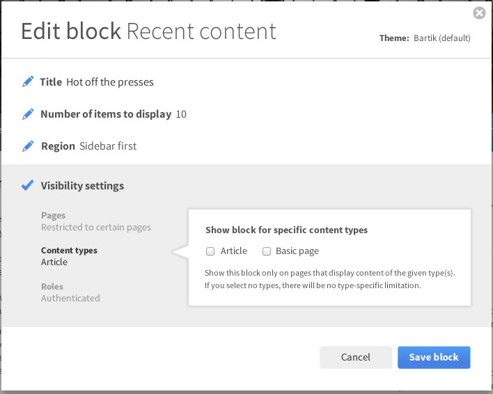
Block where a custom setting is present (recent comments):
Custom hand-created block where there is a title, admin description and a body:
When the "Show all options" links is clicked, the form looks exactly like the original block configuration form. Also, the orignal block configuration form on the admin side is not affected and not intended to be affected at this stage.
Comment #3
gábor hojtsySame patch rerolled based on changes in #1535868: Convert all blocks into plugins. The block form now uses weights instead of merely putting custom elements in display order, so using weights in the advanced element wrappers too. The changes to the UI are identical, the UI itself is slightly different due to the blocks as plugins patch (eg. there is a big machine name field on the form, the merit of which is being discussed in #1875016: Automatically generate machine names for block plugins).
Simple edit form:
When the show link is clicked:
Comment #4
Bojhan commentedThis is a really nice idea, but I think it needs more research to fully understand its scope. For example in this case, we should think about the 80% usecase, the 80% usecase for a custom block probably involves editing the body. The same goes for blocks like poll, slideshow, views block, panels block - all those have settings that aren't as easily segment able and doing a super simple mode would even decrease usability. Its ascetically very pleasing, but its important to keep the primary usecase in mind.
Also I am worried, this won't do much but reduce the overwhelming effect - when people open the settings they are still overwhelmed. When people see these "more", "view more", "click to show more" links they always click it to see the *magic* that could be there, so we should think hard how to remove that behavior.
Comment #5
gábor hojtsy@Bojhan: yes, the custom block editing includes the body (see last screenshot in #2). The patch operates with a wrapper opening weighted at 1 and closing at 100, and anything weighted between them in the form is "the 20% form portion" and hidden by default, while things weighted outside of this are shown right away. Eg. the block form weights the form buttons above 100 and the base elements as weight 0 or less. Form alters (custom configuration pieces for blocks) can put elements to either area. Eg. custom blocks currently have the block description (admin label) and the body on weight 0. The recent comments block has the number of recent comments displayed in the 80% form as well. Contrib modules could also put in elements to either area of the form.
On people always clicking on view more, I don't really have a good solution to that right away. One possible approach is if we have multiple different forms to edit the same thing, for example, if block module provides a simple block form that lacks the 20% elements and a full block form that has all elements. Then form alters would need to deal with possibly two versions of the form to alter, validation and submission would need to happen for two form versions. I know these are technical reasons for introducing a usability quirk. I might not be assessing the expected opposition to having different forms, submission and validation for different editing context use cases. At least the maintenance overhead for development sounds pretty big.
Comment #6
gábor hojtsyA quick straight reroll since it did not apply anymore.
Comment #7
gábor hojtsyThe attached patch moves the JS and CSS to a library specifically defined for this (drupal.simplifyform) and uses that library. It also implements the same for the "add menu link" page, which is also added as a contextual link (no condition there yet). The form elements can be implemented as a form process function as well, would remove some code repetition and encapsulate the code much better. Still TBD, since we don't even agree on yet whether this is a good approach as-is, so perfecting the code is not of #1 priority necessarily.
Will post updated screenshots soon.
Comment #8
gábor hojtsyActually implemented latest design from #1882482: [meta] Unify editing approaches in Drupal by summarizing the name of hidden elements. And now updated screenshots:
1. A menu block (same for the search block):
2. A custom block:
Note that elements like the separate title and admin title and the useless machina name are being discussed in sub-issues of #1875252: [META] Make the block plugin UI shippable. They would not be on the form at all :)
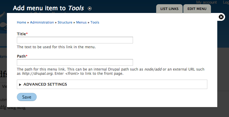
3. Adding a menu link (note hidden fields there too):
Comment #9
gábor hojtsy- Add a temporary right triangle to the optional fields list to make it look closer to the mockups.
- Add a page to be able to set title for menu item addition form which previously used the title of the menu itself (very confusing).
Comment #10
gábor hojtsyIt helps if I set the title as pass-through to make the markup properly appear instead of escaped.
Comment #11
gábor hojtsyThis is a largely different approach to the same thing:
- introduced a new #simplified attribute on forms; if the overlay is enabled and the form is displayed in the overlay, the form is displayed "simplified"
- instead of custom CSS/JS to implement, I've used a details/summary combination which is uncollapsed with standard core behaviors
- now this makes it possible to collapse the fields again
Simplified block form:
Expanded:
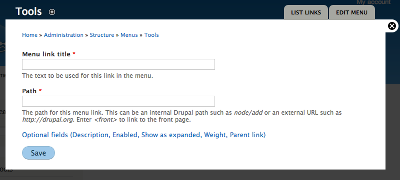
Simplified menu item addition:
Comment #12
sunThanks for working on this!
However, *ugh*, both the code and the screenshots scare me a bit... — simplifying things is always good. But in terms of user interface, simplification really requires sophisticated patterns to work out.
Slapping an "Advanced settings" container onto _everything_ to hide away the (assumed to be) less frequently used options is a pattern that is known to NOT work out. Less "advanced" users either miss it entirely, or don't even attempt to look into it (because they're not "advanced"), or in the worst but actually most common case, they cannot remember what's in there and re-open it every. single. time.
What's the actual goal here? Just making the interface more compact?
If so, shouldn't we rather consider to change the interface pattern for vertical tabs and allow a form to consist entirely of tabs? That would pretty much achieve the same, but it would avoid the "Advanced settings" pitfall.
Comment #13
webchickIn case it's not clear from the screenshots/description, when working as designed (it doesn't currently work this way in the patch), this form simplification will only be happening for forms triggered from contextual links. In that case, you are looking at a block, you are saying "Huh. Something's funky about this block." and you are clicking on a link directly on the block to edit it (most likely something visual, which makes it somewhat easier to guess what the 80% case is).
Admin forms that are not invoked via contextual links won't get this treatment. You just see the full form, same as always, because in that scenario you don't know why they're there and what the 80% use case is.
Comment #14
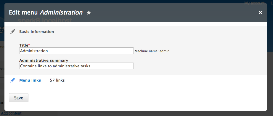
webchickAlso, I believe Kevin's thinking around determining 80% in cases where there are multiple options, is to provide more granular contextual links for tasks you might try and do. So instead of one "Edit menu" link, from which you can edit a menu description, add a link, etc. those tasks would be somewhat broken out into multiple task-oriented links ("Edit menu", "Add menu link" for example).
Comment #15
sunYeah, I got that. But I don't think it's the right approach.
Attached patch shows what I meant in #12: The idea would be this:
The result: A very compact form.
No dialog/overlay:
Dialog/overlay:
Comment #16
wim leers#15: I was going to say "but vertical tabs don't work on mobile", but I searched and found #1277352: Responsive vertical tabs, where it was more or less solved. :) What is still missing, are the handy summaries that vertical tabs can provide.
IMHO that's the biggest benefit of going with a vertical tabs approach: the summaries. It succinctly explains how those hidden-by-default settings are configured, which would help the user to know what's there and reducing the need for users to "click on everything every time because they had forgotten that" (though I personally don't buy that argument — I'm sure it's true for rarely used forms, but I doubt it's a general truth; if you can point to evidence: link me up! :)).
I think the reason we chose not to go this way was because of this requirement, which we wanted to avoid:
I may be forgetting something though — I'm sure Angie/Gábor/Kevin can explain this better!
Comment #17
Bojhan commentedCan we please stop discussing this in 3 different places #1882482: [meta] Unify editing approaches in Drupal, #1889150: Simplify overlay look, *only use for contextual operations*, and here.. This is where we should discuss it.
Its interesting to see the developments here, already covered much in 5) at https://drupal.org/node/1882482#comment-6925970), given that this seems to be the same thing I am going to copy over my comment. We also discussed this at length during our call.
Adding to this and following the discussion in this thread. I believe the strongly added value of our current design is that it achieves the "in context" concept, gets you quick to related tasks, keeps you within the same navigational model (since all you do is go to a link deep in the IA and doesn't invent two different "administration modes", the "quick mode" vs. "full mode"). Although its admirable we want to stretch this quick mode, I feel its still assuming a gain in usability that is merely aesthetic as shown by sun, users will probably still open those "show me more" because they don't know whats in there, they perceive it might be something important. Having an "advanced box" is not progressive disclosure, its just hiding - progressive disclosure would mean users have a good idea what happens if they go deeper into a certain part of the UI.
I feel this is still trying to simply remove as much, with little idea whether its actually improving usability and whether the impact of having two navigational models (see IA, and modal) and two administrative models (quick, full) will not be confusing. Its nice that we are changing the way you close a modal, moving buttons around. But I cannot see a clear rationale for the core of the two changes 1) making forms smaller, 2) removing all navigational purposes. Can't we just redesign the overlay, so its less cumbersome, and distracting when made smaller?
In conclusion, it seems like everyone is pushing on how to implement this concept - but to me its not even clear we gain anything usability wise with the core two concepts.
Comment #18
sunWell, any solution for this will require some drastic changes to our forms.
I'd rather structure all forms into sections than to add #weights everywhere and give arbitrary #weight values significant meaning, as in the prototype patch in #11. That is, because sections can be re-used for other interesting things and thus, the benefit of introducing them is not limited to the goal of more compact overlays/dialogs only.
I'm also not convinced of splitting the forms up into completely separate pages à la "Edit menu", "Edit visibility", "Edit links", etc.pp. — that would shift too much focus on "simple/small", while making the operation for users that actually want to access and edit other options really worse (e.g., like 10 steps to complete a task, for which you previously needed 2 steps).
Instead of vertical tabs, we could also consider to introduce horizontal tabs. (Not local-tasks-tabs, just horizontal tabs.) Although, horizontal doesn't scale very well, and there'd probably be no room for summaries.
Comment #19
sun#17 leaves me with the impression that the overall suggested change proposals do not actually have a buy-in from the usability team? Can we clear up what we agree on and what we disagree on first? And whether the overall direction is actually wanted and desired? The last thing I want is to work against @Bojhan and the usability team, or to ignore their advice.
Comment #20
Bojhan commented@sun I have discussed this a little bit with yoroy, basically our conclusion was that it needs to be fleshed out more before it can really be evaluated. Because I am not sure about the current assumption, that simply hiding loads of stuff will be usable - as you can obviously test, that people feel less overwhelmed but in the real world they might end up needing a lot of it/and or just opening it anyway. This proposal has two parts, hiding navigation and hiding forms - both to me right now have questionable overall gains, and I am especially worried about navigation (which seems like the rationale for dumping the overlay).
Comment #21
sunYeah, those are also the concerning parts for me.
That's why asked what the actual problem is that we're trying to solve in #12. If it's just "compactness", then I'm fairly sure that there are plenty of different ways to achieve simplified + compact forms, without a simple/advanced pattern.
What's your stance on the sections/vertical-tabs idea though? It achieves the goal of compact, and also simple, by moving the basic/simple elements into a first tab. However, other controls are still available and not hidden. Thus, serving the 80% use-case and the others at the same time. As @Wim mentioned, it has the additional benefit of summaries (which IIRC worked out relatively well in user testing; perhaps they do even better when being part of a "primary side-navigation" like this?).
Comment #22
tkoleary commentedSo on comments from #12 on I noticed a lot of assumptions being made about how users will react.
'a pattern that is known to NOT work out."
"users to "click on everything every time because they had forgotten that" "
"users will probably still open those "show me more" because they don't know whats in there"
"they might end up needing a lot of it/and or just opening it anyway"
This is pretty close to a place where it is testable si I suggest we let Dharmesh run a quick study on it tuesday to surface what the real usability issues are and then we can address the proposed changes above (many of which seem to have merit) in light of the data.
Comment #23
sunWell, the quotes you re-pasted are IMHO a nice summary of all the Drupal core usability study videos we've seen in the past years. It's exactly those moments in which I yelled "OH NOES!" — seeing probands horribly fail on their seemingly simple tasks, but yet, introspecting every other collapsible fieldset and hidden setting on every other page that humanity would be able to discover. ;)
In short, I wouldn't waste time on user-testing this. I'm also not sure which parts of these quotes you're questioning... With regard to "Advanced settings", I think there are dozens of posts and studies on the net that all arrived at the same conclusion (that has been summarized in comments): Originally invented by Microsoft Windows™ [95 or so] (IIRC), a pattern that is known to fail, badly.
Comment #24
gábor hojtsyI promise I'll read up and respond to all your great feedback here. Just rerolling the patch since it did not apply anymore and we need it to take it for a spin in testing. No changes in the patch.
Comment #25
gábor hojtsy@sun/@Bojhan: finally responding to some of your concerns maybe to highlight more of the motivation. (Sorry I have a tumultuous week due to personal life reasons).
1. The overall goal is to make simple edits/adjustments on things easier. So if you want to touch up your recent comments block, you can quickly edit it's title or number of comments, etc. You likely don't want to change visibility or region placement / weight as part of the process. So what we did here is we renamed the action to "edit block" from "configure block", so it is less technical and re-focused the contextual operation on editing easy things on the block. Editing the region does not really have value on a contextual setup since you would end up with a block at a different place and then have no way to weight the block within the region on this form anyway while visibility is a pretty complex topic you'll "likely" change less.
2. What are the most common pieces of a form in general is debatable and even if we consider specific forms. In the block case, we renamed from configure to edit and for editing a block (vs. configuring), the primary things are clearly it's title and any strictly related setting to the block's content not it's placement or visibility.
3. On the other hand we are actually merging operations in cases vs. splitting them or obscuring them. In the case of editing a menu, our related patch that is a core part of this combined effort is #663946: Merge "List links" page into "Edit menu" page which actually merges two forms so "Edit menu" becomes a one-stop place for editing items and the menu itself as one thing instead of having an "edit menu" and a "list links" page where "edit menu" is not really useful for 90% of the time. So saying flat out that we are splitting things up is not really true. We are trying to find the granularity of contextual editing that makes sense. to integrate with in-place editing.
4. We've been thinking of different ways to solve this problem. We could introduce wholly new forms for contextual editing. Contribs would need to alter these too any it would be a nightmare to maintain two copies. We discussed adding a #simplify property on elements, that children would inherit where elements not part of the simplified form would disappear (#access FALSE). We discussed separating a simplified form builder and a more complex one with submission functions that are nested (reuse each other). Either way there are elements on form where certain values are needed for proper data operations. Eg. if you create a menu item it needs to have the "Enabled" bit on for it to show, however we did not want to expose it on the simpler form. Using a weight range with wrapper was one of the other options considered.
5. @sun as for restructuring forms with top level vertical tabs (especially in a "simplified" scenario, when the complexity is intended to be reduced), let me quote yourself from November 2012:
(from http://drupal.org/node/1834682#comment-6707106)
Hopefully these might help illuminate some pieces and further the discussion.
Comment #26
sunre: #25.5:
I guess it's easy to overlook, but yes, that's why I asked in #12 already whether we need to change our current interface pattern guidelines for vertical tabs to allow for a usage that intends to leverage vertical tabs as a means to compact the total size of a form (#15).
Comment #27
eigentor commentedFinding out if people do indeed click on "Advanced options" or do not, would be vital. We tend to over-discuss and under-user-test these things.
So if Dharmesh can run some quick tests, this might get more empirical data.
Comment #28
Bojhan commented@eigentor We already did like 5 studies that discovered that people do this.
Comment #29
jessebeach commentedRerolled on HEAD (cf8827418e94922c60e51486e5f2153a277dd665).
Comment #30
gábor hojtsy@jessebeach missed the menu.module hunk (which also needed a slight adjustment to make it work for the "add menu item" link.
Comment #31
wim leersReview of the "Advanced settings" approach (currently used)
+1
Without information about what these usability studies were about, this is an overgeneralization.
If people are exploring what they can do, sure, they'll click on everything. The first time they use something? Sure, they'll click on everything.
But if they want to change a block's title, they won't click on "Advanced settings". Or if they want to add several menu items (i.e. sequentially, not one today and another one a month from now), the first time they might open "Advanced settings", but the next few times they won't.
The alternative: sectioned forms + Vertical Tabs
Proposed by sun in #12, clarified in #15, commented on by me in #16. I like it for one important reason:
That being said, it suffers from one very, very big deficiency. As stated in #25.5 and #26, the interface pattern guidelines state it shouldn't be used for the main interaction of the form. I believe this is at least in part because otherwise you could end up having nested Vertical Tabs. And that's also the deficiency I wanted to point out: how are you going to make this work when there's a top-level Vertical Tab?

Code review of the current patch:
There should be docs here to clarify what the goal is and how you can leverage it. Especially the
#weightimplications should be explained.And maybe it's better to rename it from
#simplifiedto#simplified_overlayor#simplified_contextual_overlay?These weights don't leave wiggle room for contrib to inject whatever they need to inject. Preferably work with increments of 10, otherwise at least 5? :)
Comment #32
sunThe vertical tabs implementation supports nested vertical tabs since its very introduction in D7. Merely the usage of that facility was discouraged, but the facility exists (and is actively covered by the markup/CSS/design test case for vertical tabs in design_test.module).
Obviously, forms, which are using vertical tabs in "regular mode" already, would inherently be turned into nested vertical tabs in the sectioned "compact mode". Honestly, I think that's a bullet that we can bite.
Comment #33
wim leers#32: It might work, but I can't imagine it'd look sane.
Comment #34
Bojhan commentedWimLeers asked me to chime in again, I gave a review in a couple of places. I still think that what we are doing here is treating the symptoms instead of the disease, which is that many of our forms are unnecessarily complex. Although hiding stuff, that is not the 80% will be oke for the few places we can touch (menu's, custom blocks) it will do little to establish a better pattern for conrib. What we need is better patterns for disclosing advanced settings, putting it in a fieldset and or vertical tab does not cut it. What we need is a pattern similar to Facebook's, settings where we disclose a summary with the ability to edit.
However the approach of this patch has still been to seemingly randomly hide certain functionality without a good idea, whether its pattern that can be established elsewhere. We are treating these pages as one-offs rather than thinking in terms of system design. Doing this in a system-design manner, where we consider this to be used all across core - is much more invasive but in the end, will mean a much better pattern - and not just one-off UX improvements in a few area's. I am still not pleased with the idea of introducing such inconsistencies across our UX, I think that in the end it will create for a highly unbalanced experience - where some pages employ significantly different patterns than others, just because we happend to find the design and engineering power for that one screen.
Comment #35
tkoleary commented@Bojhan
Could you elaborate on this? It sounds to me as if your issue is that there is not a granular, programmatic approach to which "types" of fields should be considered 80% and which 20% use cases. While that type of imposed consistency might create more uniformity in contrib implementations of this, consistency is not always synonymous with usability. I believe that the adaptable approach that Gabor has taken here gives contrib the flexibility to tailor solutions to the use case. As long as they follow a good heuristic (like the one I propose in the issue summary), I think the end result will suit the user and the task.
Comment #36
sunI'm still strongly opposed to the idea of introducing "advanced options/settings". Since this issue continues to go back to that proposal, which prevents us from advancing, I wonder whether we should create a separate issue for the general idea of #15? (which is in no way meant to be concrete or final)
The idea and implementation approach of form sections in #15 was not meant to be a one-off implementation for a particular form. The proposal would foresee that all forms throughout Drupal core (and contrib) would be structured into sections - whereas the first is shown and expanded by default, containing the 80% controls.
Forms that fail to do so would be exempt from an optimized/compact experience (and need to be patched). The good news is that the implementation allows for a graceful transition/conversion period; i.e., not all forms have to be structured into sections immediately.
Aside from that, I think that our current vertical tabs come closest to the envisioned and necessary "summary + expand" pattern, similar to Facebook's. Note that vertical tabs are merely the basis for the quick prototype. We definitely can and probably should look into a new interface element, to combine the features of details (expandable) and vertical tabs (summaries) into an element that achieves a "vertical stack of sections with summaries that can be expanded".
The basis for that would likely be just the existing details element, which supports summaries already (but we're not using that facility anywhere without VTs). However, I guess we'd want to introduce a dedicated appearance, styling, and look and feel for them; e.g., outputting the section heading/label first and the summary below or similar.
Our previous attempt at simplifying forms was vertical tabs. The result of this effort would be that we'd likely replace all vertical tabs with this new pattern of sectioned forms that present the most common controls first, and everything else in summarized details, grouped by topic. I certainly agree that this should continue to be the actual, higher-level goal [and "advanced options" would contribute nada to that].
Comment #37
Bojhan commentedI do not think that Vertical tabs is a fitting pattern, if you look across many apps - using vertical tabs in such an extensive manner is extremely rare, and simply because it is a very heavy visual pattern for grouping items. Vertical tabs is all we have, which is why we result to it so often - but its by far a fitting pattern for this purpose.
@sun Thanks, I think thats exactly what we want a "new" pattern to group and display advanced options. Without actually plain out hiding them, which is a suboptimal solution to the breath of Drupal's usecases. However doing this is much harder, than putting things in a fieldset and hiding it - because we need to research how it can be applied across more complex pages (not just menu/custom block).
@tkoleary Sorry, I was not referring to the pattern of 20/80% of functions using some kind of weighting, that could work - although arguably harder on more complex forms (which is basically almost everything, beyond menu's/custom blocks). I was referring to removal of all the navigation options, buttons, moving around of buttons, etc. its now part of the overlay issue for some reason, but it has a strong affect on the form and I have not yet seen reasoning for it.
There is no automation in this pattern, so I fear that it will be come random as contrib is about adding advanced settings - Drupal core does not capture the 80%, so do we leave it up to contrib maintainers to decide if they are in that 80% boat? I think that this is a stop-gap fix, because in the end people will open "advanced settings" to be conforted with loads of stuff - thats not progressive disclosure, thats just hiding all the stuff we couldn't make usable. I feel its treating a symptom of looking like a lot, while the disease is poorly designed forms - we don't have a good pattern to capture "advanced settings", hiding it is just not the answer - its a stop-gap fix.
@Wim Leers I do not think that the usability testing so far is irrelevant, it captures exactly what this issue is trying to do stuff things in an "advanced area" we found it in in different area's (installer, people opening the advanced settings on DB step each time (Baltimore 2009 test), Advanced settings has no description that users can rely on to figure out their purpose (Minnesota 2011) , people opening "More" in Views UI (BADCamp UX test 2012). It has come up in so many tests (i18n test, ad-hoc tests) in the meantime, that we marked it simply as observation and not problem anymore - but I am sure many trainers, and others who watched these studies like webchick, Gabor could confirm that this is behaviour that people exercise. I could try and find the exact logs + videos, but I am sure time is better spend.
Comment #38
wim leers#37: noted, but I have one small follow-up question for that: those tasks (installer DB advanced settings, "more" in Views UI) *appear* to be singular in nature: they're only performed once. Of course users would take a peek then. What I'm questioning is whether this is also proven to be bad for actions that are performed more often.
Comment #39
gábor hojtsy@sun: we already tried a couple of approaches. We started with "Show all options" (http://drupal.org/files/SearchBlock.png) then "Optional fields (list of fields hidden)" (http://drupal.org/files/AddLinkEdit.png) and then "Advanced options". It is true they were all around hiding elements and showing different level of information about them and definitely not the larger picture of sectioning forms or summarising elements like Bojhan suggests from Facebook settings. I'm not sure we are married to the idea of "Advanced settings", we have been quick to adapt elsewhere as well when viable alternate ideas came up. (eg. #1874664: Introduce toolbar level "Edit" mode that shows all contextual links). Unlike on that issue, we clearly don't have an agreement here on where we want to bring this.
I think we agree the contextual forms are complex and daunting, but we don't really agree/know how to make them simpler. This effort was set up to focus on the forms accessible from contextual administration on blocks (that is menus, nodes, special blocks themselves, views(!), etc). We did not really sign up to make a simplified forms of all Drupal's forms. That would not be viable. The scope was set up to try and figure out ways to simplify the forms that participate in contextual operations, so the user can do quick editing operations easier. There are one-off form issues like the #1123662: Participants did not know how to get the path while creating a menu link which pertains to the menu item addition and editing form and we can/should look for one-off simplification possibilities but that will not lead to solutions for the 20% complexity that is present in some of these forms.
I'm hopeful we can continue our discussion here to figure this out and not open yet more issues :) It is already stretching Bojhan thin to keep track of these :)
Comment #40
tkoleary commented@Bojhan
Looked at the facebook example as well as linkedin and a few others and updated the prototype with a revised approach.
Have a look: http://invis.io/FVB89STC
Turn on edit and go to recent content block
Comment #41
Bojhan commented@tkoleary Thanks for doing this, I think this is in line with one of your earlier designs for the content creation page. I think this is the direction we want to take, I wonder about a few things - should we by default have a few things exposed and not use this pattern? I imagine thats a realistic way to bring back your idea of expose the 80% functionality, and figure a way to progressively disclose the 20%. Also wondering do we need some kind of nesting pattern here, for visisbility settings you have created a pattern for vertical tabs - but should we allow one to nest these items (e.g. see Facebook privacy settings), as otherwise you cannot encapsulate big fieldsets.
Just an image of kevins prototype, sorry for the yellowish thats because I am shifting to screenshot. Worthwhile to do add images like this, to make this discussion more visual as invision prottypes tend to only last a few weeks.
@Gabor I know this is far beyond your initial scope, but I also think your initial scope was too limited and did little to actually solve the problem, it just created a work around. You signed up to simplify only a small part of core, and although thats admirable - I dont think it has the desired effect of increasing UX of the overall product - it is actually counterproductive, because it introduces one-off optimalisations where generic patterns are desired.
Comment #42
wim leers#30 was broken by #916388: Convert menu links into entities — see http://drupalcode.org/project/drupal.git/commit/e72ff704095bcaf9883dc80d....
This is supposed to be a straight reroll of #30, though I might have missed something. Rerolling so D8 Spark can be based off latest D8 HEAD.
Comment #43
gábor hojtsyI think the robot icon looks pretty surprising. Also did not understand the checkmark icon would close down the editing. These are personal observations :) Anyone else has opinions before we jump on this as well and then find no more people to like it? :) @sun what do you think?
Comment #44
wim leersI agree that the checkmark icon is rather odd there, whether it's for closing the editing of that section or not. It's usually used for validation indications, so I think it's relatively dangerous to use that for a different purpose.
The robot icon is… intriguing :) I really don't know if that's either a genius idea or something that the average user would find annoying, childish/unprofessional or a nice little touch.
I'm also not sure why the "Theme: Bartik (default)" setting is up in the right corner instead of along with the other form items?
Finally, I agree with Bojhan that this is a very important question:
Comment #45
gábor hojtsyThe "Theme: bartik" info is currently in the page title unfortunately. See http://drupal.org/files/EditBlock2_0.png above. I don't think we could componentize the title like that, but we can take that out of the title and put it in the form.
Comment #46
tkoleary commented@Bojhan,
Thanks for the review. I think it is a good idea to have the first field open by default. Not sure about more than one field since then we need another method to determine which fields are open and which are not.
Just to clarify, the direction i was going in this prototype which differs from where we have been going is that *all* fields are displayed but all (except the first) are collapsed. *Existing* Fieldsets (eg. the visibility settings vertical tabs) are displayed as one label with a summary of the settings (not just the conetents) akin to what we do now with vertical tabs.
This way we can simplify the form without removing visibility to both what the options are, and how they are currently configured. I'm going to try to get this tested today or tomorrow.
Also, I am working on getting the prototypes to be more permanent but space on invision (paid for by Acquia) is currently limited.
Comment #47
tkoleary commentedIMHO it's the latter. Drupal in general has a) way too much arcane developer centric information like "machine name" and b) way too little humor and personality. This hits both of those.
Comment #48
gábor hojtsyAlthough the robot might give some personality, it is not very consistent with the rest of Drupal. So I'm not sure introducing one-off items like this is a good idea. Probably best to focus on the simplified forms only.
Are we envisioning this to only show up in the overlay ever, and not used anywhere else (eg. if you hit the same form in the regular admin area)? Is that absolutely OK for everyone involved?
Comment #49
gábor hojtsy@tkoleary: only opening the first form element only would be pretty strange on a form like "Add new menu item", where you could only specify the label right away but not the path. Also in forms where you submit something, which fields are required is key, especially if not prefilled, and now you need to open down the edit section even for required fields. So when thinking about forms, if we think about forms to add things might have somewhat different needs.
Comment #50
sun@Bojhan's prototype in #41 is more or less exactly what I had in mind, too.
That said, not sure what you guys see in there, but what I see are details elements with summaries. ;) The styling, look & feel is pure CSS.
Also, I'm relatively sure the iconic language chosen in #41 was not meant to be serious, and/or doesn't need to be discussed right now, as we can adjust the visual design at any time. I actually suspect that @Bojhan chose those icons to intentionally trigger comments on that unimportant detail, while implicitly getting buy-in for the actual proposal; a.k.a.: A "Duck" (5.) ;-)
Sleeping over this for a couple of days, one rather essential part of the VTs was/is that they essentially act like an accordion/harmonica. This particularly helps on small screen devices, since only one tab/section is open at any time.
We could investigate whether an accordion/harmonica behavior would work with Sections™, as depicted in #41. But unlike VTs, their UX rather implies a click-edit-click-save/leave interaction (focus on "click"), and as long as we do not support instant changes in Drupal/core, we will have to cater for potential form validation errors in multiple sections, which commonly means that it needs to be possible for multiple to be opened.
Comment #51
wim leers#50: the "prototype" in #41 is actually a screenshot of @tkoleary's work in #40.
Comment #52
gábor hojtsy@sun: are you proposing that each form element (in case of mostly single elements like title, number of items, region) would be wrapped in an additional details element? That sounds like a bit overkill. Also my understanding is we don't want any of this on the actual backend, right? No? In that case, we'd need to ignore some heavy form wrapping in the display there (if we add the details wrappings all the time, which is probably unavoidable if there is any place in the form with #tree => TRUE).
Comment #53
Bojhan commented@sun Yhea, stop looking at only the pictures :P I didn't make it, it was Kevin. Yhea, multiple sections need to be able to be open, and arguably we should open a couple of the 80% by default. It would seriously hinder usability, if you have to open the 80% all the time. I do envision that we enroll this pattern to all other pages, and not have a "simplified" modal - everything is simplified. Anyways needs more thinking/testing.
Comment #54
gábor hojtsyRight, @tkoleary's proposal for vertical tabs for example as wrapped in this system looks even more stylish :)
Comment #55
tkoleary commented@Gabor Hojtsy:
Yes, I was thinking of having it everywhere. Yes it is really a separate issue from this discussion. Yes, you are right it is different from the rest of Drupal, I am introducing a new concept, humor. :)
Look at this as a shot across the bow towards adding many other delightful and humanizing elements to Core. As a community we are way behind the curve on this.
Comment #56
tkoleary commented@Gabor Hojtsy:
Good point. Perhaps we should consider opening all fields that are required? I imagine this would make validation easier as well.
Comment #57
tkoleary commented@sun:
Accordian behavior is not what I intended in this design. The check box acts exactly as the summary/fieldset arrow does. No other fields are collapsed when a new one is expanded. The user could, if they desired, open all of them. IMHO accordian behavior is inherently limiting. I can imagine many instances when users wil want to compare the contents of multiple fields to aid decision making.
BTW the check is specifically not an "x" because that may be read as "close without saving" whereas check is "close and maintain current setting, whether dirty or clean"
And the little machine name robot is not a "duck", I know the duck, the duck is a friend of mine, the robot is no duck. :)
Comment #58
tkoleary commented@Gabor Hojtsy:
I'm not sure that would not be a good idea. If it improves the experience it should improve it in both places, right? And wouldn't that make it easier to implement, not harder?
Comment #59
tkoleary commented@Bojhan, @Sun:
So the prototype has been updated as of yesterday and Dharmesh and I are going to run some tests this afternoon. I also tweeted a link to the prototype for more feedback and Dries has promised to re-tweet.
Prototype is here: http://invis.io/TWC1O3DG
and incidentally, invision has added anonymous viewing to the system for those who don't want to provide an email.
Comment #60
tkoleary commented@Bojhan
Preston So and I have started hacking this into a sandbox of the latest version D8. Should eb ready tomorrow and I will test it on Thursday with Dharmesh. That will give us some validation on the interactions with a real functioning form and actual expand/collapse javascript.
I am also revising the design and the invision. Consensus here was that the checkmarks were confusing so I changed to: blue pencil icon=expanded, and: grey pencil icon=collapsed.
Comment #61
tkoleary commentedSo Dharmesh and I ran a few hallway tests here at Acquia yesterday. The tests went very well and I am confident that we are going in the right direction here. I will give a quick summary here and Dharmesh is writing up a more detailed report.
The tests were run on four participants, two with zero knowledge of Drupal but above average experience with social and business web applications, and the other two with experienced Drupal 7 users.
The test placed the users in the demo and asked to:
On the whole users experienced no issues with the interaction pattern, they commented that it was intuitive and easy, the majority of issues that they did encounter centered around Drupal nomenclature and form structure and for the most part are known issues that have surfaced before. Here are the main issues:
Non Drupal users:
Negative
Positive:
Drupal users:
Negative:
Positive:
Action items:
Comment #62
tkoleary commentedBTW users in the test did not have a problem with having to open and close multiple fields to edit them. Even Kate Fogarty who manages Acquia.com and edits huge amounts of content in Drupal every day saw this as an improvement because "it gets the stuff you don't need to do out of the way".
Comment #63
sunre: #52 / #54: I definitely interpreted these to be sections, not individual/single form elements. Apparently, @tkoleary's visual prototype exposes single form elements instead of sections.
I strongly disagree with single form elements. That is, because that pattern is already occupied by popular web sites for instant editing of single options/settings. The focus is on instant - most of these modern apps do not have a "Save" button at all. Instead, you click-enable the edit mode for a particular option/setting, you change it, and done.
That's not the case in Drupal. We're still operating on regular forms, and we're merely trying to make them simpler and more compact. We do not want to trigger false connotations and expectations for as to when a change is going to be saved. And we also do not want to add a JS-driven tabledrag-alike injected warning message into all forms that informs you that you have unsaved changes.
In the end, we're essentially going back to the pattern of "collapsible fieldsets" from Drupal 6 and below. But this time, the entire form is chunked into collapsible sections (instead of only the optional/advanced controls), leaving only the form actions/buttons at the end outside of the sections. Also, D6 fieldsets did not have summaries.
What we gain from that is a grouping/sectioning mechanism that allows to simplify and shorten all forms, while still providing orientation (via summaries).
What we do not really gain with that is a more compact presentation of long forms with many sections as in #15, since there is no accordion/harmonica/vertical-tabs-alike switching between sections involved, but multiple sections are simply stacked vertically, thus falling off the screen/viewport. Therefore, the concept, as it currently stands, will not help with dialogs as well as smaller screen devices in any way.
That's the part that concerns me most — it doesn't look like we're accomplishing the task and are not solving the actual/original problem.
Comment #64
tkoleary commented@Sun
First off, sorry for not actually linking the revised prototype along with the usability test summary. It is here:http://invis.io/FVB89STC
I have no objection to sectioning the forms but my current thinking is that sectioning should be part of the design of the forms themselves and not a "special" sectioning that occurs only in overlay. So, for instance in the example in the prototype, there is no "advanced options" container but the vertical tabs, since they are already in a container, are collapsed as one item.
Yes, all individual fields are collapsed individually, but only at the top level. Any fields grouped in fieldsets (or summary/details) will be collapsed/expanded as a group. Recursive collapsing of all nested fields would not scale well.
Actually, Linkedin, the example I felt was the most well thought out, has save and cancel buttons on every field and my initial design followed that pattern unti Wim pointed out that it would be very difficult to get that implemented in the current architecture. I think the current design is a good compromise.
In the tests we questioned the users about their expectations on when things were saved and not saved and their expectations matched the design.
Q: "you changed the field and closed it, is it saved?"
A: "No, it won't be saved till I click that save button in the bottom corner"
(paraphrased from memory, we did not record these)
Is there an architectural or performance reason not to do this? Because from a usability perspective I think it makes perfect sense. (Just to be clear, validation is not fully inline—though that would be cool if we could do it—the invalid fields expand on an attempted save with their relevant messages.)
Actually in the last few days through conversation, testing, review and alot of just playing with the prototype I have come around to the conclusion that the expand and collapse should follow an accordian pattern (expanding one field/set collapses all others) Which is what we tested.
One exception to this is validation. If there are multiple invalid fields, all of them should open on an attempted save.
Comment #65
sunI do not see any arguments or reasons that would support a move of turning every single form element on the top-level into an own "click-editable thingie" (which is not a section).
Doing so would require exceptionally good reasons and a very well thought-out interface design concept. I do not think that introducing a one-element-in-a-collapsible can be D8 material. That's two years too late.
If possible, we should try to get back to the original main topic and problem space of simplifying/compacting forms to make them suitable for dialogs and small screen devices. An accordion behavior for collapsible sections may be an approach, but I'm relatively sure it won't perform very well for (larger) forms that actually need it.
Comment #66
tkoleary commented@Sun
The prototype simply takes the form as it exists now and applies the rule: "Collapse all fields/fieldsets except the first one". I agree that this is not necessarily the optimal arrangement but I wanted to apply a rule that required no additional manipulation of the forms. However in most instances it would make sense group the "80%" use case fields in a fieldset at the top. So instead of our original approach: "collapse everything that is not an 80% use case field" we have the inverse: "Make everything collapsible and then collapse everything but the fieldset containing the 80% use case fields"
Nevertheless I do believe there are instances where individual collapsed fields make sense, especially where there is field that contain a complex choice or where there are fields that really can't be logically grouped with others (see attached image of regions re-design). If we allow individual uncollapsed fields outside of sets then we break the logic of "when I expand one thing to edit all others collapse".
Well, views already does this, and has done it for some time, so it's already committed to D8. The only question is whether we ought to apply it more generally. I think so, but I am just one voice. That's why I shared it with Bojhan, Yoroy, Jeff Noyes, ry5n, tsvenson, and everyone else in usability office hours. Thus far many have made important suggestions (which I have incorporated) but in general I think the consensus is that this is a move in the right direction.
I am pretty confident that it will work for larger forms but you need not take my word for it. Just give me a specific example of a larger form on which you think this would not work and I will add it to the prototype and test it again today.
Comment #67
tkoleary commentedOh yeah, and the updated prototype is here: http://invis.io/FVB89STC
Comment #68
sunTrying to clarify issue title.
Can we try to implement #66 as an actual prototype patch? The patch in #15 should get us to 50% already, just change the #type from 'vertical_tabs' to 'container'. We can and should ignore the CSS/styling for now.
A larger form and second test case would e.g. be the content type edit form on /admin/content/types/add
Both forms have summaries for all sections but the default already, since they're currently using vertical tabs, so even that should inherently work in the initial prototype already.
Comment #69
Bojhan commentedThanks for doing the usability study, I didn't anticipate this design would bring much trouble - its quite an established pattern. We didn't evaluate efficiency though, thats something that should be measured.
I do share @suns concern, that doing this so extremely late in the cycle on such a fundamental UI part with each form requiring custom design (as shown above), is not a very good idea. If we have to basically custom tailor this to every form in core, go over each one and figure out the best summary and when needed invent new interactions. This will be a job that would take a whole release (with efforts by everyone, the UX-team, Spark, many core contributors in their respective fields), and if we do it only for a few forms we will be left with a half-converted interaction pattern.
We can implement all we want, but I dont think this is a solid strategy. There is still so much more design work to be done here, for example the vertical tabs are although looking nicely, a complete deviation from other styling in core (its way to visually heavy), we still have no way to actually group functionality beyond VT's pattern (e.g. replace fieldsets), we have no idea how to capture nested fieldsets. That we are now 2 days before feature completion, at the state that we are trying out a second test case, is worry some. I imagine redesigning fields like the content type configuration, text formats, performance page, etc. will be much harder, and even if its not we need to bring and validate solid principles around all of this (so contrib can follow).
I like this whole idea, but I am definitely worried that its such a fundamental change, that requires so much work and additional testing to see if it works well (we would have to reevaluate the usability of each form, just testing the pattern of custom block is a good initial study but it will do little to validate this pattern in more complex use cases). Keep in mind that this is system-design, we are asking everyone to redesign their forms, the multilingual people, the fields people, all configuration screens, all of contrib. Because in the end, we dont know what ends up on contextual links, it would be wierd if one contextual link opens up a full form while the other does not - seemingly random, because changing a custom block is far less of a 80% sitebuilder task than changing a menu/views.
This was the risk, as Spark started so late in the cycle (just like D7UX, heh). But I am not sure what we should do here, I dont want you guys to focus on such a large effort just because it has a positive reaction, taking time away from high impact things like streamlining edit in line, fixing broken interactions (menu, placing a block, etc.). This could also be high impact, but for it to be that way the pattern has to significantly mature more - and this will probably take quite a while still. We can cut corners, but it will only result in a UX that is inconsistent - and we tried really hard in D7 to bring at least consistency to all our forms.
Comment #70
tkoleary commented@Bojhan
This is true if we introduce this pattern or not. Tests have show that the interactions, nomenclature, descriptions, and placeholder text on almost all forms in core need work. Yes it is a lot of work but it must be done and it falls squarely within the scope of UX cleanup.
The only change that this necessitates on a field-by-field basis is the summaries. We already have experience with how to approach that from vertical tabs. We can extend those patterns and we can build on that. Given your experience working through these types of language and labeling issues in D7, I think you would be the person to do this. I so I will happily work on the interaction patterns (many of which I already have designs for) both designing and writing CSS.
Well, yes and no. It will taks some effort, but IMHO the bulk of time that gets spent on these types of things occurs in protracted discussions in the queues. Yes it would require efforts from Spark, but less from core contributors, since this is primarily a presentation issue whose implementation will occur almost entirely in CSS with some javascript. The actual work here is not insurmountable if it's taken on methodically in a staged way that avoids wheel spinning. The approach I would take is similar to the one we take in Spark:
This gives community members with a vested interest in the usability of a feature the opportunity to weigh in at the beginning of the process. It starts from actionable test data as opposed to opinion. It mitigates confirmation bias by building in unbiased testing at every stage. It mitigates not-invented-here bias by starting from design and prototyping outside Drupal rather than making a patch and testing it within the existing architecture. It mitigates the curse-of-knowledge effect by making sure at least half of all test subjects are unfamiliar with Drupal. It avoids the trap of the decoy effect (seen countless times in issue queues), by allowing no forks in the design process, if the test fails, start over, don't propose a parallel design.
Again, as I understand, feature freeze does not mean "This feature is complete and the usability of this is perfect", it means "this feature performs the function it is intended to perform now we can polish the interactions provided we are not adding functionality"
Yes, with our help. And much of it can be programmatic, ie. we introduce the pattern and see if anything breaks then start fixing. IMHO a great many things will not break.
It cannot "mature" if it never sees the light of day. We have a good deal of time to work through these problems. The promise of usability improvement here is indeed high impact. Let's not squander the opportunity.
Comment #71
gábor hojtsyHere is yet another first patch :) Now based on the intended design for form sections. Implemented:
- Form sections for the block form *regardless of overlay or not* as discussed above
- This had some far reaching implications, such as the need to make the blockForm() method serve as a form alter, so it can inject elements into different areas of the form
- Implement initial higher level summaries for the top levels of the form (see tricky notes below)
- Make the summary actually appear by NOT using the details element even if supported; we don't have summary support implemented for the details element in core (note that this looks buggy, so browsers that don't support the details element seem to be getting this bogus look now)
What this made work is top level sections in the blocks form with summaries. It obviously looks ugly because I wanted to adhere to @sun's recommendation at first to not include any style changes. I don't think though that this can be basis for any testing since it looks horrendous...
As for the summary generation, forms will mostly need custom code to generate their summaries; maybe the vertical tab code looks a bit reusable, but then @tkoleary's design have a lot more bling to the text in the summary, not this simpler version. Also, with form components coming from different modules, you could have any kind of custom settings (eg. body text, recent number of comments dropdown, etc). in the block settings, so the summary would somehow need to be made component based. That is an interesting question nonetheless.
Comment #73
yoroy commentedLooks like this issue needs a better title. Having an 'Advanced' or 'More…' section with hidden options is not a viable option, but that doesn't seem to be the latest proposal anymore.
Comment #74
gábor hojtsyHere is minimal CSS change addition which makes it more bearable :) The system.theme.css parts are probably plain bugs that they are even there, they make the collapsed forms look ugly if details element support is not there. The rest is just casing and bolding tweaks. Those have much wider consequences on Drupal forms, so definitely not as easy as I put them there.
Comment #76
gábor hojtsyFix aggregator PHP issue.
@yoroy: I think the title is fine, the issue summary needs updating definitely.
Comment #78
gábor hojtsyRerolling for custom blocks moving places (and implementations). No visual change.
Comment #80
gábor hojtsyFixing that PHP error.
Comment #81
webchickTagging as something we're working on this sprint.
Comment #82
gábor hojtsyRerolled for current head. It did not apply anymore due to the block admin label change. Also moved the block region to the basic information set based on feedback from user testing relayed from @tkoleary:
Comment #83
Bojhan commentedHehe, well that you want to be able to select region in your block config wouldn't be weird :P
Comment #84
gábor hojtsyRerolled the same patch, since it did not apply cleanly anymore.
Comment #85
gábor hojtsyAll right, here is a patch that is much closer to the design. It cuts some corners to get there:
- hides the native browser triangle displayed with the details element (as per http://stackoverflow.com/questions/7461692/how-can-i-override-the-browse...)
- removes borders and makes the details elements display closely "stacked" on top of each other (did not make only one to be possible to be opened (yet?))
- adds a pencil sprite that uses a blue pencil for open details elements, a gray one for closed ones
- removes parenthesis from the summary text
The styling is implemented in the overlay style which is not really a complete approach given that we propose to have this structure on backend pages too.
The resulting UI looks like this:
And this:
Some of the styling CSS and the sprite have been created by Preston So.
When applied with the patch at #1889150: Simplify overlay look, *only use for contextual operations* (use the simpler overlay companion patch that is only a tiny bit different on one spacing style):
Comment #86
webchickThat looks hot! :)
Comment #87
gábor hojtsyNote that the overlay + forms patch among other things can be tested altogether in http://simplytest.me/project/spark/8.x-1.x
Comment #88
gábor hojtsyAlso, user testing results of this form interaction have been posted at #1889150-67: Simplify overlay look, *only use for contextual operations*.
Comment #89
tkoleary commentedGábor Hojtsy: Ideally, the UA focus effect should encompass the details element *and* the summary element when details is expanded. I understand that this could be a difficult thing to control, but it's odd now. A focused area suggests an input and there is none. Everything else looks perfect.
Comment #90
joachim commentedI can understand the motivation for this. But I can't help but think that first we had fieldsets, then vertical tabs, and now this. We keep adding new ways to group things in forms, and it's getting more confusing when to use which ones.
Comment #91
gábor hojtsyHere is a reroll that cleanly applies on top of #1953374-10: Implement Seven style guide for core overlay. I think the visual style of this does not blend 100% with the new overlay, the colours are off at least.
Comment #92
gábor hojtsyAdded the same setup to contact category forms and menu forms. The categorisation of elements and summaries are best effort based :)
Comment #94
gábor hojtsyRerolled again current HEAD and patch at #1953374: Implement Seven style guide for core overlay.
Comment #96
gábor hojtsyNew styling to match better with the Seven styleguide overlay and fix usability testing issues:
- no gray background anymore on currently open section
- instead currently open section gets the blue pencil + blue title
- currently closed sections get gray title, gray pencil and grayed out summary
- summary lines up now with the title of the section, not inline with the title,
therefore possibly easier to read
- "subtitles" in the summary bolded
- thin gray line between sections
Additionally fixed a bug with the checkbox in the contact form code.
Comment #97
klonosI like how this looks! Thanx.
Comment #98
yoroy commentedI echo joachims concerns in #90. It seems to me that allthough nobody is denying that we're basically introducing another pattern to sweep things under the rug, we still move on and try and do it anyway. Instead of cleaning up the actual amount of options and improving their wording, interactions, and order in the form we make collapsible. Its been pointed out multiple times in this thread
1. to me making even the topmost section collapsible proves that we're not sure it contains the 80% interactions. If it is, it could stay open.
2. the pencils, the pencils. Instead of cleaning up the amount of non-clickable stuff, we have to add another indicator for 'this is clicable, tappable'. So we hide stuff but have to add other stuff to tell that we did. I don't buy the touch screen argument here either, i has ipad and android phones. I don't see that many pencil/edit icons. Again, a better effort at removing non-tappable ui elements in the first place would be healthier future friendly approach.
But It's great to see the iterations here. In drupal 6 this would probably have been committed at around #12 :-)
Lets maintain our higher standards though. I think we need to explore more use cases first, it seems that's been largely ignored in favor of getting the nice new pattern done, without a solid idea of the consequences. Without that understanding we're really only inventing a more elegant way to ignore the actual issues.
Comment #100
eigentor commented@yoroy do I read you right you are advocating of improving the general forms instead of special-casing them for quick contextual actions?
Well maybe that's what I want to read into it.
What's been worrying me about this whole approach is that it does not really improve our often clogged forms at the core.
While I feel a better progressive disclosure (hiding all 20% options) would help in a lot of situations, a more thorough approach would help more.
But basically how I understand the issue is to introduce a "being able to show only 80%-actions for all forms" so that is a good thing.
I kind of share Joachims and yoroys concerns about adding yet another way to open fieldsets. While editing approaches must be unified as is worked on in other issues, this one is basically introducing pencils for all fieldsets.
It might be good, it might be bad, but we should be aware of the consequences. If we have arrows for fieldsets in other places, they should be here also. We should trust our own interaction patterns and use them as consistently as possible. At the cost of a user not grasping it right away, he at least some time later gets what an arrow meeans and what a pencil.
If pencils fare much better generally than arrows - well, then let's use them everywhere and anywhere.
Comment #101
eigentor commentedComment #102
gábor hojtsy@yoroy: I agree with your assessments. We've had several deep discussions about this functionality in the Spark team in the past months and mostly pushed on. I agree we are both out of time to do such sweeping changes and we did not explore the full effect of this proposed change. Postponing to Drupal 9 for discussion later.
Comment #103
Bojhan commentedThanks, I agree that this is note in scope of D8.
Comment #104
tkoleary commented@bojhan, yoroy, Gábor Hojtsy
"I agree we are both out of time to do such sweeping changes and we did not explore the full effect of this proposed change. Postponing to Drupal 9 for discussion later."
True. One thing we could do is implement this in D8 contrib as part of Spark and then have a solid background of testing if we ant to bring it back up as a candidate for 9.
Comment #105
eigentor commented@tkoleary to have real-world-testing via contrib sounds like a solid idea. Very much looking forward to Spark awesomeness! I for one love your prototypes and core is sure limiting as to how sweeping a change you can introduce. So proof-of-concept may be the way to go and not having to compromise too much.
Comment #106
tkoleary commented@eigentor
Thanks! Going forward I am going to make an effort to get work and prototypes out in front of people as early as possible in the form of HTML prototypes. Any help you or any other developer with front-end skills could provide would be welcome.
Comment #107
catchThis looks potentially minor releasable - not a comment on whether we'd actually want to do it or not, but moving back to 8.x for now.
Comment #108
tkoleary commented@catch
I was hoping that form modes would solve this because now we have a way to configure more compact versions of forms and—since we want to make things like this configurable—we could create shorter default form modes where needed.
However while I can make a form mode that displays exactly what I want to see I can't use it.
For example:
Say I want to make a shorter—or just different—version of the "node/edit" form and have that form be the one that is used when the user clicks the "edit" contextual link. And say I also want this form to appear in a modal dialog and not in the admin theme.
I can create the form mode and I can enable the form mode for whatever content types I like. What I can't do is:
So that seems pretty simple. Add a form modes tab to types/manage/[typename] with a checkbox to add a contextual link or not (as I can in views), a select for which form mode the link should use and one for whether the route should open a modal or go to the admin page.
That handles content entities but we should really enable this for config entities as well. For example I should have the same configuration options as above on the "place block" form.
That would give the site builder the ability to achieve most of what this issue was originally intended to provide. Of course like I said, we should also have compact modes for the entities that have contextual links by default.
Comment #109
tkoleary commented@catch
Another possible way to go about this would be to make each set of contextual links a configurable menu listed on the menus page and make the option to open the link in a modal appear in the link configuration options. I think both would be equally discoverable to the sitebuilder.
Comment #125
smustgrave commentedThank you for creating this issue to improve Drupal.
We are working to decide if this task is still relevant to a currently supported version of Drupal. There hasn't been any discussion here for over 8 years which suggests that this has either been implemented or is no longer relevant. Your thoughts on this will allow a decision to be made.
Since we need more information to move forward with this issue, the status is now Postponed (maintainer needs more info). If we don't receive additional information to help with the issue, it may be closed after three months.
Thanks!
Comment #126
geek-merlinAs i understand it, the idea is for forms to only show most important form fields and add a "Show all" button. See screenshots.
Imho this should go to the UX team to decide.