Problem/Motivation
Responsive layouts will require using a variety of image sizes at different resolutions. Unfortunately, we haven't identified a solution for responsive images yet. We need to objectively evaluate solutions. Initial evaluation criteria include:
- Optimize images sizes for screen and bandwidth considerations on mobile devices.
- Allow anonymous page caching.
- Support arbitrary image resizing (ie pinch and zoom on iDevices).
- Allow art direction to override automatic resizing.
Proposed Resolutions
- Implement the still to be approved picture element so Drupal is using the latest technology at the time of release, by the looks of it (http://www.w3.org/community/respimg/2012/08/04/picture-in-the-html5-spec/) this will be solved in a timely matter, well before Drupal 8 is released.
- Implement it as a separate module so user can decide if they need it or not. This also gives contrbi the possibility to come up with something better.
- There are 2 modules created in contrib as a proposal (working versions for Drupal 7 & 8):
- Focus on image fields first, but make it easy to support media, inline images as well.
- For the moment all modern browsers are working (so not IE8-).
Remaining tasks
- Clearly define evaluation criteria and reach consensus on solution requirements.
- Compile pros and cons for each proposed solution.
- Evaluate proposed solutions based on agreed upon requirements and reach consensus.
- Create action plan for implementing said solution including task list and/or appropriate issues.
- Write needed tests.
- Document API changes.
Original report by [Jeff Burnz]
// Text of original report:
Responsive images are images that respond to the size of the browser window - which means they are 1) flexible and 2) should use a preset appropriate to the screen size.
Small screen mobile devices don't need large images, so being able to push a smaller image saves bandwidth and improves the mobile experience. I would think within two years this is a problem that will largely be solved by other systems and if Drupal cannot do this we will be lagging behind.
I think we should explore this idea and decide if we want to have something like this in core.
Some relevant stuff going on out there:
http://unstoppablerobotninja.com/entry/responsive-images/
http://filamentgroup.com/lab/responsive_images_experimenting_with_contex...
Contrib project leveraging the Filament group ideas:
http://drupal.org/sandbox/svendecabooter/1132954
Related Discussions
From http://drupal.org/node/1170478#comment-6273588
HTML WG mailing list discussion:
http://lists.w3.org/Archives/Public/public-html/2012Jul/0123.html
W3C’s bugtracker issue:
https://www.w3.org/Bugs/Public/show_bug.cgi?id=18384
WHATWG mailing list discussion:
http://lists.whatwg.org/htdig.cgi/whatwg-whatwg.org/2012-July/036669.html
Related Materials
Some references used in discussion (in no particular order):


Comments
Comment #1
lewisnymanI've been thinking about this for quite a bit. It seems like the simplest solution would be a 'master' image style that can create various contexts with in it that would then be linked to another standard image style. A JS file is generated from these settings and the rest is a done deal.
There is no reason to limit this to just screen size, we could take in to account other contexts. If we do expand like this then we are better off making a Context API that other modules can leverage.
It's interesting to point out that the new version of Filament's script responds to the size of the images container and not the whole screen.
Comment #2
dvessel commentedsubscribing
Comment #3
lewisnymanQuick note:
I've split out part of this topic of 'context' into a thread on g.d.o
http://groups.drupal.org/node/152079
There is no reason to limit the context to just screen size from the get go. We should keep the system open and pluggable.
Comment #4
lewisnymanIt would be great if we could somehow include css background images in this solution, either in core or a contrib extension.
That would be a more complete solution.
I'm going to do some wireframe proposals for this UI soonish...
Comment #5
Jeff Burnz commentedWell, CSS images you can do with media queries or something like adapt.js - the key here is split the CSS so only one sheet is ever downloaded so we're not forcing the browser to download each version of the background image (I think this could potentially happen).
Comment #6
lewisnymanThat's true, media queries built from a 'mobile first' perspective can save bandwidth on these background images.
Is this something we should offer as part of the interface? It makes sense to have the context sensitive media located in one place, then have css generated on the fly. This would also open up more powerful and flexible conditions then static css.
Comment #7
Jeff Burnz commentedNot really sure media queries are really something for core.
We should support media queries in the info file and drupal_add_css(), I cant recall what happens when you do something like this and turn on aggregation:
Comment #8
lewisnymanMy proposal is "Device Context API".
Tests -> Device Context API -> Modules
Tests are plugins that run a check for a certain condition and return a value to DCAPI. This can be a string, boolean or integer. These values can be cached. Modules can access the available data in order to take action based on conditional statements.
Here's an example:
Plugin - Screen Width
Module - Image Styles
An additional image style is available when device context is enabled "Contextual". This is a kind of master file, with the ability to reference existing image styles using conditional values.
Users are able to select available tests, choose their required values and choose the image style to reference when these conditions are met.
I've attached a quick mock up of how this would look in the Seven theme.
Comment #9
johnalbinLewis, your idea is a good start and roughly equals to what I was thinking about 3 months ago when I started thinking about this. However, if you logically extend that idea, you realize that it is infeasible. It would require a complex UI that included each set of conditions we wished to test for on each feature. That's completely unwieldy. Plus, if a site admin decided to change the test parameters of the website, they would need to reconfigure all the features. Ugh.
What's needed is several thin APIs that allow a simple UI.
Let's start with the theme layer. How are modules supposed to know what media queries (and screen sizes) the theme natively supports. Obviously, we want the site configuration to be inline with the theme’s design. The simplest method is to let the theme define the screen sizes it supports and let an API module query for that data.
Now let's look at the next hurdle. Anonymous page cacheing. With anonymous page caching, changing the markup based on the current device requesting the page simply doesn't work. Donna visits the /about page first using an iPhone and Drupal caches it. Bob visits the /about page and gets the iPhone cache from when Donna visited even though he is using a desktop connected to his 220" jumbotron at Soldier Field. Whatever. You can see that you have to have separate anonymous page caches depending on the way the HTML is built.
Now let's look at what device capabilities we want to support. If we allow any capability to determine how we build the markup, each time we had a new capability we increase factorially the number of different possible HTML renderings. e.g. If we have 3 capabilities we'd like to influence our HTML, we have 3! (3 x 2 x 1) or 6 different ways the HTML could be built. 4 capabilities means 24 different HTML renderings. Do we really want 24 different anonymous page caches? Nope. As the number of different page caches increases, the likelihood that a user will hit a page without an existing cache increases, as does the likelihood that a page cache will be built and never used again before it is flushed.
The only way to handle device capabilities with page caching is to start making device groups. A site admin directly defines how many HTML renderings are needed for the website and then configures the device capabilities tests for each group. A simple setup (where simple may be the optimal setup for many use cases) is to have only 2 or 3 groups: Desktop, Tablet, Mobile. And, for example, the site admin configures the screen sizes for each group; in fact, the site admin could take the screen sizes defined by the theme and drop them into the appropriate device group configuration.
I need to make a diagram of all this to help make sense of it all. But that's the basics.
Here's the sandbox where I'm working on these ideas. http://drupal.org/sandbox/johnalbin/1110358
Comment #10
lewisnymanI think this is a good direction John. I was originally imaging a UI like Rules but obviously following the structure of the Context module makes a lot of sense.
I've knocked this up:
http://www.flickr.com/photos/lewis_nyman/5814470339/in/photostream
There is still a lot to talk about here.
Comment #11
jbrown commentedsubscribing
Comment #12
lewisnymanSome good work has been done on server side responsive images:
http://blog.keithclark.co.uk/responsive-images-using-cookies/
Comment #13
chichiMi5 commentedsubscribing
Comment #14
heyyo commentedsubscribing
Comment #15
jurriaanroelofs commentedsubs
Comment #16
jurriaanroelofs commentedThis is a nice php implementation of the Filamentgroup responsive images idea:
http://adaptive-images.com/
Comment #17
johnalbinHopefully, many of you have already seen this, but here is a fantastic round-up of the current responsive image implementations:
http://www.cloudfour.com/responsive-imgs/
http://www.cloudfour.com/responsive-imgs-part-2/
http://www.cloudfour.com/responsive-imgs-part-3-future-of-the-img-tag/
Bonus post: http://www.cloudfour.com/other-mobile-first-responsive-web-design-challe...
Comment #18
janusman commented+1 for the links in #17. Great reads. I'll also toss in this presentation that goes deep into saying what can be done on the server, and touches some of the ideas discussed: http://www.slideshare.net/yiibu/adaptation-why-responsive-design-actuall...
Also, +1 to the diagram in #10. We need more diagrams =)
Even if we can get a basic, pluggable "capability reporter" API into core (which could be used by others to know about current and/or maximum screen size, for instance) that would be a great win.
From there we can probably try to nail down some specific use cases like linking image field styles with that API. Yes, a *generic* UI to map "device groups" with image styles could get pretty complex. But we could ship core with a UI for a *basic, most-common* use case and leave it to contrib to override/extend/complement that.
Agree on anonymous page cache being a big issue.
Is there a meta-issue in D8MI for discussion of the APIs mentioned in #9 (Since they're not just related to responsive images). Please post link (or I will if I find them)
Comment #19
David Lesieur commentedI would be glad to see specific use cases for a server-side device capability API, because I fail to see the need for such API at the server-side — at least for the particular purpose of serving adapted images — given that there are ways to do it at the client-side.
The Client-side adaptive image module does it wholly at the client-side, thus avoiding thorny caching issues. The only thing the server does is inform the client about the set of available images, and then the client chooses the most appropriate one. I'd be happy to hear what anyone could have to say about possible drawbacks of that technique (which is explained in more details on the project's page).
I could imagine, however, an admin page where one could build conditions, media queries-style. Those conditions could be selected in a UI like lewisnyman has posted above on #8, and tested at the client-side to provide adaptive images.
Comment #20
janusman commented@David: thanks of bringing attention to that module. Speaking of just images, perhaps fully client-side is a way to do it, and the technique from that module does seem to be one of the best-supported client-only options.
I think the D8MI in general would benefit from a client capability detection API because site builders will not only be serving images but other resources as well, like videos (although I admit, perhaps not with straight core modules?), etc. Image serving could also benefit from this API when there's no JS available to implement the above technique.
In terms of the Client-side adaptive image module, how it or something similar work as a solution that could go into core?
Comment #20.0
ZenDoodles commentedFill in issue summary with details from comments and propose next actions.
Comment #21
ZenDoodles commentedI updated the issue summary. I'm sure I've gotten some of it twisted around. Jump in and fix it please.
Comment #21.0
ZenDoodles commentedUpdated issue summary.
Comment #22
mstrelan commentedI like the idea and approach of the cs_adaptive_image module, but I think there are a few caveats around using the tag for a fallback.
According to W3Schools:
Can anyone confirm the behaviour when there is a javascript error? Some browsers tend to stop the rest of the script from executing, and I would imagine HTML inside the tags would not be added to the DOM.
Sitepoint has some more information relating to this:
Comment #23
medden commentedThis seems to be the way responsive images will go in HTML5
http://www.whatwg.org/specs/web-apps/current-work/multipage/embedded-con...
and should be very simple to implement in Drupal 8, or as a contrib module.
For those who don't want to read the draft... you add a set of images to your html img tag, under the attribute "srcset", with the fallback image stored in the usual "src" attribute.
Browsers that support this will ONLY load the media they need, using the media queries you provide in the srcset.
This seems by far the cleanest and simplest way to add responsive images, with a working fallback for unsupported browsers.
It's only a draft proposal, but I see this becoming the best way to add responsive images.
Comment #24
lewisnymanIt would be great if we could design a UI to output the desired sizes using image sets.
Comment #25
gmclelland commentedHere is a couple of spreadsheets comparing different techniques for making images responsive:
https://docs.google.com/spreadsheet/ccc?key=0Al0lI17fOl9DdDgxTFVoRzFpV3V...
https://docs.google.com/spreadsheet/ccc?key=0AisdYBkuKzZ9dHpzSmd6ZTdhbDd...
Hope that helps
Comment #26
attiks commentedFYI: there's also Responsive images and styles created by us, so I'm a bit biased.
Comment #27
johnalbinI'm also tracking the standards body as it tries to figure out the markup needed to do a non-JS responsive image. Here's a summary of the latest developments: http://dev.opera.com/articles/view/responsive-images-problem/ Lots of interesting discussions, but its uncertain if this will solidify before Drupal 8's code freeze.
Comment #28
johnalbinTagging
Comment #29
medden commentedThere have recently been some good contrib modules addressing responsive images in drupal.
http://drupal.org/project/resp_img Looks to be the best IMHO.
Guess these will adapt to whatever specification emerges, and we can happily use them in D8.
Comment #30
attiks commentedIf you want us to help prepare resp_img for core, let me know
Comment #31
medden commentedAs great as responsive images in core would be... I think this technology is too new to lock down yet.
Contrib modules give us more flexibility for frequent patches and updates.
If resp_img went in to core, it would be like having a code freeze for 2-3 years. I imagine the responsive image solution might mature an awful lot in that time. I'd rather Drupal was agile enough to keep up with those trends.
It's good that core themes are going responsive. CSS media query specifications are pretty much set in stone now. However, the standards for responsive images are too much in flux to consider including in core right now.
What do others think?
Comment #32
attiks commentedI partly agree with @medden, the only thing to keep in mind is that core can make it maybe easier to support contrib, but I assume some support will be added if they want to make core themes responsive. I cannot image that core themes are going to send huge images to mobile devices, so it has to be solved one way or an other.
Comment #33
webchickBy the logic of "there will be better ways of doing this in 2-3 years" we wouldn't ship with pretty much anything in core, including jQuery, etc. which contrib is able to make great benefit from. I think it's fine to ship with a default way to do things in core as long as contrib has a way of overriding it easily as new/better methods are found.
Comment #34
medden commentedI totally agree webchick.
But with the responsive image situation, in which the Web community will soon adopt one final best practice from a choice of many valid suggestions (Image sets, picture tags, etc), it would be a big hinderance to Drupal going forward if we backed the wrong horse and ended up with an unsupported multi image code in core.
Now that I've thought about this a bit more, the resp_img module doesn't actually try to use any of the new fangled, hotly debated, semantics for including multiple responsive images in markup. Drupal is clever enough to do media queries and provide the correct size images, without resorting to cutting edge markup. This puts it in a very advantageous position. It solves the problem that the best minds in the industry have yet to crack, and does it without introducing any unusual markup or killing any kittens.
So just to clarify my point a little better....
responsive images = Drupal checking the display size via CSS media query and providing the appropriate image. (Done via php, image api in the Drupal back end.)
responsive image semantics = What the web community and standards guys are arguing over right now - to provide the best way of including multiple responsive images in markup, that a browser can decide which is the best to load. (img set attribute, picture tag, etc).
I simply don't want Drupal 8 to ship with any HTML markup that has become obsolete before we get to release. But I confess, I was confusing responsive images with the whole semantics argument going on. It's something we don't even need to worry about, because Drupal is so smart! Except these types of display could never be cached, which opens up a whole new can of worms.
I have an interesting question; If the web sorts out a way of the browser deciding which image it should render, (the HTML provide a list, with break points) would it be wise to include this method in Drupal (contrib or core) or should we stick to serving up just one image picked ?
Performance wise, I guess the browser rendering will beat a server having to do calculations and could also be cached without causing problems.
Comment #35
attiks commented@medden, we deliberately tried to keep resp_img simple, most other solutions depend on changing .htaccess/nginx.conf, use javascript or are using custom tags to decide what image to download (delaying the page building). The consequence of this approach is that resp_img is depending on cookies (and jquery for now) to detect the window size and pixelRatio and Drupal is doing the 'calculations', complicating the caching.
If (part of) resp_img is usable in core, the following points should be addressed:
Comment #36
nod_@medden, with D8 mobile focus and images being the biggest offender by a large margin on load time, core needs to have a solution. This is such a big deal that standards body have to agree, and agree fast. When was the last time you saw something that advanced in 6 months specification-wise?
I'm also for saying that whatever happens, once the standards are in place D8 should change for it even if it means an API change after the first release (we'd probably still be in beta at that point though). Unlike jQuery we can't get them to alter their roadmap to suite our feature/code freeze and this issue is a big, big deal. Thankfully for us, JohnAlbin is stalking the discussions and will update us whenever a compromise is reached or what the standard body leans towards if that's not final by the time we have to implement it to avoid having too much of a problem later on. It might be the case that the standard is just not there at some point and we should go for a hack to make it work in which case what attiks is saying is the way to go (and I like that the jQuery thing is on top of the list :)
If that is not in core somehow, we can't call D8 "mobile". It's even more important than all my javascript complaints.
And well, things seems pretty far along: http://www.w3.org/community/respimg/ there is even a more or less official polyfill: https://github.com/scottjehl/picturefill
The proposal: http://www.w3.org/community/respimg/wiki/Picture_Element_Proposal
Comment #37
attiks commentedFYI: I created a task for resp_img at #1671844: Add support for picture tag
Comment #38
RobW commentedRe: altering page output for different device capabilities on the server side (responsive server side, aka RESS), check out Dave Molson's Detector (server side modernizr) and its Drupal sandbox project: http://drupal.org/project/detector. The way detector works is insanely suitable for a php based (or twig based) theme system.
Comment #39
RobW commentedOh damn, it's not a sandbox anymore!
One point about any responsive solutions that I can't stress enough: This is a moving target, and there is no single end point. Anything going into core needs to be separated into abstracted, pluggable, disableable components. Some projects need a client side only responsive approach, some work best with RESS; firms and developers pick a set of solutions that they like and have to support them across multiple projects, and core needs to do its best to accommodate them. Pieces like grouped image styles, and device specific cacheing or edge side includes for device specific templates will make responsive devs cry for joy, as opposed to one monolithic "responsive solution" that is either on or off (which will probably make them cry in a different way). The goal should be to make Drupal 8 responsive ready, with a built in suggested solution, but open to other solutions that people much smarter than us haven't even begun to build yet.
Comment #40
attiks commentedDetector is nice, but if it just for responsive images it's a bit over kill, nonetheless I also believe that the solution will be a combination of client and server side.
In the meantime I adapted resp_img to use the (slightly adapted) picturefill library (picturefill demo) for Drupal 7. It works by replacing theme_image_style.
Pro's:
Con's:
Comment #41
wim leers#40: colorbox?
Comment #42
attiks commented@Wim, page with colorbox added to demo (http://picturefill.h011.attiks.com/node/3), the settings for this field are as on the screenshot, the regular resp_img module automatically alters the href so it points to the right image, with the picturefill this isn't working (for now) and will need extra javascript to handle it.
Comment #43
lewisnymanServer side device context is a killer feature. Being able to specify alternate mark up, be it images or otherwise. Is the most flexible system we can hope for.
Sometimes it isn't enough to just scale down images, how do you scale down an image like this infographic and it still be readable on a small screen? You can't the image needs reformatting completely.
We're trying to deal with the idea of different mark up for different devices in #1276908: Administrative tables are too wide for smaller screens. In the Drupal admin interface we use use tables to navigate to other items but tables can be used for many purposes.
Comment #44
attiks commented@lewisnyman, I agree but to be able to do that, you need device detection on the php side and it isn't strict responsive design anymore. If you want to do something like that, the resp_img module exposes the width / pixelRatio to the context plugin and we're using this to show/hide blocks, alter output, but it depends on javascript and cookies.
In the case of your infographic, you'll need something like device detection to handle it, or even better change the content so it includes a table as well (so screenreaders know as well what the image is about). You can make the table invisible for desktops and only show it on mobile devices.
Comment #45
lewisnymanWould you rather have a good solution or would you rather stick religiously to a concept that's loosely defined to begin with?
Comment #46
attiks commented@lewisnyman I'm all for a good solution, but this issue is about 'Responsive Images', I don't think we're going to solve all problems in one issue :/
Comment #47
medden commentedThe discussions about Responsive design always get so lively because it is, at heart, a chicken and egg problem...
The server-side needs to know the client display size so it can go away and work out which content to serve.
The client-side 'usually' needs a fast loading, pre-cached page that works on any resolution device, where it can pre-load all the image before/while processing css.
Result: You can't supply what one side needs before you know what the other side wants. So it's a stand off.
For me, telling PHP a client screen width, then waiting for it to go build a page, then serve up that page, is a great solution, but not good for performance, especially as users wont get a new page if your resolution changes ( i.e IPad/tablet flips to landscape, user resizes the browser window). Correct me if I'm wrong there please.
If only Drupal could output a cacheable, php generated, page, that had all the information about what size images to use for which size screens embedded, and then the browser handled how to put all that together and adapted it when needed.
The web community is so very close to finding a satisfactory way to do this (ok very close may be optimistic), that I think we should at least keep a good eye on how it's progressing, to see what we can include or as RobW suggested, keep the core API as flexible as possible for this kind of solution in the future.
I like the resp_img module, but for me, it's a solution to a limited number of use cases. Admittedly a great module, and a very good solution, but it wont suit every project.
Is it not better to improve the existing core image size admin page?
I can picture an extra tick box next to each image style saying 'responsive' or 'resizable'.
If checked you got an edit link to a new admin page, where you can add as many images and sizes as you want. Either separate images for each size, or using the image api scale/crop ability.
Then, building from a mobile first perspective, drupal outputs a cachable page with the following example markup...
CSS
HTML
JS - pseudo as I am no expert.
Is that at all feasible?
It's extendible with image module plugins. It's ignored by anyone not specifying responsible images, and a really intuitive interface. Plus it caches!
Comment #48
attiks commentedSome random thoughts about #47
This is mostly true for content, not for images, we use this technique right now to alter the page depending on the device, but most of the alterations are changing lay-out (show/hide blocks), altering filters (search facets, views exposed filters), limiting the number of pictures, ...
For the performance it doesn't really matter, you a way to detect the screen width (js + cookie, UA sniffing) and change the output, the problem is that you need to override the page caching to support multiple version of the same page. Detecting a change in screen width isn't hard either but it depends on javascript (for now) and on what you want to do: scale the images or load new ones. In the casing of reloading another variant the user will notice it :/
That's the way the picture tag will work, if it gets implemented, you pass the browser a list of images and each image can have a media query attached to it so the browser can decide what to do. That's what we did for the demo
I couldn't agree more, no matter what solution we'll add make it pluggable.
Not all images are using image styles, think inline images inside body fields. So only focusing on image styles isn't going to solve it, there's a new sandbox module doing that: #1661210: Responsive Image Styles, #1355098: Responsive Image Styles
Regarding your html code example, most browsers will start downloading the image even before they processed the javascript and css, resulting in an extra request if the image is changed.
Comment #49
RobW commentedSpeaking of unpopular statements, why are we trying to put "good enough for now" in core? I think the work Attiks is doing is killer, but it seems like a clear contrib case: there's no web community standard, many people are working on competing solutions inside and outside of Drupal, and developers want to use the technique they've chosen/ are working on themselves. I personally would use the picture element php for sure, but not necessarily this js. Is there a reason this can't be something that developers choose to install, instead of being something that gets the "this is the core way" blessing and we have to choose to turn off? Even for people who only download and install themes (don't write code and are scared of a lot of config), module dependencies are going to be available for themes in D8 I hear, so there's no added end user simplicity for building all of this into core.
[Edit] I rescind everything. Picturefill in core, let's do it!
Comment #50
attiks commented@RobW: the problem is that Drupal 8 is going to be shipped with a responsive theme, so there's something needed to solve the image problem. The other things is that it would be nice if there was some kind of API in core to make it easier to support this: not only for images, but also for other content like tables, video, ... (see @lewisnyman remark)
Core has to decide at some point what's going to be needed to handle this, it doesn't have the luxury to wait till there's a standard (see @webchick's remark)
Comment #51
RobW commented"As long as it's easy to override" we're in agreement.
Comment #53
attiks commentedFYI: If you want to track the progress on the resp_img module using the picturefill follow #1671844: Add support for picture tag, for the moment there's support for image fields and inline images inside 'long text' fields.
Comment #54
medden commentedSo how are we going to proceed with this in Drupal 8?
I feel the comments here got really interesting, some very good points raised. Now we need to choose how D8 will handle responsive images in its new responsive theme.
Can we decide if we want to incorporate a contrib module like 'client side adaptive images' or 'resp_image' into core. Even though the web community hasn't adopted a set standard for doing this yet. Picturefill looks like a good solution, but will eventually be replaced by a true HTML standard for incorporating these images.
Importantly, D8 can still support responsive images, without any extra modules/polyfills/additional javascript.
You simply use CSS media queries. And image can be responsively resized. However, this does mean serving up one image with the largest filesize.
Without getting too deep into the responsive image debate, trying to optimise for bandwidth is outside the scope of what I think Drupal 8 should be trying to do, at least under this issue. Perhaps someone can open a new issue called bandwidth optimised images in D8, and we can discuss the best way in there.
For me, if we can include a clean, semantic, CSS only solution, that adapts images responsively to the users display, that ticks all the boxes of 99% of use cases. This I what I would like to see in core.
For people that need to serve up different images to address the bandwidth issue, I suggest keeping that a contrib module, unless a solid solution is adopted into HTML 5.
I can understand the logic behind trying to serve up smaller filesize for mobile, but it isn't always wise to make broad assumptions, for example, if I'm on wifi on my iphone, I want the best quality image. If I'm on 3g mobile connection on my laptop, I might want no images.... A web server can never work out what a user actually needs, so until technology catches up with this problem, which should probably be handled by the browser, we should adopt the widely supported standard of CSS media queries in to core, and keep a close eye on developments in this area.
It does mean D8 will serve up larger images than necessary for low bandwidth users, but that is what is happing now in 99% of cases. If your project needs to address that concern, there will be a contrib module to turn to, or simply disable images in your mobile CSS.
It is wrong to assume that every user of your site has good bandwidth. Broadband has yet to reach many countries in the world, and mobile technology, on cheap handsets, with pay per MB downloaded contracts, is many peoples only gateway to the web. Let's not break the internet for these users. But remember that nearly all mobile browsers have the ability to turn off image downloading. So they have their own way of avoiding large images. The same way I have a Firefox toolbar switch that I use to disable images on my Laptop when I'm on mobile connection. But that should be a user decision, not Drupals.
Comment #55
RobW commentedAdding build scripts to compress and optimize all served images would go a long way to making core more mobile friendly. That's something I can definitely get behind being part of D8.
If we're talking about CSS only, there should be no responsive image CSS in core. Responsive themes that ship with core can use max-width:100%; height :auto;, or whatever CSS fits them best in the theme CSS, but we can't make the decision that all D8 themes are responsive by default -- adding two lines of CSS in your theme file is many times easier than preprocessing, patching, or bloating your CSS to remove two from something in system.css.
If the decision is to include the picture polyfill as a core module, I think the most use for the most people would be to abstract it into three parts, each requiring the ones before it:
1. Grouping multiple image styles into "picture groups", and providing an API/template file to output the picture element. If people want to use a different responsive image solution, the grouping will still be useful, and the markup implementation can be overridden by other modules or simple theming.
2. Some vanilla CSS to go along with the picturefill. Most front end devs will be happy to have the two lines mentioned above turned on with the picturefill module, and if they want to turn off responsive-img.css, plenty of easy ways to do that.
3. Js that runs the picturefill.
I'm coming around to something like this being in core -- actually I'm all for it. Building blocks, reusable, extensible, and if you like disableable. Would be a great addition.
Comment #56
medden commentedHere's a really interesting interview about responsive images...
http://5by5.tv/webahead/25
Responsive Images Community Group chair Mat Marquis suggest picturefill is the way to go, but that the method is still very much in flux.
What I took away from it, is that we aren't far from getting this standard accepted now, and once that happens we should absolutely include this in D8 core.
I believe this is the final proposed syntax: http://www.w3.org/community/respimg/2012/06/18/florians-compromise/
Comment #57
attiks commentedI started cleaning resp_img for D8 using picturefill, feel free to supply patches, reviews, ideas, ... at #1679728: Drupal 8 version of responsive images (resp_img)
Comment #58
attiks commented@medden, @all: I created a demo site using the picturefill method (doesn't work in IE for now): http://atix.be/ZkA
Comment #59
medden commentedThanks for taking the time to make the Demo Attiks,
Here is a demo using only CSS: http://109.74.196.130/resp_img/
Works in I.E > 8 (http://caniuse.com/css-mediaqueries to see the browser support.)
Works with javascript disabled.
Standards Supported (http://www.w3.org/TR/css3-mediaqueries/)
Simple code:
Comment #60
attiks commented@medden, but it's loading the high resolution images for each device, which doesn't feel right and is a waste of bandwidth (125KB vs 23KB).
Comment #61
RobW commentedThis CSS is breakpoint specific, not a good candidate for a core module. Just add max-width:100%; height:auto;, and let the theme layout container define theme specific widths (see SMACSS, OOCSS, Nicholas Galagher's Thoughts on Front End Architecture post). No need for importants, either -- we shouldn't/don't need to override any CSS this close to system.
As for CSS only, I don't see a huge need for it. If people want responsive images out of the box, they can use the Drupal version of picturfill that attiks is working on; if they want to use a different solution they should be able to use individual parts of picturefill (as I recommended in #55) and integrate their code; and if they want to use CSS only they can turn off Drupal picturefill all together and add whatever code they like in the theme CSS. Each of these choices fits well with the required knowledge to implement it.
Comment #62
medden commented@RobW I was just showing how CSS can give the same breakpoints as picturefill, purely for example. As you say, if you set it to max-width:100% it is totally responsive, and fits any size display perfectly.
@attiks... yes it does load the higher resolution image.. but should Drupal be deciding which resolution image people need? On wifi on a small device, I don't care.. On 3g on widescreen retina, I do care... how does the server know which case I need? Can picturefull solve this problem?
Even the author of picturefill says this task should be handled by the browser, never the website/server.
Back to the simple question for this issue...
Do we want responsive images in the core theme? (if yes.. I suggest CSS max-wdith/media queries)
OR
Do we want adaptable image file sizes dependent on display size built into core? (if yes... put resp_img moduke into core)
Comment #63
webchickI don't really think it's acceptable to send full-resolution images to mobile devices by default. Yes, there are settings that sophisticated users on low bandwidth connections can change (e.g. turning images off), but the vast majority of users will not know a) where those settings are (or even that they exist), nor b) whether they are on a high-bandwidth or low-bandwidth connection at a given time. They just pull out their phone wherever they are and go to a website. And if the website responds slowly, they get angry.
Comment #64
attiks commented@medden, it's like @webchick says people will blame the site (CMS) and no matter what the author of picturefill says, it does make a difference even on wifi, mobile devices have limited memory and cpu as well. I don't think there's much use of loading one or more images of 1600*1200px to a device with a screen size of 320*480.
So to answer your question, yes we need responsive images in core and done in a similar way as resp_img is doing. If people don't want to use it on their D8 site, they can disable the module.
Comment #65
gmclelland commentedFor devices that can use retina images you could display a toggle switch somewhere. See http://benfrain.com/making-a-retinahigh-resolution-image-toggle-for-webs...
If we had modernizr in core I think we could also test for this. Here is an example modernizr test https://github.com/gavroche/jquery-retina-display#readme.
Comment #66
attiks commented@gmclelland the new picture tag will (likely) have support for pixelRatio, but I have no idea on how easy it will be to make it toggable.
Comment #67
RobW commentedThis isn't an either-or situation. A picturefill in core will give some good default options to anyone developing a responsive site.
Can we agree on:
Attiks, I will take a closer look at your module as soon as I finish up some other contrib work I'm in the middle of. Haven't had a chance to read through your docs yet -- are you still basing your work on https://github.com/scottjehl/picturefill?
* As a side note, there are valid use cases for pure css, single image source responsive design. Not every site will have 1600px wide content images. Some may have well-optimized 700px wide png8s, and loading them with css max-width can provide a better overall experience on less powerful devices (less http requests, cpu, and round trips) than image switching .js and extra markup (e.g., a simple 1 column responsive site like http://futurefriend.ly). If a dev is building a site like this with Drupal, more power to them, but since it doesn't need any core addition I think it's outside of the scope of this issue.
Comment #68
attiks commentedI completely agree on all 5 points (including *)
8.x-1.x is using https://github.com/Wilto/picturefill-proposal with support added for width, height and title attribute, it also includes matchmedia.js to allow media queries on older browsers. See #1679728: Drupal 8 version of responsive images (resp_img) for details
@gmclelland I stand corrected, the new picturefill.js has support build in for retina, but untested.
Comment #69
RobW commentedDamn that polyfill is so sexy :D. I was wondering if you were using the
<picture>element version or the Filament recommended<div>version -- glad to see it's the former. We'll have to note in docs that html provided by this module won't validate, and that it uses the js picture shiv, but that's a reasonable tradeoff for future facing code (and 10 000 cool points).Comment #70
medden commentedI still have concerns that by the time D8 gets released, picturefill will no longer be in use, and that a better method will have been adopted/devised. But support for including it seems pretty convincing.
Can I suggest someone contact Mat “Wilto” Marquis, Ethan Marcott or Scott Jahil, who are the maintainers/experts behind picturefill. Sure they will be impress to hear it's being included in the next Drupal release, and may have some valuable advice or insights to offer us.
Comment #71
attiks commented@medden, if picturefill isn't in use at that time, we can still change the code and use whatever is best.
Tweeted:
Comment #72
medden commentedThat's a sensible suggestion @atticks, I've no objections with that.
Comment #73
attiks commented#1690216: UX Improvements created in the resp_img issue queue
Comment #74
wilto commentedHey guys!
First and foremost: it’s awesome that Picturefill is going to be part of Drupal 8! Exciting stuff.
For now, I’m a little hesitant about the decision to go ahead with version using the `picture` element itself. While the proposed `picture` markup pattern may very well end up being specced in a form close to how it stands now through the W3C’s HTML Working Group, I’m a little leery about endorsing the not-yet-standard markup. Instead — at least, for now — I’d recommend the matching div-based solution. I’m happy to put that branch through its paces over the next couple of days and make sure everything is in great shape. We’ll likely be moving this version to a more formal Filament Group repo in the near future, and we’ll be continuing to maintain it there — we’re using it too, after all.
All that said, though, I’m glad we’ve got some time before D8 ships — I think this gives me an excellent point to raise with the HTML WG Chairs. I’ll see if I can find out anything in terms of a rough timeline, and you guys will be the first to know. A native implementation could give us a great deal more flexibility in terms of dealing with related bandwidth issues; this post on the official proposal is definitely worth a read.
Thanks, guys. I’ll be in touch soon!
Mat Marquis
Comment #75
Snugug commentedFor what it's worth, here are my thoughts on Responsive Images:
With this in mind, the solution I like best, and the one I'm implementing in my upcoming build of Borealis Responsive Images is to allow users to create image styles using core Image to their choosing, then be able to define image styles as responsive or not. Once defined, they use the base image style as normal, but during preprocess_image_style, I swap their image out with the small generated version of their image, add HTML5 data attributes for each image size, add some Drupal JS settings for image sizes and styles, optionally swap out the image URI for a 1x1 preloader image, and then on the client side swap out the images based on the maximum size they can be based on their parent element as opposed to max viewport size (allowing some responsive images to be at their small size, some at their medium, some at their large, etc…). If a user has a larger image size loaded in than needed (say, if parent element width decreases), it doesn't load in additional images. Image sizes are built by defining a minimum size for responsive images and building out doubles (for example, 5->10->20->40) to allow for swapping out for higher than 1dppx (and doing so if needed).
For my money, this is the most usable and sensible approach until there is an official spec way of doing so.
Comment #76
attiks commented@Snugug I installed your module and i like the integration of the UI with image styles, but I couldn't find any other settings besides setting the minimum image width.
Some things i noticed, but might be because I missed something:
Things we (all) agree on:
General remarks, some already addressed above:
"allowing some responsive images to be at their small size, some at their medium, some at their large, etc…" this is the same with resp_img, it allows you to use different image styles as well, it doesn't force the use of a single image style.
Can you make a Drupal 8 version of your module so we have multiple options to choose from?
Comment #77
attiks commented@wilto thanks for the feedback, I went with picture, because hopefully be the time Drupal 8 get released (August 2013) there will be a standard by then. Once your div-markup branch is finished, I'll make a variant so we can do some real browser testing.
I've read the Florian’s Compromise, and I like the combination of media and srcset attribute, it keeps things manageable. Implementing it is next on the list for resp_img module.
Comment #78
Snugug commentedI literally just pushed an RC that has the min-width working (found here http://drupal.org/node/1691644). Before RC1, the image sizes were 250 500 1000 2000 4000, now they are on a previous * 2 scale from the min-width set.
Let me explain how an image size gets chosen, and then I think this will answer a bunch of your questions. What happens is the initial image is loaded. Then, my JavaScript finds each image with the "borealis" class, and finds the width of the closest parent with a non-inline display to determine the maximum width that image can be. It then swaps in the smallest image that will fill that entire size (the math is width >= potential image width - 1, swap in potential image width +1, previously it was (potential image width - 1) * .9, which lead to images too large being swapped in). What this means is that if you had an image whose max size was 270px, it would swap in the 500px image. Now it's whatever the sale is off of your minimum. I use double sizes so that we can swap in 2>=dpr>1 images super easily.
It does not handle inline images, as inline images don't get passed through imagecache. This is indeed a shortcoming, but can theoretically be solved with an input filter. It does not let you associate images with breakpoints because you don't want to do that.
In my mind, ideal responsive images in a generalized environment aren't based on maximum size of the viewport, but rather maximum size of the image itself. This does mean that, at times, the image loaded in is larger than needed (as is the case when you need to step up to the next size), but it also means that many times, the image loaded in will be smaller than needed (there are many nuanced image sizes between 480px and 768px as a device based example). One of the issues I believe is the mindset that a lot of Omega themers bring to the table; that breakpoints are where devices exist and that one for each device represents all you'll need. In reality, breakpoints should be placed where your content breaks, and Borealis is designed with that philosophy in mind; image swaps occur only when they need to, not when we get to an arbitrary device size. One important thing to point out, all proposed solutions to the W3C and WHATWG use the same thinking that I (and many others) employ for Responsive Image solutions; have image "breakpoints" with fluid images in between. The want to constrain those image "breakpoint" to device breakpoints is a personal want, not functional one, and one I feel is wrong.
Let me rephrase "there's no official spec". HTML5 and CSS3 all have draft spec, some of it even in the suggested phase. Responsive images has no draft spec, only proposed ones, two radically different approaches and one hybrid approach. My suggestion is we should not develop toward a proposed option until there is at least a draft spec in place.
As for not building toward devices, I can't stress this enough, and I also can't seem to convince Omega themers of anything differently, but RWD is not about mobile devices. It is about ensuring your website works at its best regardless of device used to access it. Building a solution that can be generalized to accommodate just about any potential device in the future, then shoehorning it into known current device sizes in fact defeats the purpose of RWD by focusing on the devices instead of the principles. Sure, a 320px wide width works now, for small touch based iOS devices, but just about all other touch devices currently created don't have that as their device width, Android included (although many fake it, which, of course, goes back to normal once you throw in
<meta name="viewport" content="width=device-width">). RWD isn't about now, it's about being future friendly, and it's not just about small, it's about large too. I hope this gives you an idea as to why devices targeting is bad for RWD.I'll look into making a D8 version of my module.
Comment #79
attiks commentedAnd who is going to implement it, or are we going to tell all wysiwyg users to stop inserting images (which I personally prefer, but this isn't about me :/)
I agree, we define breakpoints based on how the content has to be displayed, all the steps in between two breakpoints are fluid (using max-width: 100% on images), but by not allowing the themer to choose the breakpoints on the images you're forcing them to follow your point of view, why don't you let the themer decide what's best for his/her site?
This was never the plan to do, what gave you that impression?
I know the difference, but suppose we wait and implement another (custom) solution, and in July 2013 there's a draft (or better), will this mean we're going to delay the release of Drupal 8 or release Drupal 8 with a less optimal solution?
Yes it is!
Where the breakpoints are placed is not the responsibility of this module, it's a decision made by the site owner/themer, they choose to place them on device widths or where content breaks.
OT: Apparently you have a problem with 'omage themers', whatever it may be, but I think this type of discussion is a bit off-topic.
Summary:
From #55:
BTW: If the tone off this post is too harsh, I apologize, my goal is to find the best approach/solution for Drupal, keeping in mind the nearing freeze.
Comment #80
RobW commentedThat's an interesting approach for automating choosing between multiple image sizes. But, as evidenced by the huge clamor in the development community for the picture element, devs are interested in the precise control specifying breakpoints gives them, which picturefill provides but your module doesn't.
Draft or not, it seems pretty certain we're going to get something like the picture element in the future. Those instrumental in working towards it are maintaining a public polyfill repo with tons of people implementing, testing, and refining in environments in and outside of Drupal. For a default responsive image option to ship with core, I don't think we're going to do better than that.
Comment #81
Snugug commentedWe're actually pretty damn far from having something like the picture element being implemented. None of the browser manufacturers support it, and iOS 6 is actually implementing srcset, so blindly saying that we should forge ahead with picturefill/picture element is actually quite wrong.
Everyone has their own opinion as to what the best solution is. I think the way I wrote my RI stuff provides the best generalized solution for image style based image replacement, and writing an input filter for content images shouldn't be that hard even if it hasn't been done yet. The method is sensible even if it doesn't provide minute control over every aspect, something that IMO overwhelms normal users and provides a bad UX (I think the UX for resp_img is atrocious, but that's just me). UX, to me, is a tradeoff between absolute power and absolute no touch usage. I prefer my solution, if you don't, that's fine, don't use it.
Comment #82
tim.plunkettWhere is it stated that picturefill needs a
<picture>element to function?Yes, the
<picture>element may be a long way off, but please stop tying that to usage of picturefill.Comment #83
attiks commented@snugug, all improvements of UX are welcome in #1690216: UX Improvements
Comment #84
Jeff Burnz commentedI can see both sides of the coin guys.
Snugug ideas are attractive because they afford a level of automation (afaict) - this is key to a workable solution to core - a high level of automation and simplistic UI and workflow.
To my mind this has to work and be tightly integrated into the current Image Styles UI, so it becomes a natural extension of setting up your image styles.
Image size is one parameter. For mobile images you might want to crop it tighter, or chose a different aspect ratio - so the full set of image styles needs to be available.
For me the most important overriding factor is usability. Any time you mention RWD or breakpoints etc peoples eyes glaze over and they get a headache. This has to be a simple, largely automated process - and very easy to understand, to the point of simply understanding that one needs to do something and that something is easily achieved.
Guys, I don't care about your modules, or your JavaScript and what it does, sorry, I just don't. I would sincerely ask that you stop waxing lyrical about how great your modules are and why they are better and start discussing an optimal solution for core - and NOT one that focuses on what freaking HTML element or Polyfill we are going to use, but one that focuses on how this is actually going to work in the front end.
Comment #85
Snugug commentedMy concern with picturefill isn't that it's not a good RWD solution, it's that if picture doesn't make it into draft and srcset does (or really, anything that isn't similar to the picture element syntax), then we've thrown our weight behind, started coding towards, and and started training towards, a non-standard responsive image solution. This means that, if we go with picturefill and a solution doesn't go into draft before code freeze, we've got a 50/50 chance we're either going to need to rip out all of our RWD image stuff after code freeze and rewrite it or be OK using a non-standard solution to a problem that has a standard solution. This is my issue with putting picturefill into core and actually, now that I think of it, until there is a draft solution, any RWD image solution.
That being said, if there's a change of heart around how Core can change post code freeze/launch, (and this may be what we should be doing anyway), we should be building a clean and concise UI/UX for outputting the picture element,srcset, and picture/srcset hybrid solutions at the choice of the user. Let's all keep in mind that, despite how sexy the picture element is, the only browser native responsive image solution that we can currently code towards is in fact srcset.
Comment #86
attiks commentedThat was my idea as well:
@Snugug if you want I can try adding your html/js combo as well?
Comment #87
RobW commented"To my mind this has to work and be tightly integrated into the current Image Styles UI, so it becomes a natural extension of setting up your image styles." -- absoultely agree.
I think we need to define our audience here too. IMO refinement and simplification of ux == good, reduction of control == bad. Responsive design is not and will never be a push button task; the people configuring the responsive portions of a Drupal install are going to be designers and front end developers looking for tools to build responsively within the "Drupal way". Push button site builders who want a responsive site will either be installing a responsive theme (who's creators fall into the group above) and building on top of it, or putting in the work to understand responsive design and graduating to that same group above. Anyone can use the ui to choose an image style, but let's not talk down to the people setting up those responsive image styles.
Ah, speaking of responsive it's hard to write and edit a long post on a phone. Basically I'm saying let's work towards as simple as it can be while providing the control it needs to, no simpler.
Comment #88
Snugug commentedIf you'd like to add my data-attr/js combo as well, feel free to. My points are that we shouldn't be hitching our wagon to a solution because it matches up with a non standard option, that if we are going to be including a non standard solution, it should be the absolute best option available to us regardless of who wrote it, and we shouldn't be adding form overload because if there's one thing Drupal's hated for, it's form overload.
Comment #89
webchickIn my mind there is nothing wrong with implementing our best guess now but tagging this issue (or a follow up) "revisit before release " and changing the exact markup by the time D8 ships with the agrees upon standard a year from now. But if we don't get *something* in before feature freeze we will be SOL.
I'd recommend moving forward with the most logical thing for this day amd age and stop trying to predict the future. Lets deal with the future when we get there :)
Comment #90
wim leersThanks for all the hard work and the lively discussion to all of you, it's been very interesting to watch from the sidelines :)
I am glad webchick's stating that "get it in now, revisit it later" is an acceptable way to deal with this tricky problem. It allows us to at least get the UX as good as possible today, and worry about the final spec in the future :)
Comment #91
attiks commentedQuick update, details in #1690216:
Question: do we need support for different sets of breakpoints for each theme (admin and front, ..), I guess we do?
Comment #92
RobW commentedNot just front end and admin, but multisite as well. Breakpoints are theme specific, so I don't think we can do sharing of image styles without being able to specify per theme breakpoints. Then again, maybe sharing responsive image style groups between themes isn't a requirement.
If there are going to be a bunch of different modules reading and writing breakpoints in the future, it seems like a good idea to make a generalized responsive config module that would store per-theme sets of breakpoints, maybe defined in theme settings and overridable at the module level or with template.php. Any future responsive image or responsive anything module would then be able to share the same API/config UI and not have to invent new ways of entering or parsing breakpoints from the theme.
Comment #93
attiks commentedSo maybe it's even better to add the UI for breakpoints at admin/appearance/settings?
Comment #94
RobW commentedCould be, the theme settings area can get pretty busy (re: Mothership). How would that look/work with theme specific settings?
(Ahh I need to finish the project I'm on so I can devote some code/design time to this.)
Comment #95
Jeff Burnz commentedI'll throw some mud around, with regards to a few ways this could work:
1. User creates an image style, and then can set derivative styles.
In essence this would be "create a default style", then the system asks if they want this style to be responsive, and if they do (checkbox), they can set up derivatives, which includes a field for the media query.
2. Forget about image styles for a minute, do this in field display settings.
In this scenario image styles are configured as per normal, the end user creates as many as they want, just like now. However, on the field display settings for image fields you get a new option to make this field responsive - if you check this you can choose a different image style and enter a media query.
Comment #96
effulgentsia commentedGreat discussion here.
I agree with this being the ideal for site builders who are not themers. For example, say you have a site with a left sidebar that's 20% of your viewport and a right sidebar that's 30% of your viewport. It would be better UX, I think, to be able to define a single set of image break points (e.g., 60px, 120px, 240px, 360px, 480px) and have them work both for images in the left sidebar and ones in the right sidebar, and to have them keep working if you later decide to make your left sidebar 25% and your right sidebar 25%, or if you later configure your right sidebar to drop off entirely in a small viewport. It seems like any solution based on media queries falls short of this ideal, because any change to your high-level layout necessitates reconfiguring all your rules for how to relate viewport size to image break points as well as needing to have different rules for each differently sized region. So I very much like Snugug's idea to base the system on container width rather than viewport width. However, if I'm understanding things right, all the proposed W3 drafts are based on media queries which can only target viewport widths. Is there a way to reconcile this, or are we stuck with having to either adopt a (future) standard that will force significant UX challenges on us, or else pick something that makes for better UX but that's not based on anything likely to become a standard, cause frankly, that's a sucky choice to have to make.
I'm in favor of limiting the scope of this issue to just image field formatting. The File entity module already makes all image field formatters available for rendering images outside the context of a field, and the Media module already integrates that into Wysiwyg. There's also D8 core work happening to decouple all field formatters from fields to make them more easily usable for non-field rendering. So even for contrib modules wanting to implement inline images with something other than File Entity, I still think it's their responsibility to either integrate with the formatter system in some other way, which D8 should make easy, or else if they're really stubborn and want to bypass the formatter system, then to implement their own integration for responsive images.
Re #95, I think both options are worth exploring a bit to see what works best in terms of UX. The key though, I think, is that an image style (or "derivative" image style if we introduce such a concept) should only be responsible for generating the image file(s), and that any special HTML/JS/CSS output that's needed should be the responsibility of the image field formatter that's selected and its display settings. [Edit: I guess that means I'm leaning towards option 2, but I don't want to close off exploration of option 1 if that makes for better UX.]
Comment #97
RobW commentedAddressing effulgentsia's first section:
Image source switching should happen as infrequently as possible, with the minor adjustments taken care of with fluid image css (
max-width:100%;, etc.). For instance, a full layout width image source might be 800px wide from 800px to 600px, and 600px wide from 600px to 480px, then maybe 430px wide below (taking into account some different padding on the container).Front end devs are learning to minimize major breakpoints -- if you go breakpoint crazy, you may be loading all new images when you maximize your desktop browser, or change orientation on mobile. And there are many instances where a plain old single source image is best: user pics loaded at 100px square and displayed from 50px to 100px don't need multiple sources. Point is, a good developer or theme author should be able to build a theme that won't need image breakpoint configuration between minor end user adjustments.
As for viewport widths, I'm not sure I understand exactly. The layout changes that are a part of responsive design are all tied to viewport width, so viewport width seems to be the best thing to connect source switching to. Can you elaborate?
Comment #98
Snugug commentedRobW, let me elaborate on some of this:
What both effulgentsia and I are advocating for are what you're suggesting: we load in only what's needed at runtime and, if the screen gets smaller, don't use max-width to shrink it instead of loading in a smaller size image. If the screen gets larger, no matter the solution, you're going to need to load in a larger image.
I agree that frontends should not be writing "major" breakpoints. Breakpoints are when design breaks, not when there is a device, so really the only places where you would should have a sweeping design wide breakpoint are moving from one column to two and if you change your grid. Otherwise, all breakpoints should occur when individual pieces break, sometimes more than once (I, for instance, currently have a site where the main nav changes 4 times, and actually has a view that is carried between the one column to two column switch). I feel as if the advocating for user defined breakpoints for media is based on the "major breakpoint" thinking, and we should not be catering to that as it's in fact the wrong way to do RWD.
Finally, as to the reason we shouldn't be using viewport; it's the same reason we shouldn't be doing device detection to figure out features. Querying off of viewport allows us to make an assumption about how large a piece of content should be (if I'm at a 42em viewport width, and I've got a piece of media that's 50% viewport, then that piece should be 12em wide). The issue with this, of course, is in a generalized system where the same image style can be placed in multiple different regions and therefore have multiple different calculated widths, the only way to ensure that all media sizes at that given viewport option are available is to serve a 100% viewport image. Now this, this adds to Volume over Wire and page load speed. If, on the other hand, we were querying off of the max width a piece of media can be, bearing in mind our max-width CSS magic, we'd be able to load in the media that's just the right size, and best of all, it would be just the right size for each instance. This is what, for the lack of a better term, my solution does, I'm not saying it's the end all be all perfect solution, but I think it's much better than the alternative.
With this being said, I'm sure the next thing said is going to be "but all of the official solutions use some form of viewport to do the media swapping" and the answer is yes, yes they do; kinda. srcset, for instance, strictly uses viewport measurements, but was also designed for hand coding your srcsets and if you were going to do that, you wouldn't be swapping in a 100% width image. Each image you swap in you'd use viewport as a way to guess parent element's size for you to swap in. The picture element, on the other hand, makes no assumption about viewport, but rather just uses media queries, which we all then jump on to mean viewport. Media queries are great, but using viewport for media queries you're doing the same thing, using it as a guess. What's nice about media queries, though, is that we can add new media queries, and since they came about, people have been clamoring for element based media queries, which if/when they happen, would allow us to stop using viewport and instead target the width of the parent element, exactly what my solution aims to do. Viewport is a canary.
With this all being said, again, I agree with effulgentsia that we're in an unenviable situation: do we provide a solution that has a great UX that potentially won't become standard, or do we provide a solution that may become standard but has really bad, if not impossible to solve, UX challenges especially given that this needs to be a generalized solution?
I think the answer to this is we've got to go propose parent selectors and comparative media queries to the w3c.
Comment #99
wim leersRegarding how to configure this (i.e. #95): I casually want to mention that we may eventually want both responsive layouts and responsive images (and maybe other responsive things) be configured in the same central location. That's not something that's necessarily going to happen in core, but I just wanted to mention it.
For Spark's Layout module, I created an issue for precisely that: #1693036: Responsive layouts & responsive images: both need breakpoints.
Comment #100
Jeff Burnz commentedWim, its certainly crossed my mind that the layout builder could contain this functionality, that breakpoints are all set in one place. The reason I did not include that as a 3rd option in #95 is that there is no layout builder in core right now. Certainly there are UX issues both ways, regardless this possibility deserves to be on the table.
Comment #101
RobW commentedSee my suggestion in #92 and follow up comments. I think a simple sister module to responsive images could work in core. Let's not attach it directly to panels everywhere or responsive images to avoid unnecessary dependencies, in case people want to turn those off but still use future modules that need centrally defined breakpoints.
Comment #102
effulgentsia commented@Snugug: can you post some links to some high profile places where people are discussing this?
Pity it's not in the new MQ4 draft yet.
Comment #103
RobW commentedParent selectors have been proposed a number of times but have so far been shot down by implementers/ browser vendors because of performance issues.
[edit] A good overview with links to in depth discussions: http://css-tricks.com/parent-selectors-in-css/
Comment #104
Snugug commentedI guess I should rephrase this as my wording wasn't quite as precise as I'd like (actually, it was quite wrong). That was a combination of people wanting a way to select parent elements in CSS and the want of most of the people I've worked with doing RWD of applying a media query based a comparison, which came out as element based media queries (sorry for the bad wording).
Fortunately, we're getting half of that in CSS4 with the Subject Selector; kind of. Subject selectors allow us to write something like this:
$ol > li:only-childto target the<ol>if it only has one<li>. It's the second half, the comparative queries, that need to be proposed.Comment #105
RobW commentedAddressing some concerns in Snugug's #98:
There's no inherent connection between using a few major breakpoints and using device specific breakpoints (which I agree are the "wrong way"). I think it's important to have per-theme major breakpoints available as defaults, but we should definitely include the option to add custom media queries in an image style to accommodate situations where a piece of content changes outside of a major breakpoint. But, the vast majority of times it's beneficial to change an image's source happen during major layout changes; minor adjustments between major breakpoints are better handled with css.
With picturefill site and theme designers will have to take care to make sure that both an image's initial size and it's behavior fit where it's being used. With non-responsive design we only have to pay attention to the image style's initial size. This is an increase in complexity of image styles in exact proportion to the increase of complexity between single-sized design and responsive web design, which seems reasonable and expected.
As an aside, with that added complexity we also get added control, for example using the same image on landscape and portrait modes of a device, and cropping the image with an
overflow:hidden;container on portrait. I don't think this would work with a container based image switching solution.It's great we're having this conversation -- it's obvious we all care about Drupal, its users, and the future of responsive design. I think Snugug's method elegantly solves some very difficult problems, and for the correct use case is a great solution. But, based on
I think picturefill is the clear winner for core. We just have to work on streamlining the current project's ux as much as possible.
Comment #106
attiks commentedI need feedback on the new UI/UX (#1690216-7: UX Improvements), this is only about the management of suffixes/breakpoints not about output.
In short:
Comment #107
Jeff Burnz commentedAs far as UX and expectation of result, combined with being able to use all image styles, this module: http://drupal.org/project/cs_adaptive_image has been, by far, the easiest to set up and actually use.
I was immediately able to understand what I needed to do in order to get a result. It worked, strait off, which is more than I can say for every other module I have tested.
I understand this modules noscript technique has limitations and I am not advocating for the code it outputs, what I am advocating for is the concept as a field formatter - this is very powerful and opens up a lot of flexibility, rather than tying this to image styles directly.
Comment #108
attiks commented@Jeff:
Comment #109
Jeff Burnz commented@108 - why do we need to account for different themes? I really don't get this idea of needing to support multiple themes - most sites only have one theme. Sounds like a case for contrib.
As for modules like Colorbox etc, see effulgentsia's post in #96, I think that answers some of the questions, and there is no reason (that I can see) why other field formatters couldn't leverage the same solution.
My underlying advocacy for a field formatter is usability, although strongly based on assumptions, this could well be a more intuitive way to deliver the functionality. Its also extremely flexible because contrib can easily extend or replace it entirely.
I'm not taking a hard line on this, however I think the idea has real merit and promise, but would love to hear from Fields and UX folk on this subject.
Comment #110
RobW commentedEverything in core has to work together, out of the box. I don't think there are any core modules that are incompatible with or only partially support another core module or functionality. If core provides multisite (true), and responsive considerations are inseparable from design/themes (also true), we need to make our responsive images work with multisite.
Comment #111
Jeff Burnz commentedImage sizes are less theme specific, more content specific. Themes may be able to supply breakpoints in the info file, however they are more likely to be used for layout of the major page components, but images likely require different breakpoints - much more content specific.
The edge case I thought it might be interesting (theme specific image styles) is for theme switching, that's what I though could be solved in contrib.
Are there other cases?
Comment #112
effulgentsia commentedI like the field formatter approach of http://drupal.org/project/cs_adaptive_image, but I don't like that the pixel values of the breakpoints is specified as part of the formatter setting.
I would think something more like:
- a global settings page where you can define named breakpoints (e.g., mobile, narrow, wide, tv)
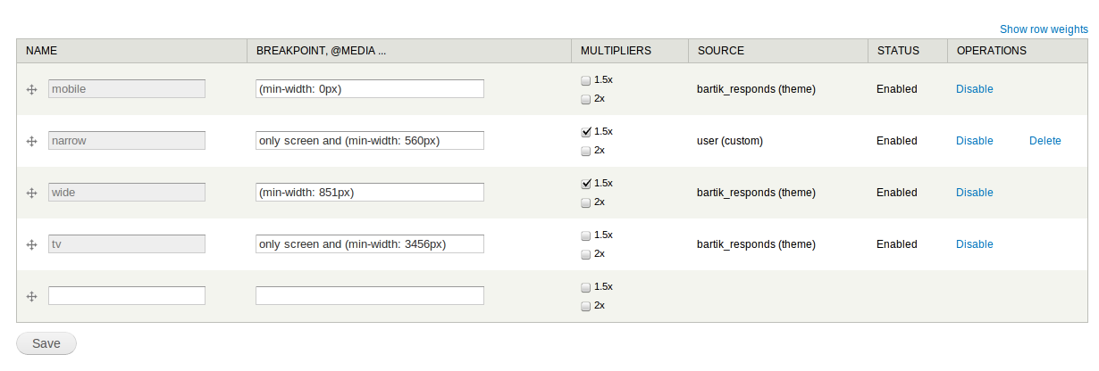
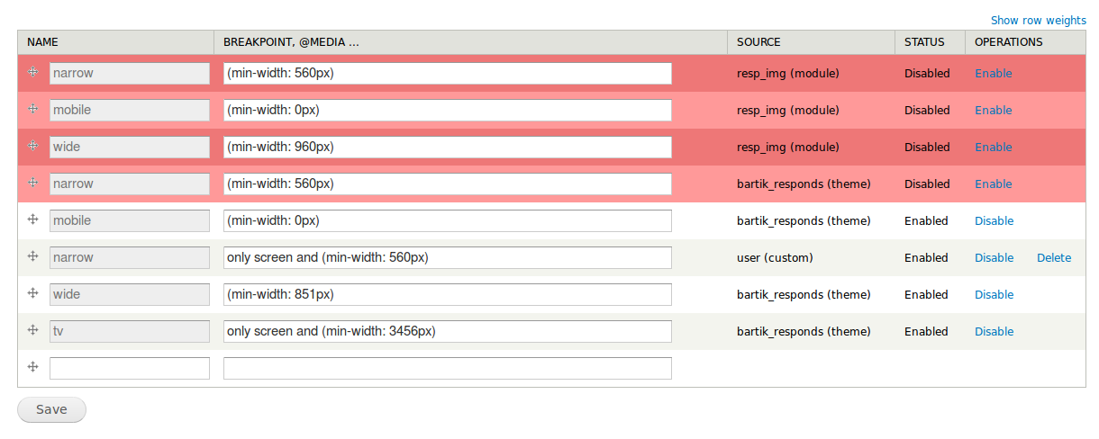
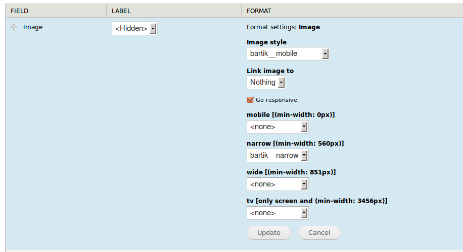
- on a per-theme basis (but not per-field basis), define the pixel (or em) values of each break point
- as part of formatter settings, select which image style to use for each named breakpoint
Note that the Layouts initiative may well end up redefining the nature of the relationship between themes and layouts, so defining the pixel values of each break point may move from per-theme to per-layout, but that's still all speculative, so per-theme is what currently makes sense. But given the moving target on this, let's not get overly obsessive about that part of the UI, and just do the minimum needed by this issue. The real meat of this issue is the formatter settings part, and making the implementation follow a suitable standard.
Comment #113
effulgentsia commentedNot as I understand it. If we're following a standard based on media queries, and media queries can only target viewport width, then aren't we most likely to want to change image source at the same breakpoints that we change major page layout? Not that we should limit image break points to only those that involve page layout changes, but that these are related, and therefore, so long as layout break points are theme-specific (which they currently are), the image break points should be as well.
Comment #114
effulgentsia commentedI hate this choice as much as you do, Snugug, but given #103's assertion that parent selectors have been repeatedly rejected by browser makers, I think the right choice is for core's implementation to follow what is most likely in line with standards and future native browser support. Contrib's a great place to explore other options though, so please keep up your work on http://drupal.org/project/borealis, and offer up suggestions on how core can provide the underlying capabilities to enable such contrib projects.
Comment #115
RobW commentedWith breakpoints attached to image styles I can see WYSIWYG inserted images working pretty easily, with little to no extra code and no end user/ content editor config. How would WYSIWYG integration work with the formatter style config? No point in doing work until Spark/WYSIWYG in core goes through, but it would be good to have a rough roadmap.
Comment #116
Jeff Burnz commentedYou've got to be able to define more than a single value, we really should support both stacked and overlapped media queries. Design can demand both, even at the same time. This is what I mean by content based media queries not marrying up with major page layout breakpoints - you page layout might hard switch on stacked media queries, but image and other content items get controlled more on an overlapping system.
For those not familiar with what these are:
Overlapping media queries
Stacked media queries - target very specific ranges
As a default "not much config" sort of thing this can certainly work.
Comment #117
Jeff Burnz commentedYes, agreed, are we saying here Field formatter with Picturefill, using div or span for now?
Comment #118
Jeff Burnz commentedRobW, I can see certain attractiveness with the breakpoints set in image styles, especially combined with #112 - where I imagine you select from some option at the point of creating the image style, as opposed to at the point of field display settings.
I wonder if there is a killer advantage in one way or the other (I don't see WYSIWYG as a problem), and would we have resources (time especially) to UX test both?
Comment #119
effulgentsia commentedPer #96, my recommendation would be to make image field formatters available outside of field context, whether by moving the relevant parts of File Entity into core, or via other Field API improvements. This overlaps with some of the issues being worked on as part of the unofficial Media initiative, and then decide how much of Media module (or a lightweight alternative or scaled back version) to add to core in order to provide the UI integration of managing images and their formatters in wysiwyg. Or, if that doesn't generate sufficient community approval, then to explore another integration point for responsive images, like the "suffix" concept from http://drupal.org/project/resp_img. But to not add that concept now, before knowing if Wysiwyg, File Entity, and/or Media will become part of core.
[Edit: in other words, "how do I add inline (non-text) stuff into wysiwyg and control its formatting" is a general problem worthy of a general solution, and Media is already exploring that problem space, so I think trying to solve it in a custom way for image responsiveness only is premature.]
Comment #120
attiks commentedTheme related breakpoints:
- defined in theme.info
- mostly used for lay-out changes
- can be enabled/disabled
- can be overriden
Content related breakpoints:
- defined in resp_img settings (but related to the theme)
- used for specific content
#111: theme switching and most sites are using an admin theme as well, where the content editing is done using the admin theme.
#113: we need both, change as lay-out breakpoints, but als allow the user to define content breakpoints. Content breakpoints are theme specific in the latest version but the management is on a separate screen.
#115: "How would WYSIWYG integration work with the formatter style config?"
Not easily, unless using an input filter, this means that contrib has to use this as well and all editors have to be adapted. So let's hope Spark will fix this ;-)
#116: Overlapping and stacked media queries
Can be done, as it is now 'breakpoint' is just a textfield, expecting a min-width, but this can be changed so you can enter a media query.
#117: div or span
For the moment the output uses theme_picture, so it can be overriden, this will likely change to a preprocess and tlp.php file
The output is still using the picture tag, will be updated once @wilto div branch is updated.
#118: image formatter
My main concern with using an image formatter is that you'll have to repeat your self.
Use case:
Site with 20 entities each with an image field
15 of them are used as content, so they all need the same settings
5 of them are shown in sidebar/header, so they need separate settings
You'll need 3 image styles per region, like content_small, content_medium, content_large, header_small, ...
If you use per field settings you have to enter ±60 breakpoints
If you use global settings you select the image style (_small) and you're done
my 2cents: if we add per field settings, i think we need to make it optional and still support global as well.
Questions:
How to handle alt/title tag
(off topic) questions:
Do we need even further control so people can manually upload multiple images instead of using image styles?
The more I'm working on this, the more I get the feeling the display settings are theme related as well but this will have impact on everything
Comment #121
Jeff Burnz commentedLets round up and see if we can get some more specific dialog, I'll put a few ideas out there for a minimal implementation. I have left out per theme settings for now as I don't really see those as being required for a minimal implementation.
To my mind the killer advantage of using field formatter is no change to the Image Styles UI - which is already quite complex. Additionally we are merely extending the current image field formatter UI - users are already familiar with selecting image styles in field display settings. We know this works.
Some additional points:
Is this sounding like something we can move on?
Comment #122
attiks commented#121 sounds great! I already implemented the per theme settings, so I will leave them in there for the moment, the field formatter is going to default to the default theme so on that side it appears as there are no per theme settings.
Can you clarify on how you see 'can one limit the scope of a media query in this UI', or is this just meta data that one can add to a breakpoint?
Comment #123
Snugug commentedHoly bad UX Batman!
Let us discuss, for a second, the proposals in depth:
Problem number one with this is you can't do responsive from the back end. Responsive web design is all about your content and your front end. To set breakpoints, if you'll allow me to quote Stephen Hay:
A proposed Breakpoint UI would mean the following: Either we as a community are de facto encouraging device breakpoints by decoupling the setting of breakpoints from the content they should be in charge of (in which case, bad on us), or we are creating a User Experience where a site admin will need two windows open, one front end tab and one admin window where they can determine their breakpoints and one to set it in the admin UI (and for the record, anyone who says most places use the same frontend and backend theme, not only does this ignore the very usual usecase where that's not the case, but you're also going to want different breakpoints between admin screens and user content). And then, after all of this, if this "Breakpoint UI" doesn't spit out, for our styling pleasure, separate CSS files for us to actually code in, then we're going to need to repeat all of the breakpoints in our theme.
Here's an awesome idea. Let's ignore the Image Styles UI (which, contrary to what you're saying, has one of the best UIs and UXs in Drupal Core), something that is really easy to extend and gives users a visual preview of what they're getting and instead, let's throw all responsive image options into the field formatter form, because if there's one Drupal UX thing that everyone loves, it's our endless forms. But better yet, let's confuse the situation by giving the user three, yes three things to keep track of: First, an multioption form to select multiple image style settings, requiring each and every one to be defined in Image Styles (what they look like, how they crop, etc…) and figure out what images work for what, and this is the second, breakpoint that you defined somewhere else in the Admin screens and if you need more than two (you should, oh you should, especially when talking about different resolutions and small through huge size screens), or third, a responsive image checkbox I guess that ignores the other settings and does some magic with Picturefill that's not quite well defined and functionally works similar to the first option, but not quite? Then not only are we cluttering up a user's image style settings select with every single possible style they would need, but we're going to force them to create each and every one, with potentially the same style options, for each and every scale. Bah is that a bad UX. And if the first option doesn't use whatever image replacement that we've chosen (picturefill seems to have taken the cake), what the hell is it using?
My continued reservations aside about using a polifill for something that doesn't exist yet and may not be the best option on the table, if we are questioning whether to use
divs orspans, let's all keep in mind that Picturefill usesdivs for a reason, namely that by default they are block elements instead of inline elements, and when dealing with widths block elements out of the gate are easier to work with.Not including the max width scaling trick is absolutely resigning Drupal Core to encouraging and producing fixed-width, adaptive sites instead of fluid responsive sites because it's saying to our community that fluid media isn't something that the Core dev team cares about. Since Responsive Web Design's inception, Flexible Media (along with media queries and fluid grids) has been one of the core pillars of RWD.
We shouldn't be so quick to ignore this as this is one of the core reasons behind the picture element syntax, unless we are resigned to just allowing for image style swapping.
First, repeat after me: Responsive Web Design isn’t about current devices and known unknowns, it’s about future devices and unknown unknowns. Why are we still talking about devices? It's not device context that we should be concerned with (in fact, I would go so far as to say if you're serving different images based on any device context other than resolution, you're doing it wrong), it's the context of the content on the page. This is what I've been trying to get at: Drupal is specifically designed for its content to be modular, to be used in different places and with different things. If we just blanket use viewport sizes as our determining factor instead of the content's context to determine image's src switching, Let's take the very basic use case of a news article having a leading image attached where, for the main page, it takes up 50% of the content area, but when used as the image for related stories, it takes up 10%. At a 700px wide viewport, and if we were only querying off of viewport, we'd serve, at best, a 350px wide image for both, and that ain't right.
With this all being said, I've got one very important question to ask. If you've actually built a responsive website by hand, using content based breakpoints, fluid grids, and fluid media, please raise your hand. I'm genuinely curious as to who has experience implementing what we're talking about at its best practice level (what I believe we should be striving for) and who hasn't done any RWD or has only done it using sweeping major breakpoints and fixed layouts.
Comment #124
Jeff Burnz commented@122 - lets focus on a minimal implementation, per theme settings are an edge case, for example Drupal core does not have theme switching by default. Its also inconsistent, for example there are no other fields that have per theme settings - so that would likely be something part of the Field API that became available to all fields, not a formatter specific feature.
Comment #125
Jeff Burnz commentedSnugug - I have built many responsive themes, as for the rest of your post, well, afaict everyone is trying to craft a solution, your post comes across as very ideologically driven. You seem tobe presenting the idea that RWD is a specification of sorts, it is not, it's a set of technologies very much in flux, barely out of its diapers. I think your criticism of the UX are a bit unclear and to be honest, rather one sided.
I will comment on only a few points:
Exactly - that is ultimately flexible, leveraging all of image styles. Your module on the other hand breaks a basic tenant of mobile web design, that image cropping/aspect ratio should ideally be adjusted - merely scaling the image is not ideal.
It has been but not all sites will be responsive. CSS max-width is incredibly useful, but also a hack and it breaks a lot of things, such as all mapping solutions. Its something a theme will want to define, for itself, the last thing front enders want is core doing more CSS trickery. We should not impose this, but allow themers to choose for themselves. Please don't quote the "we can override", users should not have to override something that should not be there in the first place.
Device contexts are not set in stone on a particular date. One thing I have learnt in dealing with thousands of users doing RWD is that a good proportion of them want to combine context with RWD. Its a powerful idea and users like it. I fully back what Lewis said much earlier on in this thread - we stop being ideological and instead focus on reality. The reality I see and experience is that users want context.
At the end of the day we have to do something, and that something has to be workable. Whatever way you look at this its not going to satisfy everyone, nor every use case.
I'm not wedded at the hip to field formatter solution, indeed the image style idea has a lot of merit, if it can work - and remember, this will not reduce the complexity or the necessity for end users to have to fiddle around with things, nor remember where and what they did. Indeed, I wonder if a unified breakpoints UI could tell users where their breakpoints are being used.
On a final note regarding RWD from the backend - actually I think you are very wrong on this account. Clearly Omega and Adaptivetheme are hugely popular and, guess what, they work. People love those themes - and they do breakpoints from the backend.
No one is saying its precluded to write granular, content specific media queries in your themes CSS, of course themers will do this - but those do not solve our problem of delivering responsive images, nor breakpoints for other systems, such as a page builder, or a dozen other modules that might want to leverage such a feature. Our alternative would be to sprinkle breakpoint entry through the system, which might work, if its an API and consistent. Personally I think the unified breakpoints UI idea has potential.
What I do know Snugug is that the clock is ticking and we need to get on with this, sooner rather than later. That is why I came into this issue now, I saw it going round and round with no real direction. We need to drive this forward and make some decisions, to that end someone needs to stand up and say - this is how we are going to do it right now - of course I am not that person, but I am prepared to attempt to drive this forward in a constructive way.
Comment #126
attiks commentedFYI: Integration with field formatter settings
Some remarks:
- states aren't working for the moment, so everything is shown by default
- didn't try ajax yet
- if all selects are , all of them are used for the output
- output is done by theme_picture_formatter and theme_picture
- the original image style is used as default (which makes the 'mobile [(min-width: 0px)]' redundant
Comment #127
attiks commentedManagement of all suffixes/breakpoints
Breakpoints can be defined by theme, module, user
All breakpoints can be enabled/disabled
Drag and drop added to order the breakpoints from 'small' to 'big'
Comment #128
rainbowarrayThanks so much for all the work everybody here is doing this. I'm working on a redesign of a website that will be using responsive web design and got here because I was looking for the best solution for responsive images. I'll be working in Drupal 7, so I'm hoping the resp_images module will help me out there. But anyhow, I just wanted to provide some feedback, from a site builder perspective (and from someone pretty familiar with the responsive images debates) as to what I'd love to be able to do with responsive images.
Breakpoints
One of the great things about the picturefill solution is that it allows for breakpoints to be set for an individual image that are independent from the breakpoints in the layout of the design.
An example of why this is useful: In the design I'm working on, as the viewport increases in size, the main content area doesn't infinitely increase in size. At a certain point, a sidebar column moves up to eat up some of that space. At a wider viewport, that sidebar column becomes two sidebars. This helps to keep the main column of content relatively the same width. So even though there have been multiple breakpoints for the layout, in theory, I might not want to have different breakpoints for my images in the content area.
That should be up to me as a designer: it should be possible for image breakpoints to differ from layout breakpoints.
Measurement
Best practices are to set breakpoints with ems, not pixels. This is critical for accessibility: if people resize their font size, rather than their zoom size (and people with low vision do so), setting in breakpoints in ems allows the layout to change much better in relation to the text size. This is equally true of images. There are some other measurements being worked on right now, too, including rem, and more.
I want to make sure I have the ability to set my preferred measurement, such as em, on my breakpoints.
Types of images
All images are not created equal. I might want to have some images that take up the entire width of my content column, no matter the size of the column. Others might fill the column width at small viewport sizes, but then end up floated to the right at, say, 33% of the width of the center column, at larger viewport sizes.
So I need to be able to say that this image uses this set of styles, with this set of breakpoints. And that other image uses a different set.
Retina
The interesting thing in the newest versions of picturefill is that it takes the srcset proposal from WHATWG and mixes it with the mediaqueries of picture: this has been called Florian's Compromise. Anyhow, for each set of breakpoints, it allows for a standard def version of the image as well as a retina version.
So I'm hoping that image styles will be able to handle outputting a 1x and 2x version of each image using srcset on the src element.
Art direction
This may be a stretch for core: maybe this should be in a contrib module. But in an ideal world, here's what I'd love to do. I upload an image: it's really, really large, because I want it to be retina ready. Image styles takes care of shrinking that down to all of the smaller versions. I get to then see a preview of those images. It might turn out that for the smallest versions, the thumbnails for example, the picture is no longer recognizable. I would love if I then had the opportunity to use some sort of crop tool so that the version of the image that is shown at a certain breakpoint focuses in on the most important part of the image.
Like I said, that may be a stretch, but it would be great to be able to do cropping per breakpoint on an as-needed basis.
* * *
I think that pretty much covers my wishlist. If all of those things were possible, Drupal would be providing a world-class solution for responsive images. The brilliant thing about it is that it would future-proof your design. Rather than hand-coding the HTML of a picture element and uploading separate versions of each image to a server, and if your layout changes, you have to go back and recode and reupload each image, Drupal would provide a far more elegant solution. You would upload one image, just once, set your styles for the image, possibly provide your art direction, and then Drupal handles the rest. If you change your site layout, no problem! You go into your image styles, tweak your breakpoints and image resizing, and Drupal handles all the changes. Maybe you could even get a view showing what images had art direction cropping applied, and then you could go in and check that the cropping still made sense.
Having such a system in place would make Drupal one of the best ways to create a large responsive design that would be future-proofed. That would be a huge selling point. Responsive design is taking over the web design industry by storm, so that would... rock.
Comment #129
RobW commentedThanks for taking the time to post such a well thought out list. I'm totally in agreement: I think we want all but the last for the D8 picturefill module.
The idea of different image styles applied to different picture sources is pretty essential, but going farther into "art direction" is a great case for contrib, seeing as there are a bunch of potential ways to do this (focal point, jQuery crop).
Comment #130
attiks commented#128:
Drupal 8 resp_img
Breakpoints:
Measurement:
Types of images:
Retina:
Art direction:
That would be a neat feature, but I guess contrib has to solve this one. Basically it means changing the node/edit form so a user can see all enabled breakpoints for an image field with a file upload next to it, it left empty it will use the image style and auto generate the image, otherwise the editor can upload another image.
Drupal 7 resp_img
Can you create a new issue in the resp_img issue queue, because it's a bit off-topic in here.
Comment #131
rainbowarrayI figured art direction was a bridge too far: if this can be set up for contrib to handle that, awesome.
Thanks for the detailed breakdown, attiks.
So basically, if you want to have two different types of images for a content type, you'd just set up two different fields for each? That seems straightforward enough. You could then reuse that field type for other content types.
For retina images, in theory, it should be pretty simple. It's just a different image style with twice the width and twice the height of another image style. Automatically create the image sizes based on that, and then add the srcset to that breakpoint's src element. Since I don't know the ins and outs on how the modules work, in practice, it might be far more complicated than that.
I do believe retina images are a "must-have" rather than a "nice-to-have." While the Phone 4S, new iPad and retina MacBook Pros are the ones with the retina label, there are already plenty more Android phones with high-res displays. Retina displays will probably be available for all Mac laptops and displays within a year from now, and given how the tech industry works, I can only assume all the PC vendors will be doing the same before long. So by the time D8 launches, there are going to be a slew of retina displays out there. And without retina images available in the srcset, there are going to be an awful lot of Drupal sites that are going to wish their images looked better on those retina displays.
It seems like that would be a doable feature to add.
Comment #132
attiks commented#131:
You can even use the same field on both content types, the settings are attached to each instance separately.
Retina support will be added, but it has to be configurable and not limited to only 2 options (1x, 2x), maybe we have retina++ in 6 months and we need 4x
Comment #133
rainbowarrayAgreed. Multiple options would be future friendly.
Comment #134
RobW commentedFor a default high density image style we should probably go around 1.5x, not 2x. Apple bases the "retina" distinction on ppi x average device distance; retina on the MacBook is 1.8ish, while iPhone is around 3. A quick breakdown:
The only situation where standard pixel density is a problem on a high density display (aka looks like crap) is small icons. Normal res .jpgs look pretty OK, and a 1.5x image looks great.
I know I've read a couple of articles that recommended 1.5x over 2x images for high density screens; I'll try to find them again and post here (edit: one was Trent Walton's "In Flux": trentwalton.com/2012/05/08/in-flux/). The basic idea is 1.5x hits the middle of the high density display landscape, giving noticeably better quality than a 1x image (even on 300+ ppi displays) without serving quite as many pixels as 2x, pixels that wouldn't even get used on many of the devices that claim retina.
Oh, and hearing the words "future friendly" in a Drupal issue warms my heart :D.
Note: this all assumes that 1x, 1.5x, and 2x are multiplying the image dimensions (width and height), not the area. A 2x image is 4x the area: if we were talking about area we'd actually want to be around 2x.
Comment #135
attiks commented@RobW we can solve this in a couple ways:
only screen and (min-device-width : 768px) and (min-device-pixel-ratio : 1.5)) to support retina, but it means if they want it for all 'regular' breakpoints they have to enter a lot of queries. Pro is that they can add retina support only to content breakpoints without having to add it to layout breakpoints.Edit: typo's
Comment #136
attiks commentedI implemented option 3 from #135
Management screens allows you to select which multipliers are needed, '1x' is implied and always enabled.

Multipliers are defined in config settings as follows:
multipliers: [1x, 1.5x, 2x]ormultipliers: [1.5x, 2x]Field display settings shows all enable breakpoints and all selected multipliers

Output looks like:
Comment #137
attiks commentedForgot to mention, the output can still change to another polyfill
Comment #138
RobW commentedLooks good. Is there any reason to restrict the multiplier choices to 1.5 and 2? I think a small decimal or text input would be more flexible, and keep the module ready for more use cases (the inevitable 3x, when someone figures out how to do 0.5x for feature phones, the dev who believes that 1.8 is the real sweet spot, etc.).
Comment #139
attiks commented@Robw: I think you missed this line, which can be changed by the user, or do you want different multiplier for each breakpoint?
Comment #140
RobW commentedI was thinking it would be more configurable and the workflow would be simpler if instead of a global config there was a textbox on the formatter. But, I thought the line you quoted meant those points were hard coded. If they're not, all is good.
Comment #141
wilto commentedHey guys!
As promised, I re-raised the issue to the HTML WG with mention of the Drupal community’s interest, and `picture` is being actively discussed on the HTML WG mailing list at present. That thread can be found here:
http://lists.w3.org/Archives/Public/public-html/2012Jul/0123.html
An associated issue has also been added to the W3C’s bugtracker here:
https://www.w3.org/Bugs/Public/show_bug.cgi?id=18384
In light of Ian Hickson stating that he’ll be reconsidering the issue in the WHATWG IRC channel recently, I’ve reposted a summary of the proposal to the WHATWG mailing list, as well. That thread can be found here: http://lists.whatwg.org/htdig.cgi/whatwg-whatwg.org/2012-July/036669.html
I hope this helps you guys track the ongoing saga — and of course, I’ll be sure to share anything I should hear on the subject.
Thanks,
Mat Marquis
Comment #142
attiks commented@wilto, thanks for doing this
Comment #142.0
attiks commentedUpdated issue summary.
Comment #143
rainbowarray@wilto You rock, Mat! Awesome podcast with Jen Simmons on Responsive Images. Very helpful update of what's going on with Responsive Images.
@attiks Instead of Multipliers as a heading, how about High-Res Size or something like that, which might be more intuitive.
@RobW +1 on being able to provide options beyond 1.5x and 2x. For simplicity's sake, it make actually be easier for most users if the ability to choose that is a bit more hidden, and Drupal just provides intelligent defaults (with the ability for more options elsewhere).
Comment #144
RobW commentedRe: "high res", anyone dealing with this part of the site is going to have knowledge of media queries and their syntax. I think the best usability will come from letting users enter the code and allowing it to be reused. But high res would be a great label if content editors are manually choosing images for each source with a contrib module.
Comment #145
Bojhan commentedIs this serious? The level of usability that is proposed here, does not come near anything that could go into core. I understand the necessity to do this, but also know that the conceptual framework we use here is the implementation model. What I see so far, is highly technical focused around the complexities of breakpoints, with no visual feedback what is actually happening.
People are highly visual, and its nice that this can all be fit in the Field UI but to be frank the Field UI is a usability nightmare (we have proven this in testing time and time again), and the format pattern here does not accommodate a lot of options.
Although I cheer trying to meet existing standards, I think this one really needs a new UI.
I have never found HTML/CSS constructors like this to be particularly use able, nor desirable for core. I believe with responsive design, there is no choice but to do this - if we want to make it configurable. I think the discussion has steered away from providing a minimum/simple UI to a - lets do everything UI, there needs to be discussion what the bare minimum for core is.
To move this forward I suggest getting people on the Spark team, to comment - as they have been working on a visual way to do this. Discuss and prototype beyond the boundaries of whats possible in Drupal, its tempting to try and find a solution in the compounds of Drupal patterns - but for something like this, you need to invent something new.
Comment #146
attiks commentedIt appears there's some misunderstanding, the UI that I'm showing here, is so people can see what's going on, and to decide what is needed, not how it's going to look. If you have any proposals on how the UI/UX can be handled, please share. If there's something on the 'UI' that isn't needed (like in can removed from code) great, the lesser code the better.
Part 1: breakpoints:
Themes need a way to expose breakpoints to core so other modules can react on them.
Themes need the flexibility to use whatever MQ they want.
Themes need the flexibility to use any number of breakpoints.
Themers need a way to add site specific breakpoints, again any number they want and with the full power of MQ.
Themers need a way to add override theme specific breakpoints.
Module need a way to interact with breakpoints.
Part 2: image - breakpoints - image styles:
Themers need a way to specify for each image field a set of breakpoints and related image styles.
Regarding Spark, I assume you're referring to #1677196: Build out a static prototype of the layout editor which is nice and great looking, but AFAIK is about the layout of the page, not about content specific MQ and only works with a limited subset of MQ. They also will need CRUD for breakpoints, hence the idea of splitting this 'solution'/'proposal' into at least 2 parts: breakpoints (which by itself will exist of an API and admin module) and the rest. Related spark issue #1693036: Responsive layouts & responsive images: both need breakpoints where I asked for feedback from Spark team members.
Off-topic (and leave it as such please): "Is this serious?" isn't going to get this implemented, positive feedback is much more appreciated.
Comment #147
wim leersI agree with @attiks, I think you misunderstood what's been happening here @bojhan :)
The discussion in this issue has not really been about how to make it easy to use, rather which technical (underlying) standard-to-be/implementation should be used. We're getting closer to consensus in that regard AFAICT (@attiks will be better able to comment on this).
Maybe it makes sense to have a separate "Responsive Images UI/UX" issue? This is the 147th comment already, after all!
Comment #148
attiks commentedI created:
#1701112: Advanced responsive images UI/UX for breakpoints
#1701116: Responsive Images UI/UX: Image styles
Comment #149
Bojhan commented@attiks @Wimleers Sorry, but I saw red flags. The technical concepts completely influence what UI we can make. When I see "decide what is needed, not how it's going to look.", I see a misunderstanding what UX design is about. UX design is totally about designing how it works, how it looks is only a small part of that effort. It's not going to be the first time we put "an initial technical concept" as the UI into core, so I am extremely cautious when I see UI concepts bubbling up for important stuff like this.
Spark exposes a visual way of doing breakpoint configuration, which is what I was referring to. The fact that it currently doesn't handle responsive content configuration is only because that is a huge thing to tackle. I can't offer design suggestions, when there is not a clear breakdown which functionality will be there and for whom, I imagine this has different audiences - and our challenge is in those that are not knowledgeable about responsive design (which probably still is the majority of our userbase).
Comment #150
webchickI think Bojhan is right to be cagey about this. Good UX design is about much, much more than slapping paint on at the end to hide technical details from users. I think what Wim's saying though is that the programmers right now are working through the technical details of what options need to be set at all, and it's easier to communicate this and play around with it when it's in the form of form fields that regular people can use and see what happens (as opposed to manually manipulating JSON requests or something).
The current thinking of the Spark team on how breakpoints could be defined in a visual way is at about 1:25 in this video: http://www.youtube.com/watch?v=Ek2eyWZPI1c This design is not yet implemented, but our similar "raw values form fields" stuff which is implemented currently can be found in the Layout module: http://drupal.org/project/layout if you want to take a look. Currently, this is actually targeting the content area (ala Panelizer), not the entire page, but we do hope for it to be able to do both.
I do think that defining breakpoints "globally" is going to make more sense to users, rather than defining some for the global page area, some for the content area, and still others for where images will break. Ideally, you'd define your global site's breakpoint sizes, and then these would be selectable from image styles.
Looking at #136 though, that would only take care of a couple of the columns in that screenshot ("Breakpoint + @media", "Source" (machine name of breakpoint(). There's still the matter of how to deal with other things like "magnifier" (I have no idea what that is, but I'm sure an updated issue summary will be provided before this patch is ready for review that can help ;)).
So, I think glomming onto Field UI atm makes sense for the purpose of figuring stuff out, but I would actually be inclined to commit this when it's eventually ready with no UI and then hash out the finer details in those two sub-issues you created, as they do rightly deserve their own consideration. Getting this UI right is going to be critical to people actually being able to use Drupal 8 to build out mobile-friendly websites, and it's a killer feature.
I'm also escalating this to a "major" task, because I think that accurately reflects its importance. Thanks for all of the hard work on this.
Comment #151
attiks commented@Bohjan, @webchick: I completely agree we need good UX
The problem now is indeed to figure out what all initiatives, developers, themers, users need to be able to do their part of the job, hence the rather extended form.
For the moment the 'responsive image' part uses this breakpoint object:
UI related feedback added at #1701112-2: Advanced responsive images UI/UX for breakpoints
@webchick, good idea, let's focus on what's needed and how it might be used in this issue and move all the rest of the discussion elsewhere.
Comment #152
wim leersGreat news; the discussion about adaptive images now seems to be on the fast track towards standardization: https://twitter.com/laura_carlson/status/228537672476553216, http://www.w3.org/2012/07/26-html-wg-minutes.html#item10
Comment #153
jessebeach commented@attiks et. al. the thread of the discussion here revolving around breakpoint management strikes me as a crucial concept we need to explore. I'm not sure yet if it's the solution to defining when to inflect images, but it seems very promising. We've been playing around with this concept in early Spark responsive layout experiments. I wrote up some of my thoughts in this thread (not copied for brevity):
#1693036-9: Responsive layouts & responsive images: both need breakpoints
With a common API for breakpoints, the question of when do we trigger a content inflection (change a layout, swap an image) becomes a black box of sorts and hopefully let's folks in this issue focus on how does one make images responsive given a qualified trigger and the context.
I also started a child-page of the Community Initiatives called Responsive Design where I'd like to collect links to the various issues, modules and projects that are addressing problems in this RWD space. Please add links you feel are relevant. I know I need a curated roll-up of resources in order to grasp where we're at with our efforts.
Responsive Design community initiative page
Comment #154
Jeff Burnz commentedjessebeach - that's going to be a critical resource, the big problem I am having and others I think also is knowing what is going on in all the initiatives - Spark, Scotch, Mobile. Its very hard to tie this all together.
Certainly this issue has been much more about "what do we need to support responsive images" in terms of technical issues, because this technology is brand new, by and large does not exist, and is being invented as we go.
Comment #155
sgtsaughter commentedHere is a D7 module that I just implemented on mobile version of one of my sites that worked great in terms of responsive imaging. Maybe you can take a look at the source code for this module and take some ideas from it.
http://drupal.org/project/borealis
Also, I think that the user should be able to set the breakpoints instead of core deciding on when it should break.
Comment #156
attiks commentedFYI: resp_img is split in 2 parts:
Edit: links added
Comment #157
dodorama commentedI personally believe the solution outlined by snugsnug in his Borealis module is the most elegant and user friendly.
Images tagged as responsive in the image style settings are resized according to their parent. That's it. No complicated settings.
One of the many advantages is that if I move an image from the content area to a smaller block on a sidebar I won't have to change any settings. If the theme developer changes the breakpoints he won't have to change a gazillion settings on the UI.
It just works. It deserves a second opinion.
Comment #158
attiks commented@dodorama, @sgtsaughter: Borealis has indeed an easy to use UX, but it is also limited in its use cases:
- it only allows rescaling with same aspect ration (#84)
- it forces all images to max-width: 100%
- it has no support for MQ (#80, #138-#140)
- it acts the same for all themes (#80, #111)
- it only works with images fields, not with inline content
Some other related remarks, todo's:
- breakpoints are all set in one place (#100), see http://drupal.org/project/breakpoints
- roundup, see (#121)
- what is outputted and how it will be outputted still needs some more discussion, for the moment a lot of people are trying to get
<picture>accepted by w3- bad UX (#123, #145), folluw-up in #1701112: Advanced responsive images UI/UX for breakpoints and #1701116: Responsive Images UI/UX: Image styles
- background info at Responsive Design community initiative page
- handle inline images depends on a lot of other issues, so it is postponed for now.
So far this discussion is mainly focused on what kind of breakpoints we need to support all use cases, not only for responsive images, because there's a huge overlap and it's no use that each and every initiative will invent their own 'breakpoints'. We cannot separate this from other initiatives like layout, blocks, ...
I'm open to all suggestions/ideas/critisism, but can you be a bit more specific and don't turn this discussion in a popularity contest. I'm still keeping an eye on borelias to see how it will evolve and would love to see a drupal 8 version ;-)
Comment #159
sgtsaughter commented@attiks I agree with you on the popularity contest. I don't care which makes it into D8 core. I was just giving my two cents in about the responsive imaging issue. Especially since I just implemented the module and was pleased with its simplicity. I know the drupal community will take the most objective approach to implementing a responsive imaging solution into core.
Maybe I'm missing something here, but why do we need to predetermine breakpoints? I feel that the user should be able to choose and input the breakpoints just as we already do in our media query style sheets. The recommended breakpoints (smart phones: max-width 480px, iPad: max-width 1024px, etc.) may change after D8's release so we shouldn't hard-code them into the system.
Comment #160
attiks commentedRegarding "predetermine breakpoints": The breakpoints are defined on different levels
Responsive images has to be able to react on the changes the user want, but probably not on all of them. But this also means that it has to be possible to do more than only rescaling/resizing the image. It might be necessary to change for example the aspect-ratio.
Breakpoints are not defined by the breakpoint and resp_img module, the breakpoints module allows you
The resp_img module will use one (or more) of those group to combine MQ with image styles.
At least, that's the idea so far ;-)
Comment #161
sunThis is important to figure out and would be awesome to resolve, but it is a feature request (and should not count towards core major/critical thresholds, which prevent other patches from landing).
Comment #162
Zarabadoo commentedI have finally read through this epic, so hopefully I am not forgetting something that was already mentioned in my mentioning of the following thoughts. I am also far to late to this issue to make much of an impact at this point.
Why are we trying to completely alter the image style setup and also load up the image formatters? Why not keep the basics of declaring image styles we have, but also add the ability to create breakpoint bundles? We can reuse styles in multiple responsive instances by mix and matching them in various bundles. These bundles can then be applied to a field. You can even make an input format use one one on the images in a text area.
Also, having the theme feed in breakpoints in some way is not necessarily bad, but it would be nice to be able to feed in a raw one from the backend. I am thinking this may be useful for the folks that typically use contrib themes (they may not know what they are a lot of times, but the option would be there for those that do).
One more thing I keep coming back to is how much image sizes are specific to the theme, but this is likely something for another issue entirely. Modules really do need to be able to set initial styles, but it would be nice if there was an intuitive way for a contrib theme to be able to alter or tweak the output. That seems like a really complicated thing to tackle in this, though. (Not to mention likely performance issues.)
Anyway, those are my thoughts. I am really enjoying seeing all other's thoughts on this so far. It is not an easy issue to tackle.
UPDATE: And my questions seem to be answered in #1701112.
Comment #163
rainbowarrayI've been testing the D7 version of the resp_img and breakpoints modules, and they work pretty much as you describe, Zarabadoo, if I'm understanding you right.
I've wondered about the switching themes issue too.
Let's say a theme sets a certain set of breakpoints. Great, site builder says, I'll use those to build my responsive image styles! The site builder creates a group of breakpoints based on the ones available in the theme. Image styles are then assigned to each breakpoint within the theme. Those responsive image style groups are then applied to various image types.
A year or two later, there's a decision to change the theme. It has a different design, and the previous set of image breakpoints no longer work. What to do? For a site with 2000-4000 pages, even if there is an image only on every other page, nobody is going to want to go through each individual image to change the image style associated with it.
I think what's important to avoid this is that a site builder should be able to use the breakpoints in a theme, but if that theme is changed, those breakpoints shouldn't vanish. Instead, there needs to be a way to apply breakpoints from the new theme to that responsive image style group. Or manually tweak the previous themes' breakpoints still in the group.
I'm not sure I'm making much sense right now, as I'm slightly sleep-deprived. Still, it's something we should keep in mind. Part of the power of Drupal is its flexibility, and the ability to change themes. We don't want an entire site's images locked down to a particular theme's set of breakpoints without some mechanism to change them when the theme changes.
Comment #164
attiks commentedmarc is right, this is what breakpoints is doing in combination with resp_img 7.x-2.x
for now breakpoints are removed if the theme is disabled, but you only need to change the display settings, not each image separately, we are working on import/export right now, we'll see if it's possible to add some cloning functionality so you can import theme breakpoints as user defined breakpoints
Comment #165
johnalbinHere's the latest update on the official responsive image HTML element: http://www.w3.org/community/respimg/2012/08/04/picture-in-the-html5-spec/
The new element/attribute is still a moving target, but it appears to be moving slightly less then it used to be moving. :-)
I'll continue to follow along and participate in those discussions.
Comment #165.0
johnalbinAdding relevant discussions, these are very interesting and should be widely tracked by people interested in this issue.
Comment #166
attiks commented#164: Breakpoints can be exported, imported and theme breakpoints can be overridden (clone and edit).
Comment #167
RobW commentedGreat news. And:
Wooooo!
Comment #168
attiks commentedNew issue created #1734642: Move breakpoint module into core
Comment #169
rainbowarrayThe draft W3C proposal of the picture element is available here:
http://dvcs.w3.org/hg/html-proposals/raw-file/tip/responsive-images/resp...
One important note is that width and height are not allowed on source elements. I know you have reasons why you think that would be useful, attiks, but I think we should consider pulling those from your modified picturefill for the time being to conform to the proposal as it currently stands.
Comment #170
attiks commentedProposal can be found at http://wilto.github.com/draft-prop/ResponsiveImages.html
At the bottom of that page you can find all open issues.
If you can help in anyway to move this forward, please do ;-)
Comment #171
cdnsteve commentedJust wanted to provide my input - you don't want all images to be responsive in the context that they are not all created equal.
In my current project, simply scaling an image down doesn't work with the rest of the layout. What we required were different, specific, versions of the image (with text positioned differently, and cropped accordingly) for tablet, mobile and desktop views.
So now I have three different images on the server for each of my layouts:
image.jpg
image_tablet.jpg
image_mobile.jpg
How I did it:
This was all accomplished via JavaScript.
Now of course if you just needed to scale images, you can already do this via Drupal 7. Even in something like TinyMCE image upload there's an option for image preset sizes. So I can upload an image (desktop), have it become mobile and tablet if I want.
Then I just add the image and class to the page I want and it's responsive.
Here's the code on GitHub if you want to see what I mean.
Steve
Comment #172
attiks commented#171 Thanks for your input, some remarks/clarifications:
<img />tagsYour solution works, it is similar to how Responsive images and styles is working, but the problem is that you're at least loading 2 images, the one specified inside the image tag and the one after the replace with the javascript.
Comment #173
cdnsteve commentedGreat module attiks and thanks for your feedback. I wasn't aware of this module.
Does this module somehow serve the user a different rendered page depending on the device or is that the idea for this initiative?
EG: Instead of just media queries changing CSS the actual page loaded is changed or portions of it.
Comment #174
RobW commentedIt uses the proposed picture element (or a div structure that matches it), which includes all possible source files and a media query for each in markup, but only downloads and displays the first source with a media query that matches the device/ browser state.
If you haven't heard of it before, check out the A List Apart article on responsive images by Mat Marquis, and then branch out from there.
Comment #175
attiks commented#173
Picture module is serving the same html for each device, there's no server side detection. The problem with server side detection is that it's a guessing game. The best way to handle those cases is by using feature detection on the browser or use media queries in your css (prefered because you don't need javascript). There are plans to add a 'media' option to script tags, but for the moment it's just an idea. If you want to do it, you can have a look at matchmedia.js, it's a polyfill to support media query detection on almost all browsers, some support it already.
The Blocks & Layouts Everywhere Initiative might in corporate different layouts for different devices.
Comment #176
rainbowarrayQuestion on the art direction use case:
In almost all cases, art direction for responsive images is going to mean cropping an image closer for smaller breakpoints, so that the subject of the photo is proportionally larger.
What's great about how resp_img is working for Drupal is that a user just has to upload one photo and image styles takes care of the rest, automatically generating smaller versions of each file. That makes multiple source images easy, since you don't have to open Photoshop at all.
I'd love to find a way to make art direction equally simple. Uploading separate images for each breakpoint is technically simple on the backend, but it's complicated for site editors.
Ideally, what I'd love to see is that you upload an image, say with the Media module, and select the responsive image style group for the image.
Then, you see a preview pane that displays the multiple versions of your image at the sizes they will appear on your page: one for each breakpoint.
At that point, you can crop any of the breakpoint previews on-screen.
And ideally, you could then take a look at another breakpoint preview and say, hey, please use the same cropping I set up for this other breakpoint.
It may well turn out that this is too complicated on the backend, particularly to get working before feature freeze. Maybe this is something that should go in contrib, at least to start.
Does seem something to think about, though, particularly because one the primary justifications of using the picture element, rather than just a srcset attribute on img, is to allow for art direction. So having a great workflow for art direction in D8 would be a big selling point.
Comment #177
attiks commented#176 I agree that would be awesome, but it is a bit more complicated. There are javascript cropping utilities and there are at least 2 drupal modules doing something similar: http://drupal.org/project/manual-crop and http://drupal.org/project/imagecrop
If it doesn't get added to Drupal 8, it can be done in contrib, we're taking baby steps to get everything (breakpoint, breakpoint ui, picture) into D8.
Comment #178
RobW commentedBecause it can be done in so many different ways (upload different source pictures, JavaScript crop, select a "focus" area, etc.) I think picture source art direction is best left to contrib. It's one of the number one responsive media requests, so I'm sure it will get sorted right quick.
Comment #179
attiks commentedFixed: #1775530: Move picture into core
Can we discuss the rest in new issues (but please link them)
Comment #180.0
Crell commentedChanged proposed solution