
I spent some time tweaking the looks of the edit>content part of the Panels UI. In boring greys for theme-neutrality. I attached a screenshot.
| Comment | File | Size | Author |
|---|---|---|---|
| #9 | panels_dnd2_0.patch | 1.94 KB | yoroy |
| #6 | panels_dnd2.patch | 1.4 KB | yoroy |
| #5 | panels-edit-content-ui-2.png | 17 KB | yoroy |
| #2 | add.gif | 92 bytes | yoroy |
| #1 | panels_dnd.patch | 1.4 KB | yoroy |


Comments
Comment #1
yoroy CreditAttribution: yoroy commentedand this is the patch for panels_dnd.css. I only just watched the diff&patch tutorial, so be warned! :-)
Comment #2
yoroy CreditAttribution: yoroy commentedAnd a different icon for "Add content to this panel"
Comment #3
merlinofchaos CreditAttribution: merlinofchaos commentedI applied this patch and am testing it; I find the whole system a little less distinctive, and I can't immediately tell what you can do. the grabbers really need to stand out to let people know they're clickable.
Comment #4
merlinofchaos CreditAttribution: merlinofchaos commentedOk, part of my problem is, I think, a bug in the CSS for the 3 col stacked display. When I take care of that it's a little better. I realized that the grabbers have a nice hover, which is an improvement.
I do think that the greys may need to be more distinct, and I don't like the dashed border around the actual pane.
Thoughts?
Comment #5
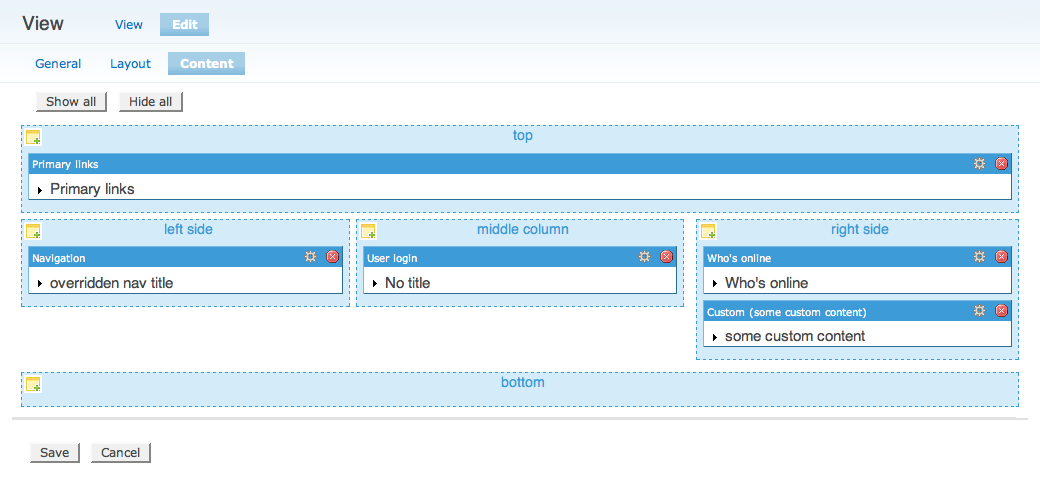
yoroy CreditAttribution: yoroy commentedThanks for the feedback, I spent some more time with it, screenshot attached.
Thoughts:
- Agreed on the low contrasty greys. I chose some blue-derivatives from Garland theme now. Made it so that the actual pane-contents is displayed on white, I found that any background-color there suggested actual styling.
- I found out about the panes being draggable by accident, it wasn't really obvious to me. What might help is that the hover on the grabber changes the border and/or background of the whole pane, I think that involves javascript?
- The dashed borders should indeed not be around the panes. But I think around the panels they are appropiate as layout guides.
- Removed the padding I added around the grabber, making it look more like the title/taskbar that it is.
- Another go at some icons, modifications of the GPL'd set here: http://www.famfamfam.com/lab/icons/mini/
Comment #6
yoroy CreditAttribution: yoroy commentedpatch of panels_dnd.css,
patched against the original file in the alpha1 release
Comment #7
yoroy CreditAttribution: yoroy commentedHmm, just one attachment per comment right? Here's a link to the icons used.
Changed 'wrench.gif' to 'configure.gif'.
Comment #8
merlinofchaos CreditAttribution: merlinofchaos commentedI love the new screenshot, and the new icons.
The patch, however, still makes everything grey -- did you post the wrong patch?
Comment #9
yoroy CreditAttribution: yoroy commentedoopsie, I did. This should be the one
Comment #10
merlinofchaos CreditAttribution: merlinofchaos commentedI've committed this. I removed a text-transform: lowercase -- as of Drupal 5, Drupal doesn't run with everything lowercase, so that would be inconsistent. Otherwise, I'm pretty pleased with the result here. Thank you very much for this! This is now a MUCH nicer looking layout page!
Comment #11
yoroy CreditAttribution: yoroy commentedYay! Really, my pleasure. I use Views and Panels a lot, so I'm just glad I could do something in return. The issue que isn't that scary after all!
Comment #12
(not verified) CreditAttribution: commented