Creating Custom Styles Leaflet Icons With DivIcon and CSS
HOW-TO on using custom markers in Leaflet (thanks for assistance @rudetrue & @das-peter).
Note: see also the module Leaflet More Markers which employs DivIcon and CSS to allows you to enter emoji and flat icons, different ones for different locations, without you having to do any calculations regarding sizes, offsets and centering.
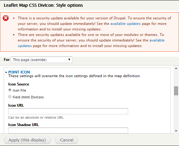
Default Setting
The default map icon is just the little blue bubble.
 |
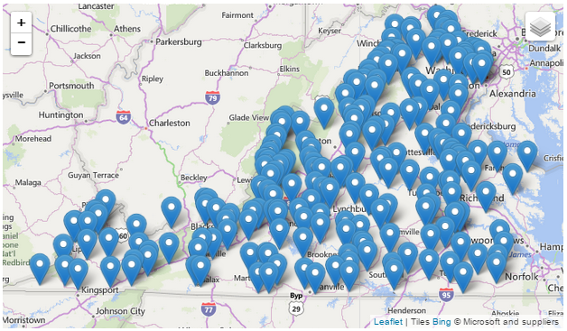 |
DivIcon without any Styles
If you omit the class in the Leaflet Views Settings dialog, the standard Leafet icon div class is used, ".leaflet-div-icon", defined in libraries/leaflet/leaflet.
 |
 |
CSS 1: The Leaflet default divIcon style '.leaflet-div-icon'.
.leaflet-div-icon {
        background: #fff;
        border: 1px solid #666;
        }
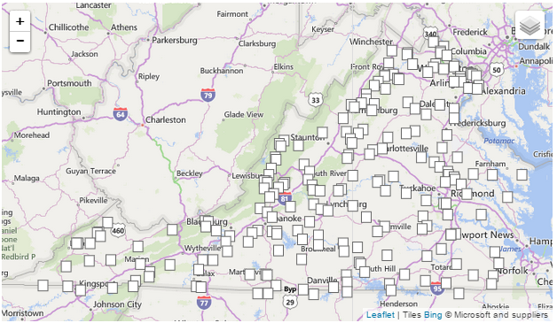
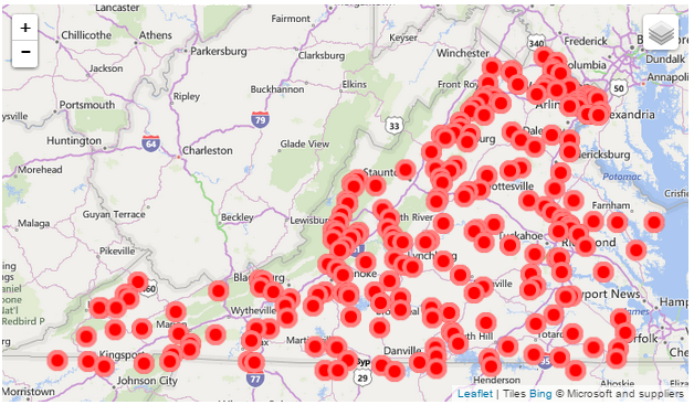
DivIcon With Style & Blank Field
You can create your own custom icon in a CSS file, in this example a red circle, and then refer to the class name in the divicon setting.
 |
 |
CSS 1: A custom divIcon for my leaflet map '.leaflet-div-icon2' saved in modules/leaflet/leaflet_extras.css.
.leaflet-div-icon2
{
  background:red;
  border:5px solid rgba(255,255,255,0.5);
  color:blue;
  font-weight:bold;
  text-align:center;
  border-radius:50%;
  line-height:30px;
}
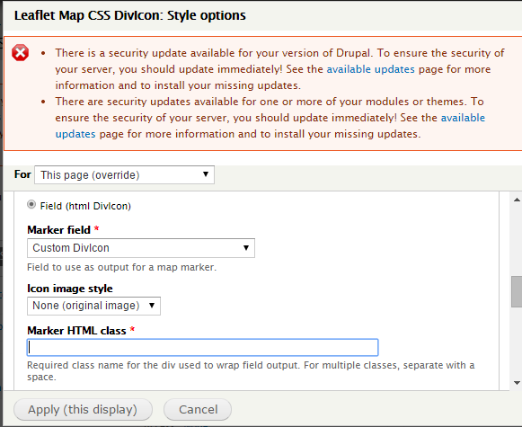
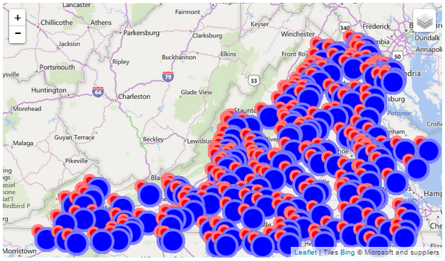
DivIcon With Style & Styled Field
Field has a custom div class, ".leaflet-div-field", defined in modules/leaflet/leaflet_extras.css.
 |
 |
CSS 1: A custom divIcon for my leaflet map '.leaflet-div-icon2' saved in modules/leaflet/leaflet_extras.css.
.leaflet-div-field
{
  background:blue;
  border:5px solid rgba(255,255,255,0.5);
  color:blue;
  font-weight:bold;
  text-align:center;
  border-radius:50%;
  line-height:30px;
  line-width:30px;
  height:30px;
  width:30px;
}
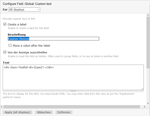
DivIcon w/Blank Style & Dynamically Styled Field
Field has a custom div class with dynamic substitution based on the contents of the field "bundle" defined in modules/leaflet/leaflet_extras.css. In this example my entities have two bundles "usgsgage" and "waterline", and the dynamic style is set in a "Custom Text" field, with the style indicated via variable substitution: <div class='leaflet-div-[bundle]'> </div>
 |
 |
.leaflet-div-USGSGage
{
  background:blue;
  border:5px solid rgba(255,255,255,0.5);
  color:blue;
  font-weight:bold;
  text-align:center;
  border-radius:50%;
  line-height:30px;
  line-width:30px;
  width:20px;
  height:20px;
}

.leaflet-div-WaterLine
{
  background:green;
  border:5px solid rgba(255,255,255,0.5);
  color:green;
  font-weight:bold;
  text-align:center;
  border-radius:50%;
  line-height:30px;
  width:20px;
  height:20px;
}
DivIcon with different Images
Field has a custom div class with dynamic substitution based on the contents of the field "type" defined in modules/leaflet/leaflet_extras.css. In this example my nodes have two content types "event" and "group", and the dynamic style is set in a "Custom Text" field, with the style indicated via variable substitution: <div class='leaflet-div-[type]'> </div>The css shows 2 different images differently positioned: center bottom (bubble) and center center (circle)Additionally suppress the default leaflet icon (square) by entering a non existing "Marker HTML class" at the map settings.
 |
 |
.leaflet-div-event
{
  background: transparent;
  border: 0px transparent;
  margin-left: -10px;
  margin-top: -34px;
  background-image:url(/sites/nutzpflanzenvielfalt.de/files/markers/Termin.png);
  width:20px;
  height:34px;
}

.leaflet-div-group
{
  background: transparent;
  border: 0px;
  background-image:url(/sites/nutzpflanzenvielfalt.de/files/markers/Regionalgruppe.png);
  width:44px;
  height:44px;
  margin-left: -22px;
  margin-top: -22px;
}
Help improve this page
You can:
- Log in, click Edit, and edit this page
- Log in, click Discuss, update the Page status value, and suggest an improvement
- Log in and create a Documentation issue with your suggestion
