Style Selector Widgets
Manage form display
Visit the Manage form display to choose a Style Selector widget and customize its options.

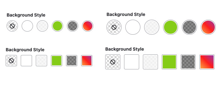
Compact widget
By default, Style Selector fields use the Compact widget, has two basic options to customize the type/shape (round or square) and size (default or large) of the option items. The display variations possible using just the basic options are pictured below.
Further customization is possible using the Advanced options.
Tile widget
Style Selector provides the Tile widget for when a larger preview is desired. The Tile widget has only the size basic option ('Default' pictured below), but also supports the Advanced options shared by both widgets .

Advanced widget settings
Further customize any Style Selector widget by changing the Advanced settings. See details below:

Extra classes
Add one or more space-separate class identifiers to add to the widget when it is rendered. This is typically useful if you need to further customize how the widget displays in the admin UI.
Empty option label
By default, Style Selector uses 'None' for the the 'empty option' -- i.e. no selection made by the user. Provide a value here to change that behavior. Example: 'Default'
Note: This value won't be shown if the field is required.
UI Options
The widget display can be tweaked using the options below.
Alpha channel
By default, each option has a checkered grid background that represents the alpha channel. This is useful for indicating that no value is present, or when a value has an opacity less than 1.0 (e.g. a semi-opaque overlay background). If you don't need or want this background, uncheck the 'Show alpha channel grid background' option.

Selected icon
In addition to border and outline styles to indicate which option is 'checked', Style Selector provides a 'selected icon' in the selected option. Uncheck the 'Show selected icon' option to remove it.
Empty option icon
When an empty option is available (i.e. the field is not required), Style Selector includes a 'No selection' icon in that option by default. Uncheck the 'Show empty option icon' to remove it.
Text color indicator/icon
If your selector element needs to convey text/foreground color, check the 'Show text color icon' to add a 'T' element to each option. By default the element will use the currentColor specified by the CSS or color selected for the option.
Help improve this page
You can:
- Log in, click Edit, and edit this page
- Log in, click Discuss, update the Page status value, and suggest an improvement
- Log in and create a Documentation issue with your suggestion
