On this page
CSS Background Styles Tutorial
This documentation needs work. See "Help improve this page" in the sidebar.
Example Use Case: You need to allow users to select a background style to apply to pages they create. Rather than a simple drop-down list of style names, you want to provide a selection method that gives a visual indication or preview of what the style looks like.
Style Selector includes a demo module (style_selector_demo) that includes an expanded version of the CSS covered in this tutorial, as well as a handful of other examples.
Create a shared CSS styles asset library
We want to define some background styles that can be shared between the user-facing theme, and the administrative theme to style the selector widget. To do this, we need to add some CSS to a Drupal asset library. You can add your asset library to your theme, or to a custom module. In this example we'll assume you're using the theme approach, and that your theme is named mytheme.
Create the CSS
Add a new CSS file (e.g. 'shared_bg_styles.css') to your theme with the following CSS:
.bgstyle--red {
  background-color: red;
}
.bgstyle--white {
  background-color: white;
}
.bgstyle--white-blur {
  background-color: rgba(255,255,255,0.5);
  backdrop-filter: blur(2px);
}
.bgstyle--lime {
  background-color: rgb(132 204 22);
}
.bgstyle--overlay {
  background-color: rgba(0,0,0,0.5);
  text-shadow: 0 0 2px rgba(0, 0, 0, 0.95), 0 0 2px rgba(0, 0, 0, 0.95);
}
.bgstyle--sunrise {
  background: linear-gradient(45deg, rgba(252,176,69,1) 0%, rgba(253,29,29,1) 50%, rgba(131,58,180,1) 100%);
}

/* Set a light text color for darker backgrounds */
.bgstyle--dark {
  color: #fff;
}
Notice that the styles mostly deal with background properties. This helps ensure they're safe to share between both the site's public, user-facing theme, and the admin theme. Setting foreground color is also safe, but if you other properties (e.g. border, margin, padding, etc.), you risk interfering with the Style Selector widget styles.
Create the library
If it doesn't already exist, create mytheme.libraries.yml in your theme root. Add an entry for your library with the correct path to the new CSS file:
shared_bg_styles:
  version: VERSION
  css:
    theme:
      path/to/css/shared_bg_styles.css: {}
Rebuild the cache to ensure Drupal knows about the new entry.
Add the library to Style Selector configuration
Now that the library has been created, we just need to let Style Selector know about it.
Visit the Style Selector configuration form at /admin/config/user-interface/style-selector, add your library to the Shared Libraries field, and click Save configuration.

Add a Style Selector field
Add a Style Selector Style List field to your entity. That could be a node, block, paragraph, etc. -- we'll use Basic Page for this example.
Visit /admin/structure/types/manage/page/fields/add-field and choose Style list for the new field type.

Enter a label for the field, (e.g. 'Background Style') and click Save and Continue.
Enter the Allowed values list for your style selections -- one value per line in the format 'class_list|label'. Note that 'class_list' can be one or more classnames separated by a space. This example uses the values below:
bgstyle--light bgstyle--light bgstyle--white|White
bgstyle--light bgstyle--white-blur|White Glass
bgstyle--light bgstyle--lime|Lime
bgstyle--dark bgstyle--black-50|Semi-transparent black
bgstyle--dark bgstyle--unrise|Sunrise
Leave the 'Allowed number of values' to the default value of 1 and click Save field settings.
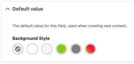
If all went well and your field was added, you should already see that a Style Selector widget is being used for the Default value selector.
Check your display settings
Visit the Manage display page for your entity to ensure your new field is configured to add styles to the node. You'll need to ensure the new 'Background Style' field is enabled for the view mode/display you're using, and that the Format is set to Style Selector CSS Style.

If your display is using Layout Builder, be sure to add the field to your layout with the correct format setting.
Try it out
Add a new Basic Page to test our new field. If you select, for example, the 'Sunrise' background, your new page in Olivero should look something like this:

This is a good start, but there are a couple of issues:
- The text color is too dark, and isn't using what we specified in our shared styles.
- This would look better with some padding between the text and the background color.
Since these are issues in the user-facing theme, we'll add a 'Theme-only' asset library and demonstrate some Style Selector's other features.
Add Theme-only asset library
In addition to styles that are intended to be shared between the public-facing and admin themes, Style Selector support 'Theme only' asset libraries that are only loaded in the public-facing theme. Let's add a little CSS to solve the problems above.
Create the CSS
Add a new CSS file to your theme (e.g. theme-only.css) with the following styles:
.has-background {
  padding: 1rem;
}

.bgstyle--dark .text-content {
  color: #fff;
}
The .has-background rule will allow us to add needed padding.
Olivero adds a foreground color to certain text containers, so the second rule above allows us to override Olivero's color when we a 'dark' background style has been chosen. This is a simplistic example, and will vary widely by theme.
Add the new library
Update your mytheme.libraries.yml file to ensure it has entries for both libraries, e.g.:
shared_bg_styles:
  version: VERSION
  css:
    theme:
      path/to/css/shared_bg_styles.css: {}

theme_only:
  version: VERSION
  css:
    theme:
      path/to/css/theme_only.css: {}
Rebuild the cache.
With that change, the text color in Olivero should already be addressed. One last step to fix the padding.
Add an 'extra class' to the formatter settings
We want to add our .has-background class anywhere the Background Style field is in use.
Visit Manage display and choose your view mode/display, then:
- Click the gear icon for the Background Style field formatter settings.
- Add 'has-background' to the Extra classes field.
- Click Update.
- Click Save.

This will add the .has-background class anywhere the field is rendered, without the need to add it to the class list in the field's allowed values.
With that change, our example page should now have the correct text color and padding.

Help improve this page
You can:
- Log in, click Edit, and edit this page
- Log in, click Discuss, update the Page status value, and suggest an improvement
- Log in and create a Documentation issue with your suggestion
