 Support for Drupal 7 is ending on 5 January 2025—it’s time to migrate to Drupal 10! Learn about the many benefits of Drupal 10 and find migration tools in our resource center.
Getting started
How to set up your Breakgen enhanced breakpoint file?
In this subsection we'll go over how to enhance your breakpoint file with the breakgen key. We're not going over how to setup your basic breakpoint file, this is explained by another Drupal 8 guide. So please read that if you're feeling lost already.
Your breakpoint file may be provided either a module or a theme. The theme and module need to be enabled to be found. ANY changes made to this file REQUIRE a cache clear to reflect these changes. So be sure to clear your cache every time you change your breakpoint file before generation.
PLEASE NOTE: Your breakpoint key name should be structured as <module/theme>.<label> if you do not use your module or theme name as the prefix the image style generation will fail!
We'll start with a basic breakpoint example.
This breakpoint example has seven breakpoints configured:
- breakgen.mobile
- breakgen.mobile_plus
- breakgen.tablet_portrait
- breakgen.tablet_landscape
- breakgen.laptop
- breakgen.desktop
- breakgen.widescreen
So this specific breakpoint file will scale from Mobile to widescreen
breakgen.mobile:
  label: mobile
  mediaQuery: '(max-width: 479px)'
  weight: 0
  multipliers:
    - 1x

breakgen.mobile_plus:
  label: mobile plus
  mediaQuery: '(min-width: 480px) and(max-width: 767px)'
  weight: 1
  multipliers:
    - 1x

breakgen.tablet_portrait:
  label: tablet portrait
  mediaQuery: '(min-width: 768px) and (max-width: 1023px)'
  weight: 2
  multipliers:
    - 1x

breakgen.tablet_landscape:
  label: tablet landscape
  mediaQuery: '(min-width: 1024px) and (max-width: 1279px)'
  weight: 3
  multipliers:
    - 1x

breakgen.laptop:
  label: laptop
  mediaQuery: '(min-width: 1280px) and (max-width: 1439px)'
  weight: 4
  multipliers:
    - 1x

breakgen.desktop:
  label: desktop
  mediaQuery: '(min-width: 1440px) and (max-width: 1919px)'
  weight: 5
  multipliers:
    - 1x

breakgen.widescreen:
  label: widescreen
  mediaQuery: '(min-width: 1920px)'
  weight: 6
  multipliers:
    - 1x
Generate image styles from Breakgen enhanced breakpoint file
Depending on your breakpoint setup you'll want to generate image styles for your breakpoints. Generating image styles is a very time consuming and repetitive task. This is where Breakgen comes in! So instead of going into your Drupal Admin interface add the breakgen key to the breakpoints you want image styles to be generated for.
Now lets add a 16x9 image style which scales the image to the provided width and height:
breakgen.mobile:
  label: mobile
  mediaQuery: '(max-width: 479px)'
  weight: 0
  multipliers:
    - 1x
  breakgen:
    16x9_scale:
      style_effects:
        - id: image_scale
          data:
            width: 320
            height: 240
As you can see we've added the breakgen key. Then inside of the Breakgen key we define a image style name (in this case 16x9_scale). And inside of the image style key we add the style effects key which will accept a list of style effects.
Read more about style effects and how to configure them on the breakgen style effects documentation page.
Now if you do this for each breakpoint your file will start to look like this:
breakgen.mobile:
  label: mobile
  mediaQuery: '(max-width: 479px)'
  weight: 0
  multipliers:
    - 1x
  breakgen:
    16x9_scale:
      style_effects:
        - id: image_scale
          data:
            width: 320
            height: 240

breakgen.mobile_plus:
  label: mobile plus
  mediaQuery: '(min-width: 480px) and(max-width: 767px)'
  weight: 1
  multipliers:
    - 1x
  breakgen:
    16x9_scale:
      style_effects:
        - id: image_scale
          data:
            width: 480
            height: 270

breakgen.tablet_portrait:
  label: tablet portrait
  mediaQuery: '(min-width: 768px) and (max-width: 1023px)'
  weight: 2
  multipliers:
    - 1x
  breakgen:
    16x9_scale:
      style_effects:
        - id: image_scale
          data:
            width: 768
            height: 432

breakgen.tablet_landscape:
  label: tablet landscape
  mediaQuery: '(min-width: 1024px) and (max-width: 1279px)'
  weight: 3
  multipliers:
    - 1x
  breakgen:
    16x9_scale:
      style_effects:
        - id: image_scale
          data:
            width: 1024
            height: 576

breakgen.laptop:
  label: laptop
  mediaQuery: '(min-width: 1280px) and (max-width: 1439px)'
  weight: 4
  multipliers:
    - 1x
  breakgen:
    16x9_scale:
      style_effects:
        - id: image_scale
          data:
            width: 1280
            height: 720

breakgen.desktop:
  label: desktop
  mediaQuery: '(min-width: 1440px) and (max-width: 1919px)'
  weight: 5
  multipliers:
    - 1x
  breakgen:
    16x9_scale:
      style_effects:
        - id: image_scale
          data:
            width: 1440
            height: 810

breakgen.widescreen:
  label: widescreen
  mediaQuery: '(min-width: 1920px)'
  weight: 6
  multipliers:
    - 1x
  breakgen:
    16x9_scale:
      style_effects:
        - id: image_scale
          data:
            width: 1920
            height: 1080
As you can see we added the breakgen key for all the breakpoints we want to generate image styles for. Now it's time to run the generation command. Run drush bg <theme> to start the generation process in this case we'll run drush bg breakgen because in this example our module is of course Breakgen.
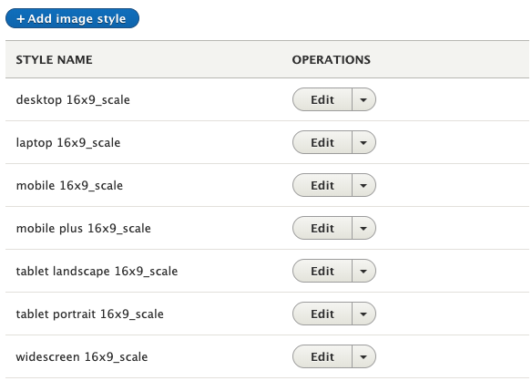
After the command has run you should see the the configured image styles in your admin interface:
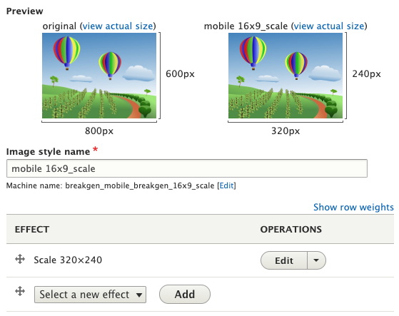
And each image style will have their style effects configured:
Help improve this page
You can:
- Log in, click Edit, and edit this page
- Log in, click Discuss, update the Page status value, and suggest an improvement
- Log in and create a Documentation issue with your suggestion


