

Closed (works as designed)
Project:
Views Responsive Grid
Version:
7.x-1.3
Component:
User interface
Priority:
Normal
Category:
Support request
Assigned:
Unassigned
Reporter:
Created:
26 Jun 2013 at 00:56 UTC
Updated:
23 Oct 2016 at 23:54 UTC
Jump to comment: Most recent, Most recent file

Comments
Comment #1
iwhitcomb commentedIt's probably something with the CSS, if you provide a screenshot I might be able to give more info?
Comment #2
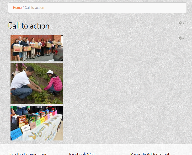
presleyd commentedHaving the same issue (it sounds like). The grid is always stacked vertically. Attached is the view export and a screenshot.
Comment #3
iwhitcomb commentedpresleyd - in the view export it looks like you're settings the view to have 3 columns each with a class of grid_12 which may be your problem. If you're using a 12 column grid for your site then you probably want to use grid_4 as your column class, otherwise you've just got 3 full width columns(that wind up looking like rows).
Comment #4
presleyd commentedYes, that was the issue. That, of course, makes sense now that I think about it..
Comment #5
iwhitcomb commentedComment #6
mattrweaver commentedSorry to reopen this, but this is my first responsive theme. I have set the column class in the settings for the responsive grid to .grid_4. Like the example, I have three columns, set to horizontal and my page uses a 12-column grid.
So, do I use .grid_4 then in global.css to correct this? Obviously I'm not grokking something fundamental, so I'd appreciate the help.
Thanks
Comment #7
iwhitcomb commentedIt depends entirely on the grid and the theme you're using.
Typically in a grid based layout you'll have a 12 or 16 column grid using classes like grid_1, grid_2, grid_3, and so on, which allow you to specify the width of your page elements. These are already defined in the grid CSS, something like Bootstrap or 960 grid already have column classes defined so you'll want to use those. If you're not using a grid then you'll just need to make sure that the columns within the responsive grid are properly styled with the correct widths and floats.
This module basically just outputs the HTML so that the grid can run in a horizontal or vertical pattern and will properly collapse(in the correct order) when viewed on mobile. You need to style it and tell it which classes to use to get it to display properly.
Comment #8
mattrweaver commentedI'm using an omega subtheme, which I didn't specify. Okay, I'll have at it.
Thanks.
Comment #9
neha.gangwar commentedHaving the same issue. Anybody got the solution for this? I am using my custom theme in drupal site.
Comment #10
neha.gangwar commentedIt doesn't work yet. And if it is fixed than please tell me the solution.
Comment #11
iwhitcomb commentedneha.drupal -- please read the thread, the module works as designed. For non-grid based themes and possibly custom themes YOU need to create the classes to make the columns lay out properly
Comment #12
kin11 commentedI would like to confirm that I have tested the module with Bartik theme and found that display is always vertical. At that time the issue was still opened. May be the best option would be to remove horizontal/vertical options and instead include display-block css with inline-block or horizontal as default. Therefore I believe that this issue is wrongly closed.
Comment #13
iwhitcomb commentedkin11 -- Bartik doesn't use a grid does it? If it does, then it's also possible that you need to apply a class to the wrapping container as well.
Comment #14
kin11 commentedThanks iwhitcomb for your quick response. You are right. I have done it for many other modules but could not manipulate the default class of this module. i tried every thing using firebug to locate the main wrap. the difficulty is that in ""Views setting field, it is not possible to set a css to wrap many fields together i.e. image and title fields. Therefore you need to provide a simple basic css file with just the container instead of providing options horizontal and vertical, which don't work anyway. I understand that you may not have enough resources to deal with this issue but I would advise that you open this issue again for someone in the community with high expertise in terms of css to provide a tangible solution.
Comment #15
mengi commented@kin11, this module is working fine. For default configuration add this to your CSS file:
Give it a max-width and an height suitable for the display and your set.
Comment #16
kristin.e commentedHi,
I'm had the same issue where the 'grid' was just being displayed as a list in a block view. I had also defined styles for the view-id, wrapper and columns. I managed on the same site to display a responsive grid in a page based view (with my own css styling) where it works fine.
It just seems to be the block view that doesn't show the grid unless you assign the grid based styles of the theme (in my case bootstrap).
Just thought this may help someone using Responsive Grid for a block based view.
Comment #17
ckoharj commentedI've got a responsive grid block view with 2 images and a title that display fine in 2 columns and is responsive. But when I add a field for the body it displays the title, the images and the body in one column instead of 2 columns. The body extends the full width of the page.
I'd like the body to appear under each image in the same column and be responsive just like the image.