The settings for the Bootstrap Grid format in Views only has options for col-xs, col-sm, and col-md.
col-lg and col-xl are missing and the col-lg takes the default full-width class (col-lg-12) and this value can't be controlled from the UI.
The patch from this issue should display the missing configurations in the form settings.
The Idea we should stop think in Bootstrap 3 and think and style with Bootstrap 4
http://upgrade-bootstrap.bootply.com/
It is better to make the change in all CSS, TWIG, and yml configs with logical code too.
Thinking in Bootstrap 4 and how we could have a full migration of old lead developers
Migrating to v4
https://getbootstrap.com/docs/4.1/migration/
Bootstrap 4 vs Bootstrap 3
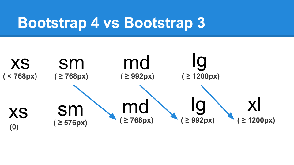
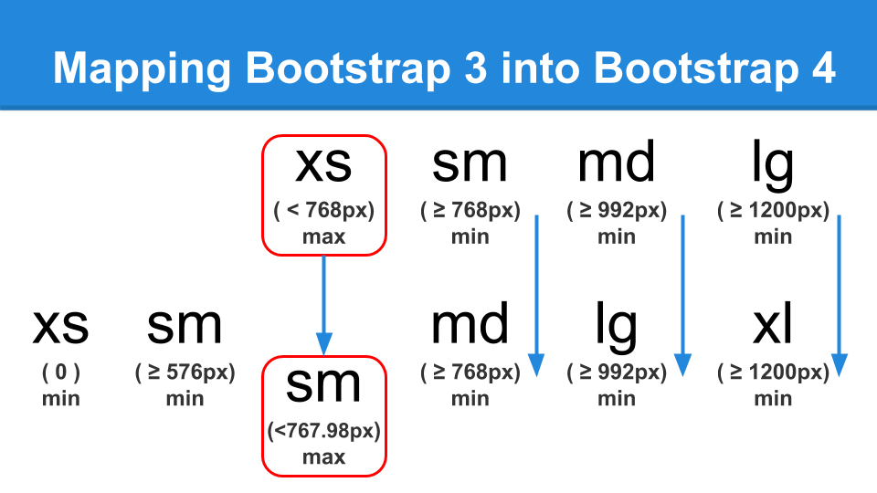
In Varbase Media we had mapped old Bootstrap 3 into Bootstrap 4
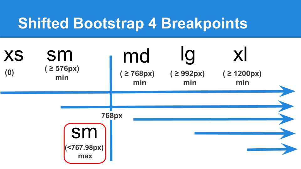
Switched BS3 XS max ( < 768px) to BS4 SM max ( <767.98px)
Switched BS3 SM min ( >=768px) to BS4 MD min ( >=768px)
Switched BS3 MD min ( >=992px) to BS4 LG min ( >=992px)
Switched BS3 LG min ( >=1200px) to BS4 XL min ( >=1200px)
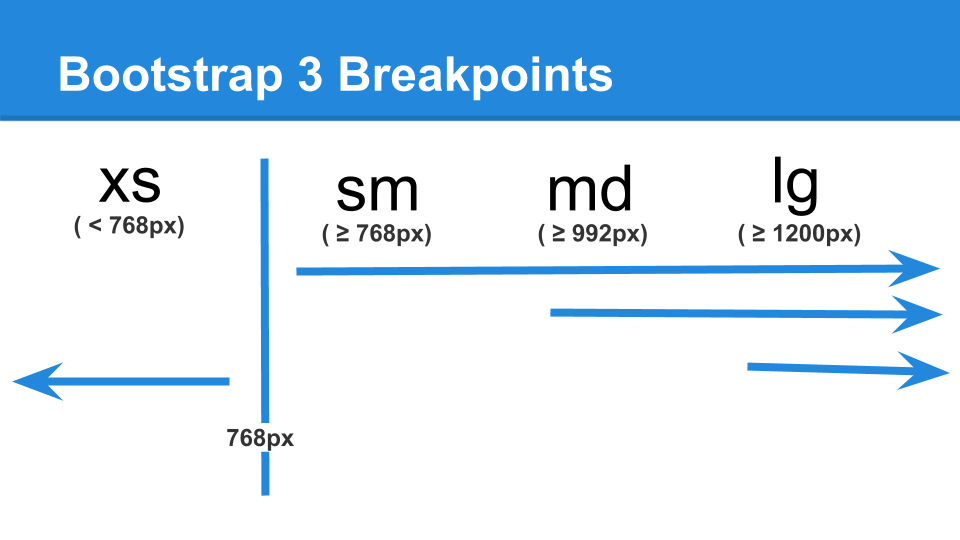
Bootstrap 3 Breakpoints
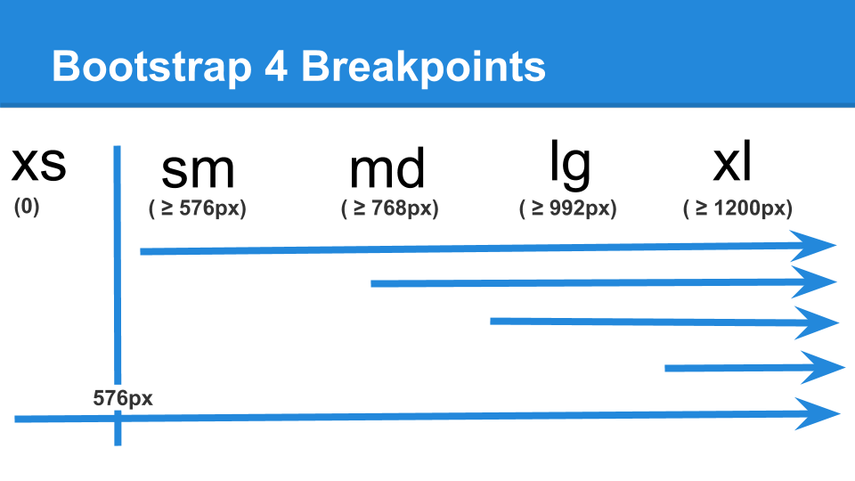
Bootstrap 4 Breakpoints
Shifted Bootstrap 4 Breakpoints


Comments
Comment #3
rajab natshahComment #4
rajab natshahComment #5
rajab natshahComment #6
rajab natshahSwitching to use the better solution from #3049311: Grids should not be split into multiple rows
Comment #7
rajab natshahComment #8
rajab natshahComment #10
rajab natshahComment #11
rajab natshahComment #12
rajab natshahComment #13
rajab natshahComment #14
rajab natshahThis will follow work on the Varbase Blog views to have the following:
#3086223: Change [Varbase Blog] views for blog listing to work with the better logic for Bootstrap 4
Comment #15
rajab natshahComment #16
rajab natshahComment #17
rajab natshah