
This project is not covered by Drupal’s security advisory policy.
A site-builder friendly Material Design theme. Use Material parts (components, theming utilities and layouts) directly from Drupal backoffice (layout builder, manage display, views, blocks, flags...) in a low-code way.
Since Beta1, this theme is now using SDC, the Drupal Core API for UI components
⚠️ That was a necessary compatibility break to be future proof.
This theme is built with UI Suite
UI Suite Initiative provides a cohesive set of modules to implement full design systems while preserving and improving the Drupal site building experience.
26 components with SDC and UI Patterns
|
Examples: Card, Banner, Button, Menu, App bars... You can browse the pattern libraries directly inside Drupal: /admin/appearance/ui/components | 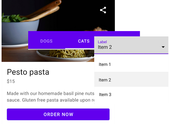 | ||

|
Components are automatically available for site buidling as: blocks, layouts, field formatters, views plugins... | ||
4 theming utilities with UI Styles
Examples: Typography, Colors, Backgrounds... You can browse the styles libraries directly inside Drupal: /admin/appearance/ui/styles
|
The styles are automatically available for site building inside layout builder's blocks & layouts, as views plugins, and from ckeditor. | 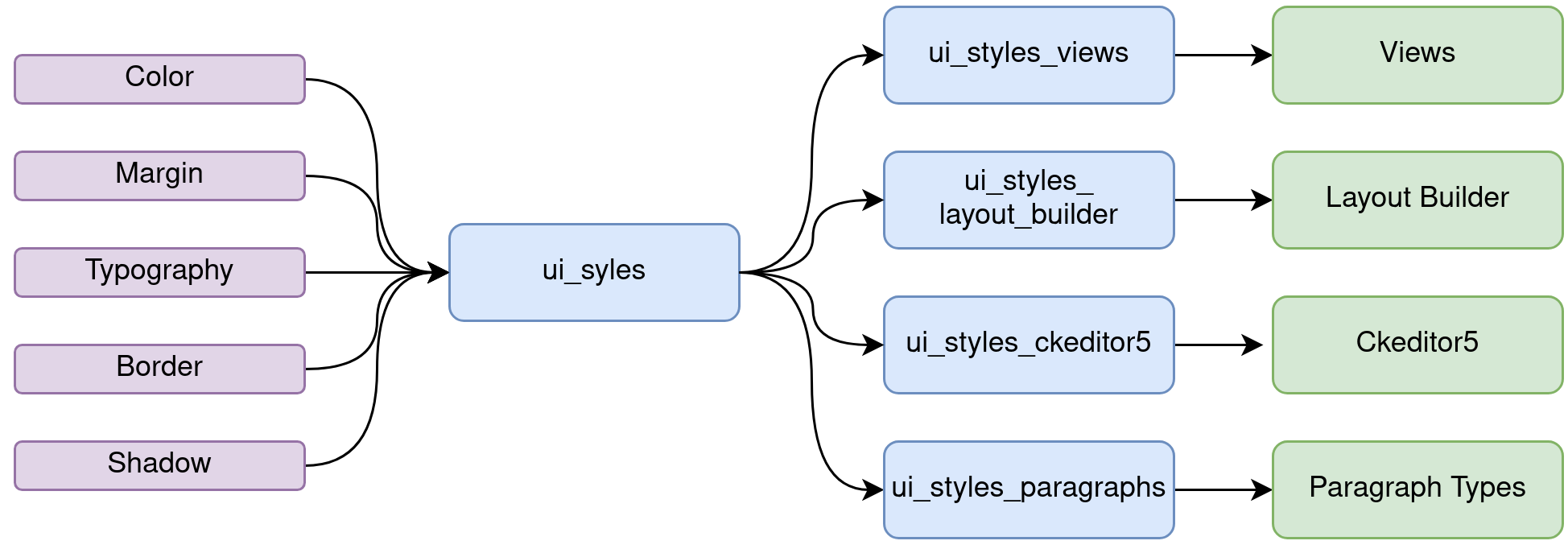 | ||
36 CSS variables with UI Skins
Customize the components and styles with custom properties. Examples: color palettes, grid settings, shapes.... Those variables can be overriden from the theme settings page: /admin/appearance/settings/ui_suite_material
1 example page with UI Examples
You can browse the example pages directly inside Drupal: /admin/appearance/ui/examples
Is it theme usable for my project?
⚠️ Technically yes. It is clean, stable and complete. However, Material Design Web 2 is more app orientated than editorial, and missing some features usually expected in a Drupal theme (breadcrumb, spacing utilities...)
Supporting organizations:
Development
Project information
- Ecosystem: UI Suite - Design Systems with Drupal
 9 sites report using this theme
- Created by pdureau on , updated
 This project is not covered by the security advisory policy.
Use at your own risk! It may have publicly disclosed vulnerabilities.

