So I got Google Nexus (codrops) style to work and now fussing around with displaying it properly with the Bootstrap 3 theme I'm suing for my project.
This is what' I'm trying to achieve:

- Convert Primary menu into the Responsive menus;
- Place Menu icon just before the logo image;
- Maintain the location of the secondary menu.
These are the classes I have in the theme:
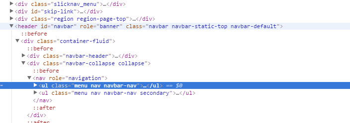
One of the issues I'm having is by adding ".menu.nav.navbar-nav", Responsive Menus also grabs secondary menu.
the other issue is adding the menu icon within the navigation bar before the logo.
Could someone point me into the right direction with this stuff?


Comments
Comment #2
jwjoshuawalker commentedI think you'll want to get the
<ul>for secondary menu out of the same parent<div>as primary.You should be able to copy the
page.tpl.phptemplate from bootstrap core into your sub-theme and move the secondary menu into a different div.If they are printed together (same variable prints primary & secondary nav) - which I think is unlikely, then:
grep the bootstrap core theme's files for "secondary", "navbar", or "menu". One of those should point you in the direction of the function which themes this area.