
Closed (fixed)
Project:
Paragraphs
Version:
8.x-1.x-dev
Component:
User interface
Priority:
Normal
Category:
Feature request
Assigned:
Issue tags:
Reporter:
Created:
21 Dec 2017 at 14:13 UTC
Updated:
5 Feb 2018 at 23:39 UTC
Jump to comment: Most recent, Most recent file


Comments
Comment #2
miro_dietikerComment #3
miro_dietikerAt its core this is now about checking $this->allowReferenceChanges()... But we need to inject the information to the field items template, likely override it.
Comment #4
johnchqueMaybe not the best way but it works. :)
Comment #5
berdirThat's pretty nasty :)
This replaces it globally, but we still want it for other/nested multi-value fields even when translating.
I would have expected that we can find a way to kick out the #tabledrag settings that paragraphs_preprocess_field_multiple_value_form() that template_preprocess_field_multiple_value_form() added, that might be enough? Might keep weight fields visible or so though, so we possibly want to explicitly hide them.
Comment #6
berdirAlso, the test you changed is not a JS test, so it will never see elements that are just added by JS. If we add a test to make sure those elements are hidden, we also need to make sure they are visible when they should be.
Comment #7
miro_dietikerComment #8
johnchqueGonna try that.
Comment #9
johnchqueWorking on tests. :)
Comment #10
berdirhm, this is interesting, I would expect we still need to know the delta but it looks like nothing is failing..
Maybe we could revert what the default preprocess is doing (move it out of $item) and add an #access FALSE?
Comment #11
johnchqueLearning JS testing. :)
Comment #13
johnchqueThis should work. Updated tests. :)
Comment #16
miro_dietikerTestbot doesn't like this... ;-)
Comment #17
johnchque:facepalm: my bad. Fixed now.
Comment #19
miro_dietikerThis is a UI change. Please provide some screenshots. :-)
Preferrably with multiple nesting levels, once expanded, once mostly collapsed.
Comment #20
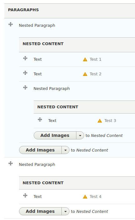
johnchqueRight, so the changes are:
Translation screen without the patch.

Translation screen with the patch.

Node edit screen with the patch.

Comment #21
miro_dietikerOK, that still looks nice and the indentation is still pretty clear to the user.
Thus, i consider committing this to make the separation complete...
Any other UX feedback?
Comment #22
miro_dietikerTested this and while on it i found: #2938452: Untranslatable containers break translation UI consistency
That said from extensive testing: the hierarchy display feels a bit different. Here are my thoughts:
1) Less indentation
This seem to be acceptable. There is enough indentation to recognize it in nesting.
It's already a step into the direction of: #2825577: [META] Optional UI flattening
2) The drag handle was a visual reference point and makes you recognise an item in multi value fields.
Users are used to it. The item horizontal border are not strong enough:
One idea was to indicate nesting depth with a bullet item like this:
-
--
---
--
--
So every child would display a bullet item for itself while it also repeats the parent bullet.
This would lead to more nesting depth awareness.
Removing the indication completely and reducing indentation would be subject of #2825577: [META] Optional UI flattening
While this needs more work in follow-ups, i think we should replace the handle with a single bullet item in this issue.
Comment #23
johnchqueRight, better to add some kind of indication, replaced the handler by a bullet item during translation.
Comment #24
johnchqueGoing mobile first. :) These are the results.
Comment #25
miro_dietikerThx, looks nice with the smaller bullets.
I'm a little bit irritated about the huge spacing on mobile. Thought it's a little bit smaller currently. But we can't see the mobile touch expand/collapse button right as it's cutoff.
I pinged Ivica to review the CSS implementation before commit.. :-)
Comment #27
miro_dietikerTested again and the vertical spacing is fine. Also the bullet items: Clearly visible and still not too dominant. Fine on mobile and desktop.
Let's get this in for now and then figure out how to improve it. :-)