Active
Project:
Form Builder
Version:
7.x-0.9
Component:
Form Builder Core
Priority:
Normal
Category:
Feature request
Assigned:
Unassigned
Reporter:
Created:
1 Mar 2012 at 22:14 UTC
Updated:
2 Mar 2012 at 00:04 UTC


When the components are in two rows it is harder to quickly find the correct component, and long names break the layout. See attached screenshot.
I like the way Aquia done it in their alternate ui.
| Comment | File | Size | Author |
|---|---|---|---|
| Screenshot-8.png | 117.23 KB | lsolesen |

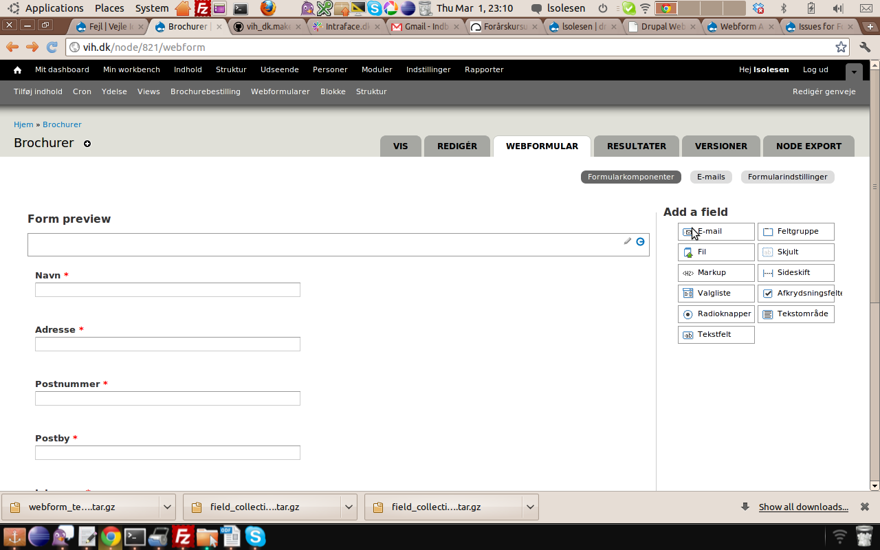
Comments
Comment #1
quicksketchHmm, perhaps a setting? The danger in a single column is having so many fields that you can't pull out the ones at the bottom if you don't have a large screen (since the palette moves with the top of the window).
Of course as a quick alternative you can just use CSS to override the normal behavior and make it display however you like in your theme.