Problem/Motivation
Admin pages in the Claro theme have a lot of space, requiring much scrolling both on laptops, but also Desktops.

The problem is that there is far too much spacing between elements.
Steps to reproduce
Use Claro, and have to scroll too much.
Proposed resolution
Add a Claro Compact Display option under /admin/appearance/settings/claro. This option should reduce padding and margins, to change the experience into a more compact display, requiring less scrolling.
Remaining tasks
Implement CSS from Claro Compact as a "Compact Display" option under Claro settings.
User interface changes
Claro settings will get a "Compact Display" option.

Introduced terminology
API changes
Data model changes
Release notes snippet


Comments
Comment #2
bnjmnm+1. I have this concern as well, and this is amplified when a notification message is present. Aside from above/below the fold issues, it makes it more difficult to intuit what needs to be done within the context of a page, as only a limited amount of the page is visible at one time. Zooming out helps, but the text gets pretty small before the experience noticeably improves.
Comment #3
fhaeberleI did a small change in my local browser, would that be better?
At which ratio/zoom/resolution are you experience this issue? Do you have ideas/suggestions for improvement?
Comment #4
fhaeberleComment #5
ckrinaSome of the solutions we have in mind so far for that are:
Also, a major Layout redesign is in the future plans (#3076820: [META] Layout redesign), but we can't be sure how it will exactly help here.
Comment #6
bnjmnmI'm not a designer, but I thought I'd try reducing margins and a few other changes to see how it changes the experience. (it looks like it touches on two of the three things mentioned in #5_ Even if it's imperfect, I think it may help demonstrate that the smaller-screen experience can be improved by reducing the size of some spacing and elements.

Current Claro
With This Patch

This isn't a patch I'd expect to have committed, but perhaps it can help the discussion.
Comment #7
huzookaComment #8
vinodhini.e commented#6 patch does not apply
Comment #9
ckrinaOn a design perspective patch from #6 is not the path we want to follow: if there are too many elements on this first fold the solution should be re-arrange, hide/show and redesign, not removing space between each element so we keep vertical rhythm.
That said, thank you @bnjmnm for the proposal and showcasing the impact of reducing the spacing: it's really useful and clearly shows this is a problem that need work! 🙌
Comment #11
bnjmnmOnce #3070558: Implement bulk operation designs and #3083256: Create smaller variations for form elements land, this will likely be resolved. Even if not, work should not continue here until those are complete to avoid repeated work.
Comment #15
joachim commentedThis is the WHOLE HEIGHT of my screen. On Claro, the Views admin page doesn't fit. There is far too much spacing between elements.
Comment #16
alisonI wholeheartedly agree everything is way too spaced out! We were in a position to create an admin child theme, and we tightened things up in there, but I think it would be great to do it in Claro itself.
I'm not a designer or a front-end developer, but if it would be helpful, I could see about sharing the modifications we made? -- either with screenshots or code or whatever. (I don't usually participate in theme issues, so I defer to whatever y'all say on how to contribute.)
Comment #17
dwwFWIW, +1 to tightening up spacing to leave more more the content above the fold. Yes, spacing is important for 1 side of accessibility. But the cognitive load of having to scroll back and forth to accomplish tasks vs. having everything on 1 screen to look at is also real. See the entire life work of Edward Tufte for details... 😅
However, -1 to "Major" and "unusable". But I don't want to get in a shoving match about it. 😉
Comment #18
dwwAlso FWIW, #3070558: Implement bulk operation designs wouldn't help at all on the views_ui page under direct consideration in #15. That will definitely help other admin pages, but not this one...
Comment #19
joachim commentedIt's not just Views UI.
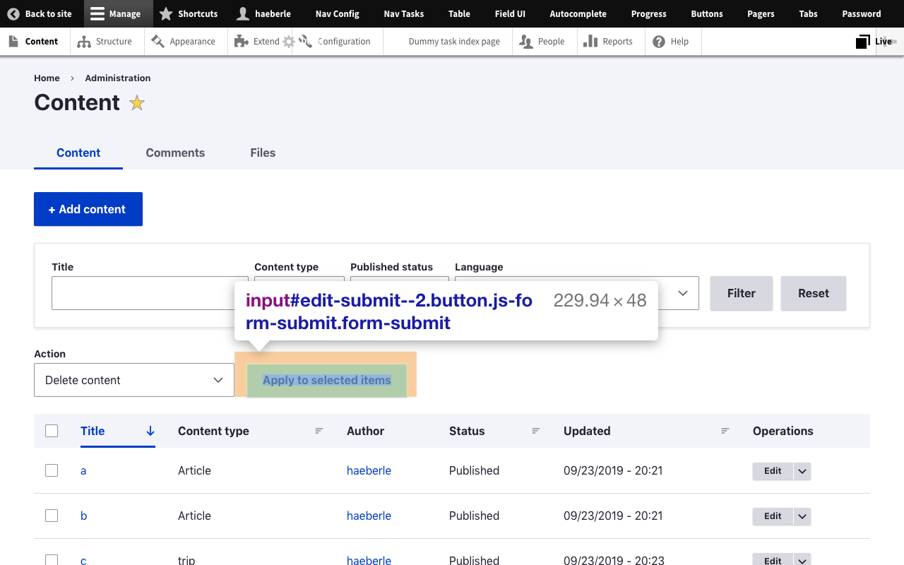
On Claro, admin/content shows *NO NODES* above the fold. The last thing visible on the screen is the 'Apply to selected items' button. We don't even make it to the table header!
Comment #20
dwwadmin/content is a page that would be much (but not entirely) improved by #3070558: Implement bulk operation designs. I was not trying to say this was only a problem with views UI, but that there are still issues we need to address beyond what #11 proposed 2 years ago.
Reminder for all of us to keep a positive tone as we struggle with changes that folks put in huge efforts to make, and which are big gains in some ways, but that aren’t totally perfect, yet. Sending appreciation and respect to everyone that built Claro, and everyone trying to improve it.
Thanks,
-Derek
Comment #21
saschaeggiI mentioned this already in the Slack thread about this, but posting my answer here as well for transparency:
We understand that some of you have concerns about spacing and want a denser layout, and that's perfectly fine. The changes were made with accessibility in mind which was a huge priority for Claro as you might know. But we want to address this in the future with the ability to change the layout density settings.
By the way, we also have a corresponding issue in Gin - and which may first get the function as a test run. see #3187648: Add ability to change theme density
Comment #22
catchThis isn't 'unusable'. #3279640: Standard install profile uses Olivero for update.php with an no-text button is an example of 'unusable', and that was rightly critical with major spinoffs since it prevents usage. This is having to scroll a bit, which is annoying, but not unusable. I have to scroll on the permissions screen on literally any monitor in any Drupal theme. I personally have a 13" laptop and have used the views UI with Claro, and didn't particularly notice the scrolling issue. Now that I've read this issue I do, but I didn't find it particularly unusable - although I know where all the various bits are and don't have to look for anything on it so not the target audience as such.
This can potentially be addressed by design/styling via a compact mode as suggested in #21 but especially with admin/content the issue is as much/more the form layout than the theming of it, and could be addressed in Views itself. So there might end up being multiple fixes for this issue, some in Claro some not.
Comment #25
ressaI agree with @joachim, @bnjmnm, @alison and @dww that there's too much spacing in Claro. I have to use Seven, for its compact and efficient drop-downs, forms and lists. In the Content page, no content is shown on the first page ... and this is on a big screen, because I usually zoom web pages. So I am updating the title, since this is a general problem, not only for laptops.
Olivero has the same issue. If I view a node, I only see the title, any additional content is hidden below the fold ...
Thanks @saschaeggi, that sounds wonderful, adding a "Compact mode" option would be great. A primary aim could be to show the same number of elements as in Seven, since I think it works really well. Has an issue been created for this?
If this task has been postponed, somebody could create the two themes "Compact Claro" and "Compact Olivero", as simple sub themes :-)
Focusing on optimal usability for disabled users is great. But if the design decisions affects daily usage negatively for the majority of non-disabled users, thereby reducing their productivity and being annoying, it's not an ideal situation. Both groups should feel heard, and have the optimal user experience, in my opinion.
Comment #26
saschaeggi@ressa you might want to give the Gin Admin Theme a spin in the meantime. It gained the ability to change the layout density recently and has an overall more compact layout/design.
Comment #27
ressaThanks, @saschaeggi, I did take a look at Gin earlier on, and it has many good things going for it. I like the compact option, for example. On the other hand, I feel like there are too many small changes for my liking, such as:
- Reordering Admin toolbar order, such as putting "Configuration" last
- Floating a button such as "Add content" to the right
- Placing "Delete content" and button "Apply to selected items" at the bottom
These are just elements, where I have grown too used to their locations ... I actually do like most of the aesthetic choices in Claro, like colors of elements and text. And the Admin Toolbar looks the same as always, which I prefer. My main gripe is all the spacing. Second on my list is that drop-downs are styled as text fields (also, why no cursor hand on hover?) where I would prefer them to look like drop-downs.
So I still think that a "Compact Claro" theme (sub theme of Claro), or "Compact" option added directly in Claro, would be my preferred solution. I see #3083256: Create smaller variations for form elements, which might fulfill my wish, only it looks stalled ...
Comment #28
dwwJust stumbled upon #3122609: Implement collapse/expand functionality for views exposed filters and commented over there to ask if it's duplicate with this one...
Comment #29
djg_tram commented@ressa, your wish is my command. :-) Actually, I had the same problem, in order to switch to Claro, I had to modify it to be usable. So, I created Claro Compact.
Comment #30
ressaCool @djg_tram, thanks! I look forward to the first release (it looks like the systems are populating themselves right now) and will try it out, as soon as it's available. Have a great day!
Comment #31
djg_tram commentedAlready published around that time. :-)
Comment #33
ckrinaThe option to have reduced spacing for some specific cases where you need to deal with a lot of info is something we're aware of in Claro. Since it's a page specific or user specific (really valid) use case we started the conversation to provide it as a setting in #3067273: Provide form for customizable settings, so any help or ideas there would be really appreciated.
When we finish #3324398: [META] Update Claro CSS with new coding standards most of the spacing will likely be easily changed with variable settings. @djg_tram if you'd like to provide an overview of what you have changed in your theme it might help deciding what will need to be changed & moving forward here. Thanks!
Comment #34
ressaThanks @ckrina, I am using https://www.drupal.org/project/claro_compact and it works great, improving productivity due to much less scrolling. There are minor issues here and there, but nothing which is easily fixed. Thank you @djg_tram!
Comment #35
djg_tram commented@ckrina, actually, it was a few months ago already, and I've been simply using it without thinking much about it. I don't know how I could describe what was changed without simply resorting to a "look it up in the CSS". :-)) I think I touched most containers and almost all changes are paddings and margins where I mostly simply moved to a smaller variable: for instance, you might have used
var(--space-m)somewhere, I modified it tovar(--space-s)and similar. There are two or three font size changes, too.@ressa, anything that you would care to mention as an issue so that I can look into?
Comment #36
ckrinaAnswering again after @joachim's comments on Mastodon so all the time invested on the explanation is useful for others.
The problem you are pointing out is that elements are taking too much space and the main content ends-up below the fold. We all agreed from the first time we got that feedback in Claro years ago. But with my years of experience in design and UX I can assure you just making all the elements smaller as you propose is not the solution. To really solve the real problem we need think more holistically (there are other UX related problems) and re-organize the UI and we opened an issue for that way back on time: #3076820: [META] Layout redesign. Also, other alternative specific solutions have been developed for several places, with one of its examples being #3070558: Implement bulk operation designs.
Why hasn’t this happened yet? Because the new Toolbar/Navigation is one of the big changes we need to do. We are mainly focused on making sure that lands soon with enough user testing and as much feedback taken into account as we can. And that has priority because its complexity and impact overall in the admin UI.
Also, we can’t just make elements smaller by default in an issue and changing this in a minor release. How many sites and contributed modules that have built UI elements on top of the existing styles would be affected by a change like this? But we’re planning on updating Claro look&feel thanks to all the work happening on the new Toolbar and the layout redesign. It will not be just a change of colors, but several visual changes planned years ago like the “layers” (Gin has implemented it) and other spacing changes beyond the ones suggested here and that will improve the UX in several levels. I can’t share the designs because they aren’t finished yet, but it will probably add smaller defaults, plus the already mentioned capacity to customize it. But we need to plan how to release this changes in a way we don’t break anything.
All this hasn’t happened yet because there isn’t enough people working consistently on this. We do everything we can, but we keep needing help.
So if you can’t or don’t want to help, you can try to use the great fixes suggested on this issue.
Comment #37
saschaeggiHey y'all 👋
I'm going to close this issue in favor of #3076820: [META] Layout redesign
As we won't be able to tackle this independently and it is something we're currently look into while working on the layout redesign. We're also currently migrating some CSS so in the future we will be able to migrate/port more features from Gin to Claro. This would mean that we can include things like theme density settings etc. to customize the admin experience.
In the meantime there are some viable options out there to be considered & ready to be used if you can't wait:
Thanks for your patience & let's create an even better Admin UI experience with the upcoming changes 🤝
Comment #38
ressaSo this issue was opened September 2019 and #3076820: [META] Layout redesign looks stalled, with no activity in 16 months ...
I have used only Claro Compact intensively the last few years, and it works perfectly, doing a stellar job, providing a nice and compact admin user experience. Perhaps this issue can be reopened and the few CSS changes from Compact Claro added in Claro, as a "Compact Display" option?
I guess we'll need to add Claro Compact CSS to the Claro theme, plus an option to turn on "Compact Display", and that should do it?
Comment #39
ressaComment #40
saschaeggiHi @ressa
I'm going to close this again as we're currently only maintaining Claro and not planning to add new features anytime soon.
Claro Compact is still well maintained so you can continue using this or as Drupal CMS will use Gin you might want to give Gin a try (it has layout density settings) .
Best wishes
Comment #41
ressaThanks @saschaeggi for the suggestion about using Gin. I tried the "Narrow" setting, and it makes lines appear closer to each other on the "Content" page (though not as much as I would like), but doesn't affect for example the Views admin interface ... I found two issues (adding as related issues) about getting other elements, such as Views and fonts to be affected in Gin by the Compact/Narrow option, which they are currently not ... only tables, as far as I can tell.
It would be nice with an "Extreme Compact" option in Gin, which squeezes everything together, like Claro compact does with Claro.
I am all right with keeping this issue closed, but anyone who feels like adding an MR, which adds this "Compact display" setting to Claro should feel free to do so. If nothing else, it can serve as prototype for a future Drupal admin theme, implementing a compact display option, since there is obviously a need for this.