

 Come together with the global Drupal community in Rotterdam, 28 Sept – 1 Oct 2026. Sessions, contribution, connection, and Early Bird savings until 8 June.
# Logged in as user (admin role).
# Click on Structure from the top menu.
# Created content types, people, menus, blocks, views
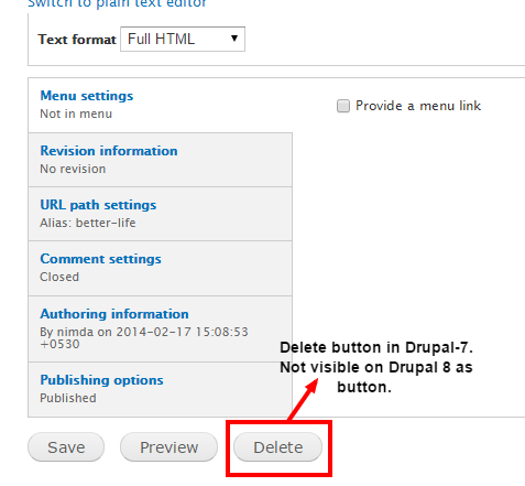
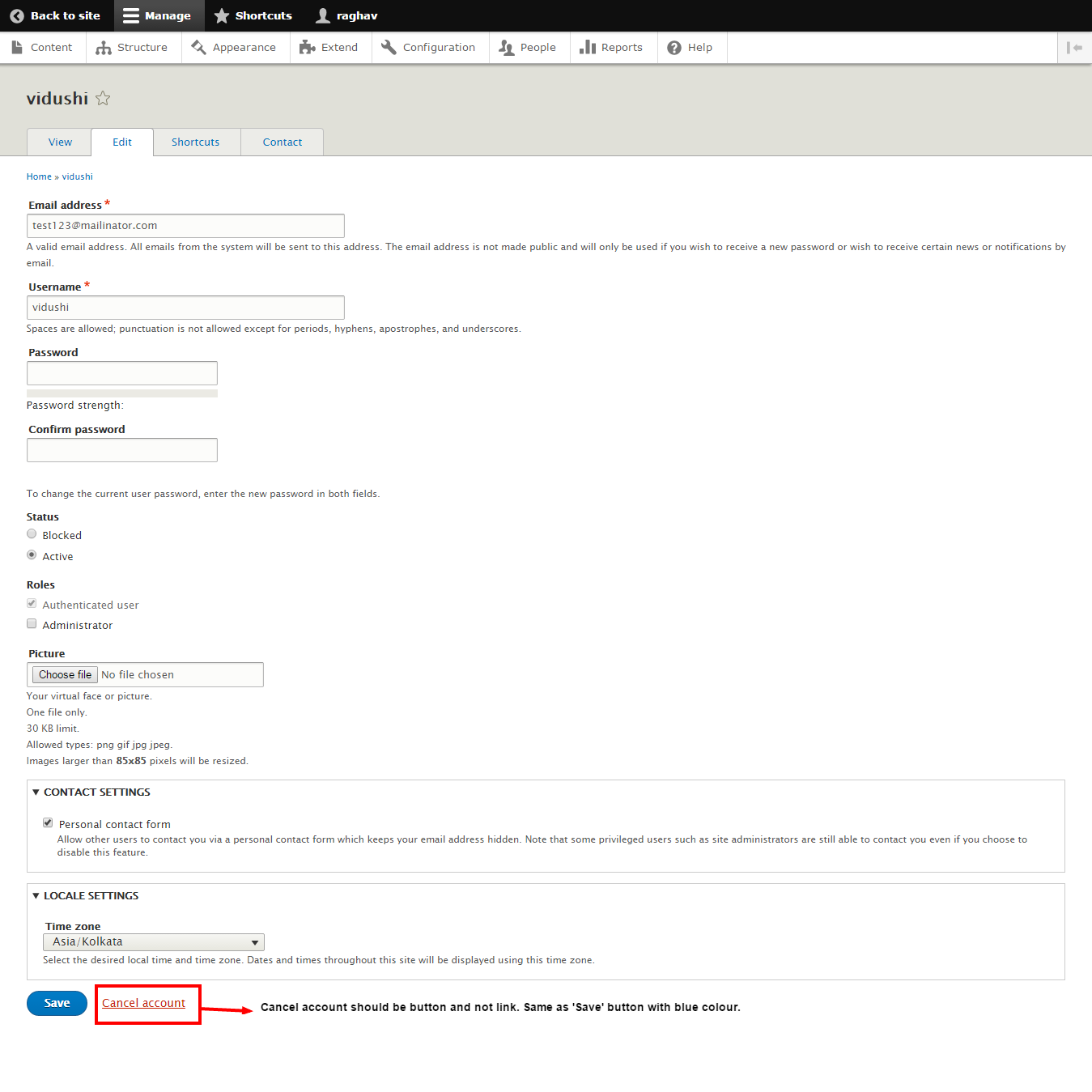
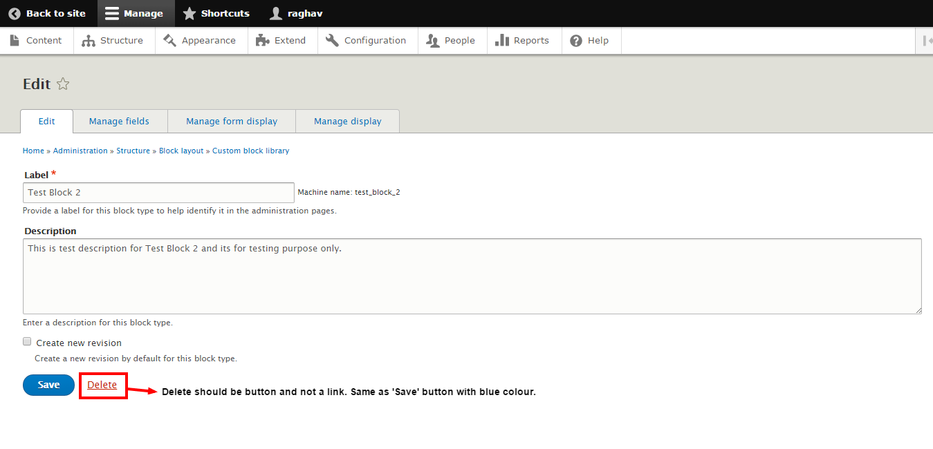
# Delete button and Cancel account button is visible as link which should not be the case. It should be in the form of buttons same as Save.
| Comment | File | Size | Author |
|---|---|---|---|
| drupal_7_delete_button_reference.png | 24.95 KB | moonpeak | |
| people_edit_issue_4.png | 105.79 KB | moonpeak | |
| Custom_block_lib_issue_3.png | 53.96 KB | moonpeak | |
| Edit menu Test Menu 1_issue_2.png | 51.89 KB | moonpeak | |
| Edit custom block Test Block Description_issue_1.png | 74.9 KB | moonpeak |



Comments
Comment #1
waako commentedIt seems very poor UX to want cancel/delete buttons the same colour, hence I completely disagree with the requested change
Comment #2
moonpeak commentedComment #3
nod_We have a styleguide for those kind of things and it's implemented as intended. I'm expecting the UX team to close that as "worked as designed" but I'll leave it up to them if they want to reopen the discussion. https://groups.drupal.org/node/283223#Buttons
Comment #4
mcjim commentedTo quote from the style guide:
Comment #5
emma.mariaChanging this issue to be for the Seven theme as you are questioning the Seven style guide.
The buttons are purposely styled this way https://groups.drupal.org/node/283223.
I will let the appropriate people chime out on this :)
Comment #6
lewisnymanSee the comments above. Thank you.
Comment #7
moonpeak commentedThank you all for your valuable feedback. I went through the guidelines and understood that the danger button like delete is plain red link as per WCAG 2 AA contrast guidelines.