
 Come together with the global Drupal community in Rotterdam, 28 Sept – 1 Oct 2026. Sessions, contribution, connection, and Early Bird savings until 8 June.
Problem/Motivation
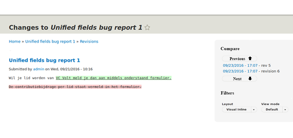
The diff navigation and layout selection steal space in header.
Also the current context indication is not available on visual inline diff, see #2801749: Unclear what is compared with the visual plugin
We need a solution with consistency.
Proposed resolution
Use outside-in for navigating through revisions.
This allows simply switching between backend and frontend.
We see two variants:
1) All revisions are listed and on a click, the references are changed. Prev / Next buttons could be omitted.

2) Only list the two revisions in comparision with a previous and next button to switch.
Additionally, sure, the layout and format option selection should be moved into the tray/bar.
This should be optional if the experimental module is enabled.
Remaining tasks
Button prev / next?
Implementation
User interface changes
Outside-in bar.
Elements moved from content area into bar. Content area is more focussed.
| Comment | File | Size | Author |
|---|---|---|---|
| #2 | Sidebar.png | 99.76 KB | drobnjak |
| #5 | Screen Shot 2016-10-10 at 15.55.34.png | 30.64 KB | drobnjak |
| #6 | google-docs-revisions-tab.png | 54.91 KB | miro_dietiker |
| #6 | google-spreadsheet-revisions.png | 55.59 KB | miro_dietiker |
| #7 | inception-revisions.png | 144.29 KB | miro_dietiker |

Comments
Comment #2
drobnjak commentedHere is the first mock-up of the idea.
Comment #3
johnchqueI was wondering if the outside in tray can be displayed in that screen, because I've seen is used for editing when we are in the page view.
Comment #4
miro_dietikerI discussed with @drobnjak and requested to consider the existing Drupal outside-in look.
Comment #5
drobnjak commentedUsing the Sketch tool and outside-in look I upload new screenshot.
Comment #6
miro_dietikerLots of feedback:
- A mock should always contain the environment, not only itself. It belongs as a sidebar to the diff content, so we want to see it.
- The title is not bold in the core sidebar. All bolds (Label, Button) are not in core. But they are a bit bigger.
- The blue border is heavily irritating. There should be a black horizontal, no other.
- The pencil icon suggests the user is editing. He is not.
- You are missing a previous / next link item, i would propose to add some arrow up / down additionally.
Additionally:
- I would love to see a version that lists all the revisions in a scrollable element (with bar) so i can freely compare two revisions by clocking on two.
- In that case the active ones need a special indication. We can't use a triangle/arrow left as this would suggest it's collapsible. But we can use a triangle/arrow right.
- This will lead to a problem if there are too many revisions... Pagination is hard.
- Still a simple "previous" / "next" button to iterate through the revisions could be nice. So the buttons could be placed below the revision list.
In general, the Google Material Design Guidelines give us some inputs about clutterless UI design.
https://material.google.com/components/lists.html#lists-specs
(For many cases it would propose to indent left.)
https://material.google.com/components/lists-controls.html#lists-control...
(We could use a checkbox indicator for active revisions?)
That's also why i pointed at the revision sidebar in Google spreadsheet / docs. Thus i attached two screens of its revision tab.
Comment #7
miro_dietikerAlso i just found a video showing how Woodwing Inception deals with revisions:
https://youtu.be/6LLbDk4cxAA?t=400
Attached a screenshot of it.

So one of the questions would be if we add an icon to directly go to the restore dialog.
I don't like to add a full "Restore" button, but an unobtrusive icon (counterclock arrow) would be very nice.
Comment #8
drobnjak commentedAddressing the feedback from previous comments.
-Included environment in the following screenshot
-Title not bold anymore
-Removed pencil symbol
-Removed blue border
Considering the list of all revisions and following problems with pagination, I introduce the scrollable element with the bar where user can choose between revisions. Revisions are sorted by the date. I would remove all arrows and symbol since the whole element below the "Comparing" would be scrollable. There is a cut off part of the first revision to present the functionality of the scroll bar. The idea is to remove the next/previous button and not to include pagination to evade possible complications.
Selected revisions are highlighted base on the Woodwing Inception example.
Comment #9
miro_dietikerYeah this looks really nice.
Let's do it! ;-)
Comment #10
miro_dietikerComment #11
miro_dietikerRevision menu => Revisions
The first element is misleading. It has only 1 row of revision message but has space below. Revisions will also sometimes have much more text and we want to display it there. So the height should be dynamic.
Spent some time to think about the clicking behavior, but it's not 100% what is best UX, because it's a sequence of revision and we have two active items.
As long as we only compare subsequent revisions, it's easier. But i already ended up many times being limited by UIs / applications that don't offer comparision of two disconnected (say partially reverted) revisions. We want to keep that capability.
The most simple approach would be to track clicking sequence and compare the last two revisions clicked.
Or we could offer selecting a reference point, by default "current" that needs to be unlocked with another click... and afterwards everything selected is compared against that.
Or we could offer the sequence mode as default. Say whatever you click shows only its specific changes. And you need to click some pinning to compare that agains non-subsequent ones.
So here's my proposal:
By default clicking on a revision always shows its very specific changes. In that mode, only that one revision is displayed as active.
The active revision has a "pinning" icon. If i click that pin icon, the revision gets pinned (also visually) as a reference point.
If i then click on other revisions, they are always compared against the other pinned one.
i can unpin that revision again or pin any other revision that is active as a second, switching their roles.
Comment #12
miro_dietikerTagging for Drupal UX team to discuss the challenges / problems. :-)
Comment #13
miro_dietikerAnd putting a reference to the core limitation problem that the outside-in bar only existis in frontend seven theme. We also need it in backend.
Comment #14
miro_dietikerI think postponed is a better state as we first need feedback from core people or progress in core to implement the sidebar in admin UI.
Comment #15
miro_dietikerNot relevant for our current release. Still promoting as it should be a goal in our next phase to make outside-in ready. I guess many parts will move into that direction.
Comment #16
miro_dietikerComment #17
miro_dietikerIdentified related core issue.
Comment #18
miro_dietikerIt seems things in off-canvas got postponed and there was more refactoring with slow progress.
So it's still not yet ready to continue.
Comment #19
miro_dietikerThings are progressing... Some stuff got committed such as #2803375: Rename Outside-in module to "Settings Tray" for real
Unpostponing as we can now start look into the situation how to use the available tools in 8.5.