Closed (fixed)
Project:
Bluecheese
Component:
Miscellaneous
Priority:
Normal
Category:
Task
Assigned:
Unassigned
Reporter:
Created:
28 Sep 2005 at 18:23 UTC
Updated:
21 Aug 2014 at 21:00 UTC
Jump to comment: Most recent

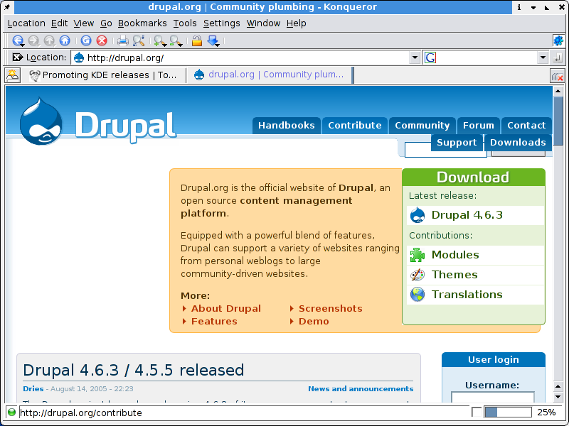
Hi,
With the new tab (cool) the tabbar grew wider. This lookw quit amateuristic on a small screen. /I/ know that this is due to the way CSS works, but I find that most (good) sites have no real problems with small screens.
| Comment | File | Size | Author |
|---|---|---|---|
| snapshot2.png | 75.64 KB | Bèr Kessels |

Comments
Comment #1
Bèr Kessels commentedThis issue is repeated about every week. We should start marking them as duplicate, once one of the issues is actually followed up.
Steven, are you actually going to work on this, or do you consider this a "wontfix" ?
Comment #2
Steven commentedI don't think there is much that can be done about it. Wrapping upwards is only possible with CSS tables and those are not supported by IE.
Comment #3
dries commentedMaybe we should remove the 'Contact' tab or otherwise reorganize them to fix this?
Comment #4
killes@www.drop.org commentedYou can remove any of the tabs, but please not the contact tab.
I suggest you remove one of Support, Contribute, Forum, or Community.
Comment #5
Zen commentedThe contents of community can most likely go into "Support".
-K
Comment #6
oadaeh commentedI wouldn't remove the Forum tab. Personally, that's one of the top three that I use.
Comment #7
kbahey commentedCombine either:
Community with Support (as suggested before)
Or
Community with Contribute
Forum should stay.
Other options:
- Have primary and secondary, with some one one line, and others on the other.
- Make the font smaller for primary.
This should reduce the clutter.
Comment #8
dries commentedSecondary tabs would be convenient but required changes to the theme. Drupal 4.7 easily supports secondary tabs though. Would be nice to have handy. :-)
Comment #9
sepeck commentedmaybe the secondary tabs could be inline with the search box?
So from comments we need at a minimum, Contact, Forum, Download and Handbooks.
I can see a few approaches of combining the Contribute page with the communities page. It will make the page longer but is do-able. It would combine some stuff. Not sure what to do with the Support page though.
Comment #10
tostinni commentedCan't we just put a css min size for the site width ?
Comment #11
bryan kennedy commentedCan one of the site admins tell us how many people who visit the site use 800x600 screen res? It's about 15% still on my site. That's a pretty huge chunk of visitors to be seeing a broken layout. I think this problem should be addressed by removing (subsuming) one of the tabs as advised above.
Comment #12
beginner commentedComment #13
gerhard killesreiter commented800x600 looks ok now.
Comment #14
Anonymous (not verified) commentedAutomatically closed -- issue fixed for two weeks with no activity.