
Splitting issue from #660576: Ensuring Proper Color Contrast for Garland
Initial post:
Seven's testing hit 113 elements:
* Luminosity Contrast Ratio: 20 failures
* Brightness difference: 15 failures
* Color difference: 41 failures
Especially comment #9, #12 & #14
| Comment | File | Size | Author |
|---|---|---|---|
| #41 | Before-link-patch.png | 150.25 KB | mgifford |
| #41 | After-link-patch.png | 177.32 KB | mgifford |
| #37 | 740756-7-seven_contrasting_buttons-37.patch | 464 bytes | mgifford |
| #29 | content-add.png | 69.48 KB | dead_arm |
| #26 | before.png | 8.24 KB | reglogge |


Comments
Comment #1
mgiffordadding tagging.
Hope this allows us to properly focus the discussion on improving the contrast in Seven.
Comment #2
seutje CreditAttribution: seutje commentedsubscribe
Comment #3
bleen CreditAttribution: bleen commentedI'm not overly familiar with standards in this area, but I got dizzy looking at an an error with a link in it... the deep orange bg with the blue link is horrifying. My brain hurt...
Comment #4
aspilicious CreditAttribution: aspilicious commentedThere is an issue for that... Saw it long time ago... Webchick started it
Comment #5
aspilicious CreditAttribution: aspilicious commentedFound it!
==> #639368: Contrast between error and link colour causes death to eyeballs
Comment #6
mgiffordI've got a link here to a bunch of color contrast tools http://delicious.com/mgifford/color
This Firefox Plugin is a good tool (but there are lots of others) - http://delicious.com/mgifford/color
Please suggest some better colors!
Comment #7
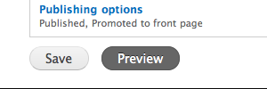
janusman CreditAttribution: janusman commentedA start: buttons with more contrast.
Copy buttons.png to Seven's images/ folder, apply patch to seven's style.css.
Comment #9
janusman CreditAttribution: janusman commentedHuh? Patches will not apply because seven is not yet in HEAD. So ignore the above error.
Comment #10
aspilicious CreditAttribution: aspilicious commentedSeven is in head... long time ago... o_O
Comment #11
janusman CreditAttribution: janusman commentedTotal FAIL on my part =P.
New patch.
Comment #12
mgiffordThis a applied nicely in my sandbox. I'm thinking it needs a usability person to review it. Or does it?
Comment #13
aspilicious CreditAttribution: aspilicious commentedMe dislikes the black... :(
Comment #14
bleen CreditAttribution: bleen commentedI agree with aspilicious... the black is way too harsh
Comment #15
mgifford@aspilicious & @bleen18 can you re-roll the patch with another option?
If the patch above is too dark, what would look good and also be accessible?
Comment #16
mgiffordA small change can make this more visible.
A contrast like this for background/foreground color is fine:
#474747
#e0e0e0
http://www.webaim.org/resources/contrastchecker/
Comment #17
aspilicious CreditAttribution: aspilicious commentedWhy can't we use the new non active, and the old active? Just a bit darker text on the button is fine for me if that passes the contrastchecker.
Comment #18
mgiffordMain thing is darker text on the submit button.
I was trying to get a bit fancier by ensuring that there is some similarity between the active & non-active look (it should just look reversed in my opinion).
Anyways, it can always be simpler. This is just text after all.
Comment #19
aspilicious CreditAttribution: aspilicious commentedI think this
can be rtbc'd.
I don't think we should change the active button as it has very good color contrast at the moment.
If you make a patch for only that part you got my bless.
We only need someone like yoroy or bohjan to give the final bless.
Comment #20
mgiffordok, here it is then.
Comment #21
yoroy CreditAttribution: yoroy commentedSubscribe
Comment #22
mgifford#20: 740756-7-seven_contrasting_buttons-3.patch queued for re-testing.
Comment #24
mgiffordTrying to keep up with core.
Comment #25
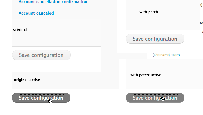
Jeff Burnz CreditAttribution: Jeff Burnz commentedI think we need some before/after screenshots.
Comment #26
reglogge CreditAttribution: reglogge commentedScreenshot before and after patch from #24 attached.
Comment #27
Jeff Burnz CreditAttribution: Jeff Burnz commentedI'm going to vote for no change - afaict this passes WCAG AA as it is and requires no change. The darker #474747 changes the design (its quite a bit darker).
The bottom most color in the gradient (the darkest bit showing) is around #e7e7e7 and the text is #5a5a5a which is a contrast ratio of 5.57:1 - more than enough for Level 2 (requires 4.5:1). #474747 has a ratio of 7.51:1 which would pass AAA but that is not a requirement of D7.
Comment #28
mgiffordOk, so we can set this as Closed (Won't fix). I think there are some issues with the greys in D7. I'd like to see it using a default grey that could easily support white or black backgrounds. However, that may need to wait till we have an Eight theme to work with.
If folks disagree with this then we can re-activate this issue.
Comment #29
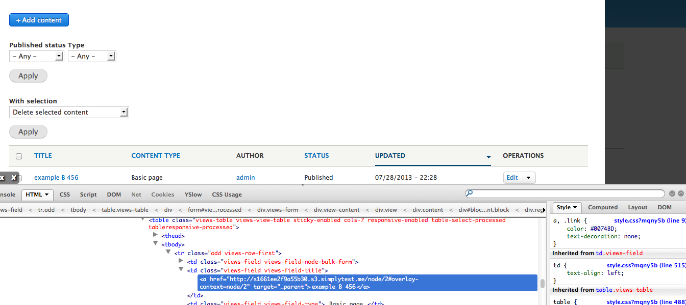
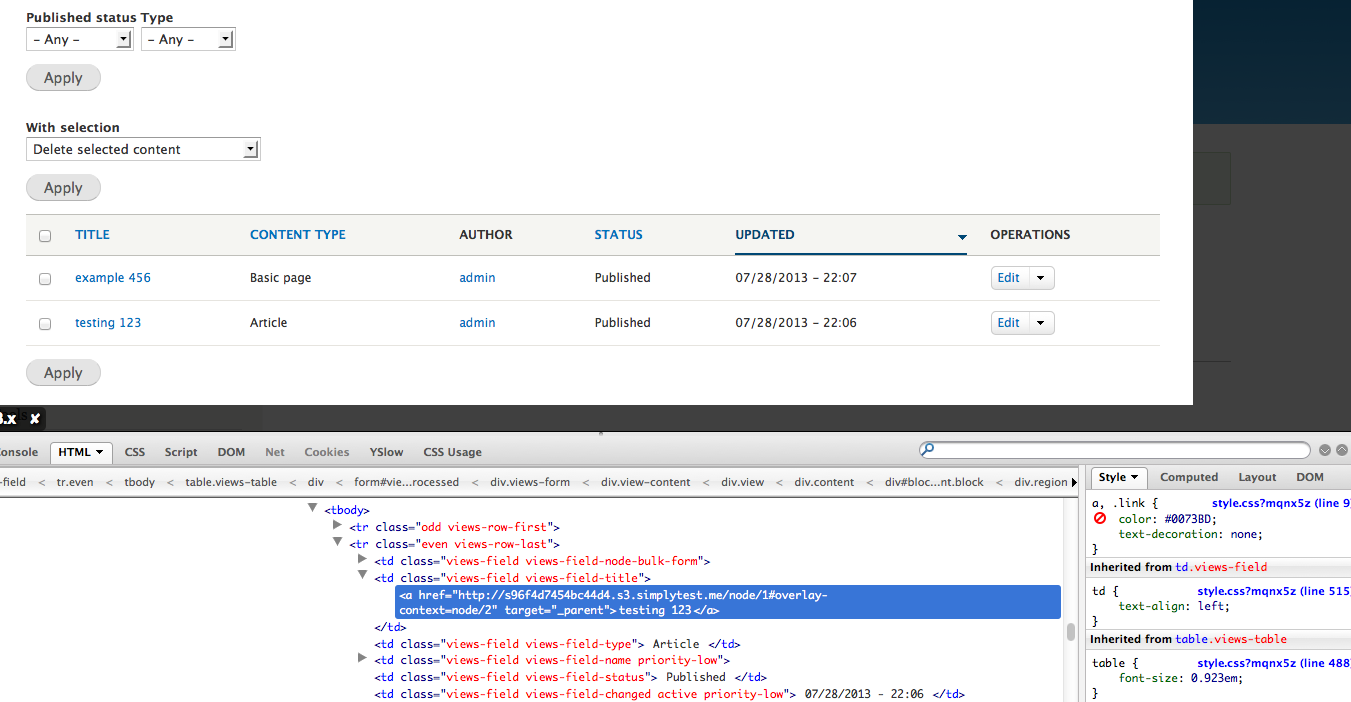
dead_armRe-opening this issue to serve as a followup to color contrast failures in Seven that were found during Views UI compliancy changes.
Seven's blue link color: #0074BD Does NOT pass AA when on even row table striping background-color: #F3F4EE, for example here on content add:
Comment #30
mgiffordThanks @dead_arm - this was the issue here #1806022: Views' text color does not have sufficient contrast
Comment #31
Jeff Burnz CreditAttribution: Jeff Burnz commentedLets look at the facts please:
4.48:1 is the contrast ratio of small text #0074BD on a #F3F4EE background.
The requirement for AA is 4.5:1, so you can see this is not exactly a dramatic failure, its very close indeed, perhaps even within a margin of error.
#0073BD would provide AAA however I have tried it, in terms of the design etc.
Comment #32
mgiffordWe don't need AAA. If we can do it and it still looks great, terrific. But the goal is AA.
Can we get some clarification about which tool is being used? I verified Jeff's response here;
http://webaim.org/resources/contrastchecker/
Comment #33
dead_armI was using http://contrast-a.dasplankton.com/ and also have a 4.48:1 ratio, but that isn't 4.5:1...
Comment #34
Jeff Burnz CreditAttribution: Jeff Burnz commentedI use Contrast A most of the time and was for this test.
#0073BD is a barely imperceptible difference to #0074BD, just a tiny bit brighter.
dead_arm, as you can see I am interested in discussion and solutions, re-stating obvious facts is a tad righteous and not exactly helpful.
Comment #35
LewisNymanThanks for the work done here, if you haven't done so already it would be great to provide accessibility feedback to the Seven style guide proposal. The meta issue is #1986434: New visual style for Seven
Comment #36
tim.plunkettThis is a bug report, that's a meta issue and proposal.
Comment #37
mgiffordLets see if this patch helps to close this issue.
Comment #38
dead_armTested and the contrast passes.
Comment #39
LewisNymanLooks good to me. RTBC++
Comment #40
catchSure this is fine but please provide screenshots before/after.
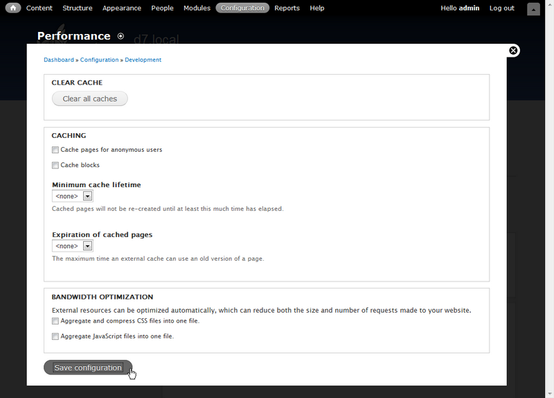
Comment #41
mgiffordSome simple before/after photos.
Adding this and setting it back to RTBC as this is a very minor css change.
Comment #42
echoz CreditAttribution: echoz commentedSeven's new table design no longer has table striping or any background color that does not pass AA contrast compliance with link color #0074bd. The table th background is #f5f5f2, and the row hover is #f7fcff. It seems this patch is no longer needed.
Comment #43
echoz CreditAttribution: echoz commentedClosing if there is no other issue/bug here, which does fall back to Lewis's invitation in #35 for accessibility feedback of #1986434: New visual style for Seven
Comment #44
dead_armGoing forward I think it may be more helpful to address Seven's WCAG compliance in individually-filed issues, so that they can be resolved as they are addressed, instead of reopening this one like I did previously. I've added #2053145: Link color does not meet WCAG AA contrast ratio in header to the list of related issues on the meta issue #1986434: New visual style for Seven.