

Needs work
Project:
Olivero
Version:
2.x-dev
Component:
Code
Priority:
Normal
Category:
Bug report
Assigned:
Unassigned
Issue tags:
Reporter:
Created:
20 Jun 2020 at 12:17 UTC
Updated:
2 Oct 2026 at 10:10 UTC
Jump to comment: Most recent, Most recent file




Comments
Comment #2
kiran.kadam911Comment #3
kiran.kadam911Comment #4
kiran.kadam911Comment #5
kiran.kadam911Kindly review the attached patch.
After resolve:

Thanks!
Comment #6
poojakural commentedComment #7
mherchelMy first thought on this is do we want to break the browser's default behavior of inserting the X? I know it definitely should not have a gradient.
Comment #8
poojakural commented@kiran.kadam911 Thank for adding patch. Patch is working for me. Please refer the SS.
Before Patch

After Patch
Comment #9
poojakural commentedComment #10
kiran.kadam911Thanks @pooja for test.
@mherchel if we are considering to do not break the browser default behaviour of X then it's fine. But that X is just icon/gradient having no action on click actually when we try to click on that X which is just a focus in input. And because of that again question comes up here about accessibility like on tab click X is not focusable. Focus directly goes on seach icon which is submit cta.
Need your input on this, what will be best for this case.
Thanks!
Comment #11
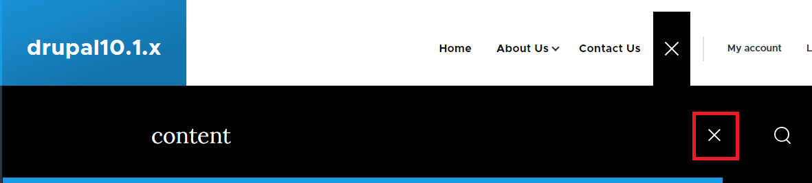
kiran.kadam911Comment #12
mherchelComment #13
komalk commentedComment #14
mherchel@komalkolekar Your patch just removes the button for only one of the search inputs. We want to style the inputs (not remove them), and we need to do it both for the desktop and mobile search input fields.
Please see the updated summary.
Comment #15
kostyashupenkoComment #16
kostyashupenkoThis is init patch. I didn't have enough time to test my changes in all browsers, but it works in chrome. Why init patch? Because by default cross is grey.. And to make it white, we need some modifier class (to prevent double code in multiple places). Well, actually we need white cross icon only for search inputs in header, so maybe possible to add some modifier classname using hook? Idk yet.
Comment #17
kostyashupenko3 screenshots after patch
Please let me know if these styles are expected and we really can keep it.
Also thoughts about modifier for white cross?
Comment #18
mherchelThis looks really great IMO (with one super minor change below).
My first thought is that we should be using
:beforeand:afterpseudo-elements instead of background images. Unfortunately, the::-webkit-search-cancel-buttonpsuedo-element doesn't support those. So, the only real option is background images.The only thing I noticed is that the icon seems misplaced on the mobile form (see the screenshot below). We can adjust this by changing the padding-right (or more correctly, padding-inline-end) on the mobile search form.
Comment #19
komalk commentedRefer screenshot tested with the RTL look off the text is not visible.
Comment #20
kostyashupenkoI have fixed feedbacks from #18 and #19 comments
Comment #21
mherchelThis looks good. However, the padding right issue on the mobile search form is still not resolved on tablet and desktop sizes (there's a media query and we need to adjust the value on line 74)
Comment #22
komalk commentedComment #23
komalk commentedWorked on #21.
Attached screenshot for reference.
Review the patch.
Comment #24
mherchelReviewed #23 and looks perfect!
Comment #25
lauriiiLet's optimize these SVG files.
Seems like this doesn't provide enough color contrast to comply with WCAG AA. Let's try to find another color that would provide sufficient contrast.
Comment #26
komalk commentedWorked on #25.
#25.2- Instead of
#7e96a7used#5F788Cto comply with WCAG AA.#5F788Cis having a contrast ratio is 4.61:1 whereas#7e96a7is having a contrast ratio is 3.08:1Review the patch.
Comment #27
ranjith_kumar_k_u commentedI have tested the above patch on 9.2 dev version.The -webkit-search-cancel-button is not much visible ,when we select the suggestions from input text field.

Before patch Desktop
when we select suggestions

Before patch mobile

when we select suggestions

After patch Desktop

when we select suggestions

After patch Mobile

when we select suggestions

Comment #28
gauravvvv commentedI have added both before and after patch screenshots.
The color contrast seems to be fixed.
Moving to RTBC.
Comment #29
gauravvvv commentedComment #31
lauriiiComment #32
sakthivel m commented#26 Patch failed
Comment #33
sakthivel m commented#33 Please review the patch
Comment #34
indrajithkb commentedHi @Sakthivel M, thanks for the patch #33 it's working as expected, adding the screenshots.
Before patch:
After patch:
Moving to RTBC.
Comment #35
mherchelThanks for working on this. My thought is that we can simplify the code by not using a gradient (use white) and use CSS to generate the X instead of SVG
Can we use CSS shapes to make the background instead of requiring the browser to download an additional image?
Note that when you do this, use borders (instead of background colors) so that it shows in Windows high contrast mode.
Why are we making this change here?
We can just make this white here. Doesn't need to be a gradient.
Comment #36
kostyashupenko@mherchel
1. About css shapes - how do you plan to do it? From what i see we can't use :before or :after on the webkit-search-cancel-button pseudo element.
Comment #37
damienmckennaThis is a quick reroll of #33 against 9.3.x.
Comment #41
pradipmodh13 commentedCreate patch for Drupal 10.1.x. Please check primary search and search text box on search result page.
Comment #42
pradipmodh13 commentedFor ref attached screenshot what I have did for search close button.
Comment #43
gaurav-mathur commentedApplied patch #41 works fine in all media (desktop and mobile) for Drupal version 10.1.x
Refer to the screenshot
We can move to RTBC
Comment #44
needs-review-queue-bot commentedThe Needs Review Queue Bot tested this issue. It either no longer applies to Drupal core, or fails the Drupal core commit checks. Therefore, this issue status is now "Needs work".
Apart from a re-roll or rebase, this issue may need more work to address feedback in the issue or MR comments. To progress an issue, incorporate this feedback as part of the process of updating the issue. This helps other contributors to know what is outstanding.
Consult the Drupal Contributor Guide to find step-by-step guides for working with issues.
Comment #45
gauravvvv commentedPatch #41, no longer applies to 10.1.x. here is a quick re-roll. please review
Comment #46
ravi kant commentedPatch #45 is applying to 10.0.9 and 10.1.x. as accepted.
Comment #47
Bushra Shaikh commentedComment #48
Bushra Shaikh commentedVerified and tested patch#45 on Drupal 10.1.X version, Patch applied successfully and looks good to me.
Test Result:
The contrast changed, styled to a light gray X.
Can be moved to RTBC +1
Comment #49
Bushra Shaikh commentedComment #52
sagarchauhan commentedRandom test failure. Moving to RTBC again.
Comment #53
sagarchauhan commentedComment #54
quietone commentedThe issue summary here is very brief but easy to understand what is being changed. I did add the template in case it is needed.
I read through the comments and found an item that has not been responded to, #25.1. I am adding that as a remaining step in the issue summary.
Setting NW for the point to be addressed.
Comment #56
quietone commentedThe Olivero theme was approved for removal in #3590816: [policy, no patch] Deprecate Olivero and move to contrib.
This is Postponed. The status is set according to two policies. The Remove a core extension and move it to a contributed project and the Extensions approved for removal policies.
The deprecation work is in #3595082: [meta] Tasks to deprecate the Olivero theme and the removal work in #3595085: [meta] Tasks to remove the Olivero theme.
Comment #57
quietone commentedComment #58
quietone commented