Problem/Motivation
In form-text.css, .form-element width is set to 100% at widths up to 600px. This pushes prefixes and suffixes to a new line in a way that doesn't look good. (Found using Umami profile on Chrome at admin/config/media/image-toolkit)

Testing instructions
- Enable Claro as the administration theme if it is not.
- Visit /admin/config/system/site-information and verify the Default front page field.
- Test it working with the focus design (using the keyboard to navigate to this field, for example).
- Visit /admin/config/media/image-toolkit and verify the JPEG quality field.
- Navigate to /admin/structure/types/manage/page/fields and start adding a field. Before saving it, edit the machine name.The preffix "field" should look like a preffix.
- Enter a wrong machine name (like add and space in the middle) and verify the error looks as in the designs.
- Test the focus working fine with the error.
- Add several combinations of Number fields with Prefix and suffix, and multiple fields too.
- Visit /admin/structure/views/view/comment and click on edit Path under "Page settings". The field path on the dialog should look OK (no prefix).
- Visit /user/1/edit and edit the Password field. The confirm password field shouldn't be visible until a password is entered, and the input and strength indicator shouldn't be too wide. (Per comment #66).
Outside of scope:
Proposed resolution
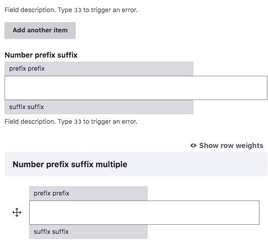
Implement a new design to solve this:

This image is just a reference. Please use this Figma link to check spacing and other definitions.
Remaining tasks
Create a new design- Accessibility review
- Create a new patch
User interface changes
A new design for prefix will be available.
Release notes snippet
Known Issues
1- Visit /admin/structure/views/view/comment and click on edit Path under "Page settings". The field path on the dialog should look OK (no prefix).

This is an issue with Views actually, since it's adding some HTML to the prefix without checking if there is a value, see:
https://git.drupalcode.org/project/drupal/-/blob/9.4.x/core/modules/view...
which ends up with an empty prefix with just a
"‎" entity on it. (Although the problem seems to be that
Url::fromRoute('<none>', [], ['absolute' => TRUE])->toString() it's returning an empty string). In any case, should this be addressed in a separate ticket for Views and not for Claro.


 Show commands
 changes




Comments
Comment #2
pzajacz commentedI used
width: autooverride on 600px and below because the 100% width pushes the suffix to a new line.(Claro 8.x-1.x dev with Drupal 8.7.7)
Comment #3
lauriiiThe
#field_suffixand#field_prefixare not specific to'#type' => 'number'. We should try to find solution that works with all field types without having to remove this usability enhancement.Comment #4
pzajacz commentedI added a new class to wrapper form-item if it contains prefix or suffix element.
(UPDATE: wrong patch)
Comment #5
pzajacz commentedComment #6
lauriiiDid you post the right patch? I don't see any new classes being added in #4 🤔
Comment #7
pzajacz commentedSorry @lauriii, I uploaded the wrong patch, this is the good one:
Comment #8
lauriiiThis fixes the problem on Chrome, but it seems like
width: autoisn't enough to fix this in Firefox.Any thoughts on renaming these to
form-item--with-prefixandform-item--with-suffix?Comment #9
pzajacz commentedOk, it's no problem, I rename the classes and try to fix the FF bug!
Comment #10
pzajacz commentedI need to add max-width:75% (or any other value) to the suffixed/prefixed input field on 600px and below because the field's width isn't working exactly as on Chrome. The field's default width is much wider on FF and IE. When I tested it on FF and IE, the width: auto is working, but the suffix is pushed to a new line on 320px screen, so the max-width: 75% is fixed this bug. Any other suggestion?
Comment #11
pzajacz commentedComment #12
pzajacz commentedComment #13
fhaeberleThis looks like the current patch comes with the result that suffixed inputs works well but we only get 75% of the width for prefixed inputs like in
/admin/config/system/site-information
Ideally, the prefix, suffix and input sharing one parent container where we could define a variable (but fixed min-) width for the input and let the prefix and suffix flow but that would also cause other problems. The main problem here is that we can't assume the width of prefix or suffix because they can be any length. Imho, it can be leaved as is (because of edge case) but if we want to improve it we need to have in mind that on other places, it could be worse with this change.
Comment #14
fhaeberleSetting it to RTBC because the patch works and fixes the problem, but the concerns are described in #13
Comment #15
pzajacz commentedAnother solution is when a JS calculate the width of the prefix/suffix, and it updates the input field's width (subtract from it). I know, it's not the perfect solution, but more accurate than playing with the max-width value. Should I try, maybe? (In this case, the JS is running after the DOM is rendered, so in some cases, it causes a little jump when the prefix/suffix is longer than 25% when we will use the 75% input field's default max-width.)
Comment #16
huzookaLet's try what happens if we add a wrapper for the input and its prefix and suffix (when at least #prefix or #suffix is set), and use flex for styling them.
Comment #17
huzookaScreenshot for #16:
Comment #18
pzajacz commented@huzooka Very good idea, I'll give it a try!
Comment #19
fhaeberleNote: /admin/config/user-interface/shortcut/manage/default
This is a place where the break into a new line makes sense for suffix.
Comment #20
fhaeberleComment #21
pzajacz commentedI tried @huzooka's idea, and it's working.
Comment #22
huzookaComment #23
huzookaRebased what we had in #21.
I apologize, I just realized that this issue is assigned to @pzajacz.
Comment #24
pzajacz commented@huzooka I removed my assign! ;)
I think this task needs review and testing, or you know anything is missing from the patch?
Comment #25
fhaeberleSetting to needs review because of the rebased patch.
Comment #26
lauriiiThis could be simplified to just
.form-item__wrapper.This could be simplified to:
This could be simplified to:
These could be simplified to
.form-item__prefixand[dir="rtl"] .form-item__prefix.These could be simplified to
.form-item__suffixand[dir="rtl"] .form-item__suffix.I'm just wondering if it would make sense to simplify this component by always rendering this wrapper. 🤔 Any thoughts?
Comment #27
huzookaThis limits the input with in 60%. I think that what we need here is
flex: 1 0 60%;.Comment #28
mradcliffeFixing the tag to be Amsterdam2019. I'm removing the novice at the moment as well, but will probably add it back on Wednesday.
Comment #29
fhaeberleFixing the tags is a little confusing because we are working with this tag to identify issues which fit in the contribution during DrupalCon. Other projects use different tags but we decided to use this one. Would be nice if we keep the current tag, thanks.
Thanks a lot for your effort and time investment.
Comment #30
mradcliffeSorry, for removing many of the tags, @fhaeberle. Usually core issues will follow the pattern
[CITY]YYYY. Having a consistent tag for core issues helps contributors searching for novice issues. I'll leave this one though.Edit: it also helps contribution event organizers and DA staff aggregate statistics for the event.
Comment #31
cgoffin commentedWorking on it at DrupalCon Amsterdam 2019.
Comment #32
rachel_norfolkretagging
Comment #33
cgoffin commentedI adjusted the patch with the mentioned comments. I will also add the interdiff.
Comment #34
cgoffin commentedComment #35
joycelam commentedHi, I'll be testing/reviewing this patch.
Comment #36
joycelam commentedThanks for the patch and thoughts.
So the input suffix on admin/config/media/image-toolkit and admin/config/user-interface/shortcut/manage/default looks great in Chrome/Safari/Firefox.
For the admin/config/system/site-information, however, the front-page input gets before the prefix. As described in #13 if I understand correctly.

Also, the input exceeds the screen in Firefox:

Comment #37
huzookaComment #38
huzookaThis patch:
Handcrafted screenshots attached.
Comment #39
lauriiiAny thoughts on #26.6?
Visually this looks good:

Comment #40
huzookaComment #41
huzookaComment #42
huzookaComment #43
huzookaComment #44
huzookaStill not addressing #26.6, this is only a rebase (without #3094696-3: Follow-up to #3084843: Re-generate production CSS files).
Comment #45
huzookaThe attached patch addresses #26.6.
Mobile screenshots attached, others in progress.
Comment #46
huzookaOSX screenshots attached.
Remaining:
IE11, MS Edge, Chrome on Windows and Ubuntu, Firefox on Windows and on Ubuntu.
Comment #47
huzookaComment #48
huzookaComment #49
huzookaRe-rolled #48.
Comment #50
bnjmnmUpdated issue summary to reflect prefix and suffix being impacted.
In manual testing, I found that when adding a field and clicking "edit" to change the automatically generated machine name, the problem is still present. I'm guessing this is due to dynamically adding the prefix, so the

.form-item__wrapper--with-prefixclass is not added.Everything else reviewed looks very good so I'm inclined to RTBC one the above is addressed or deemed out of scope with a followup.
Comment #51
ckrinaComment #53
ckrinaHere are the new designs for the prefix/suffix with a solution for the mobile/small spaces. I just updated the issue summary too.

Comment #54
bnjmnmExcited to see these designs! Assigning to myself and I'll get to work on implementing them.
Comment #55
bnjmnmHere's round 1, which is resembling the new design but definitely needs work in these areas:
Contributors that would like to tackle this would benefit from using the clarodist tools module that provides several pages worth of different prefix/suffix scenarios. The two modules needed are https://github.com/lauriii/cd_tools and https://github.com/lauriii/cd_core. Enable the "Prefix Suffix" module and it will provide test pages at
/contact/presuf_number,/contact/presuf_formatted, and/contact/presuf_text. You can modify the contents of presuf_number.module to use larger prefixes and suffixes.Comment #56
bnjmnmPostponing on #3092296: Improve email address field description at /user/register. This will be implemented differently if it's inside a max-width'd container, and I think it may be a better solution overall.
Comment #57
bnjmnmWe are now far enough along with #3092296: Improve email address field description at /user/register to know it won't impact the solution being implemented here.
Some JavaScript was necessary to elegantly support very long prefixes and suffixes in a way that didn't cause stacking when it wasn't actually needed. Very little styling is based on media queris, instead basing the behavior on the width of the affixes.
The solution still looks pretty good without javascript - definitely not as nice but far less diminished than many other nojs experiences in core.
Many screenshots attached.
Comment #58
bnjmnmUpon looking at an image field form such as
admin/structure/types/manage/article/fields/node.article.field_image, it looks like there's a use case that still needs to be addressed.Comment #59
bnjmnmThe edge case spotted in #58 is addressed here.
Note that the stacking is not ideal here, but this is a pre-existing problem not in the scope of this prefix/suffix issue. This will be addressed in #3029675: Add support for the inline variation of form elements

Comment #61
bnjmnmBack to NR, was switched to NW due to an unrelated test failure (as evidenced by the fact that I accidentally uploaded the patch twice, and the other upload didnt fail)
Comment #62
bnjmnmTalked with @lauriii about the image resolution styling from #59. It was pointed out that the "x" and "pixels" don't actually function as prefixes/suffixes despite appearing before/after the fields. @lauriii also felt that adjusting the render array to generate these outside of a prefix/suffix was acceptable scope for this issue.
This patch also adds JavaScript behavior to help with machine name suffix styling. This required extra attention as machine name functions can be empty -- but when that's the case the suffix padding results in an extraneous gray box to the right of the input. It was apparent the CSS solution would not work when visiting an existing text format config form such as
admin/config/content/formats/manage/basic_htmlas the selectors function differently.Comment #63
bnjmnmA little extra info on #62:
.form--inline .form-item-separatorwas modified a bit. The one use I'm aware of outside of the image resolution inputs is the "or" when adding a field. This is how it now appears in seven and claroComment #65
bnjmnmFixing the test failure in #62. "x" and "pixels" in the editor max dimensions were moved from prefix/suffix to their own render array elemenets in the form. This resulted them in being part of the schema config checks, so I added them to the schema with as
type: ignoreComment #66
katherinedThis is a partial review up to form--text.pcss.css to try to make this a bit more digestible.
1. I understand moving "x" and "pixels" to their own render array elements, but I'm not confident enough here to say whether or not there's a better way to handle the schema issue, so I would rather defer to others with more expertise there.
2.
This selector is duplicated.
3.
I can't quite figure out why the
overflow:hiddenis necessary here, but that may just be me missing something.4.
I'm still seeing a bit of a gray box here, so I think a
border:nonemight be a good idea.5. At small breakpoints, and only on the "Number prefix suffix" test page, the label does not span the full width of the input element. This happens in Chrome, Firefox, and IE. See screenshot below:

6. In IE, the focus border is obscured when the prefix and suffix are stacked. See screenshot below:
Comment #67
bnjmnm#66.1 We can have another reviewer determine if the schema approach is acceptable
#66.2 Consolidated that dupe.
#66.3 The overflow hidden keeps inputs from spilling out of the viewport in IE11 at narrow widths and is not targeted for IE11 since it's overall beneficial to have overflow enforced in this way when it's a container with several elements of different widths stacking in a variety of ways.
#66.4 Yep, it looks nicer with the border removed.
#66.5 It looks like JavaScript doesn't get the correct width of number inputs when it is styled at
width: 100%. Fortunately, it looks like it would be preferable to not have number inputs at 100% width when an affix is present. I've made it so number inputs -- only when affixes are present -- have width set to auto instead of 100% at narrow widths.Comment #68
katherinedI've confirmed that the issues in #66 are addressed, and this is everything else I could find:
1.
Extra line.
2.
Nit: typo (an affixed?)
Comment #69
bnjmnmAddresses #68 + a little bit of clean up and added comments.
Comment #70
katherined+1 to more comments. :)
I've tested this with Firefox, Chrome, and IE, and with the form variations provided by the Prefix Suffix Claro dev tools module.
I've manually located and tested each css selector, and I can't find any additional issues.
Comment #71
alexpottHow come config schema is changing here? These shouldn't be making it into config. If something is failing because of config schema then it means that this form elements are resulting values being saved in configuration. that shouldn't be happening here.
Comment #72
alexpottRe-titling as the scope sounds huge from the title.
Comment #73
lauriiiIt seems like item elements get added to form state regardless of its documentation. I opened an issue for this: #3164524: Item elements are added to form state. In the mean while, we could consider using for example inline templates for rendering the form element separators.
Comment #74
bnjmnmThe schema-editing solution felt ugly when I was doing it, so very happy to get the suggestion in #73. This uses inline templates instead.
This patch has a few additional tweaks to facilitate better backwards compatibility.
Comment #75
lauriiiShould we open a follow-up to convert these to use #type => item once #3164524: Item elements are added to form state has landed?
Comment #76
bnjmnmOpened followup #3165290: [PP-2] Convert inline template elements to items in editor_image_upload_settings_form
Comment #77
katherinedThis simplified approach looks great to me and works. Marking as RTBC.
Comment #78
quietone commentedJust a light review.
Great to see the manual testing done here, See #70. As a review it would be nice to have that in the issue summary.
I do see that patch has coding standard errors, https://www.drupal.org/pift-ci-job/1795540. Setting NW for that.
Comment #79
bnjmnmThe CSS coding standard errors are from CSSLint, which has been abandoned in favor of Stylelint, which is capable of linting the newer syntax used by Claro. The JS error is a also a known idiosyncrasy of drupalci and not indicative of an actual error. This can be confirmed by running
lint:cssandlint:jslocally, which check against current standards. Definitely confusing, but fortunately I know that @lauriii is looking into getting drupalci updated so these inaccurate errors are not triggered. This can safely go back to RTBC.Comment #80
lauriiiA bit of feedback I have after testing the patch:
I'm not sure it makes sense to apply this pattern for the generated machine name use case.
While it looks good to align text to right on the fields that have a suffix, using it feels really strange. I think we should consistently align text on left when in LTR.
Comment #81
bnjmnm#80.1
The machine name is now explicitly un-styled with a @todo pointing to an issue I just created: #3166429: Consider moving the machine name preview element out of #suffix/#field_suffix
#80.2
Yea, the right align looks weird. Got rid of it.
#80.3
I thought it was just my cruddy display, but I thought readability was a bit tough, too. Using existing grays there's really only one other choice, so I added it to the patch for review. It does change the feel, so if this seems like a direction worth pursuing we can bring it up with design/
Comment #82
saschaeggi@lauriii
+1, agreed
We could use a lighter shade yes. But I'm not sold on using borders like @bnjmnm did in his approach.
Comment #83
ckrina100% agreed with what @saschaeggi said. This big contrast between the border and the background is too much. What about something like this that we tried at the beginning?
Comment #84
saschaeggi@ckrina I would just increase the text a bit more (also because of the feedback of the contrast)
Maybe like this:
White Smoke bg, Light Grey border, Davy's grey text color)
Comment #85
saschaeggiWe've discussed this (@ckrina, @lauriii & @bnjmnm & I) in Slack.
I've updated the specification for this in Figma: https://www.figma.com/file/OqWgzAluHtsOd5uwm1lubFeH/Drupal-Design-system...
Also here as a screenshot:

Comment #86
bnjmnmThanks for the quick feedback @saschaeggi @ckrina, this looks good!
Comment #87
saschaeggiThat was even quicker @bnjmnm 😉💪
Comment #88
lauriiiBased on https://api.drupal.org/api/drupal/developer%21topics%21forms_api_referen...
#field_prefixand#field_suffixcould be used incheckbox,machine_name,password,password_confirm,radio,select,textareaandtextfieldform elements. Let's make sure that we test all of them.I had to link Drupal 7 documentation because I couldn't find this documentation page for Drupal 8 or 9. Closest what I could find was https://www.drupal.org/docs/8/api/form-api/form-render-elements which doesn't mention
#field_prefixor#field_suffixbut only talks about#prefixand#suffixwhich are different.Comment #89
saschaeggiUpdated the design in the issue summary
Comment #90
lauriiiThis also breaks Views UI path configuration for page views:
Comment #91
lauriiiComment #92
bnjmnmComment #93
bnjmnmRegarding #90, it looks like that views form adds incomplete spans inside field_prefix and field_suffix, but since the affixes themselves are spans, this causes all sorts of problems that happen to be more noticeable in Claro.
There was an existing Views issue for this that I just provided a patch for.
#2336569: Remove incomplete <span> usage from #field_prefix and #field_suffix
Comment #94
bnjmnmThis expands the styles so they work well with more input types. Many screenshots in the attached .zip.
Checkboxes and radios are parts of fieldsets and the styles in this issue would not work well with these kind of elements. Fortunately, they use a different template and aren't impacted by any of the changes in this issue. Screenshot attached as confirmation. If these inputs require the Claro treatment, they'd need element-specific designs and could be scoped to a different issue.
Password inputs are impacted by these styles. They don't work well at all due to how password elements are structured. These would also need to get designs specific to the type of field. For now, I added theme suggestions that have password inputs use templates that don't include the new field_prefix/field_suffix markup.
Comment #95
bnjmnmComment #96
katherinedI see an issue with password fields.
The confirm password field shouldn't be visible until a password is entered, and the input and strength indicator are too wide.
before:

after:
Comment #97
bnjmnmGood find on #96! Looks like the theme suggestion steps on the preprocess_form_element_HOOK calls for the password and password confirm elements. Looks like its easiest to add a template for both instead of trying to link them to the same template but not the same preprocessor.
Comment #98
katherinedThe fix in #97 makes sense to me, and that was the only thing I found to report in #96 after reviewing the code, including the recent style updates.
I believe this is ready to RTBC when #2336569: Remove incomplete <span> usage from #field_prefix and #field_suffix is committed (it's currently RTBC).
Comment #99
bnjmnmComment #100
katherinedSince #2336569: Remove incomplete <span> usage from #field_prefix and #field_suffix has been committed, I believe everything is resolved sufficiently to mark this as RTBC.
Comment #101
ckrinaI've opened #3174118: Text area prefix/suffix on Claro as a followup to improve the designs for the text area suffix and prefix.
Comment #102
lauriiiLet's add @todo that reminds that we should convert these to use #type=>item after #3164524: Item elements are added to form state has been resolved
Should we rename this class to form-item--inline-separator to be more consistent with BEM? Or maybe we should make it a new block level class to not be dependent on form-item which is defined elsewhere.
Nit: s/radii/radius
Why is this only needed on IE 🤔
Comment #103
bnjmnm#102.1 Todos added
#102.2 Added a block level class, .form-inline-separator for both the reason you mentioned, and that the name still strongly hints that this class is at its most useful when used as a child of form--inline.
#102.3 Radii is the plural form of radius (but does look odd typed out)
#102.4 Reworded the comment to hopefully make this clearer.
Comment #104
bnjmnmComment #105
katherinedThe changes look good to me. The block level class name makes sense, and the comment clears things up. Moving back to RTBC.
Comment #106
gábor hojtsyThe patch does not apply anymore. I believe the CSS would need to be regenerated, etc. so not trying to hotfix it locally.
Comment #107
lauriiiReroll of #103. Also added minimumred to the dictionary to pass cspell tests.
Comment #108
alexpottIt's interesting that we're using inline template in one place and item type in another. How come we're not waiting for #3164524: Item elements are added to form state to use item everywhere?
Comment #109
lauriiiI believe I recommended using inline templates as a work around for #3164524: Item elements are added to form state in #73. While it is not ideal I thought it could be acceptable. However, now that I'm looking at it again, I'm a bit concerned of using this work around given that changing to type item could have BC implications.
Comment #110
gábor hojtsyThat sounds like at least needs discussion then.
Comment #111
lauriiiBesides #108, we should probably add some test coverage for the JavaScript added here.
Comment #113
bnjmnmThis adds tests and a few needed adjustments that were surfaced by those tests.
Comments 8-10 here #3164524: Item elements are added to form state makes it seem like there may not be a solution for the
'#type' => 'item'that doesn't have more BC implications than the inline template approach currently happening here. It's possible there's something a little less BC breaking than what we currently have, though.Comment #114
fhaeberleComment #115
ckrinaComment #119
javi-er commentedHi, I just created a merge request with the latest patch (#103) to help with the review process. The changes are still mergeable (no conflicts with base branch) at this point.
Comment #120
ckrinaThanks for making it easier to test @javi-er! Everything I've tested looks great but there's a JS issue on Firefox that might need some eyes: right now the width for the prefix is being calculated on the window resize and it's causing some issues. It can be reproduced at /admin/structure/types/manage/page/fields/add-field when the prefix is triggered changing the machine name: the width is only calculated when the window is resized.
Here's a recording of the behavior:
https://www.drupal.org/files/issues/2021-06-22/prefix.mp4
Comment #121
javi-er commented@ckrina I took a look and the width is actually calculated both on windows load and resize, the issue is that it should also be calculated again when a field becomes visible since the
.visually-hiddenclass in the parent sets the width and height of that container to 1px which wrecks it.To solve this, I added a listener for class changes on the parent, which is where the
.visually-hiddenclass is located.It will actually recalculate widths on any class changes in the parent to cover for any other future cases.
Another alternative was using
drupalViewportOffsetChangeevent, which probably is an overkill since it will recalculate widths with any change, for instance if a fieldset is expanded.I also changed this line https://git.drupalcode.org/project/drupal/-/merge_requests/828#note_30422 since it was throwing an error in the case of a CK Editor field with a prefix.
Comment #122
javi-er commentedComment #125
ckrinaThanks @javi-er!! I've reviewed it with modern browsers (Firefox, Chrome and Safari) and it works great but... IE11 not, sorry. The form to edit the label is not properly working and the label appears twice:
@lauriii mentioned on Slack that we have tried to support IE 11 the same way as any other browser but it might not make sense anymore given that we are dropping support for IE 11 in Drupal 10, so something along the lines of making it usable would make sense for him.
But the problem is that we end up with one extra label that makes the form confusing. This is how it should be:
So I'd say we should try to hide that extra label on IE11.
Apart from that, everything looks great. Here are some screenshots:
Comment #126
volkswagenchickTagging for Design4Drupal 2021. Contributions are Friday, July 22
https://design4drupal.org/
Comment #127
volkswagenchickCorrecting tag Design4Drupal2021
Comment #129
javi-er commentedRebased to 9.4.x
Comment #130
javi-er commentedI rebased this to 9.4.x and I'm not seeing the issues on Internet Explorer 11 in my local, can you confirm if it's still happening? Screenshots below.
Comment #131
ckrinaThanks @javi-er! I've checked the commit and the color changes should be adapted to the new Gray scale from #3154539: Implement new Gray scale on Claro. So this needs some color changes now.
But on the other side you're right, I don't see that issue anymore on IE.
Comment #132
javi-er commented@ckrina great! I just updated the colors to adjust to the new grayscale, also as part of this ticket
--color-minimumredis added as well.Comment #135
ckrinaThanks @javi-er! On a design perspective this looks great!
I've taken a look into the code and I've found a few things, so I've left a few comments on the MR.
Also, I've found a place that is still not looking good, mentioned already in comment #90: /admin/structure/views/view/comment. See in Seven:
While in Claro:
I've updated the testing instructions too.
Comment #136
javi-er commented@ckrina hi! I addressed your comments in the MR.
Regarding the view page path prefix issue, it seems to be an issue with Views actually, since it's adding some HTML to the prefix without checking if there is a value, see: https://git.drupalcode.org/project/drupal/-/blob/9.4.x/core/modules/view...
which ends up with an empty prefix with just a "
‎" marker on it. Although the problem seems to be that in that line, the site URL should be placed. In any case, this should be addressed in a separate ticket.Comment #137
mherchelLooks like the JavaScript needs to be recompiled
Comment #139
andregp commentedRecompiled the JavaScript file to address #137
Comment #140
mherchelLooks like we also need to recompile the CSS. It was probably like that before, but I just saw the one failure and didn't look further. Sorry!
Comment #141
andregp commented@mherchel no problem :)
Recomplied the css files.
Comment #142
deviantintegral commentedI can no longer replicate the issue on 9.4.x on the site information form, but I can on the image toolkit settings. Regardless, this design is a nice improvement!
To review the testing steps (macOS Safari 15, 560px width):
Passed
Failed
Comment #143
andregp commentedNeeds work for #142
@deviantintegral, thanks for the detailed review.
Comment #144
deviantintegral commentedI reviewed the PHP and JS side of things. Very minor notes, that are of a "take it or leave it" variety. Nice work so far!
Comment #145
deviantintegral commentedComment #146
javi-er commentedRegarding this comment from @deviantintegral for one of the issues:
I pointed above that it seems to be an issue with Views actually, since it's adding some HTML to the prefix without checking if there is a value, see: https://git.drupalcode.org/project/drupal/-/blob/9.4.x/core/modules/view...
which ends up with an empty prefix with just a "
‎" entity on it. (Although the problem seems to be thatUrl::fromRoute('<none>', [], ['absolute' => TRUE])->toString()it's returning an empty string). In any case, should this be addressed in a separate ticket for Views and not for Claro?Comment #147
javi-er commentedAlso regarding this point on comment #142:
Isn't this also a separate issue? there are two problems here but none seems to be on the scope of the prefix and suffix redesign:
Comment #148
javi-er commentedContinuing with points mentioned in #142:
I couldn't reproduce this, in my local the password confirm field is showing up after I enter a password, also in any case isn't this too a separate issue than suffix and prefix redesign?
Comment #149
javi-er commentedRegarding the last point on #142:
This was addressed in the merge request, but it was incorrect. I replaced
MutationObserverwithIntersectionObserverso it looks for actual visibility changes in the element instead of class changes in the wrapper parent.Comment #150
deviantintegral commentedCI checks are passing for me locally. There's been ckeditor changes in 9.4.x, let's see if merging clears them up.
Comment #152
javi-er commentedI addressed the last two comments in the MR, I'm moving this to "needs review" since the errors in the tests doesn't seems to be related to these changes, please move it back to "needs work" otherwise.
Comment #153
ckrinaMoving to Need work because of the test failures.
Comment #154
deviantintegral commentedI've pushed up a fix for the kernel test, and updated against 9.4.x.
For the remaining javascript failures, I have got as far as replicating the issue. It looks like the
(and the corresponding suffix) classes are not being applied to the form:
I likely won't get more time this week to dive into the actual fix for it, so someone else is welcome to pick this up.
Comment #155
deviantintegral commentedhttps://git.drupalcode.org/project/drupal/-/merge_requests/828/diffs?com... should fix the above test failure 🤞.
Comment #156
deviantintegral commentedTests passed, and from my perspective all of the review notes I left are resolved. It looks like I don't have permission to actually mark them resolved in GitLab.
Comment #157
javi-er commentedThanks @deviantintegral ! I just marked all comments as resolved in the MR.
Comment #158
javi-er commentedComment #160
javi-er commentedMoving this to RTBTC in hope of move it forward, since all the issues that were found are addressed now.
Comment #161
mherchelThanks for the excellent work on this @javi-er. I did a followup review at the request of @lauriii, and found a couple issues above.
In addition to those:
There's a prefix in front of the views path. Is this intentional?
RTL styling isn't complete
It's looking really good, though. If I have time later this weekend, I'm going to continue to look through the code (I really haven't yet) and maybe push up some fixes.
Comment #162
javi-er commentedThanks @mherchel! I fixed the two issues you noticed in the MR.
Regarding the empty prefix you noticed in front of the Views path, I think this is a bug that needs to be addressed as a Views issue actually, see comment #146 above.
Comment #164
nod_The merge request should be updated/recreated against 10.1.x branch.
Comment #165
lauriiiRerolled for 10.1.x.
Comment #166
lauriiiThere's a regression to the bulk operations form with #165. The "Action" label should be displayed inline.
Comment #167
srishtiiee commentedComment #168
srishtiiee commentedComment #169
gauravvvv commentedFixed the build and regression bug. Attached interdiff for same. please review
Comment #171
bnjmnmEven as someone who put a ton of work into this a few years back, I'm not sure this should go in as-is due to the many ways that #prefix/#suffix is used. This is a very opinionated style, and is great for things like adding a currency symbol before a "cost" field or "https://sitename/" before a relative path field.
There are many valid uses for #prefix/#suffix beyond these field-decorating ones. Several are successfully addressed in this issue, but it also strongly suggests that many contrib and custom modules use #prefix/#suffix in ways that would be disrupted by this change to Claro. Perhaps the flexibility of #prefix/#suffix makes this kind of styling prohibitively complex, but that flexibility has also made it possible to introduce valuable functionality.
I do like these styles, though. My thought is to make them opt-in, perhaps via an additional render array property. This way, fields that benefit from them can do so, but we can avoid surprises like #166, #161, #142, #135, #125, #96 etc, etc.